Free Templates Keynote Charts
This collection covers free Keynote chart templates - and it`s worth knowing upfront that "charts" here means something broader than bar graphs and line plots. You`ll find structural diagram types that Keynote`s native chart editor can`t produce at all: Gantt layouts for project scheduling, funnel diagrams for pipeline and conversion reporting, radar charts for multi - variable comparisons, waterfall charts for financial delta analysis, and matrix frameworks like the Business Model Canvas.
A product manager preparing a quarterly roadmap review for a leadership team reaches for a Gantt layout - not because it`s decorative, but because time - plus - task structure is exactly what that audience needs to evaluate sequencing decisions. Keynote doesn`t build that natively. That`s what makes this free set genuinely useful for working decks, not just for trial runs. Find the chart type that fits your next presentation and start from structure rather than a blank slide.
 (790)
(790) Decision Making Keynote Charts - Editable Keynote | ImagineLayoutID: #KC00660free
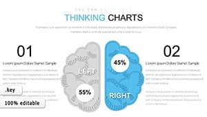 (803)
24 Free Thinking Charts - Editable Keynote | ImagineLayoutID: #KC00651free
(803)
24 Free Thinking Charts - Editable Keynote | ImagineLayoutID: #KC00651free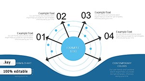 (49)
(49) Free Radar Charts Keynote Template - Instant Download | ImagineLayoutID: #KC00646free
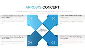 (97)
Arrows Concept Keynote Chart - Free Editable Keynote | ImagineLayoutID: #KC00643free
(97)
Arrows Concept Keynote Chart - Free Editable Keynote | ImagineLayoutID: #KC00643free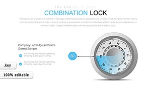 (40)
Combination Lock Keynote Chart - Free Editable Keynote | ImagineLayoutID: #KC00641free
(40)
Combination Lock Keynote Chart - Free Editable Keynote | ImagineLayoutID: #KC00641free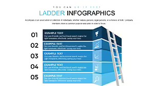 (372)
Ladder Infographic Keynote Chart - Free Editable Keynote | ImagineLayoutID: #KC00640free
(372)
Ladder Infographic Keynote Chart - Free Editable Keynote | ImagineLayoutID: #KC00640free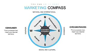 (885)
(885) Marketing Compass Keynote Charts - Fully Editable | ImagineLayoutID: #KC00638free
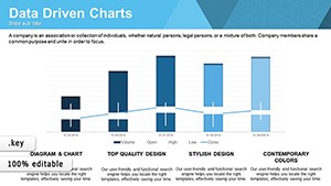 (872)
Data Driven Charts Keynote Template - Instant Download | ImagineLayoutID: #KC00637free
(872)
Data Driven Charts Keynote Template - Instant Download | ImagineLayoutID: #KC00637free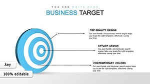 (358)
Business Target Keynote Charts - Fully Editable | ImagineLayoutID: #KC00636free
(358)
Business Target Keynote Charts - Fully Editable | ImagineLayoutID: #KC00636free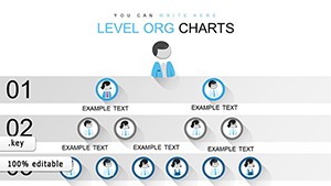 (705)
Organizational Keynote Chart Template - Instant Download | ImagineLayoutID: #KC00635free
(705)
Organizational Keynote Chart Template - Instant Download | ImagineLayoutID: #KC00635free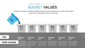 (255)
Bucket Creative Keynote Charts - Editable Keynote | ImagineLayoutID: #KC00634free
(255)
Bucket Creative Keynote Charts - Editable Keynote | ImagineLayoutID: #KC00634free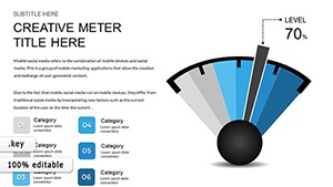 (230)
(230) KPI Gauges Keynote Charts - Fully Editable | ImagineLayoutID: #KC00632free
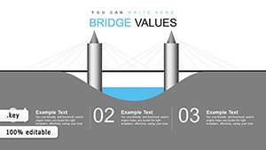 (1120)
Bridge Value Keynote Charts - Instant Download | ImagineLayoutID: #KC00631free
(1120)
Bridge Value Keynote Charts - Instant Download | ImagineLayoutID: #KC00631free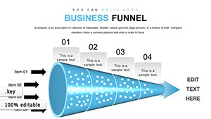 (148)
Business Funnel Keynote Charts - Fully Editable | ImagineLayoutID: #KC00627free
(148)
Business Funnel Keynote Charts - Fully Editable | ImagineLayoutID: #KC00627free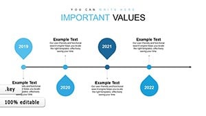 (300)
Timeline Concept Keynote Charts - Instant Download | ImagineLayoutID: #KC00626free
(300)
Timeline Concept Keynote Charts - Instant Download | ImagineLayoutID: #KC00626free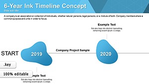 (783)
Ink Timelines Keynote Charts - Fully Editable | ImagineLayoutID: #KC00624free
(783)
Ink Timelines Keynote Charts - Fully Editable | ImagineLayoutID: #KC00624free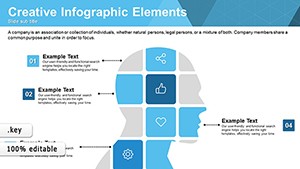 (18)
Creative Matrix Keynote Charts - Editable KEY | ImagineLayoutID: #KC00622free
(18)
Creative Matrix Keynote Charts - Editable KEY | ImagineLayoutID: #KC00622free (133)
Infographic Concepts Keynote Charts - Editable KEY | ImagineLayoutID: #KC00621free
(133)
Infographic Concepts Keynote Charts - Editable KEY | ImagineLayoutID: #KC00621free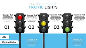 (714)
Traffic Lights Keynote Charts - Editable KEY | ImagineLayoutID: #KC00619free
(714)
Traffic Lights Keynote Charts - Editable KEY | ImagineLayoutID: #KC00619free (244)
Free Process Description Keynote Charts TemplateID: #KC00616free
(244)
Free Process Description Keynote Charts TemplateID: #KC00616free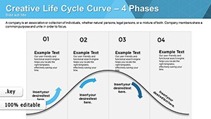 (977)
Life Cycle Curve Keynote Charts TemplateID: #KC00615free
(977)
Life Cycle Curve Keynote Charts TemplateID: #KC00615free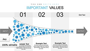 (746)
Keynote Charts Template - Instant Download | ImagineLayoutID: #KC00614free
(746)
Keynote Charts Template - Instant Download | ImagineLayoutID: #KC00614free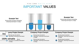 (116)
Chemical Test Keynote Charts - Instant Download | ImagineLayoutID: #KC00613free
(116)
Chemical Test Keynote Charts - Instant Download | ImagineLayoutID: #KC00613free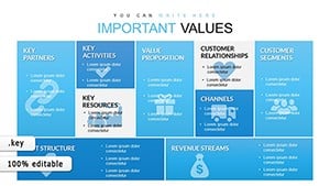 (1145)
Business Model Canvas Keynote - Fully Editable | ImagineLayoutID: #KC00612free
(1145)
Business Model Canvas Keynote - Fully Editable | ImagineLayoutID: #KC00612free (668)
Chevron Steps Keynote Charts - Editable Keynote | ImagineLayoutID: #KC00611free
(668)
Chevron Steps Keynote Charts - Editable Keynote | ImagineLayoutID: #KC00611free (732)
Sector Circle Keynote Charts - Fully Editable | ImagineLayoutID: #KC00610free
(732)
Sector Circle Keynote Charts - Fully Editable | ImagineLayoutID: #KC00610free (239)
Free Christmas Keynote Charts Template: Sparkle Up Your Holiday PresentationsID: #KC00430free
(239)
Free Christmas Keynote Charts Template: Sparkle Up Your Holiday PresentationsID: #KC00430free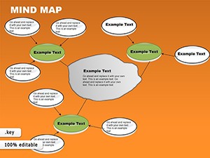 (678)
Free Mind Map Keynote Template: Ignite Ideas with Visual BrillianceID: #KC00070free
(678)
Free Mind Map Keynote Template: Ignite Ideas with Visual BrillianceID: #KC00070free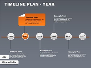 (695)
Yearly Timeline Plan Keynote Template - FreeID: #KC00069free
(695)
Yearly Timeline Plan Keynote Template - FreeID: #KC00069free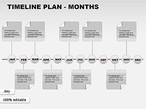 (132)
Free Monthly Timeline Keynote Charts - Download NowID: #KC00068free
(132)
Free Monthly Timeline Keynote Charts - Download NowID: #KC00068free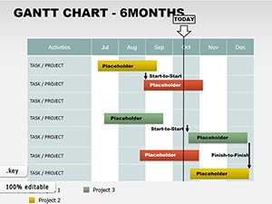 (387)
6-Month Gantt Keynote Template - Free & EditableID: #KC00067free
(387)
6-Month Gantt Keynote Template - Free & EditableID: #KC00067free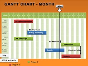 (1000)
Monthly Gantt Keynote Charts - Instant Download | ImagineLayoutID: #KC00066free
(1000)
Monthly Gantt Keynote Charts - Instant Download | ImagineLayoutID: #KC00066free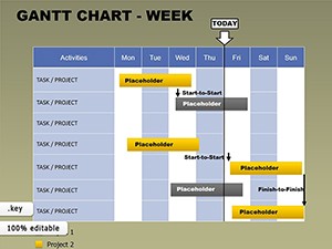 (1138)
Free Weekly Gantt Keynote Template: Master Short-Term Projects with EaseID: #KC00065free
(1138)
Free Weekly Gantt Keynote Template: Master Short-Term Projects with EaseID: #KC00065free
What these chart templates do that Keynote`s native editor cannot
Keynote ships with a capable built - in chart editor. You can build a bar chart, a line chart, an area chart, a scatter plot - all linked to an editable data spreadsheet, all styled consistently with your theme. That`s genuinely good for conventional data visualization. But a significant portion of what gets called "charts" in business presentations isn`t a data chart at all. A Gantt is a time - and - task grid. A funnel is a sequential narrowing shape. A Business Model Canvas is a structured 9 - block layout. A waterfall (or bridge) chart shows the cumulative effect of sequential positive and negative values - and Keynote`s native chart editor won`t build that without custom workarounds. These templates provide those structural types pre - built: you replace the placeholder text and data labels rather than constructing the layout from shapes and connectors yourself.
Five real - world scenarios across five chart types
Product manager preparing a quarterly roadmap review. The leadership team needs to see which features are prioritized, when they`re scheduled, and how dependencies line up. A Gantt layout shows time, task, and dependency in one view. The six - month template provides the right scale for strategic discussion without drowning in task - level detail.
Sales operations lead reporting on pipeline conversion. A funnel template shows drop - off at each stage from lead to closed deal. The narrowing shape communicates the conversion rate story before the presenter says a word. When I opened a funnel template for a client quarterly review, the pre - set stage labels matched our CRM exactly, saving twenty minutes of setup.
Marketing analyst comparing campaign performance across channels. Three channels, six metrics - CTR, conversion rate, CPA, ROAS, volume, and trend. A radar chart overlays all three profiles on one slide. The shape of each polygon tells the story faster than a six - row table. The pre - set axes matched standard marketing metrics, saving time on axis labeling.
Finance manager presenting a budget bridge analysis. A waterfall chart shows how you got from last year`s profit to this year`s forecast. Positive and negative contributions stack sequentially. The template handles the cumulative logic so the presenter can focus on explaining each driver, not rebuilding the visual structure.
Strategy consultant facilitating a business model workshop. A Business Model Canvas layout with nine pre - aligned blocks. The team fills in customer segments, value propositions, channels, and revenue streams without fighting shape alignment. The slide becomes a working surface for discussion, not a presentation of pre - determined answers.
Which Gantt template scale fits your planning horizon
There are three Gantt layouts in this collection: weekly, monthly, and 6 - month. The distinction isn`t cosmetic - each one has a fundamentally different scale, which determines what kinds of project milestones fit legibly on a slide. The weekly Gantt works for sprint - level planning: short tasks, dense milestones, two to four weeks of horizon. If you`re presenting a delivery timeline to an engineering team, this is the layout. The monthly version covers a single project phase or a quarter, which is the right scale for cross - functional reviews where dependencies across teams need to be visible simultaneously. The 6 - month Gantt is for roadmap presentations to leadership - high - level milestones, minimal task - level detail, long enough horizon to show strategic sequencing. The most common mistake is using the monthly version for weekly sprint reviews. The scale makes individual tasks look compressed and hard to read from a distance. Match the template scale to the planning horizon you`re actually presenting.
When to choose these free Keynote charts over adjacent categories
If your argument depends on a specific structural framework - time - plus - task, sequential narrowing, multi - variable comparison, cumulative delta, or nine - block business logic - then these templates are the right choice. For conventional data visualization where you need linked charts that update automatically when numbers change, use Keynote`s native chart templates. For process flows and relationship mapping where the logic is directional rather than comparative, switch to Keynote diagram templates. And if your point is geographic distribution, a Keynote map template will communicate more clearly. This collection exists to fill the gap where Keynote`s built - in chart editor stops.
Why rebuilding these structural chart types from scratch wastes time
You could build a Gantt in Keynote using shapes and lines. The time isn`t lost in drawing rectangles - it`s lost in alignment, scaling, and connector behavior. Getting bars to align consistently across three months, ensuring task labels don`t overlap when you add a new row, maintaining the same color logic across ten slides. That`s where most people burn time. These templates solve that upfront. The slide master defines color behavior, the grid spacing is consistent, and the layout handles text overflow predictably. You change one accent color, and every chart in the collection updates across the deck.
Technical note: timeline and Gantt behavior in Keynote
These Gantt templates use milestone - based logic (specific dates, no duration) rather than duration - based bars. That means if you add a new milestone mid - sequence, spacing redistributes automatically. However, if you`re trying to represent a task that spans two months, a milestone layout won`t show the span. For that use case, you`d need a different structural approach. Also, connectors in funnel templates sometimes detach when you add a new stage. Not a dealbreaker, but something to watch. Duplicate the slide before making major structural changes, and keep the original as a fallback.
Why this free collection is actually useful for working decks
All templates here are free to download and edit in Keynote on Mac. No stripped - down versions, no watermarks, no "upgrade to unlock" popups. The free versions deliver the complete editable slides with no paid upgrade listed on the page. You change the entire palette once through the slide master and every diagram updates automatically across the deck. That`s what a free template should do: handle the boring alignment so you can focus on the story.
Navigate related chart categories
This free collection covers the structural chart types Keynote doesn`t build natively. For a broader range of free options, see free PowerPoint templates. For paid structural charts with larger slide counts, browse Keynote chart templates. For visual frameworks that aren`t chart - based, explore Keynote diagram templates.
Frequently Asked Questions
What Keynote version do I need for these templates?
The templates are fully compatible with recent Keynote versions on macOS. In most cases they run on macOS 10.15 or later. The free download includes the full KEY file with editable slides. If you`re using an older version, you might notice that some layout elements behave differently, but the core structure usually holds. Exporting to PDF is fully supported across versions.
Can I use these charts for commercial presentations?
Yes. The free templates come with a standard license that allows commercial use. You can present them in client meetings, internal reviews, and investor decks without additional fees. The only restriction is redistribution of the template file itself. You cannot resell the template as your own product, but you can use it to create presentations you charge for.
How do I add a new stage to a funnel template without breaking alignment?
Duplicate the existing stage shape, then adjust its vertical position manually. The funnel templates are built as separate editable shapes, not a single grouped object. That means you can add or remove stages, but the spacing won`t auto - balance. From experience, it`s easier to start with a funnel that has more stages than you need and delete extras, rather than adding new ones. If you must add a stage, duplicate the slide first and experiment on the copy.
Can I change the color scheme across all slides at once?
Yes. These templates use slide master colors consistently. Change the color in the slide master once, and every chart that uses that color updates automatically across the entire deck. That`s one of the main reasons these templates save time. If you`re not familiar with slide master edits, go to View > Edit Master Slides, change the swatches, and exit. The whole deck updates instantly.
What`s the difference between these free charts and your paid Keynote charts?
The free collection gives you the core structural chart types - Gantt, funnel, radar, waterfall, Business Model Canvas. The paid collection includes those plus more specialized layouts, larger slide counts (often 30 - 50 slides instead of 10 - 20), and additional variants of each chart type. For most one - off presentations, the free set is enough. For recurring decks or teams that present the same frameworks weekly, the paid collection offers more depth and consistency across a larger library.