Cubes Keynote Charts
These charts give structured 3D visuals for any data-heavy presentation. A financial analyst preparing the quarterly earnings review can skip the time spent building cube models from individual shapes.
The file opens with pre-built cube sets and data tables already linked. This collection serves business analysts, educators, and strategy leads who must show comparisons without rebuilding the same diagram each quarter.
The layouts keep visual hierarchy so the audience follows the story from overview cube to detailed breakdown. Select the chart set that matches your next report and begin.
 (9)
(9) Keynote Building Blocks Chart - Instant Download | ImagineLayoutID: #KC01107$18.00
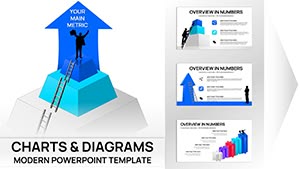 (8)
(8) Personal Trainer Proposal Keynote Charts Template - Fully Editable | Instant DownloadID: #KC01098$18.00
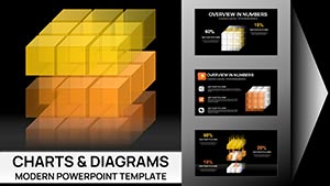 (9)
3D Cubes Charts Keynote Template - Fully Editable 41 Slides | ImagineLayoutID: #KC01095$22.00
(9)
3D Cubes Charts Keynote Template - Fully Editable 41 Slides | ImagineLayoutID: #KC01095$22.00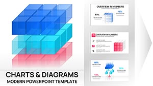 (17)
3D Cube Charts Keynote Template - Fully Editable | Instant DownloadID: #KC01071$25.00
(17)
3D Cube Charts Keynote Template - Fully Editable | Instant DownloadID: #KC01071$25.00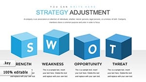 (985)
Editable Strategy Adjustment Keynote Charts - 28 SlidesID: #KC00866$20.00
(985)
Editable Strategy Adjustment Keynote Charts - 28 SlidesID: #KC00866$20.00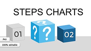 (1142)
 3D Steps Processing Keynote Charts Template: Visualize Processes with DepthID: #KC00809$20.00
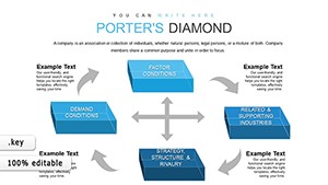 (997)
Elevate Strategic Insights with 3D Cubes Porter's Five Forces ChartsID: #KC00806$15.00
(997)
Elevate Strategic Insights with 3D Cubes Porter's Five Forces ChartsID: #KC00806$15.00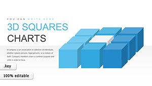 (301)
Innovative 3D Squares Cube Keynote Charts Presentation TemplateID: #KC00801$18.00
(301)
Innovative 3D Squares Cube Keynote Charts Presentation TemplateID: #KC00801$18.00 (1063)
Business Process Modeling Keynote Charts: Visualize Efficiency in 3DID: #KC00794$15.00
(1063)
Business Process Modeling Keynote Charts: Visualize Efficiency in 3DID: #KC00794$15.00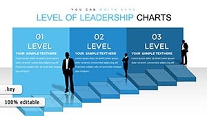 (1126)
 Leadership Skills 3D Cube Infographic Keynote Template: Inspire and LeadID: #KC00793$20.00
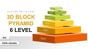 (980)
3D Pyramid Keynote Charts - Fully Editable | ImagineLayoutID: #KC00744$20.00
(980)
3D Pyramid Keynote Charts - Fully Editable | ImagineLayoutID: #KC00744$20.00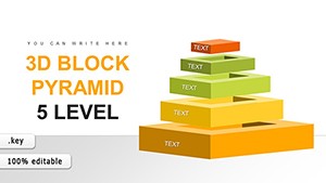 (1100)
5-Level 3D Pyramid Template - Editable | ImagineLayoutID: #KC00743$22.00
(1100)
5-Level 3D Pyramid Template - Editable | ImagineLayoutID: #KC00743$22.00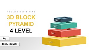 (306)
4-Level 3D Pyramid Charts - Editable | ImagineLayoutID: #KC00742$21.00
(306)
4-Level 3D Pyramid Charts - Editable | ImagineLayoutID: #KC00742$21.00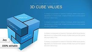 (168)
3D Cube Keynote Charts - Instant Download | ImagineLayoutID: #KC00676$20.00
(168)
3D Cube Keynote Charts - Instant Download | ImagineLayoutID: #KC00676$20.00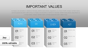 (566)
3D PDCA Cycle Keynote Charts - Editable KEY | ImagineLayoutID: #KC00673$20.00
(566)
3D PDCA Cycle Keynote Charts - Editable KEY | ImagineLayoutID: #KC00673$20.00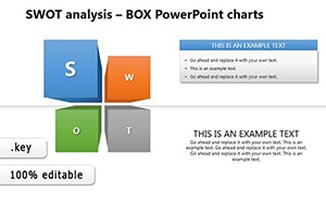 (742)
Professional SWOT Analysis Keynote TemplateID: #KC00261$23.00
(742)
Professional SWOT Analysis Keynote TemplateID: #KC00261$23.00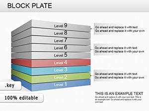 (335)
Block Plate Keynote Charts Template: Modern Sleek Designs for Professional PresentationsID: #KC00239$22.00
(335)
Block Plate Keynote Charts Template: Modern Sleek Designs for Professional PresentationsID: #KC00239$22.00 (948)
Decode Design Data: Box Plots That Build Better ProjectsID: #KC00215$18.00
(948)
Decode Design Data: Box Plots That Build Better ProjectsID: #KC00215$18.00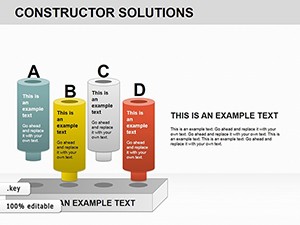 (195)
Constructor Solutions Keynote Charts: Blueprint Your Path to Project WinsID: #KC00212$22.00
(195)
Constructor Solutions Keynote Charts: Blueprint Your Path to Project WinsID: #KC00212$22.00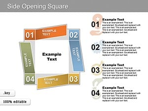 (435)
Modern Side-Opening Square Keynote Charts: Open New Doors to DataID: #KC00172$15.00
(435)
Modern Side-Opening Square Keynote Charts: Open New Doors to DataID: #KC00172$15.00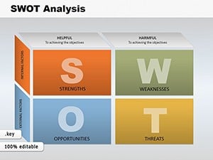 (789)
SWOT Analysis Cube Keynote Charts: Elevate Your Strategy PresentationsID: #KC00123$26.00
(789)
SWOT Analysis Cube Keynote Charts: Elevate Your Strategy PresentationsID: #KC00123$26.00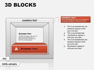 (996)
3D Blocks Keynote Charts: Elevate Data Visualization in 3DID: #KC00072$18.00
(996)
3D Blocks Keynote Charts: Elevate Data Visualization in 3DID: #KC00072$18.00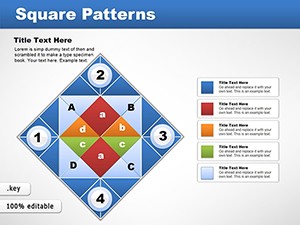 (124)
Square Patterns Keynote Charts Template: Creative and Professional DesignsID: #KC00043$18.00
(124)
Square Patterns Keynote Charts Template: Creative and Professional DesignsID: #KC00043$18.00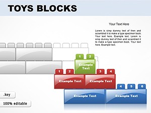 (688)
Toy Blocks Keynote Template: Playful & ProfessionalID: #KC00037$25.00
(688)
Toy Blocks Keynote Template: Playful & ProfessionalID: #KC00037$25.00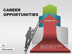 (1041)
Career Potential Keynote Infographic TemplateID: #KC00036$25.00
(1041)
Career Potential Keynote Infographic TemplateID: #KC00036$25.00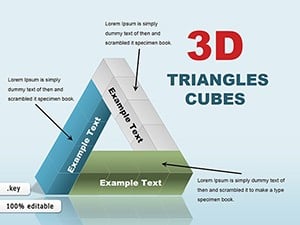 (925)
3D Triangles and Cubes Keynote Charts: Elevate Data to New DimensionsID: #KC00028$26.00
(925)
3D Triangles and Cubes Keynote Charts: Elevate Data to New DimensionsID: #KC00028$26.00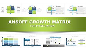 (875)
Ansoff Growth Matrix Keynote Template: Fuel Your Business ExpansionID: #KC00020$27.00
(875)
Ansoff Growth Matrix Keynote Template: Fuel Your Business ExpansionID: #KC00020$27.00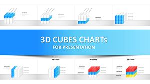 (1199)
3D Cube Infographics Keynote Template - 42 Fully Editable Charts | Instant DownloadID: #KC00005$20.00
(1199)
3D Cube Infographics Keynote Template - 42 Fully Editable Charts | Instant DownloadID: #KC00005$20.00
Turning Complex Data Into Clear 3D Cube Visuals
A marketing strategist building a campaign performance deck needs to show ROI across four channels. The stakeholder meeting is in two days and standard bar charts feel flat. The 3D cubes chart template places each channel on its own face so comparisons appear in one glance.
An operations manager presents process efficiency to the leadership team. The data includes six stages and every stage must show volume differences. The 3D steps processing layout keeps depth consistent so the audience sees bottlenecks immediately.
A consultant delivering a Porter`s Five Forces analysis uses the dedicated cube set. The client expects one slide that communicates all five forces without extra explanation. The template already arranges the cubes in the classic formation.
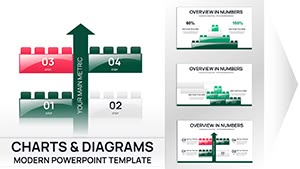
A personal trainer creating a client proposal report uses the fitness metrics cubes. Progress numbers for strength and endurance fit the same visual language across six months of data.
Technical Considerations for Cube Charts in Keynote
Link the underlying table to an external spreadsheet so numbers update automatically when source data changes. Rotate the group on the slide master to lock viewing angles across the entire deck. Keep animation builds simple to avoid lag on older machines.
Common Editing Steps for Consistent Cube Sets
Select all cubes on a slide, then adjust one data value to see the height change propagate. Use the color palette stored in the master slide for brand matching in one click. Group the entire chart before copying to new slides to preserve depth settings.
When Cube Charts Outperform Standard Visuals
In quarterly reports where three variables intersect, a cube shows the relationship in one object instead of multiple separate charts. The depth dimension adds context that flat graphs lose.
Why This Collection Focuses on Business Clarity
Designs remove decorative shadows that hide data edges. Every cube supports direct number entry without rebuilding the shape. The layouts stay light so decks with fifty charts open quickly.
Pairing With Other Collections
For transportation metrics that need cube visuals, combine these with our cars keynote templates. When the presentation includes training handouts, the education and training brochures templates provide matching print materials. For agricultural yield comparisons, see the agriculture keynote templates.
Choose the cube set for your next data slide and open Keynote.
Can I update cube data from an external file?
Yes, copy the table from Excel and paste directly into the Keynote chart editor. The cube heights adjust instantly while keeping the 3D perspective locked. Save the linked spreadsheet alongside the .key file for future quarterly updates without rebuilding the visual.
Do the charts work on older Keynote versions?
The templates are built for Keynote 12 and above. On version 11 some 3D lighting effects may flatten; simply re-apply the preset style from the master. All data tables and grouping remain editable regardless of version.
Can I change the cube colors to match my brand?
The color palette sits on the slide master. Update the six swatches once and every cube in the deck refreshes automatically. The change carries through to exported PDF and PowerPoint files without manual recoloring.
What file size should I expect with many cubes?
A deck with twenty cube charts stays under 8 MB because the 3D objects use vector definitions rather than raster images. Embed fonts only if needed for PDF export; otherwise the file remains compact for email sharing.