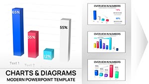
Graphs Keynote Charts
Transform complex data into compelling visuals with our curated collection of Keynote chart templates. Designed for professionals, educators, and creatives who demand precision and style, these templates make it simple to craft presentations that captivate and inform.
Whether you're analyzing sales trends, outlining project timelines, or illustrating key metrics, our editable designs - featuring bar graphs, line charts, pie diagrams, and interactive infographics - ensure your message lands with clarity and impact. Built natively for Apple Keynote, each template supports seamless animations, color schemes, and data integration, saving you hours of design time.
From boardroom pitches to classroom lectures, these tools empower you to focus on your story while we handle the aesthetics. Explore the full range today and discover how effortless data storytelling can be. Start downloading your favorites and watch your presentations come alive.
 (16)
(16) 3D Clustered Column Charts Keynote - Editable | ImagineLayoutID: #KC01106$14.00
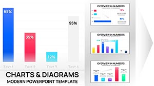 (9)
(9) Clustered Column Keynote Charts Template - Fully Editable | Instant DownloadID: #KC01102$10.00
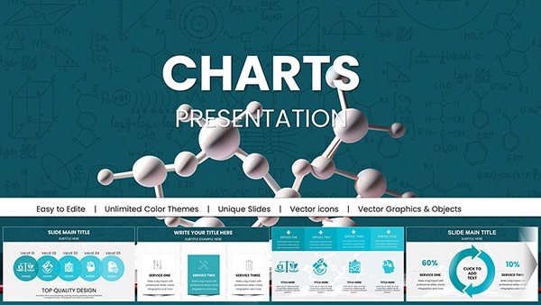 (8)
Chemical Charts Keynote Template - Fully Editable 47 Slides | Instant DownloadID: #KC01062$15.00
(8)
Chemical Charts Keynote Template - Fully Editable 47 Slides | Instant DownloadID: #KC01062$15.00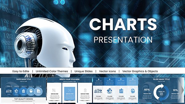 (16)
AI-Powered Robot Charts Template: Fuel Your Tech Visions with Futuristic FlairID: #KC01054$20.00
(16)
AI-Powered Robot Charts Template: Fuel Your Tech Visions with Futuristic FlairID: #KC01054$20.00 (10)
Nanoscience and Nanotechnology Charts Template for Keynote PresentationsID: #KC01039$20.00
(10)
Nanoscience and Nanotechnology Charts Template for Keynote PresentationsID: #KC01039$20.00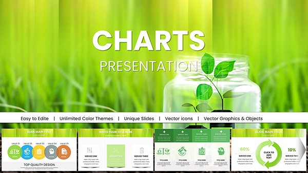 (1179)
 Ecology Conservation Charts Keynote Presentation TemplateID: #KC01028$18.00
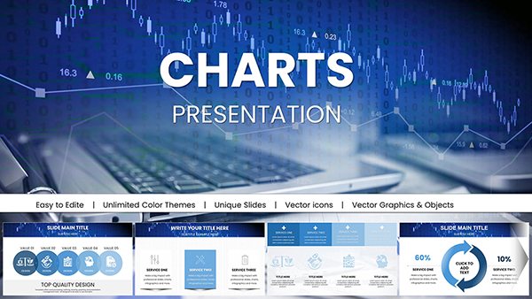 (130)
Marketing Strategies Keynote Template - Professional ChartsID: #KC01026$22.00
(130)
Marketing Strategies Keynote Template - Professional ChartsID: #KC01026$22.00 (409)
Premium Secure Cloud Business Charts for Keynote PresentationsID: #KC01024$18.00
(409)
Premium Secure Cloud Business Charts for Keynote PresentationsID: #KC01024$18.00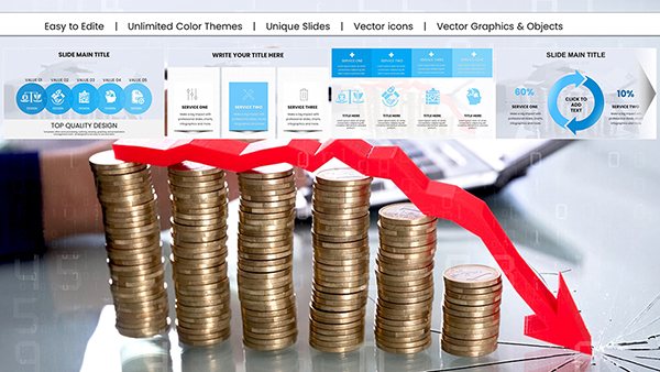 (105)
Data Visualization Keynote Charts Template: Illuminate Your InsightsID: #KC01017$18.00
(105)
Data Visualization Keynote Charts Template: Illuminate Your InsightsID: #KC01017$18.00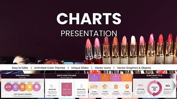 (377)
Vibrant Beauty Makeup Cosmetic Keynote Charts for PresentationID: #KC01004$22.00
(377)
Vibrant Beauty Makeup Cosmetic Keynote Charts for PresentationID: #KC01004$22.00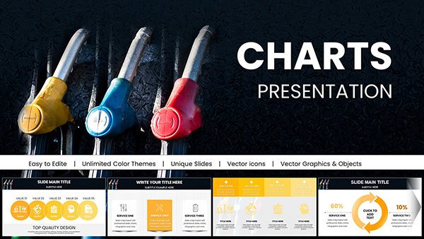 (165)
(165) Gas Prices Keynote Charts: Visualize Fuel TrendsID: #KC01000$18.00
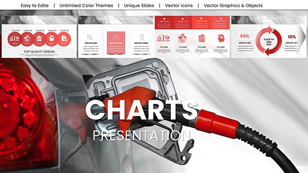 (791)
Oil Price Keynote Charts: Forecast Energy MarketsID: #KC00999$18.00
(791)
Oil Price Keynote Charts: Forecast Energy MarketsID: #KC00999$18.00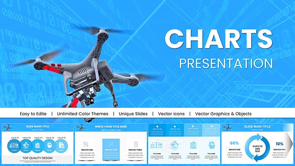 (863)
Drone Commercial Keynote Charts for PresentationID: #KC00998$20.00
(863)
Drone Commercial Keynote Charts for PresentationID: #KC00998$20.00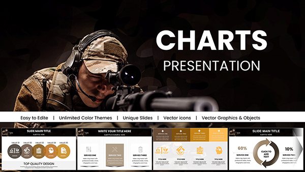 (520)
Armed Forces Keynote Charts for Military PresentationID: #KC00995$18.00
(520)
Armed Forces Keynote Charts for Military PresentationID: #KC00995$18.00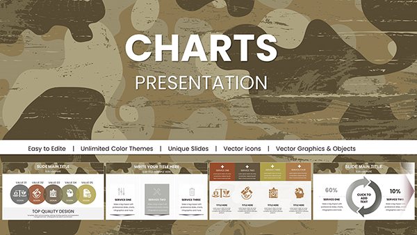 (444)
Military Pay Keynote Charts TemplateID: #KC00994$18.00
(444)
Military Pay Keynote Charts TemplateID: #KC00994$18.00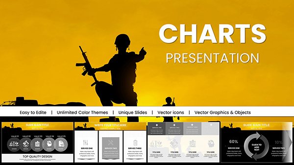 (966)
Armed Forces PowerPoint Charts for Military PresentationID: #KC00993$16.00
(966)
Armed Forces PowerPoint Charts for Military PresentationID: #KC00993$16.00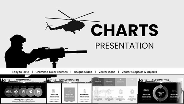 (1062)
Army Pay Keynote Charts for Military PresentationID: #KC00992$18.00
(1062)
Army Pay Keynote Charts for Military PresentationID: #KC00992$18.00 (15)
Real Estate Market Keynote Charts: Transform Data into DealsID: #KC00988$18.00
(15)
Real Estate Market Keynote Charts: Transform Data into DealsID: #KC00988$18.00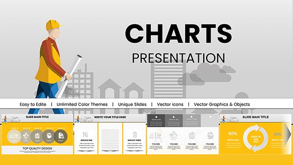 (168)
Architectural Keynote Charts Template for ProsID: #KC00987$18.00
(168)
Architectural Keynote Charts Template for ProsID: #KC00987$18.00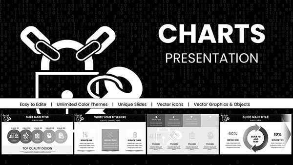 (135)
Background Information Security Code Keynote Charts: Safeguard Data with Visual PrecisionID: #KC00985$18.00
(135)
Background Information Security Code Keynote Charts: Safeguard Data with Visual PrecisionID: #KC00985$18.00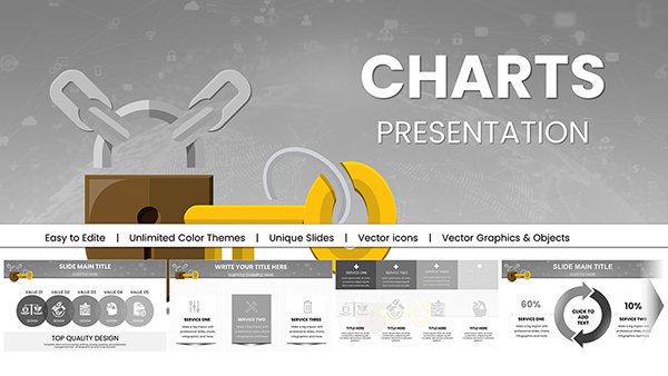 (131)
Key Access Control Keynote Template: Secure Presentations with Advanced VisualsID: #KC00983$18.00
(131)
Key Access Control Keynote Template: Secure Presentations with Advanced VisualsID: #KC00983$18.00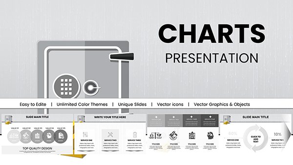 (926)
Bank Security Safeguarding: Keynote Charts for Financial FortificationID: #KC00981$18.00
(926)
Bank Security Safeguarding: Keynote Charts for Financial FortificationID: #KC00981$18.00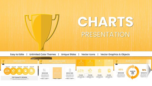 (1188)
Winner Victory Cup: Keynote Charts for Motivational MasteryID: #KC00980$20.00
(1188)
Winner Victory Cup: Keynote Charts for Motivational MasteryID: #KC00980$20.00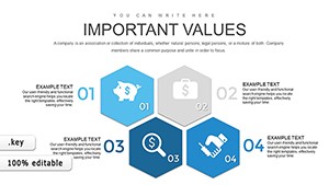 (525)
Marketing Mix Keynote Charts TemplateID: #KC00754$24.00
(525)
Marketing Mix Keynote Charts TemplateID: #KC00754$24.00 (643)
Animated Keynote Charts: Dynamic PresentationsID: #KC00504$20.00
(643)
Animated Keynote Charts: Dynamic PresentationsID: #KC00504$20.00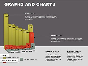 (909)
Graphs Keynote Template - Instant Download | ImagineLayoutID: #KC00078$22.00
(909)
Graphs Keynote Template - Instant Download | ImagineLayoutID: #KC00078$22.00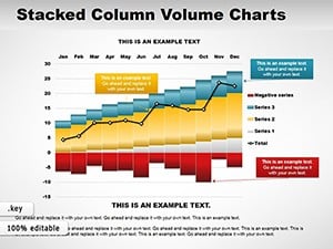 (842)
Stacked Column Volume Charts for KeynoteID: #KC00053$14.00
(842)
Stacked Column Volume Charts for KeynoteID: #KC00053$14.00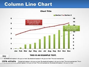 (128)
Column Line Charts Keynote Template: Dynamic VisualsID: #KC00052$16.00
(128)
Column Line Charts Keynote Template: Dynamic VisualsID: #KC00052$16.00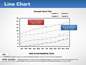 (242)
Lines Keynote Charts Template: Visualize Trends EffortlesslyID: #KC00050$12.00
(242)
Lines Keynote Charts Template: Visualize Trends EffortlesslyID: #KC00050$12.00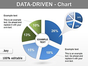 (900)
Data Visualization Keynote Charts Template - 13 Fully Editable Slides | Instant DownloadID: #KC00009$10.00
(900)
Data Visualization Keynote Charts Template - 13 Fully Editable Slides | Instant DownloadID: #KC00009$10.00 (914)
Sales Funnel Keynote Charts Template - Revenue Growth Infographics | ImagineLayoutID: #KC00015$12.00
(914)
Sales Funnel Keynote Charts Template - Revenue Growth Infographics | ImagineLayoutID: #KC00015$12.00
Essential Use Cases for Keynote Chart Templates
In the fast-paced world of business presentations, clarity is king. Our Keynote chart templates shine in scenarios where data drives decisions, such as quarterly reports or investor updates. Imagine a sleek bar graph template that highlights revenue growth quarter-over-quarter, with smooth animations revealing each segment as you narrate your success story. Unlike basic defaults in Keynote, these designs incorporate layered elements for depth, allowing you to overlay icons or subtle gradients that align with your brand palette.
For educators, these templates turn abstract concepts into tangible insights. A pie chart template can break down historical events by era or student demographics in a sociology class, making lessons more engaging and memorable. The vector-based graphics ensure scalability without pixelation, perfect for high-resolution displays or printed handouts.
Creative professionals will appreciate the flexibility in marketing pitches. Use a line graph template to plot campaign performance metrics, with customizable axes and trend lines that emphasize peaks in engagement. These go beyond standard tools by including pre-built legends and tooltips, enhancing interactivity during live sessions.
Business Applications: Driving Strategy with Visuals
Executives rely on data to steer the ship, and our templates provide the sails. Consider a dashboard-style chart combining multiple graph types - bars for comparisons, lines for trends, and areas for projections. This holistic view helps in SWOT analyses or competitive benchmarking, where every percentage point matters. Best practices include limiting data series to three or four per chart to avoid clutter, ensuring your audience absorbs the narrative without distraction.
- Sales Forecasting: Layer seasonal adjustments into column charts for accurate predictions.
- Team Performance: Radar charts to showcase skill matrices across departments.
- Budget Allocations: Donut charts for expense breakdowns, with hover effects for details.
Compared to generic Keynote charts, our versions offer advanced styling options like 3D rotations or isometric views, adding a modern edge that impresses stakeholders.
Educational Scenarios: Simplifying Complex Topics
Teachers and trainers transform dry statistics into dynamic stories. A scatter plot template can illustrate correlations in scientific data, such as temperature versus crop yield, fostering deeper discussions. These templates support accessibility features like high-contrast modes and alt-text placeholders, aligning with inclusive design principles.
- Start with a blank slide and insert the template via drag-and-drop.
- Input your dataset using Keynote's intuitive table editor.
- Animate elements sequentially to build suspense during explanations.
The unique value lies in their adaptability - resize, recolor, or recombine elements without losing quality, far surpassing the rigidity of built-in options.
Creative Projects: Infusing Art into Analytics
Designers and marketers craft narratives that sell. Bubble charts visualize market sizing, where size represents volume and position indicates growth potential, ideal for pitch decks. Integrate with Keynote's media tools for embedded videos or images, creating multimedia masterpieces.
Practical tip: Use consistent color coding across slides to reinforce themes, boosting retention by up to 65% according to visual learning studies. Our templates include 20+ color variants, from minimalist monochromes to vibrant palettes.
Why Choose Our Templates Over Standard Designs?
Standard Keynote charts are functional but lack flair - they're like plain white bread in a gourmet world. Our collection elevates with bespoke illustrations, such as hand-drawn icons for organic feel or metallic gradients for premium appeal. They're optimized for Core Web Vitals equivalents in presentation delivery, ensuring smooth playback on any device.
Unique propositions include one-click data import from CSV files and AI-suggested layouts based on dataset size. This streamlines workflows, letting you iterate faster. For voice search compatibility, headings use natural phrasing like "best charts for sales data," aiding discoverability in shared resources.
Internal linking opportunity: Pair these with our infographic templates for comprehensive decks. Schema markup for accessibility ensures screen readers interpret graphs accurately, describing axes and values aloud.
Best Practices for Chart Implementation
Maximize impact by following these guidelines:
- Choose chart types wisely - bars for comparisons, lines for trends.
- Maintain white space to prevent overcrowding.
- Test on multiple screens for responsiveness.
- End with a takeaway slide summarizing key insights.
Examples abound: A tech startup used our funnel chart to depict user acquisition, converting 20% more leads post-presentation. In education, a biology professor's ecosystem balance graph via our template sparked a 30% rise in class participation.
Ready to upgrade? Download a free sample pack and experiment - your next presentation deserves excellence.
Creative Applications and Real-World Examples
Unlock innovation with unconventional uses. In event planning, a Gantt-style chart template tracks timelines, with milestones as colorful milestones. For nonprofits, stacked area charts show donation trends over campaigns, inspiring donor confidence.
Case study: A marketing agency revamped their ROI report using our combo charts, blending pies and bars for a hybrid view that clarified multi-channel contributions. Result? Client approval in under 10 minutes.
Explore variations like animated heat maps for geographic data or Venn diagrams for overlapping concepts. Each template includes alt-text suggestions, e.g., "Bar chart showing quarterly sales from 2024-2025," enhancing SEO for shared online decks.
Frequently Asked Questions
Common queries from our community:
What types of charts are included in these Keynote templates?
Our library features over 20 varieties, including bar, line, pie, scatter, radar, and combo charts, all fully editable for your needs.
Are these templates compatible with older versions of Keynote?
Yes, designed for Keynote 6.0 and later, with backward compatibility notes in each download.
How do I customize colors to match my brand?
Use the built-in color picker or global theme editor - changes apply across all slides instantly.
Can I use these for Google Slides too?
Export as .key files and import into Google Slides, though some animations may need adjustment.
Do the templates support data animations?
Absolutely - pre-configured builds reveal data point-by-point for dramatic effect.
Is there support for importing external data sources?
Paste from Excel or Numbers directly; advanced users can link via scripts for live updates.
Still have questions? Contact our design team for personalized advice. Elevate your visuals - start exploring now!