Matrix Keynote Charts
This collection includes matrix Keynote charts built for strategy teams that need to structure decisions visually rather than narrate them slide by slide. You get 2x2 grids, multi - axis comparisons, and quadrant - based layouts that carry meaning through position, not decoration. A product manager preparing a quarterly roadmap review doesn`t need another bullet list - they need to show trade - offs: high versus low risk, market growth versus share, effort versus impact. A matrix does that in one frame. The layout forces prioritization. That`s why this format shows up in board decks more than people admit. If your work involves comparing options, mapping uncertainty, or presenting strategic positioning, start here and pick the layout that matches how your data actually behaves. Download the layout that fits your next board review.
 (12)
(12) Marketing Mix Keynote Charts - Fully Editable | ImagineLayoutID: #KC01108$20.00
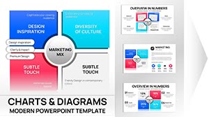 (11)
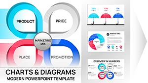
Marketing Mix Keynote Charts Template - Fully Editable | Instant Download | ImagineLayoutID: #KC01090$15.00
(11)
Marketing Mix Keynote Charts Template - Fully Editable | Instant Download | ImagineLayoutID: #KC01090$15.00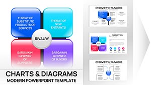 (13)
(13) Porter's Diamond Charts Keynote Template - Fully Editable | Instant Download | ImagineLayoutID: #KC01089$15.00
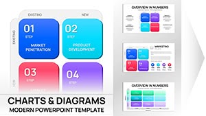 (14)
Ansoff Matrix Chart Keynote - Editable PPTX | ImagineLayoutID: #KC01082$20.00
(14)
Ansoff Matrix Chart Keynote - Editable PPTX | ImagineLayoutID: #KC01082$20.00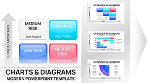 (14)
Risk Matrix Charts Template for Keynote | Fully Editable | Instant DownloadID: #KC01080$18.00
(14)
Risk Matrix Charts Template for Keynote | Fully Editable | Instant DownloadID: #KC01080$18.00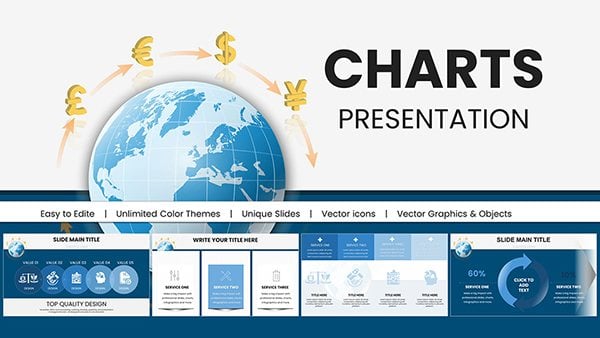 (1062)
 International Currency Exchange Keynote ChartsID: #KC00982$18.00
 (221)
Professional Development Keynote Charts: Elevate Your Growth StrategiesID: #KC00936$20.00
(221)
Professional Development Keynote Charts: Elevate Your Growth StrategiesID: #KC00936$20.00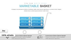 (769)
Marketable Basket Matrix Keynote Template for Economic AnalystsID: #KC00853$20.00
(769)
Marketable Basket Matrix Keynote Template for Economic AnalystsID: #KC00853$20.00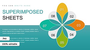 (650)
Superimposed Boundary Sheets Keynote Charts Template: Elevate Your ComparisonsID: #KC00849$14.00
(650)
Superimposed Boundary Sheets Keynote Charts Template: Elevate Your ComparisonsID: #KC00849$14.00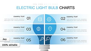 (1067)
 Light Bulb Keynote Charts - Fully Editable | ImagineLayoutID: #KC00689$18.00
 (104)
Keynote Square Matrix Charts - Fully Editable | ImagineLayoutID: #KC00686$12.00
(104)
Keynote Square Matrix Charts - Fully Editable | ImagineLayoutID: #KC00686$12.00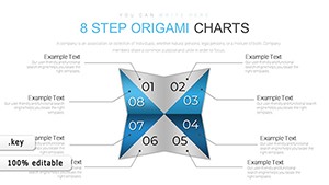 (624)
Keynote Origami Matrix Charts - Fully Editable | ImagineLayoutID: #KC00685$16.00
(624)
Keynote Origami Matrix Charts - Fully Editable | ImagineLayoutID: #KC00685$16.00 (18)
Creative Matrix Keynote Charts - Editable KEY | ImagineLayoutID: #KC00622free
(18)
Creative Matrix Keynote Charts - Editable KEY | ImagineLayoutID: #KC00622free (1186)
Data Analysis Graphs Keynote Charts TemplateID: #KC00597$15.00
(1186)
Data Analysis Graphs Keynote Charts TemplateID: #KC00597$15.00 (684)
Training Courses Keynote Charts: Animated ToolkitID: #KC00594$15.00
(684)
Training Courses Keynote Charts: Animated ToolkitID: #KC00594$15.00 (229)
Revolutionize Your Research Presentations with Research Methods Keynote Charts TemplateID: #KC00583$15.00
(229)
Revolutionize Your Research Presentations with Research Methods Keynote Charts TemplateID: #KC00583$15.00 (981)
Workflow Business Process Keynote TemplateID: #KC00569$22.00
(981)
Workflow Business Process Keynote TemplateID: #KC00569$22.00 (456)
Professional Keynote Charts - Fully Editable | ImagineLayoutID: #KC00567$20.00
(456)
Professional Keynote Charts - Fully Editable | ImagineLayoutID: #KC00567$20.00 (677)
Choice and Advantages Keynote Charts: Simplify Decisions VisuallyID: #KC00563$18.00
(677)
Choice and Advantages Keynote Charts: Simplify Decisions VisuallyID: #KC00563$18.00 (1015)
Sphere of Influence Keynote Charts: Visualize Networks and ImpactsID: #KC00562$20.00
(1015)
Sphere of Influence Keynote Charts: Visualize Networks and ImpactsID: #KC00562$20.00 (839)
Growth Prospects Keynote Charts Template: Visualize Business Expansion with EaseID: #KC00559$23.00
(839)
Growth Prospects Keynote Charts Template: Visualize Business Expansion with EaseID: #KC00559$23.00 (1095)
Concept of Sustainable Development Keynote Charts TemplateID: #KC00553$15.00
(1095)
Concept of Sustainable Development Keynote Charts TemplateID: #KC00553$15.00 (493)
Master Data Management Keynote Charts Template: Empower Your Data StrategyID: #KC00547$22.00
(493)
Master Data Management Keynote Charts Template: Empower Your Data StrategyID: #KC00547$22.00 (116)
Construction Keynote Charts: Editable Hexagon ProcessesID: #KC00526$21.00
(116)
Construction Keynote Charts: Editable Hexagon ProcessesID: #KC00526$21.00 (643)
Animated Keynote Charts: Dynamic PresentationsID: #KC00504$20.00
(643)
Animated Keynote Charts: Dynamic PresentationsID: #KC00504$20.00 (852)
Infographic Creator Keynote Charts: Craft Data MasterpiecesID: #KC00494$22.00
(852)
Infographic Creator Keynote Charts: Craft Data MasterpiecesID: #KC00494$22.00 (400)
Business Infographic Process Keynote Charts: Streamline Workflows VisuallyID: #KC00480$21.00
(400)
Business Infographic Process Keynote Charts: Streamline Workflows VisuallyID: #KC00480$21.00 (1062)
Project Timeline Charts Keynote Template for ArchitectsID: #KC00466$20.00
(1062)
Project Timeline Charts Keynote Template for ArchitectsID: #KC00466$20.00 (677)
Selection Sort Keynote Charts Template - Fully Editable | Instant DownloadID: #KC00418$17.00
(677)
Selection Sort Keynote Charts Template - Fully Editable | Instant DownloadID: #KC00418$17.00 (868)
Methods of Website Promotion Keynote Charts: Chart Your Path to VisibilityID: #KC00411$15.00
(868)
Methods of Website Promotion Keynote Charts: Chart Your Path to VisibilityID: #KC00411$15.00 (615)
Boost Sales: SEO Services Keynote Charts TemplateID: #KC00408$15.00
(615)
Boost Sales: SEO Services Keynote Charts TemplateID: #KC00408$15.00 (780)
Unlock Opportunities: Business Keynote Charts TemplateID: #KC00407$14.00
(780)
Unlock Opportunities: Business Keynote Charts TemplateID: #KC00407$14.00 (418)
User Experience Keynote Charts: Bridging the Digital DivideID: #KC00404$12.00
(418)
User Experience Keynote Charts: Bridging the Digital DivideID: #KC00404$12.00
What a matrix chart communicates that a bar chart or table cannot
A matrix chart isn`t just a grid - it`s a decision surface. You place items relative to each other across two variables, which means the layout itself carries the argument. A bar chart shows magnitude. A table lists values. A matrix shows relationship and tension between factors. When I worked on strategy decks for a retail client`s quarterly business review, the matrix slide consistently got the longest discussion. Not because it was complex, but because it forced alignment. Where something sits in the quadrant becomes the conversation. The labels are already anchored, spacing is consistent, and the visual hierarchy makes it clear what belongs where. You drop in your data and the slide works immediately.
Five real - world scenarios where a matrix slide solved the communication problem
Product manager, quarterly roadmap review, consumer tech
Needed to justify why certain features moved forward and others didn`t. A 2x2 matrix - impact vs effort - did that faster than any list. Placing features visually made prioritization obvious to stakeholders who had been debating for weeks.
Strategy consultant, BCG matrix for a CPG portfolio review
The client needed to see which brands were cash cows versus question marks within five minutes. A BCG - style matrix carried the logic without explanation. When I opened the template for a client session, the quadrant placement itself answered questions before they were asked.
Risk manager, internal operations review, financial services
Mapping likelihood versus severity across operational risks. The matrix slide became a working tool, not just a visual. The team discussed mitigation directly on the slide, moving items between quadrants as the conversation evolved.
Marketing director, audience segmentation for campaign planning
Needed to show which segments were high - value but low - engagement. A matrix revealed the gap that a bar chart hid. The visual made it obvious where to focus next quarter`s budget.
IT lead, vendor selection presentation to leadership
Comparing four enterprise platforms across cost and capability. The matrix forced honest placement. One vendor landed in the low - cost, low - capability quadrant, and the conversation moved on quickly. That`s exactly what the slide was supposed to do.
When to choose matrix Keynote charts over adjacent categories
If your goal is comparison across two variables, this category fits better than standard charts. But it`s not always the right choice. Use a matrix when positioning matters more than exact numbers. If you need precise data visualization, something from Keynote chart templates will be more appropriate. If your content is process - driven - steps, flows, sequences - then a diagram from Keynote diagram templates will communicate more clearly. And if your slide is about geographic distribution or regional strategy, switch to Keynote map templates. A matrix won`t help there. Choose this category when the story is about positioning and trade - offs, not sequence or volume.
Why rebuilding a matrix slide from scratch wastes time you don`t have
The time isn`t lost in drawing four quadrants - it`s lost in consistent typography across the deck. These templates solve that upfront. The slide master defines color behavior, spacing rules, and label anchoring. You change one accent color, and the whole matrix adjusts. From experience, the biggest win is consistency across a full deck. Once the matrix style is set, you don`t think about it again. Also, many people break matrix layouts by nesting shapes inside groups that restrict movement. These templates avoid that by keeping core elements separate but aligned. You can move items across quadrants without losing spacing or snapping behavior. This matters most during live edits - when someone asks to reposition an item mid - discussion. With these layouts, you can do it without rebuilding the slide.
A technical observation specific to matrix charts in Keynote
The axis labels in these Keynote templates are separate text objects aligned to guides, not embedded into shapes. That means you can rename them or reposition slightly without breaking the alignment of the quadrants. However, be mindful of how transparency renders when exporting to PDF. If you use semi - transparent fills to show overlapping quadrants, test the PDF output first. In some versions of Keynote, transparency flattens unpredictably, turning a layered matrix into a solid block. These templates avoid that by using clean fills with opacity applied at the object level, not through complex blends. When you duplicate a matrix slide to create a sequence, the guides duplicate as well, so alignment remains consistent across multiple slides. That`s something you don`t get when building each matrix manually.
Why this collection is different from typical marketplaces
These templates aren`t overloaded with styling. They focus on structure first, which is what you need in a matrix. The hierarchy is clear, the spacing is consistent, and there`s enough flexibility to adapt without redesigning. Not ideal if you need complex data modeling. But for strategic positioning and trade - off analysis, the approach here is more usable than decorated alternatives that look good in preview but break during editing. The slide master actually works. The color palette is restrained. And the layouts don`t assume your data fits a specific number of items. They adapt.
Related template collections on ImagineLayout
This category focuses on strategic positioning and trade - offs. If your work involves comparing options, mapping uncertainty, or presenting strategic positioning, start here. For more precise data visualization, browse Keynote chart templates. For process - driven content, see Keynote diagram templates. For geographic distribution, check Keynote map templates. Each collection serves a different communication need. Choose the one that matches your next presentation.
Frequently Asked Questions
Can I adjust the axes labels in a matrix template without breaking alignment?
Yes, and usually without much effort. The axis labels in these Keynote templates are separate text objects aligned to guides, not embedded into shapes. That means you can rename them or reposition slightly without breaking the alignment of the quadrants. However, if you drag a label too far, it might drift off the guide. In that case, you can use the alignment guides that appear when you move objects near the center or edges. If you accidentally lose alignment, select both the label and the matrix background, then use the Align > Center Horizontally or Vertically options. The key is to keep the labels as separate objects, which these templates do by default.
Do these matrix charts work with Keynote on iPad or just macOS?
They are optimized for Keynote on macOS, but the files will open in Keynote on iPad as well. However, some advanced layout features - like guide - based alignment and complex object layering - may not translate perfectly to the iPad version. The iPad version of Keynote has fewer precision controls. If you plan to edit on iPad, you`ll be able to change text and colors, but fine - tuned repositioning of quadrant elements might be frustrating. The recommendation: do your structural edits on macOS, then use the iPad for presentation or minor text updates.
What`s the difference between a matrix chart and a bubble chart for portfolio analysis?
A matrix chart gives you discrete quadrants. Items land in one of four boxes. That`s good for categorization - high/low, yes/no. A bubble chart adds a third variable (size) and allows continuous positioning. For BCG matrix, you often see bubble charts where the size of the bubble represents revenue. However, bubble charts are harder to build and edit in Keynote because sizing bubbles proportionally is manual. These matrix templates include some bubble matrix layouts, but they require adjusting bubble sizes manually. If you need precise proportional sizing, you might be better off building the chart in Numbers and importing it. For most portfolio reviews, the discrete quadrant approach is sufficient and much faster to edit.
Can I convert these Keynote matrix templates to PowerPoint?
You can export any Keynote file as a PowerPoint (.pptx) file from the Keynote menu: File > Export To > PowerPoint. However, be aware that some transparency effects and guide - based alignments may shift during conversion. Matrix layouts rely on precise positioning, so always check the converted file slide by slide. In my experience, simple 2x2 grids convert cleanly, but layouts with overlapping elements or complex gradients may need repositioning. If your audience uses PowerPoint exclusively, you might be better off starting with our PowerPoint matrix collection. But if you already have these Keynote templates, the conversion is workable - just budget 10 - 15 minutes to verify alignment.
What`s the most common mistake people make when using matrix slides in board reviews?
Putting too many items in one quadrant. A matrix works when the distribution is relatively even. If 12 out of 15 items land in the same quadrant, the matrix becomes a visual list - it loses its comparative power. The solution is either to adjust your axes so items spread out, or to move the analysis into a table. A second mistake is labeling quadrants with vague terms like "high" and "low" without defining what they mean. Every matrix slide should explicitly define both axes on the slide, not just in your verbal explanation. These templates have dedicated space for axis labels. Use them. Third, people sometimes animate quadrants flying in one at a time. That destroys the comparative structure. Reveal the entire matrix at once, then highlight items.
Are there any limitations to editing these matrix templates?
Yes, and being upfront about it is useful. These templates are not designed for complex data modeling. If you need to show precise numerical values for each quadrant - like exact market shares or revenue figures - a table or bar chart will be clearer. The matrix is for positioning and trade - offs, not precision. Also, the templates assume a maximum of 5 - 7 items per quadrant. More than that, and the slide becomes visually crowded. You can add more items, but you`ll need to adjust font sizes and spacing. Finally, if you`re working with a non - Latin script (Arabic, CJK characters), check rendering. Keynote handles these generally well, but some template fonts may not include the character set. Switch to a system font like Helvetica or Arial if you see missing characters.