PowerPoint Charts
Our PowerPoint Charts Templates provide various solutions to meet any presentation requirements. Our templates range from simple bar charts to complicated pie charts, allowing you to build visually appealing and insightful data visualizations. Customize colors, fonts, and styles to fit your brand, and save time with our pre-built layouts. Our high-quality PowerPoint charts, designed to impress, can help you successfully deliver your idea.
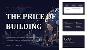 (17)
(17) Global Economic Analysis The Price Of Building PowerPoint Template with Editable ChartsID: #PC01164$18.00
 (16)
Task Progress Report PowerPoint Template with Editable ChartsID: #PC01163$12.00
(16)
Task Progress Report PowerPoint Template with Editable ChartsID: #PC01163$12.00 (17)
Brand Metrics That Matter PowerPoint Template with Editable ChartsID: #PC01162$12.00
(17)
Brand Metrics That Matter PowerPoint Template with Editable ChartsID: #PC01162$12.00 (12)
Vaccination Levels By Age Group PowerPoint Template with Editable ChartsID: #PC01161$15.00
(12)
Vaccination Levels By Age Group PowerPoint Template with Editable ChartsID: #PC01161$15.00 (12)
(12) Political Party and Leader Ratings PowerPoint Template with Editable ChartsID: #PC01160$15.00
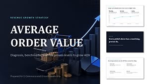 (12)
Average Order Value PowerPoint Template with Editable ChartsID: #PC01159$15.00
(12)
Average Order Value PowerPoint Template with Editable ChartsID: #PC01159$15.00 (11)
Hospital Operations Patient Flow PowerPoint Template with Editable ChartsID: #PC01158$15.00
(11)
Hospital Operations Patient Flow PowerPoint Template with Editable ChartsID: #PC01158$15.00 (10)
Sales Funnel PowerPoint Template with Editable ChartsID: #PC01157$18.00
(10)
Sales Funnel PowerPoint Template with Editable ChartsID: #PC01157$18.00 (13)
Gender Equality in the Labour Market PowerPoint Template and ChartsID: #PC01156$15.00
(13)
Gender Equality in the Labour Market PowerPoint Template and ChartsID: #PC01156$15.00 (13)
Environmental Impact of Projects PowerPoint Template and ChartsID: #PC01155$15.00
(13)
Environmental Impact of Projects PowerPoint Template and ChartsID: #PC01155$15.00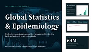 (9)
Global Statistics and Epidemiology PowerPoint Template and ChartsID: #PC01154$15.00
(9)
Global Statistics and Epidemiology PowerPoint Template and ChartsID: #PC01154$15.00 (13)
Risks of Financial Losses PowerPoint Template and ChartsID: #PC01153$18.00
(13)
Risks of Financial Losses PowerPoint Template and ChartsID: #PC01153$18.00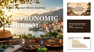 (8)
Gastronomic Tourism PowerPoint Template and ChartsID: #PC01152$20.00
(8)
Gastronomic Tourism PowerPoint Template and ChartsID: #PC01152$20.00 (14)
Academic Achievement VS Student Satisfaction PowerPoint Template and ChartsID: #PC01151$15.00
(14)
Academic Achievement VS Student Satisfaction PowerPoint Template and ChartsID: #PC01151$15.00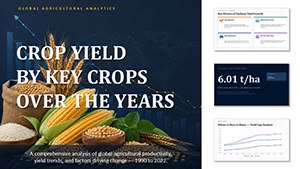 (9)
Crop Yield by Key Crops Over the Years PowerPoint Template and ChartsID: #PC01150$20.00
(9)
Crop Yield by Key Crops Over the Years PowerPoint Template and ChartsID: #PC01150$20.00 (12)
Popularity of Specializations PowerPoint Template and ChartsID: #PC01149$14.00
(12)
Popularity of Specializations PowerPoint Template and ChartsID: #PC01149$14.00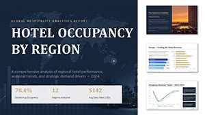 (9)
Hotel Occupancy by Region PowerPoint Template and ChartsID: #PC01148$20.00
(9)
Hotel Occupancy by Region PowerPoint Template and ChartsID: #PC01148$20.00 (17)
Student GPA Dynamics PowerPoint Template and ChartsID: #PC01147$14.00
(17)
Student GPA Dynamics PowerPoint Template and ChartsID: #PC01147$14.00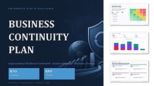 (10)
Business Continuity Plan PowerPoint Template and ChartsID: #PC01146$20.00
(10)
Business Continuity Plan PowerPoint Template and ChartsID: #PC01146$20.00 (8)
Fintech User Dynamics PowerPoint Template and ChartsID: #PC01145$14.00
(8)
Fintech User Dynamics PowerPoint Template and ChartsID: #PC01145$14.00 (15)
Car Sales Dynamics PowerPoint Template and ChartsID: #PC01144$18.00
(15)
Car Sales Dynamics PowerPoint Template and ChartsID: #PC01144$18.00 (14)
Sales Forecast PowerPoint Template and ChartsID: #PC01143$18.00
(14)
Sales Forecast PowerPoint Template and ChartsID: #PC01143$18.00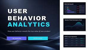 (15)
User Bahavior Analytics PowerPoint Template and ChartsID: #PC01142$14.00
(15)
User Bahavior Analytics PowerPoint Template and ChartsID: #PC01142$14.00 (17)
Equity Capital Dynamics PowerPoint Template and ChartsID: #PC01141$15.00
(17)
Equity Capital Dynamics PowerPoint Template and ChartsID: #PC01141$15.00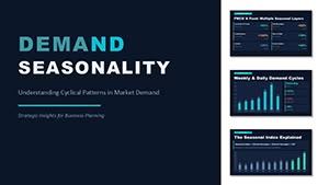 (16)
Demand Seasonality PowerPoint Template and ChartsID: #PC01140$18.00
(16)
Demand Seasonality PowerPoint Template and ChartsID: #PC01140$18.00 (8)
Global Finance Analytics PowerPoint Charts Template (18 Slides)ID: #PC01139$20.00
(8)
Global Finance Analytics PowerPoint Charts Template (18 Slides)ID: #PC01139$20.00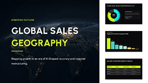 (14)
Global Sales Geography: PowerPoint Template - Charts (34 Slides)ID: #PC01138$15.00
(14)
Global Sales Geography: PowerPoint Template - Charts (34 Slides)ID: #PC01138$15.00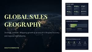 (17)
Download Global Sales Geography PPT ChartsID: #PC01137$8.00
(17)
Download Global Sales Geography PPT ChartsID: #PC01137$8.00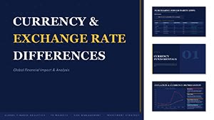 (16)
Currency Exchange Rate Differences PowerPoint TemplateID: #PC01136$15.00
(16)
Currency Exchange Rate Differences PowerPoint TemplateID: #PC01136$15.00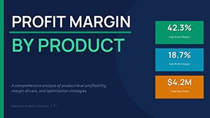 (16)
Profit Margin by Product Chart Template for PowerPointID: #PC01135$13.00
(16)
Profit Margin by Product Chart Template for PowerPointID: #PC01135$13.00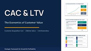 (14)
CAC and LTV PowerPoint Charts TemplateID: #PC01134$15.00
(14)
CAC and LTV PowerPoint Charts TemplateID: #PC01134$15.00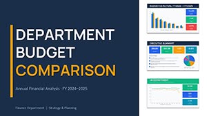 (15)
Department Budget Comparison PowerPoint Template 2026 - 30 Editable SlidesID: #PC01133$14.00
(15)
Department Budget Comparison PowerPoint Template 2026 - 30 Editable SlidesID: #PC01133$14.00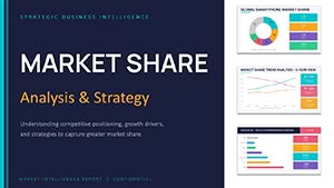 (17)
Market Share Analysis PowerPoint Charts Template 2026ID: #PC01132$14.00
(17)
Market Share Analysis PowerPoint Charts Template 2026ID: #PC01132$14.00
What are PowerPoint Chart Templates?
PowerPoint chart templates are pre-designed layouts that allow users to construct visually beautiful and useful charts for their presentations. These templates have established structures, styles, and components, allowing users to easily insert and change data charts without beginning from scratch. They are excellent tools for presenting data clearly and engagingly while maintaining consistency and professionalism.
Advantages of Using PowerPoint Chart Templates
- Time Efficiency: Using a pre-designed template, users save time formatting and producing charts. This allows you to focus on the content and analysis rather than the design process.
- Consistency: Templates provide a consistent style to all charts in a presentation, making them appear unified and professional.
- Ease of Use: Templates ease the process of designing charts, even for those with less design knowledge. They include simple layouts and design features that are easily customizable.
- Enhanced Visual Appeal: Professional templates are developed with aesthetics in mind, allowing you to build visually interesting charts that attract the audience's attention.
- Accuracy and Clarity: Well-designed templates convey data clearly, decreasing the chance of misinterpretation and ensuring that crucial information is highlighted.
Types of PowerPoint Chart Templates
- Bar Charts: Ideal for comparing multiple categories or displaying changes over time. Templates frequently incorporate variants, such as stacked or grouped bars.
- Pie Charts: Useful for illustrating proportions and percentages. Templates come in various styles, including basic pie charts and more contemporary, segmented forms.
- Line Charts: Ideal for displaying patterns over time. Line chart designs may incorporate several data series and trend lines.
- Area Charts: Highlight the extent of change over time. Templates often include possibilities for stacked or layered regions.
- Radar Charts: Suitable for showing multivariate data on a 2D plane. Templates frequently use many overlapping lines to indicate different variables.
- Scatter Plots: Used to demonstrate correlations between two variables. Scatter plot designs often contain options to include trend lines and data labels.
- Bubble Charts: An extension of scatter plots that adds a third dimension (size of bubbles) to show more data points.
- Histograms: Useful for showing the distribution of data points. Templates may offer options for bin size and frequency distribution.
Examples of Using PowerPoint Chart Templates in Different Situations
- Business Presentations: Bar and pie charts are frequently used to illustrate sales figures, market analysis, and financial results. Templates allow for a clear comparison of quarterly sales numbers or market share distribution.
- Academic Reports: Line and area charts are commonly used to illustrate research trends, experimental outcomes, and historical data analysis. Templates help to illustrate trends in student performance or research findings throughout time.
- Project Management: Gantt charts and scatter plots are used to track project schedules and resource allocation. Templates may help you visualize project phases, deadlines, and resource distribution.
- Marketing Reports: Radar and bubble charts are useful tools for showing competition research, consumer segmentation, and marketing performance indicators. Templates help to portray complicated facts in a digestible fashion.
- Financial Analysis: Use histograms and pie charts to examine financial distributions and investment portfolios. Templates can help with the presentation of financial summaries and expenditure breakdowns.
Where and Who Needs PowerPoint Chart Templates?
- Corporate Professionals: Managers, analysts, and executives utilize chart templates for corporate reports, presentations, and data analysis to communicate insights and plans effectively.
- Educators and Students: Utilize chart templates to show research findings, educational statistics, and trend analysis clearly and interestingly.
- Project Managers: Use chart templates to track project progress, allocate resources, and measure performance indicators.
- Marketers: Utilize charts to display campaign outcomes, market research, and customer analytics; therefore, templates are an important tool for succinct reporting.
- Financial Analysts: Financial specialists utilize charts to represent financial data, investment portfolios, and budget allocations, with templates to assure accurate and visually appealing presentations.
User Reviews for PowerPoint Chart Templates
- Jane D., Marketing Manager: "The PowerPoint chart templates have substantially accelerated our report development process. The diversity of chart styles allows us to choose one that suits our data readily."
- Tom R., Financial Analyst: "I enjoy the regularity and professionalism that these templates add to our presentations. Tailoring them to our requirements is simple, and the results are consistently remarkable."
- Emily L., Academic Researcher: "I use PowerPoint chart templates to make my presentations more engaging. They are simple to use and save significant time, which is critical for research undertakings."
- Michael K., Project Manager: "Gantt chart templates are a lifesaver for tracking project timelines. They provide clear and effective communication of complicated project data to stakeholders."
- Sarah J., Business Executive: "I like the sleek appearance of the templates. They improve the readability of our company reports and make data presentations appear more professional."
PowerPoint charts are effective tools for improving the quality and efficiency of data presentation. Whether for corporate, academic, or personal usage, these templates provide a variety of advantages, ranging from time savings to increased visual appeal. Users can successfully explain their facts and ideas by selecting the appropriate template, making their presentations stand out.
FAQ
- What are PowerPoint Chart Templates? PowerPoint Chart Templates are pre-designed templates in PowerPoint that allow users to quickly and easily construct charts and graphs. They offer an organized manner for displaying data graphically.
- Why should I use PowerPoint chart templates? Using PowerPoint Chart Templates saves time, guarantees design consistency, and allows data to be presented clearly and professionally. They also allow users to adapt charts to meet their requirements quickly.
- What charts may be used in these templates? PowerPoint Chart Templates can incorporate a variety of chart formats, including bar charts, line charts, pie charts, scatter plots, and area charts, among others.
- How can I modify a PowerPoint Chart Template? To fit the design and substance of your presentation, you may change a template by updating the data, changing colors, tweaking fonts, and adding or deleting chart components.
- Can I use PowerPoint Chart Templates for many industries? Yes, PowerPoint Chart Templates are adaptable to various industries, such as business, education, healthcare, and finance.
- Can I use animations with PowerPoint Chart Templates? You may include animations in PowerPoint Chart Templates to emphasize certain data points or make the presentation more engaging.