Analysis PowerPoint Charts
This collection of analysis chart templates in PowerPoint is built for people who need to explain data clearly, not just show it. You see these used by analysts, consultants, and finance teams who deal with dense numbers and have to turn them into decisions.
Think about a business analyst preparing a monthly performance review for leadership. The challenge isn`t the data. It`s choosing a structure that makes trends obvious without overloading the slide. That`s where these layouts come in. They focus on comparison, progression, and breakdowns. Not decoration. And yeah, the hierarchy actually saves you a lot of pain when you're under time pressure.
Browse the slides and pick the format that matches your next report or stakeholder update.
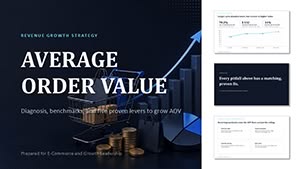 (12)
(12) Average Order Value PowerPoint Template with Editable ChartsID: #PC01159$15.00
 (11)
Hospital Operations Patient Flow PowerPoint Template with Editable ChartsID: #PC01158$15.00
(11)
Hospital Operations Patient Flow PowerPoint Template with Editable ChartsID: #PC01158$15.00 (10)
Sales Funnel PowerPoint Template with Editable ChartsID: #PC01157$18.00
(10)
Sales Funnel PowerPoint Template with Editable ChartsID: #PC01157$18.00 (9)
(9) Global Statistics and Epidemiology PowerPoint Template and ChartsID: #PC01154$15.00
 (13)
Risks of Financial Losses PowerPoint Template and ChartsID: #PC01153$18.00
(13)
Risks of Financial Losses PowerPoint Template and ChartsID: #PC01153$18.00 (12)
Popularity of Specializations PowerPoint Template and ChartsID: #PC01149$14.00
(12)
Popularity of Specializations PowerPoint Template and ChartsID: #PC01149$14.00 (9)
Hotel Occupancy by Region PowerPoint Template and ChartsID: #PC01148$20.00
(9)
Hotel Occupancy by Region PowerPoint Template and ChartsID: #PC01148$20.00 (10)
Business Continuity Plan PowerPoint Template and ChartsID: #PC01146$20.00
(10)
Business Continuity Plan PowerPoint Template and ChartsID: #PC01146$20.00 (8)
Fintech User Dynamics PowerPoint Template and ChartsID: #PC01145$14.00
(8)
Fintech User Dynamics PowerPoint Template and ChartsID: #PC01145$14.00 (14)
Sales Forecast PowerPoint Template and ChartsID: #PC01143$18.00
(14)
Sales Forecast PowerPoint Template and ChartsID: #PC01143$18.00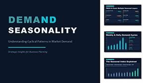 (16)
Demand Seasonality PowerPoint Template and ChartsID: #PC01140$18.00
(16)
Demand Seasonality PowerPoint Template and ChartsID: #PC01140$18.00 (8)
Global Finance Analytics PowerPoint Charts Template (18 Slides)ID: #PC01139$20.00
(8)
Global Finance Analytics PowerPoint Charts Template (18 Slides)ID: #PC01139$20.00 (14)
Global Sales Geography: PowerPoint Template - Charts (34 Slides)ID: #PC01138$15.00
(14)
Global Sales Geography: PowerPoint Template - Charts (34 Slides)ID: #PC01138$15.00 (17)
Download Global Sales Geography PPT ChartsID: #PC01137$8.00
(17)
Download Global Sales Geography PPT ChartsID: #PC01137$8.00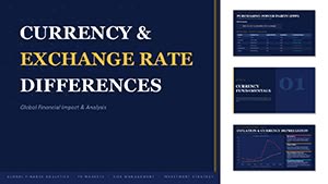 (16)
Currency Exchange Rate Differences PowerPoint TemplateID: #PC01136$15.00
(16)
Currency Exchange Rate Differences PowerPoint TemplateID: #PC01136$15.00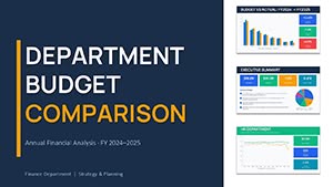 (15)
Department Budget Comparison PowerPoint Template 2026 - 30 Editable SlidesID: #PC01133$14.00
(15)
Department Budget Comparison PowerPoint Template 2026 - 30 Editable SlidesID: #PC01133$14.00 (16)
Startup Financial Model PowerPoint Template 2026ID: #PC01131$14.00
(16)
Startup Financial Model PowerPoint Template 2026ID: #PC01131$14.00 (16)
Startup Financial Model PowerPoint Template - Editable PPTXID: #PC01130$14.00
(16)
Startup Financial Model PowerPoint Template - Editable PPTXID: #PC01130$14.00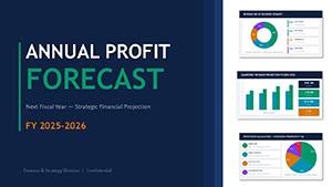 (8)
Profit Forecast PowerPoint Template - Editable PPTX | ImagineLayoutID: #PC01129$13.00
(8)
Profit Forecast PowerPoint Template - Editable PPTX | ImagineLayoutID: #PC01129$13.00 (16)
Liquidity Ratios PowerPoint Template - Editable PPTX | ImagineLayoutID: #PC01128$14.00
(16)
Liquidity Ratios PowerPoint Template - Editable PPTX | ImagineLayoutID: #PC01128$14.00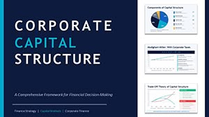 (11)
Corporate Capital Structure PPT - Editable PPTXID: #PC01127$15.00
(11)
Corporate Capital Structure PPT - Editable PPTXID: #PC01127$15.00 (15)
Financial Charts Presentation - Editable PPTXID: #PC01126$18.00
(15)
Financial Charts Presentation - Editable PPTXID: #PC01126$18.00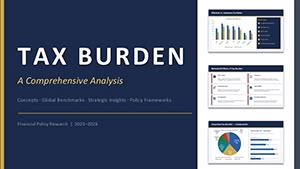 (17)
PowerPoint Tax Burden Analysis - Editable PPTXID: #PC01125$15.00
(17)
PowerPoint Tax Burden Analysis - Editable PPTXID: #PC01125$15.00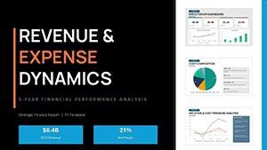 (13)
PowerPoint Revenue and Expense Dynamics - Editable PPTX | ImagineLayoutID: #PC01124$18.00
(13)
PowerPoint Revenue and Expense Dynamics - Editable PPTX | ImagineLayoutID: #PC01124$18.00 (16)
Financial KPI Dashboard Template - Editable PPTX | ImagineLayoutID: #PC01123$10.00
(16)
Financial KPI Dashboard Template - Editable PPTX | ImagineLayoutID: #PC01123$10.00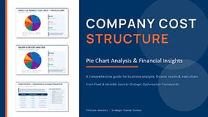 (8)
PowerPoint Pie Chart Cost Structure - Editable PPTXID: #PC01122$15.00
(8)
PowerPoint Pie Chart Cost Structure - Editable PPTXID: #PC01122$15.00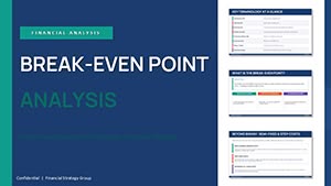 (16)
Break-even Analysis PowerPoint - Editable PPTXID: #PC01121$14.00
(16)
Break-even Analysis PowerPoint - Editable PPTXID: #PC01121$14.00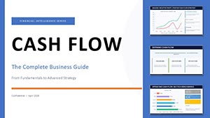 (16)
Cash Flow Charts - Editable PPTX | ImagineLayoutID: #PC01120$14.00
(16)
Cash Flow Charts - Editable PPTX | ImagineLayoutID: #PC01120$14.00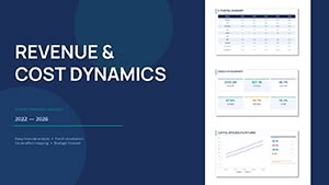 (17)
Financial Analysis Presentation Template - Editable PPTXID: #PC01119$10.00
(17)
Financial Analysis Presentation Template - Editable PPTXID: #PC01119$10.00 (17)
Profit by Regions and Branches Analysis - Editable PPTX | ImagineLayoutID: #PC01118$30.00
(17)
Profit by Regions and Branches Analysis - Editable PPTX | ImagineLayoutID: #PC01118$30.00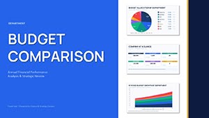 (11)
Department Budget Analysis - Editable PPTX | ImagineLayoutID: #PC01117$14.00
(11)
Department Budget Analysis - Editable PPTX | ImagineLayoutID: #PC01117$14.00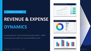 (9)
Revenue Expense Dynamics Charts - Editable PPTX | ImagineLayoutID: #PC01116$10.00
(9)
Revenue Expense Dynamics Charts - Editable PPTX | ImagineLayoutID: #PC01116$10.00 (9)
3-D Clustered Column Chart PowerPoint Template - Editable Charts for Financial ReportsID: #PC01106$14.00
(9)
3-D Clustered Column Chart PowerPoint Template - Editable Charts for Financial ReportsID: #PC01106$14.00
What kind of analysis these chart layouts actually support
Not every chart works for every situation. That sounds obvious, but in practice people still force the wrong layout into the wrong story. These templates are mostly built around three things: comparison across categories, change over time, and distribution of values.
When I last used a similar set for a quarterly board review, the biggest difference wasn`t visual style. It was how quickly we could map the story to the right chart type. Bar charts for side-by-side comparisons. Line charts for trends. Multi-layer diagrams when relationships mattered. You drop in your data. Done.
And sometimes the simplest layout wins. A clean two-series comparison slide can do more than a complex dashboard. It`s worth repeating. Simpler charts often communicate faster. Same idea, just clearer.
If your job involves recurring reporting, these structures hold up over time. They don`t break when the dataset changes slightly. That`s the real test.
Download a few layouts and test them with real data before committing to one deck structure.
Real situations where these templates make sense
A marketing analyst is preparing a campaign performance review for a weekly team meeting. The raw data sits in spreadsheets, but the team needs to see trends quickly. A line chart layout from this set helps highlight growth and drop-offs without extra explanation. Slightly annoying at first to match colors with brand guidelines, but once you adjust the master, it becomes routine.
A financial manager builds a cost vs revenue comparison for a quarterly check-in. The decision depends on clarity, not creativity. A structured column chart slide shows variance across departments. No confusion. And the alignment holds even after adding extra categories, which is not always the case with basic templates.
You know that moment when the deck is due at 9am and the summary slide still looks messy. That`s where these come in. Pick a layout that already has hierarchy built in, plug numbers, adjust labels. Works as-is.
In product teams, roadmap discussions often rely on mixed data types. Timeline plus metrics. Some templates here combine those without collapsing the layout. Not perfect, but usable in real meetings. Also works for internal ops reviews, not just client decks.
What these charts do better than generic slides
The difference is not design flair. It`s structure. Most generic slides look fine until you start editing them. Then spacing breaks, labels overlap, and alignment drifts.
In practice, working on 40+ decks this year, I noticed one thing: charts fail when they aren`t built with real data variation in mind. These templates handle that better. Columns stay aligned. Legends don`t jump around. Text placeholders don`t collapse when shortened.
But they`re not magic. If you overload a slide with too many data points, it still becomes unreadable. That part is on you. The template won`t fix bad decisions.
When to use this category vs similar ones
If your main goal is explaining data relationships, this category fits. But there are cases where another section makes more sense.
If you need broader conceptual diagrams rather than numeric charts, check PowerPoint diagram templates. Those are better for strategy or process explanation, not metrics.
If your focus is geographic data, like regional performance, then PowerPoint map templates are more appropriate. Charts won`t give you spatial context.
And if you`re building a full presentation from scratch, not just inserting charts, you might start from complete PowerPoint templates. Those include full slide systems, not just analytical visuals.
So basically, choose this category when numbers and comparisons are the core of your message.
Technical detail that matters more than you think
Here`s something that gets overlooked. Some charts in PowerPoint are native objects. Others are grouped shapes. That difference matters when you start editing.
Native charts are easier for quick data updates. But grouped shapes give you more visual control. These templates use both approaches depending on the layout. Honestly, the first time I opened the slide master, it felt like a lot. But after a few edits, the logic becomes clear.
From experience, the safest approach is to duplicate a slide before making structural changes. That way you don`t break alignment accidentally. Small thing, but it saves time later.
Why this collection works in real projects
The layouts are built with repeat use in mind. That`s the key difference. Fonts are consistent across slides. Color systems are easy to swap. Spacing is predictable.
I liked how the hierarchy stays intact even when you remove elements. Some templates fall apart when simplified. These mostly don`t.
Not ideal if you need advanced data visualization like interactive dashboards. But for static presentations, they do the job well.
Pick a few templates, test them with your actual dataset, and keep the ones that hold up under pressure.
FAQ
Can I edit the data directly inside these PowerPoint charts?
Yes, in most cases you can edit the data directly, especially for native chart objects. You just open the embedded Excel sheet and replace values. For grouped shape charts, it`s more manual. You adjust sizes and labels individually. From experience, both approaches work fine, but you need to recognize which type you`re dealing with before editing.
Are these templates compatible with different PowerPoint versions?
The short answer is yes, they usually work across most modern PowerPoint versions. If you're using something older, some formatting might shift slightly. Fonts or spacing can move a bit. It`s not a deal breaker, just something to check quickly before presenting. Oh, and exporting to PDF tends to keep everything stable.
Can I add more data points without breaking the chart layout?
Usually yes, but it depends a bit on the specific slide. Native charts handle additional data better since they scale automatically. With custom layouts, adding too many elements can crowd the design. I`ve seen this trip up even experienced users, but the quick fix is to duplicate the slide and split the data across two visuals instead of forcing everything into one.
Do these templates include full presentation decks or just charts?
It`s mostly chart-focused slides, not full decks. You get individual layouts designed for analysis sections. That means you may still need a base template for cover slides or section breaks. Works fine if you already have a company template in place. If not, you might combine these with a broader presentation set.
What kind of license applies to these templates?
It`s the same license most marketplaces use. One purchase gives you rights to use the template in a single project, including commercial use. You can edit and adapt it freely. Sharing the raw file with others outside your project team is typically not allowed. That`s basically it.