Silhouettes & People Keynote Charts
This collection contains Keynote chart templates that use people silhouette graphics to represent workforce data, engagement metrics, and organizational comparisons. It is for HR directors, talent development managers, and operations teams who need to make headcount, ratio, or engagement data readable to an executive audience without turning the slide into a spreadsheet.
When a talent development manager is presenting promotion rates across 12 regions to the executive committee, a bar chart alone rarely lands with the same clarity as a visual that positions people shapes against each other. The silhouette format anchors the data to the human reality behind the numbers - which is exactly what a board-level audience needs before approving a people strategy decision.
All files are editable .key format, built for Apple Keynote's native shape and slide master system. Browse the collection and choose the layout that matches your next workforce or organizational review.
 (16)
(16) Business Silhouettes Keynote Charts - Editable | ImagineLayoutID: #KC01110$15.00
 (8)
(8) Personal Trainer Proposal Keynote Charts Template - Fully Editable | Instant DownloadID: #KC01098$18.00
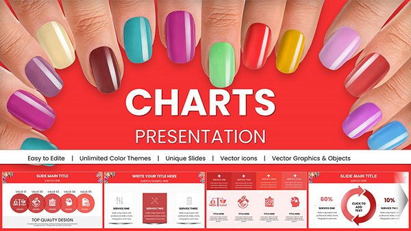 (786)
(786) Manicure Charts for Stunning Keynote PresentationsID: #KC01009$20.00
 (730)
(730) Health Food Infographic Keynote Charts: Captivate Audiences with Nutritious VisualsID: #KC00881$15.00
 (498)
Drive Awareness with Preventing Sexual Violence Keynote TemplateID: #KC00879$15.00
(498)
Drive Awareness with Preventing Sexual Violence Keynote TemplateID: #KC00879$15.00 (681)
Empower Safety Communications with PPE Keynote Charts TemplateID: #KC00878$15.00
(681)
Empower Safety Communications with PPE Keynote Charts TemplateID: #KC00878$15.00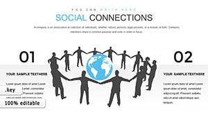 (1066)
Social Connections and Happiness: Keynote Template for Deeper InsightsID: #KC00844$14.00
(1066)
Social Connections and Happiness: Keynote Template for Deeper InsightsID: #KC00844$14.00 (962)
Festive Christmas Keynote Charts: Ignite Holiday Sales with StyleID: #KC00152$20.00
(962)
Festive Christmas Keynote Charts: Ignite Holiday Sales with StyleID: #KC00152$20.00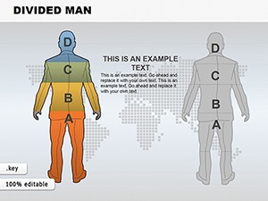 (670)
Divided Man Keynote Charts: Navigate Choices with Visual SplitID: #KC00144$15.00
(670)
Divided Man Keynote Charts: Navigate Choices with Visual SplitID: #KC00144$15.00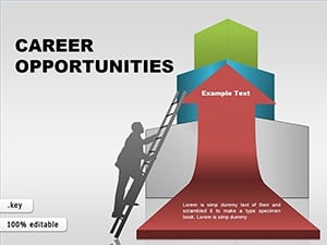 (1041)
Career Potential Keynote Infographic TemplateID: #KC00036$25.00
(1041)
Career Potential Keynote Infographic TemplateID: #KC00036$25.00 (75)
Business People Silhouettes Keynote Charts Template: Stylish Visuals for Corporate NarrativesID: #KC00034$22.00
(75)
Business People Silhouettes Keynote Charts Template: Stylish Visuals for Corporate NarrativesID: #KC00034$22.00
When a Silhouette Chart Carries the Argument Better Than a Bar Graph
Bar charts and pie charts tell an audience that data exists. Silhouette charts tell them who it is about. That distinction matters most in presentations where the subject is people - workforce composition, safety performance by shift, engagement scores by department, or headcount changes after a restructure.
A bar chart showing a 23% gap in promotion rates between two regions is technically accurate. A silhouette chart showing that gap through the visual weight of two groups of figures is immediately persuasive. The audience does not need to do arithmetic - the picture does it for them. In a quarterly talent review where the CHRO has twelve minutes before the next agenda item, that difference in processing time is the difference between a decision and a deferral.
Four Business Moments Where These Templates Have Delivered
A talent development manager at a global bank had 48 hours to prepare promotion rate data across 12 regions for the executive committee. Standard bar charts had been presented for three years without prompting action. She switched to a silhouette layout showing proportional groups by region. The visual gap was unmistakable. The committee approved a targeted sponsorship program in the same meeting.
An operations director at a manufacturing firm presented safety incident trends by shift to the plant leadership team. Using a silhouette template, she assigned different figure poses to day and night shift workers and used color to indicate incident involvement. The contrast between shifts was visible before she spoke a word. The plant manager asked for the data behind it immediately - a sign the visual had already landed.
A product marketing lead updating the customer success section of a regional sales kickoff deck replaced generic avatars with silhouette-based persona charts. The personas became characters in the story rather than labels on a slide. Sales managers said afterward they could remember which persona had which pain point - which is the entire goal of a persona slide.
An HR business partner presenting remote-work policy survey results to 800 employees used engagement-level silhouettes to show the before-and-after distribution of sentiment scores. The figure-based format read clearly from the back row in a way that a labeled scale would not have. Questions during Q&A dropped by half compared to the previous year's text-heavy version.
Download a Layout That Fits Your Next Workforce Presentation
The full collection is available below - choose the format that matches your data structure and your audience's familiarity with visual formats.
The Real Effort Behind Building Silhouette Charts Without a Template
Building this type of chart from a blank Keynote slide requires sourcing or drawing the silhouette shapes, ensuring they scale proportionally without distorting limb ratios, aligning them on a grid so that groups of different sizes still read as comparable, and setting up a slide master so the color palette stays consistent across multiple slides. Each of those steps is solvable, but together they consume two to three hours that should be going into the interpretation of the data rather than the construction of the visual.
The templates here arrive with those decisions made. The silhouettes are already proportioned and grouped. The slide master controls the color palette. You replace the sample data and context text, and the slide is presentation-ready.
Getting the Most from Silhouette Charts in Executive Presentations
The non-obvious trap with people charts is using too many figures on a single slide. When the dataset has more than twelve to fifteen items, individual figures become too small to read at projection size and the visual advantage disappears. The better approach for large datasets is to aggregate into groups - divisions, regions, or quartiles - and represent each group as a single figure cluster. The template's grouping structure supports this directly: each silhouette cluster is a separate group object you can duplicate and rescale independently.
A second consideration: figure color carries meaning. If your color coding assigns red to underperforming groups, that visual reads as a negative judgment in the room. For sensitive HR data, neutral or brand-palette color coding - where contrast is achieved through saturation rather than traffic-light colors - keeps the emphasis on the data point rather than the implied evaluation.
Technical Detail: Animating Silhouette Groups in Keynote Without Breaking the Build Order
Keynote's Animate panel allows you to apply entrance effects to individual silhouette groups so they appear sequentially. The important detail is that the build order must be set inside the group object - not on the slide level - if you plan to reorder slides later. When Keynote assigns a build to a grouped object, that build travels with the group. If you instead apply individual builds to each ungrouped shape, reordering or copying the slide can shuffle the timing sequence. Always group first, then animate the group. For export to PDF, animations are suppressed and only the final state of the slide is captured, which is the intended behavior for printed handouts.
Where This Category Fits in a Broader Presentation System
Silhouette charts work best as one component in a larger deck that mixes visual types. If the same presentation needs process diagrams to explain workflow changes alongside the people data, the Keynote process diagram templates use the same visual language and will not create a style inconsistency. For workforce data that also involves comparison matrices - a performance-potential grid, for example - the Keynote matrix diagram templates pair naturally with the people silhouette format. For broader Keynote chart options beyond the silhouette category, the full Keynote charts library covers organizational, analysis, and flow chart types.
Frequently Asked Questions
Can I recolor the silhouettes to match my company's brand palette?
Yes. Each silhouette is a native Keynote vector shape with a fill color set through the slide master's theme palette. To apply your brand colors, open the slide master editor, update the theme colors, and all silhouette groups across the deck update simultaneously. If you need to recolor individual figures within a group - for example, to highlight a specific subgroup - ungroup the cluster, select the target shapes, apply the new fill color, and regroup. The aspect ratio and proportions of the figures are unaffected by color changes, and this approach is more reliable than changing colors manually slide by slide, which introduces inconsistencies across a long deck.
Are these templates compatible with Keynote on iCloud for team collaboration?
The .key files open in Keynote on iCloud with all shape editing and text replacement features available. The limitation to be aware of is that iCloud Keynote does not support the full slide master editor - you can use existing master layouts but cannot modify the master structure from a browser. For team collaboration where multiple people need to edit different slides simultaneously, iCloud Keynote supports real-time co-editing, but the last save wins for any shared element. The practical approach for most teams is to designate one owner for the master file and distribute individual slide copies for content editing.
What is the best way to scale silhouette figures to represent actual headcount data?
The templates use representative groups rather than a literal one-figure-per-person ratio, which becomes unreadable at any significant scale. The recommended approach is to decide on a ratio before editing - for example, one figure represents 50 employees - and apply that ratio consistently across all comparable groups on the slide. Document the ratio in the slide notes or a footnote text box so the audience can verify the math. If your data groups vary significantly in size, consider using proportional scaling of a single figure cluster rather than changing the number of individual shapes - a larger silhouette group conveys scale difference more cleanly than counting small figures.
Will the silhouette shapes export correctly to PDF for printed handouts?
Yes. Keynote exports native vector shapes - including the people silhouettes - as true vectors in the PDF output. This means the outlines remain sharp at any print size, including A3 or larger formats. The only element that can degrade in PDF export is any rasterized background image included in the template; the silhouettes themselves are unaffected. Use File > Export To > PDF at Best quality and confirm the output at 200% zoom before printing to catch any text-overflow issues in caption boxes beneath the figures.
Can I use these templates for external client presentations, not just internal reports?
Yes. The license covers use in both internal organizational presentations and client-facing deliverables, including presentations you are compensated to produce. You can add client branding, replace the sample data with client-specific figures, and deliver the final Keynote file or a PDF export to the client as part of the engagement. The restriction is on redistribution of the template file itself - you cannot resell or publicly share the original unmodified .key file. Modifications you make for a client become part of your deliverable and are not subject to that restriction.