Illustrations Keynote Charts
This collection brings together Keynote charts that combine native data visualization with purposeful illustrations. Built for professionals who need their slides to do more than display numbers - they need to guide the conversation.
A financial analyst preparing next quarter`s performance review no longer spends the night before aligning icons and adjusting chart colors. Open one of these files, drop in your data, and the built-in illustrations already direct attention to the key takeaway. The operations team sees bottlenecks visually. The board focuses on decisions instead of asking for clarification slides.
Browse the collection and choose the one that fits your industry and data type.
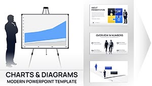 (16)
(16) Business Silhouettes Keynote Charts - Editable | ImagineLayoutID: #KC01110$15.00
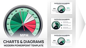 (17)
Gauge Charts Keynote Template - Fully Editable | Instant DownloadID: #KC01099$18.00
(17)
Gauge Charts Keynote Template - Fully Editable | Instant DownloadID: #KC01099$18.00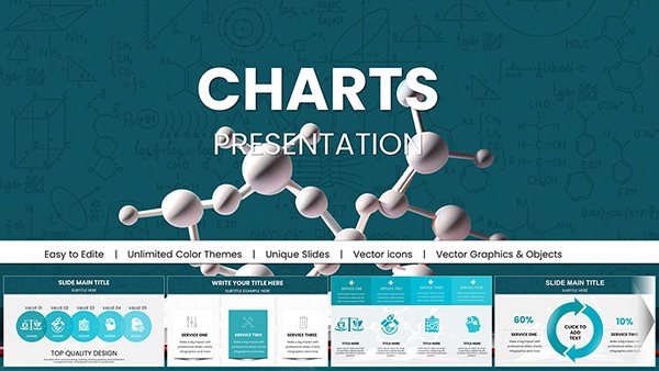 (8)
(8) Chemical Charts Keynote Template - Fully Editable 47 Slides | Instant DownloadID: #KC01062$15.00
 (14)
Online Math Lessons Charts Template for KeynoteID: #KC01060$18.00
(14)
Online Math Lessons Charts Template for KeynoteID: #KC01060$18.00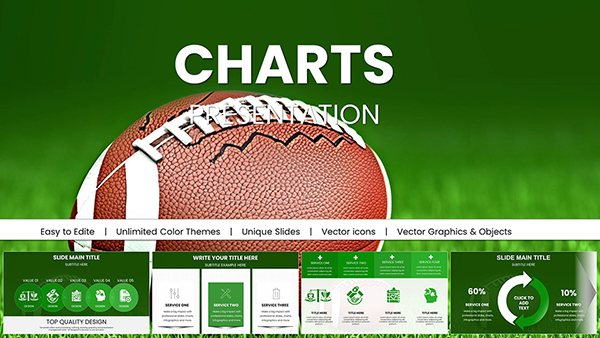 (8)
Architectural Keynote Charts Template - Fully Editable | Instant DownloadID: #KC01056$20.00
(8)
Architectural Keynote Charts Template - Fully Editable | Instant DownloadID: #KC01056$20.00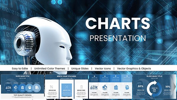 (16)
AI-Powered Robot Charts Template: Fuel Your Tech Visions with Futuristic FlairID: #KC01054$20.00
(16)
AI-Powered Robot Charts Template: Fuel Your Tech Visions with Futuristic FlairID: #KC01054$20.00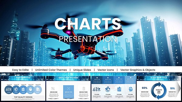 (13)
Drone IT Technology Charts Keynote Template: Elevate Tech Innovations VisuallyID: #KC01052$25.00
(13)
Drone IT Technology Charts Keynote Template: Elevate Tech Innovations VisuallyID: #KC01052$25.00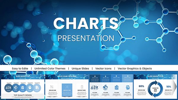 (10)
Education Presentations with Chemical Molecules Charts - Keynote Template for Scientific and Academic UseID: #KC01050$18.00
(10)
Education Presentations with Chemical Molecules Charts - Keynote Template for Scientific and Academic UseID: #KC01050$18.00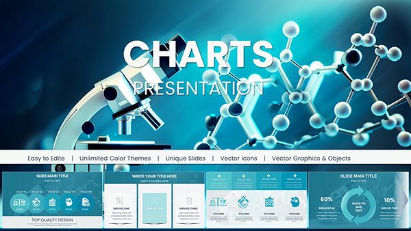 (8)
Chemical Charts Keynote Template for Science PresentationsID: #KC01047$24.00
(8)
Chemical Charts Keynote Template for Science PresentationsID: #KC01047$24.00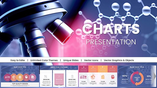 (14)
Microbiology Keynote Charts TemplateID: #KC01044$22.00
(14)
Microbiology Keynote Charts TemplateID: #KC01044$22.00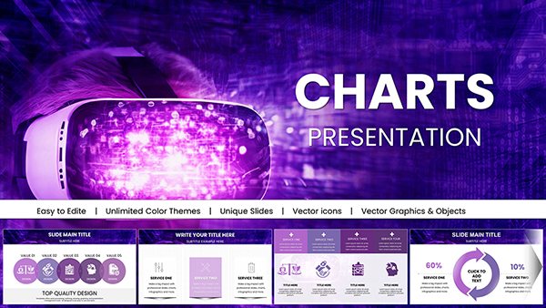 (11)
Futuristic Mask Charts Keynote TemplateID: #KC01042$18.00
(11)
Futuristic Mask Charts Keynote TemplateID: #KC01042$18.00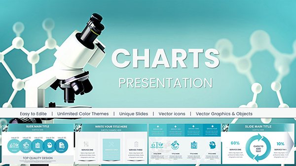 (11)
Keynote Charts Template for Chemical and Biochemical EngineeringID: #KC01041$18.00
(11)
Keynote Charts Template for Chemical and Biochemical EngineeringID: #KC01041$18.00 (10)
Nanoscience and Nanotechnology Charts Template for Keynote PresentationsID: #KC01039$20.00
(10)
Nanoscience and Nanotechnology Charts Template for Keynote PresentationsID: #KC01039$20.00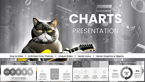 (16)
Music Charts Keynote Template: Harmonize Your Data StoryID: #KC01035$18.00
(16)
Music Charts Keynote Template: Harmonize Your Data StoryID: #KC01035$18.00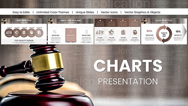 (16)
Customizable Legal Charts Keynote Template: Clarify Complex Cases with EaseID: #KC01033$25.00
(16)
Customizable Legal Charts Keynote Template: Clarify Complex Cases with EaseID: #KC01033$25.00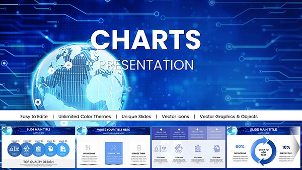 (818)
(818) Global Network Charts Keynote TemplateID: #KC01030$18.00
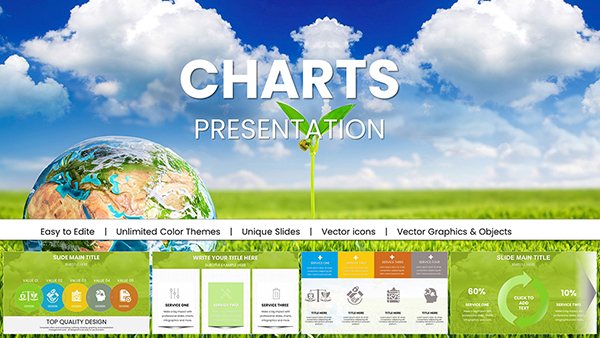 (392)
Stunning Eco Planet Charts Keynote TemplateID: #KC01029$18.00
(392)
Stunning Eco Planet Charts Keynote TemplateID: #KC01029$18.00 (1179)
Ecology Conservation Charts Keynote Presentation TemplateID: #KC01028$18.00
(1179)
Ecology Conservation Charts Keynote Presentation TemplateID: #KC01028$18.00 (1034)
Ecology Charts Keynote Template - Save the PlanetID: #KC01027$20.00
(1034)
Ecology Charts Keynote Template - Save the PlanetID: #KC01027$20.00 (190)
Cloud Network Presentation Template with Charts for KeynoteID: #KC01023$15.00
(190)
Cloud Network Presentation Template with Charts for KeynoteID: #KC01023$15.00 (909)
AI Keynote Presentation Templates with Robot AI ChartsID: #KC01020$20.00
(909)
AI Keynote Presentation Templates with Robot AI ChartsID: #KC01020$20.00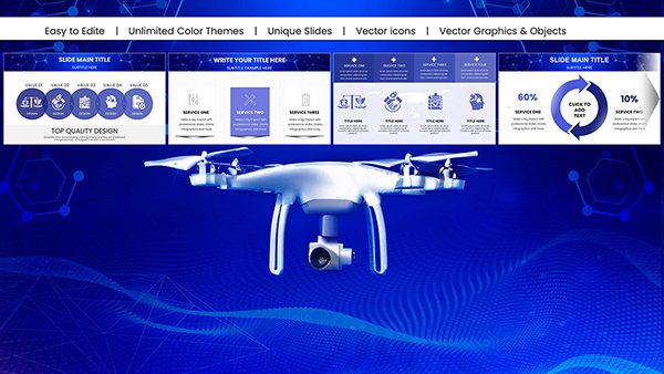 (414)
(414) Drone Keynote Template: Elevate Your Tech PresentationsID: #KC01019$18.00
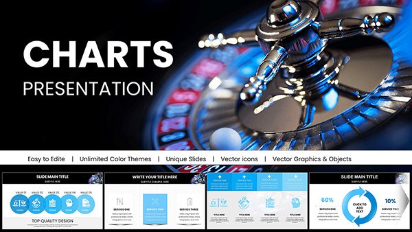 (386)
Casino Keynote Presentation Template: Bet on Professional Gaming SlidesID: #KC01018$20.00
(386)
Casino Keynote Presentation Template: Bet on Professional Gaming SlidesID: #KC01018$20.00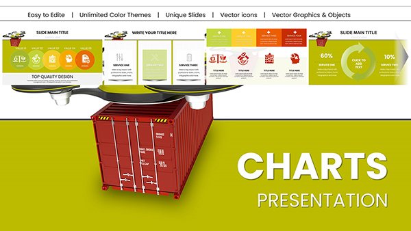 (584)
Heavy Cargo Drone Delivery: Keynote Charts for Logistics InnovationID: #KC01014$20.00
(584)
Heavy Cargo Drone Delivery: Keynote Charts for Logistics InnovationID: #KC01014$20.00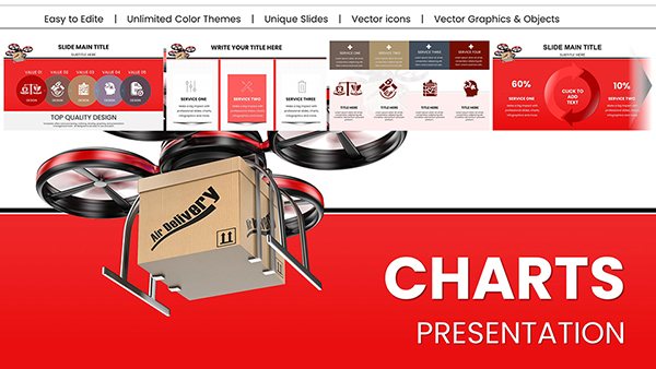 (292)
Drone Delivery Keynote Charts Template - Fully Editable | Instant DownloadID: #KC01013$18.00
(292)
Drone Delivery Keynote Charts Template - Fully Editable | Instant DownloadID: #KC01013$18.00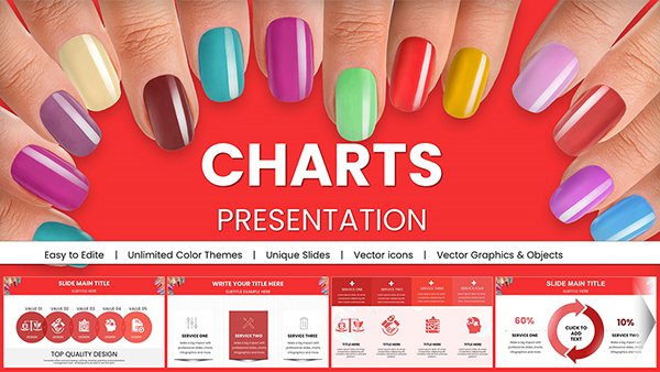 (786)
Manicure Charts for Stunning Keynote PresentationsID: #KC01009$20.00
(786)
Manicure Charts for Stunning Keynote PresentationsID: #KC01009$20.00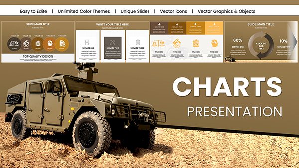 (326)
Military Vehicle Keynote Charts Presentation: Elevate Your Defense StrategiesID: #KC01008$20.00
(326)
Military Vehicle Keynote Charts Presentation: Elevate Your Defense StrategiesID: #KC01008$20.00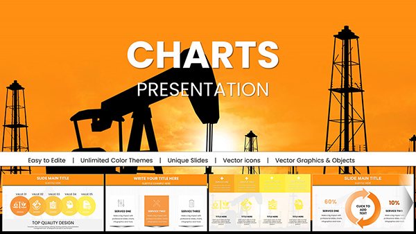 (1081)
Extraction Oil and Gas Company Keynote Charts: Strategic Energy InsightsID: #KC01007$22.00
(1081)
Extraction Oil and Gas Company Keynote Charts: Strategic Energy InsightsID: #KC01007$22.00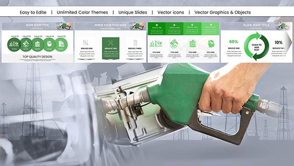 (892)
Gas Prices Keynote Charts Presentation: Navigate Market VolatilityID: #KC01006$18.00
(892)
Gas Prices Keynote Charts Presentation: Navigate Market VolatilityID: #KC01006$18.00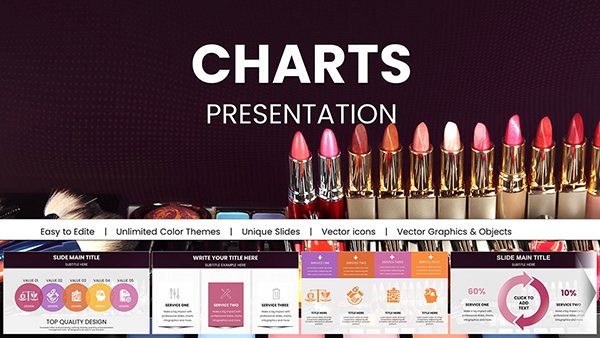 (377)
Vibrant Beauty Makeup Cosmetic Keynote Charts for PresentationID: #KC01004$22.00
(377)
Vibrant Beauty Makeup Cosmetic Keynote Charts for PresentationID: #KC01004$22.00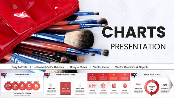 (653)
Makeup Brush Charts for Keynote PresentationID: #KC01003$25.00
(653)
Makeup Brush Charts for Keynote PresentationID: #KC01003$25.00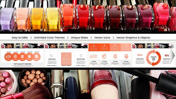 (162)
Makeup Charts for Keynote PresentationID: #KC01002$22.00
(162)
Makeup Charts for Keynote PresentationID: #KC01002$22.00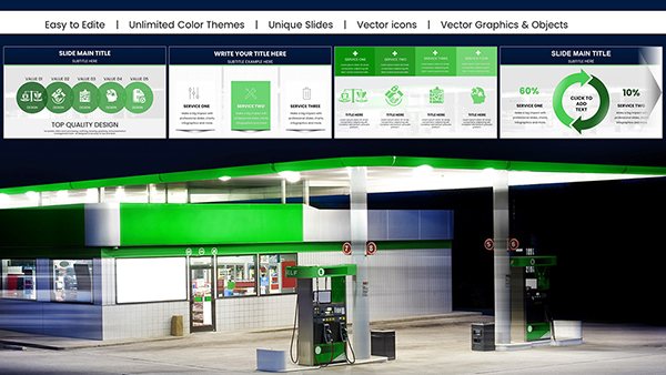 (852)
Gasoline Fuel Pump Charts for Keynote PresentationID: #KC01001$18.00
(852)
Gasoline Fuel Pump Charts for Keynote PresentationID: #KC01001$18.00
How Illustrated Charts Change the Way Teams Discuss Data in Keynote
When you put a plain chart on screen people see numbers. When the same chart sits next to a well-placed illustration they see context and implication at the same time. These templates position vector elements so the eye moves naturally from headline claim to supporting data to the action needed. I`ve watched teams cut meeting time in half once the visuals stopped fighting the message.
Real-World Scenarios Where These Templates Delivered Results
The operations director at a mid-size manufacturing company had two days to prepare a capacity update for the executive committee. He opened the production metrics layout with factory line illustrations, replaced the numbers, and the bottlenecks became obvious without extra callouts. The meeting ended with assigned owners instead of another follow-up round.
A logistics consultant used the flow chart with directional arrow illustrations during a process optimization pitch. The client team recognized their own warehouse layout in the visuals and signed the proposal the same week. The illustrations did half the explaining.
During a quarterly review the product manager swapped generic bars for illustrated milestone markers. Leadership immediately spotted the gaps and reallocated budget on the spot. I`ve seen this pattern repeat: the right illustration turns passive listening into active discussion.
An HR business partner rolled out a new performance dashboard using comparison charts with people silhouettes. Non-technical department heads understood the metrics without needing a separate explainer slide.
Technical Configuration Tips Specific to Keynote Charts and Illustrations
The charts use native Keynote objects so you can link them directly to Numbers or Excel for live updates. Illustrations sit on separate layers or masters and scale cleanly when you switch from 16:9 to 4:3. Watch animation order - let the chart build first, then bring in the illustration to avoid visual noise. When exporting to PDF the vectors stay sharp at any zoom level.
When to Choose Illustrated Charts vs Other Approaches
Use these when your story needs both credibility of real data and quick emotional or contextual understanding. For pure data-heavy slides without narrative support, the standard Keynote charts templates give you cleaner focus. When you need lighter conceptual flow without heavy metrics, look at neutral abstract Keynote templates. For printed materials that accompany the deck, the industry production brochures templates handle specifications better.
What Makes This Collection Different
These templates favor editing freedom over decoration. Charts remain fully native, illustrations are vector groups you can ungroup or recolor without breaking layouts. No locked elements or low-res images that force rework. Limitations exist - highly custom illustration requests still need manual work - but for 80% of business and technical presentations they remove the usual friction.
Ready to test one in your next data-heavy meeting? Download any template below and try it tomorrow morning.
Can I add more data points to the charts without breaking the illustrations?
Yes, the charts are native Keynote objects. You can add rows or series directly in the chart editor and the surrounding illustrations stay on independent layers. Just check spacing after adding several points - sometimes you`ll need to slightly adjust label positions. The vector illustrations scale cleanly and never distort.
How do I change the illustration colors to match my brand?
Every illustration consists of editable vector shapes and groups. Ungroup if needed, select the elements, and recolor them using your brand palette. Changes on the slide master update across all slides. This works reliably even after you`ve entered your own data.
Are these files compatible with older versions of Keynote?
The templates are built and tested on Keynote 12 and newer. Older versions usually open the files but some advanced chart linking features may not work. If a shape doesn`t render correctly, select the group and reset its style from the master. Updating Keynote solves most issues.
Do the charts support live data linking?
Yes. Each chart is a native Keynote chart and can link directly to Numbers or Excel spreadsheets. The illustrations remain independent so data refreshes won`t move or break the visuals. Perfect for monthly reports where only numbers change.
What happens with aspect ratio changes?
All illustrations and charts are built to handle 16:9 to 4:3 switches through the slide master without distortion. Always test the PDF export after changing ratio to confirm everything stays aligned, especially labels near illustrations.
Can I use these templates for team collaboration?
The license allows internal company use. Multiple team members can edit the same file on Macs. For reviews, export to PDF while keeping the native .key file for final edits. Everything stays self-contained with embedded assets.