3D Keynote Charts
Discover 3D Keynote Charts Templates - a collection of pre-designed, fully customizable charts crafted to create striking and impactful presentations. Adjust colors, fonts, and data effortlessly to suit your needs, ensuring your slides captivate and inform your audience with ease.
These dynamic 3D charts simplify complex data, making it clear and engaging for viewers. With their eye-catching design, they elevate your slides, leaving a lasting impression.
For anyone aiming to deliver exciting and professional presentations, 3D Keynote Charts Templates offer an ideal solution. User-friendly and versatile, they empower you to design slides that stand out and resonate.
 (13)
(13) 3D Volume Cyclic Keynote Charts - Editable | ImagineLayoutID: #KC01113$20.00
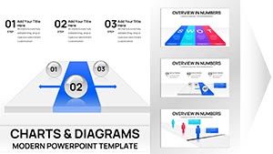 (15)
Project Tracking Keynote Charts - Editable | ImagineLayoutID: #KC01109$18.00
(15)
Project Tracking Keynote Charts - Editable | ImagineLayoutID: #KC01109$18.00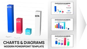 (16)
(16) 3D Clustered Column Charts Keynote - Editable | ImagineLayoutID: #KC01106$14.00
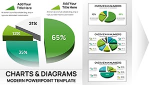 (15)
Keynote 3D Pie Chart Template - Fully Editable | ImagineLayoutID: #KC01105$15.00
(15)
Keynote 3D Pie Chart Template - Fully Editable | ImagineLayoutID: #KC01105$15.00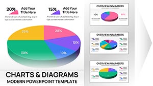 (13)
30 3D Pie Keynote Charts - Editable .key File | ImagineLayoutID: #KC01104$15.00
(13)
30 3D Pie Keynote Charts - Editable .key File | ImagineLayoutID: #KC01104$15.00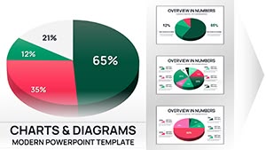 (9)
36 3D Pie Keynote Charts - Editable .key File | ImagineLayoutID: #KC01103$16.00
(9)
36 3D Pie Keynote Charts - Editable .key File | ImagineLayoutID: #KC01103$16.00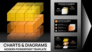 (9)
3D Cubes Charts Keynote Template - Fully Editable 41 Slides | ImagineLayoutID: #KC01095$22.00
(9)
3D Cubes Charts Keynote Template - Fully Editable 41 Slides | ImagineLayoutID: #KC01095$22.00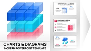 (17)
3D Cube Charts Keynote Template - Fully Editable | Instant DownloadID: #KC01071$25.00
(17)
3D Cube Charts Keynote Template - Fully Editable | Instant DownloadID: #KC01071$25.00 (667)
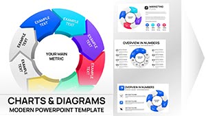
(667) Rings Connection Keynote Charts for Cycle ProcessesID: #KC00868$16.00
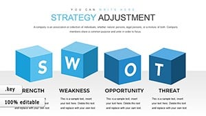 (985)
Editable Strategy Adjustment Keynote Charts - 28 SlidesID: #KC00866$20.00
(985)
Editable Strategy Adjustment Keynote Charts - 28 SlidesID: #KC00866$20.00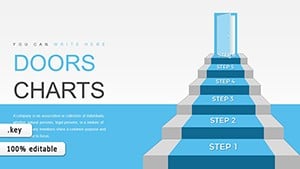 (528)
(528) Step-by-Step 3D Stairs Keynote Charts TemplateID: #KC00852$17.00
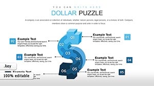 (965)
Dollars Puzzles Keynote Charts: Decode Economic Influences with Visual MasteryID: #KC00837$13.00
(965)
Dollars Puzzles Keynote Charts: Decode Economic Influences with Visual MasteryID: #KC00837$13.00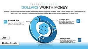 (347)
Dollars Worth Money Keynote Charts: Navigate Global Finance with Cycle VisualsID: #KC00835$15.00
(347)
Dollars Worth Money Keynote Charts: Navigate Global Finance with Cycle VisualsID: #KC00835$15.00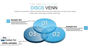 (529)
Transforming Complex Data with 3D Venn Keynote ChartsID: #KC00811$22.00
(529)
Transforming Complex Data with 3D Venn Keynote ChartsID: #KC00811$22.00 (1142)
3D Steps Processing Keynote Charts Template: Visualize Processes with DepthID: #KC00809$20.00
(1142)
3D Steps Processing Keynote Charts Template: Visualize Processes with DepthID: #KC00809$20.00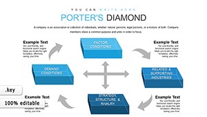 (997)
Elevate Strategic Insights with 3D Cubes Porter's Five Forces ChartsID: #KC00806$15.00
(997)
Elevate Strategic Insights with 3D Cubes Porter's Five Forces ChartsID: #KC00806$15.00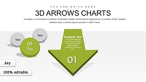 (344)
3D Arrows Effective Keynote Charts PresentationID: #KC00805$20.00
(344)
3D Arrows Effective Keynote Charts PresentationID: #KC00805$20.00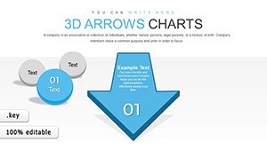 (241)
3D Arrows Keynote Charts TemplateID: #KC00804$25.00
(241)
3D Arrows Keynote Charts TemplateID: #KC00804$25.00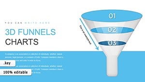 (317)
3D Funnel Keynote Chart TemplateID: #KC00803$20.00
(317)
3D Funnel Keynote Chart TemplateID: #KC00803$20.00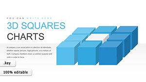 (301)
Innovative 3D Squares Cube Keynote Charts Presentation TemplateID: #KC00801$18.00
(301)
Innovative 3D Squares Cube Keynote Charts Presentation TemplateID: #KC00801$18.00 (1063)
Business Process Modeling Keynote Charts: Visualize Efficiency in 3DID: #KC00794$15.00
(1063)
Business Process Modeling Keynote Charts: Visualize Efficiency in 3DID: #KC00794$15.00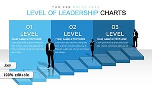 (1126)
Leadership Skills 3D Cube Infographic Keynote Template: Inspire and LeadID: #KC00793$20.00
(1126)
Leadership Skills 3D Cube Infographic Keynote Template: Inspire and LeadID: #KC00793$20.00 (721)
Oil Report Keynote Charts: Mastering Global Market InsightsID: #KC00792$17.00
(721)
Oil Report Keynote Charts: Mastering Global Market InsightsID: #KC00792$17.00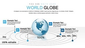 (826)
3D World Globe Model Keynote Charts: Visualize Global Data DynamicallyID: #KC00791$15.00
(826)
3D World Globe Model Keynote Charts: Visualize Global Data DynamicallyID: #KC00791$15.00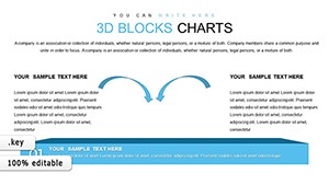 (1200)
3D Blocks Charts in Keynote: Analytical Visualization MasteryID: #KC00782$20.00
(1200)
3D Blocks Charts in Keynote: Analytical Visualization MasteryID: #KC00782$20.00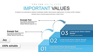 (1014)
Climbing the Stairs to Leadership: 3D Keynote Charts for Team EmpowermentID: #KC00769$16.00
(1014)
Climbing the Stairs to Leadership: 3D Keynote Charts for Team EmpowermentID: #KC00769$16.00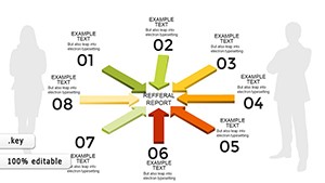 (169)
Different and Common 3D Arrows Keynote Charts TemplateID: #KC00755$18.00
(169)
Different and Common 3D Arrows Keynote Charts TemplateID: #KC00755$18.00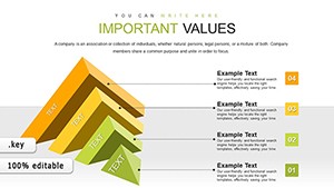 (747)
3D Horizontal Split Pyramid Keynote Charts: Dynamic Data VisualizationID: #KC00748$15.00
(747)
3D Horizontal Split Pyramid Keynote Charts: Dynamic Data VisualizationID: #KC00748$15.00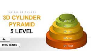 (252)
5-Level 3D Cylinder Pyramid Keynote - Fully Editable | ImagineLayoutID: #KC00746$17.00
(252)
5-Level 3D Cylinder Pyramid Keynote - Fully Editable | ImagineLayoutID: #KC00746$17.00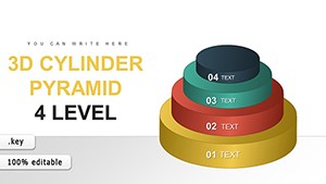 (399)
4-Level 3D Cylinder Pyramid Keynote - Fully Editable | ImagineLayoutID: #KC00745$17.00
(399)
4-Level 3D Cylinder Pyramid Keynote - Fully Editable | ImagineLayoutID: #KC00745$17.00 (980)
3D Pyramid Keynote Charts - Fully Editable | ImagineLayoutID: #KC00744$20.00
(980)
3D Pyramid Keynote Charts - Fully Editable | ImagineLayoutID: #KC00744$20.00 (1100)
5-Level 3D Pyramid Template - Editable | ImagineLayoutID: #KC00743$22.00
(1100)
5-Level 3D Pyramid Template - Editable | ImagineLayoutID: #KC00743$22.00 (306)
4-Level 3D Pyramid Charts - Editable | ImagineLayoutID: #KC00742$21.00
(306)
4-Level 3D Pyramid Charts - Editable | ImagineLayoutID: #KC00742$21.00
Visuals play a key role in communicating ideas effectively. One standout method is using 3D Keynote Charts Templates to bring your data to life.
What Are 3D Keynote Charts Templates?
3D Keynote Charts Templates are pre-built layouts for Apple's Keynote software, showcasing data in three dimensions. Unlike flat 2D charts, these templates use depth and perspective to present information in a dynamic, sophisticated way.
With a range of chart styles, they're designed for easy customization, helping you visualize data in a way that's both appealing and simple to understand.
How Do They Differ from 2D Charts?
While 2D charts are flat and basic, 3D charts add a third dimension, enhancing clarity for complex datasets and boosting visual impact.
Advantages of Using 3D Keynote Charts Templates
Here's why these templates are a game-changer for your presentations:
- Eye-Catching Design: The depth and perspective of 3D charts make your slides stand out, keeping your audience engaged.
- Clearer Data Insights: A third dimension highlights relationships in data, simplifying complex information for viewers.
- Full Customization: Easily tweak colors, sizes, and data points to align with your brand or message.
- Polished Look: 3D charts lend a professional edge, perfect for business or academic settings.
- Wide Application: Use them for financial reports, marketing pitches, or research talks - they're highly adaptable.
Visual Impact in Action
A well-designed 3D chart can turn a dull slide into a memorable one, ensuring your key points stick with the audience.
Types of 3D Keynote Charts Templates
Explore the variety of options available:
- 3D Bar Charts: Great for comparing categories, with depth emphasizing value differences.
- 3D Pie Charts: Show proportions vividly, illustrating how parts form the whole.
- 3D Line Charts: Track trends over time, with 3D effects amplifying changes.
- 3D Column Charts: Perfect for vertical data comparisons across periods.
- 3D Scatter Plots: Reveal variable relationships with added context from depth.
Real-World Uses for 3D Keynote Charts Templates
These templates shine in diverse scenarios:
- Business Reports: Display sales figures or market analysis with clarity for stakeholders.
- Marketing Pitches: Highlight campaign results or trends to captivate clients.
- Academic Research: Present stats or findings in a clear, engaging format.
- Product Development: Track metrics and progress with visually rich slides.
- Investor Decks: Impress investors with growth projections and market insights.
Example: Investor Pitch Success
A startup used a 3D bar chart to show revenue growth, securing funding by making data pop.
Who Benefits from 3D Keynote Charts Templates?
These templates suit a wide range of professionals:
- Business Leaders: Enhance reports and proposals with compelling visuals.
- Marketers: Showcase campaign data in an engaging way.
- Educators: Simplify complex research for students or peers.
- Product Managers: Visualize development milestones effectively.
- Entrepreneurs: Strengthen pitches with standout data displays.
How to Customize 3D Keynote Charts Templates
Getting started is simple:
- Open in Keynote: Import the template into Apple's Keynote app.
- Edit Data: Input your figures directly into the chart's data table.
- Tweak Design: Adjust colors and fonts via Keynote's formatting tools.
- Refine Perspective: Modify the 3D angle for the best view.
User Feedback on 3D Keynote Charts Templates
Here's what users say:
- Boosted Engagement: "3D charts keep my audience hooked!"
- Easy to Edit: "Even beginners can customize them fast."
- Pro Quality: "My slides look sleek and credible."
- Versatile Use: "Perfect for meetings and lectures alike."
Frequently Asked Questions
- What are 3D Keynote Charts Templates? Pre-designed, 3D layouts for Keynote to make data pop.
- Why use them? They enhance visuals, clarify trends, and add a pro touch.
- How to pick the right one? Match the chart type to your data and brand style.
- Are they editable? Yes, fully tweakable in Keynote - colors, data, and more.
Ready to transform your slides? Download your 3D Keynote Charts Templates now and make your next presentation unforgettable!