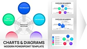
Pie Keynote Charts
These Keynote files deliver ready layouts for pie charts with built-in sector labels, legend placement, and animation presets that keep the focus on the numbers rather than manual formatting.
When a finance analyst must present Q4 budget allocation to the executive team in two days, the real work is interpreting the percentages - not redrawing slices to match brand colors.
This collection focuses on data accuracy that updates automatically when source numbers change.
Download any template to begin editing the table data immediately.
 (9)
(9) Keynote Innovative Solutions Charts - Editable Keynote | ImagineLayoutID: #KC01114$18.00
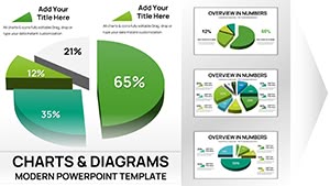 (15)
(15) Keynote 3D Pie Chart Template - Fully Editable | ImagineLayoutID: #KC01105$15.00
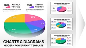 (13)
30 3D Pie Keynote Charts - Editable .key File | ImagineLayoutID: #KC01104$15.00
(13)
30 3D Pie Keynote Charts - Editable .key File | ImagineLayoutID: #KC01104$15.00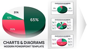 (9)
36 3D Pie Keynote Charts - Editable .key File | ImagineLayoutID: #KC01103$16.00
(9)
36 3D Pie Keynote Charts - Editable .key File | ImagineLayoutID: #KC01103$16.00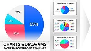 (16)
Pie Charts Keynote Template - Fully Editable | Instant DownloadID: #KC01100$15.00
(16)
Pie Charts Keynote Template - Fully Editable | Instant DownloadID: #KC01100$15.00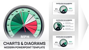 (17)
Gauge Charts Keynote Template - Fully Editable | Instant DownloadID: #KC01099$18.00
(17)
Gauge Charts Keynote Template - Fully Editable | Instant DownloadID: #KC01099$18.00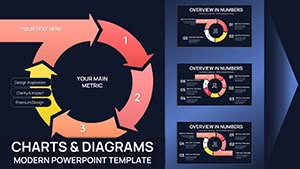 (17)
Cycle Charts Keynote Template - 44 Editable Slides | Instant DownloadID: #KC01096$20.00
(17)
Cycle Charts Keynote Template - 44 Editable Slides | Instant DownloadID: #KC01096$20.00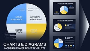 (16)
Pie Charts Keynote Template - 26 Fully Editable Slides | Instant DownloadID: #KC01094$16.00
(16)
Pie Charts Keynote Template - 26 Fully Editable Slides | Instant DownloadID: #KC01094$16.00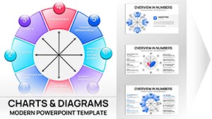 (8)
Bowman's Strategy Clock Keynote Template - 42 Fully Editable Slides | ImagineLayoutID: #KC01088$16.00
(8)
Bowman's Strategy Clock Keynote Template - 42 Fully Editable Slides | ImagineLayoutID: #KC01088$16.00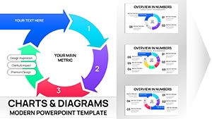 (8)
Incoming Cycle Charts Keynote Template - Fully Editable | Instant Download | ImagineLayoutID: #KC01087$20.00
(8)
Incoming Cycle Charts Keynote Template - Fully Editable | Instant Download | ImagineLayoutID: #KC01087$20.00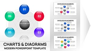 (15)
Network Charts Keynote Template - Fully Editable 26 Slides | Instant Download | ImagineLayoutID: #KC01084$12.00
(15)
Network Charts Keynote Template - Fully Editable 26 Slides | Instant Download | ImagineLayoutID: #KC01084$12.00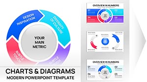 (11)
Cyclical Pie Charts Keynote Template - Fully Editable | Instant DownloadID: #KC01079$18.00
(11)
Cyclical Pie Charts Keynote Template - Fully Editable | Instant DownloadID: #KC01079$18.00 (13)
Pie Chart Keynote Template - 46 Editable Slides | ImagineLayoutID: #KC01076$15.00
(13)
Pie Chart Keynote Template - 46 Editable Slides | ImagineLayoutID: #KC01076$15.00 (14)
Process Charts Keynote Template - Fully Editable Puzzle Pie 32 Slides | Instant DownloadID: #KC01074$15.00
(14)
Process Charts Keynote Template - Fully Editable Puzzle Pie 32 Slides | Instant DownloadID: #KC01074$15.00 (12)
Fully Editable Puzzle Pie Charts Keynote Template - Instant DownloadID: #KC01073$20.00
(12)
Fully Editable Puzzle Pie Charts Keynote Template - Instant DownloadID: #KC01073$20.00 (11)
Keynote Pie Chart Template - 26 Fully Editable Slides | Instant DownloadID: #KC01070$18.00
(11)
Keynote Pie Chart Template - 26 Fully Editable Slides | Instant DownloadID: #KC01070$18.00 (10)
Pie Chart Keynote Template - 42 Fully Editable Slides | Instant DownloadID: #KC01067$16.00
(10)
Pie Chart Keynote Template - 42 Fully Editable Slides | Instant DownloadID: #KC01067$16.00 (1137)
 Circular Economy Charts for Keynote: Weaving Sustainability into Every SlideID: #KC00904$15.00
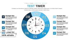 (215)
(215) Test Timer Keynote Charts for Precise Time ManagementID: #KC00874$15.00
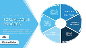 (963)
Scrum Agile Development Process: Keynote Charts for Efficient TeamsID: #KC00856$18.00
(963)
Scrum Agile Development Process: Keynote Charts for Efficient TeamsID: #KC00856$18.00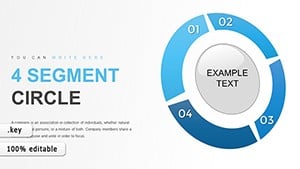 (1096)
Segment Circle Keynote Charts Template: Unlock Consumer InsightsID: #KC00821$15.00
(1096)
Segment Circle Keynote Charts Template: Unlock Consumer InsightsID: #KC00821$15.00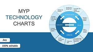 (951)
MYP Technology Keynote Charts TemplateID: #KC00813$20.00
(951)
MYP Technology Keynote Charts TemplateID: #KC00813$20.00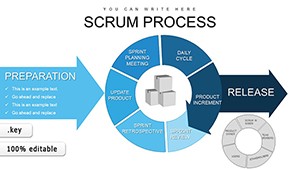 (735)
Scrum Process Flow Pie Keynote Charts TemplateID: #KC00795$20.00
(735)
Scrum Process Flow Pie Keynote Charts TemplateID: #KC00795$20.00 (730)
SEO Infographic Keynote Charts - Editable | ImagineLayoutID: #KC00735$15.00
(730)
SEO Infographic Keynote Charts - Editable | ImagineLayoutID: #KC00735$15.00 (570)
Cycle Pie Keynote Charts - Fully Editable | ImagineLayoutID: #KC00711$22.00
(570)
Cycle Pie Keynote Charts - Fully Editable | ImagineLayoutID: #KC00711$22.00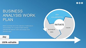 (360)
Business Analysis Work Plan Keynote Charts - Editable KEY | ImagineLayoutID: #KC00710$22.00
(360)
Business Analysis Work Plan Keynote Charts - Editable KEY | ImagineLayoutID: #KC00710$22.00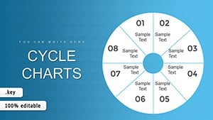 (196)
8 Segment Cycle Keynote Charts Template - Editable | ImagineLayoutID: #KC00706$20.00
(196)
8 Segment Cycle Keynote Charts Template - Editable | ImagineLayoutID: #KC00706$20.00 (1178)
Core Values Keynote Charts Template - Editable KeynoteID: #KC00699$13.00
(1178)
Core Values Keynote Charts Template - Editable KeynoteID: #KC00699$13.00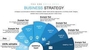 (1089)
Business Strategy Keynote Charts - Editable Keynote | ImagineLayoutID: #KC00698$18.00
(1089)
Business Strategy Keynote Charts - Editable Keynote | ImagineLayoutID: #KC00698$18.00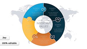 (1047)
18 Creative Economy Pie Charts Keynote - Editable KEY | ImagineLayoutID: #KC00687$18.00
(1047)
18 Creative Economy Pie Charts Keynote - Editable KEY | ImagineLayoutID: #KC00687$18.00 (1064)
Market Segmentation Keynote Charts - Fully Editable | ImagineLayoutID: #KC00677$22.00
(1064)
Market Segmentation Keynote Charts - Fully Editable | ImagineLayoutID: #KC00677$22.00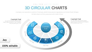 (325)
3D Circular Keynote Charts - Fully Editable | ImagineLayoutID: #KC00675$18.00
(325)
3D Circular Keynote Charts - Fully Editable | ImagineLayoutID: #KC00675$18.00 (533)
Capability Analysis Keynote Charts - Editable | ImagineLayoutID: #KC00669$20.00
(533)
Capability Analysis Keynote Charts - Editable | ImagineLayoutID: #KC00669$20.00
How Pre-Built Pie Charts Remove Manual Formatting in Keynote
Every file opens with sectors already labeled, legends positioned, and animation sequences set to reveal one slice at a time. Change the table data and the entire chart refreshes while keeping your color assignments and label rotations intact.
Browse the full collection and download the ones that fit your next presentation.
What You Lose When Building Pie Charts From Scratch in Keynote
You spend time rotating labels to avoid overlap, matching the exact color palette across six different slides, and testing animation timing so each sector appears on cue. Those steps disappear the moment you open a pre-configured file.
Business Contexts Where These Charts Deliver Immediate Clarity
A finance director presents departmental spend to the CFO. The stakeholder needs to see exactly where the 35 % marketing slice comes from. The template already highlights that sector with a pull-out effect, so the director explains variances instead of adjusting angles.
A product manager shows market share distribution in a cross-functional meeting. The operations lead asks for a quick filter on one category. With the linked table, the manager edits one cell and the updated pie appears before the question finishes.
An agency account lead reviews campaign performance with a client. The client wants to compare last quarter to this one. The side-by-side pie layout is already prepared, turning the conversation into strategy rather than slide construction.
A nonprofit director reports donation allocation to the board. The action slide already prompts approval for next-year shifts. The director rehearses the story instead of fixing label collisions at the last minute.
Recurring Reporting Workflows Made Simple
Copy the file each quarter, replace table numbers, and the same animation sequence and color logic remain. Teams across finance and marketing use identical layouts so monthly reports look uniform without extra coordination.
Keynote-Specific Technical Guidance for Pie Charts
Edit the data table directly in Keynote and the pie updates live. To control reveal order, select the chart, open Animate, and drag sectors in the build order panel. For PDF export, choose Best quality to keep crisp sector borders and labels on every page.
What Makes These Files Different for Corporate Use
Layouts prioritize clear hierarchy and automatic data refresh over decorative effects. Every element stays fully editable in native .key format, giving control without hidden locked groups.
If your project includes fitness visuals, the sports PowerPoint templates complement these charts. For health program metrics, see health & wellness PowerPoint templates. Modern depth comes from 3D shape templates in PowerPoint.
Browse the full collection and download the ones that fit your next presentation.
Are these files compatible with the current version of Keynote?
Yes, built for the latest Keynote on macOS and iOS. All .key files open with full chart editing and animation controls. Older versions may need the file saved in compatibility format; test sector animations before your board meeting.
Can I share the Keynote files with colleagues?
The license allows internal team sharing for business presentations. Distribute edited .key files across departments; no watermark is added. Only the original files cannot be resold.
How do I update the data table behind the pie chart?
Double-click the chart to open the linked table, replace numbers, and close the table. The pie and labels update instantly while keeping your color and animation settings. This works for every file in the collection.
What format will I receive and how do I export to PDF?
Each download is a single .key file. For PDF export, use File > Export To > PDF and select Best quality to preserve crisp sector borders and rotated labels on every page.
Do the animations stay intact after editing?
Yes, build order and timing are saved with the chart. After data changes the sequence remains; only the values inside each sector update. Rehearse once and the timing is ready for your presentation.