Sector Circle Keynote Charts - Fully Editable | ImagineLayout


Type: Keynote Charts template
Category: Free Templates, Pie
Sources Available: .key
Product ID: KC00610
Template incl.: 18 editable slides
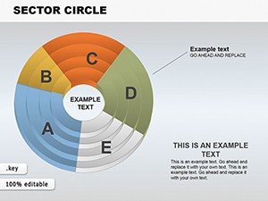
Important Sector Circle Free Keynote Charts Template
KEY file with 18 sector circle diagrams lets marketing analysts visualize parts-of-whole data without manual drawing.
No setup needed.
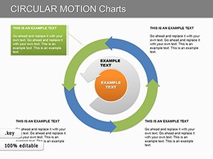
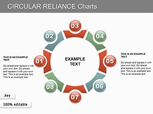
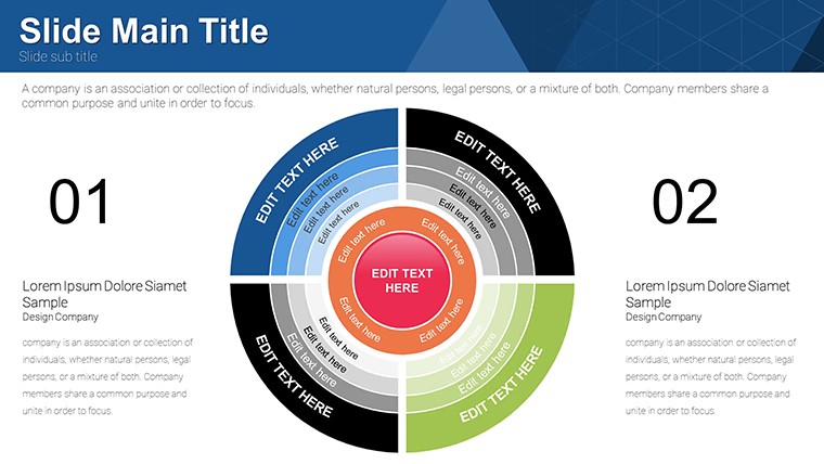
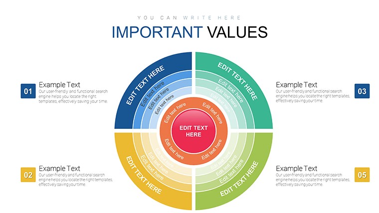
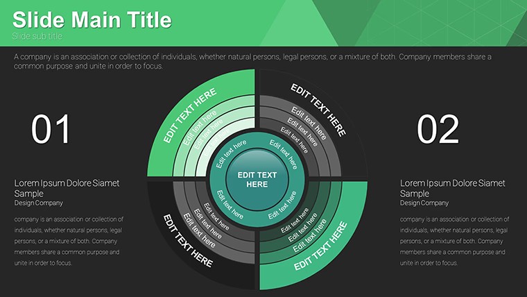
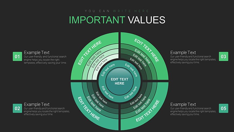
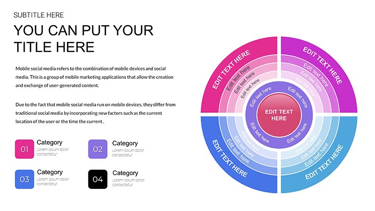
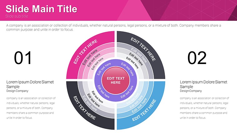
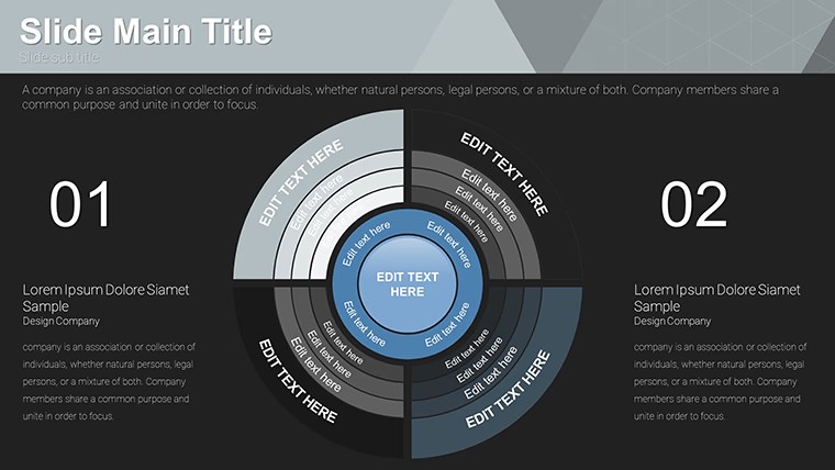
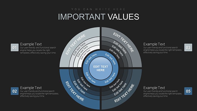
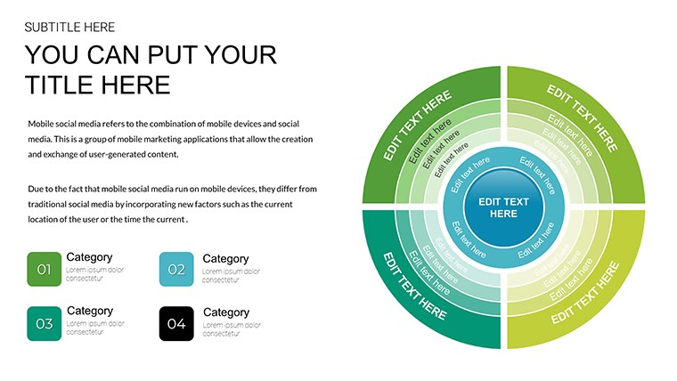
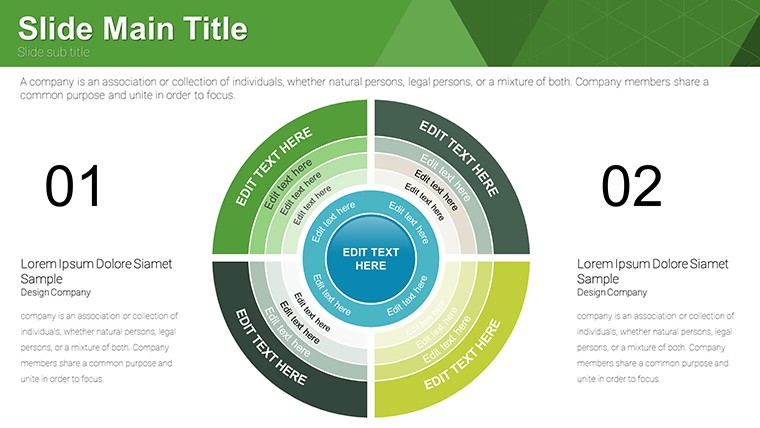
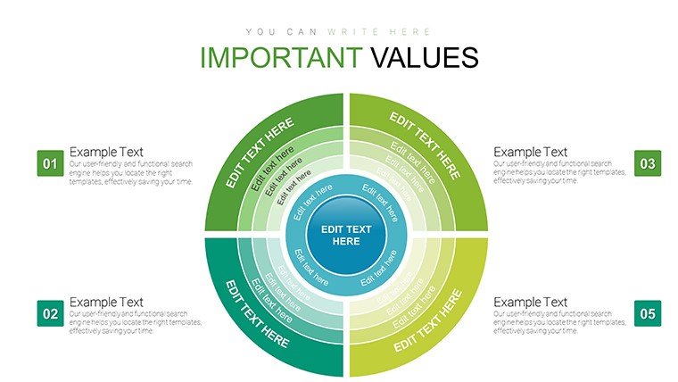
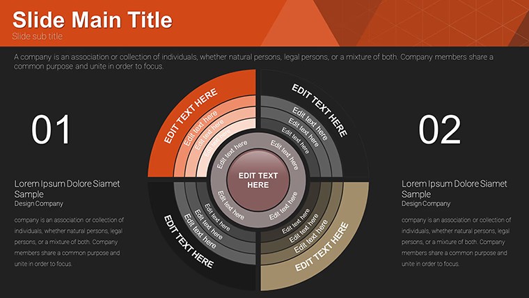
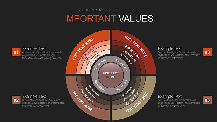
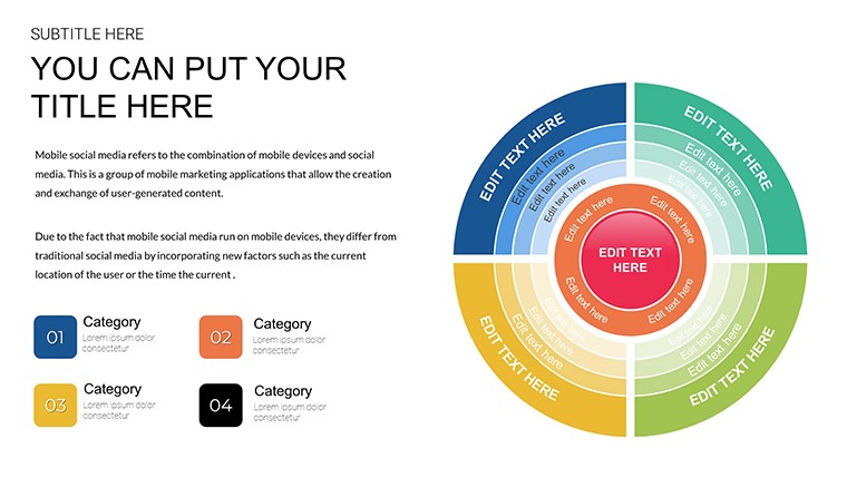
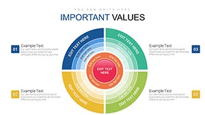
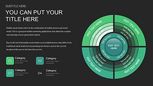
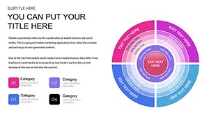
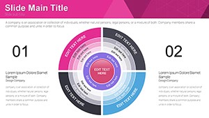
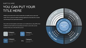
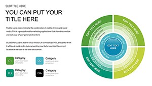
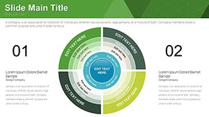
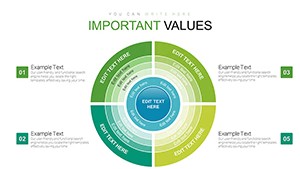
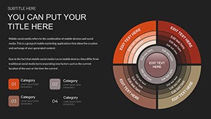
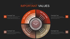
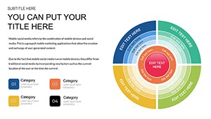
Radial structures place values into circular segments where one sector receives bold coloring that immediately pulls focus to the largest share whether market dominance or budget allocation.
In practice the file follows standard KEY format compatible with Keynote on Mac and iOS so current installations open it directly and you replace text or numbers in under a minute.
This free version delivers the complete 18 editable slides with no paid upgrade listed on the page.
You change the entire palette once through the slide master and every diagram updates automatically across the deck.
The radial layout with emphasized sector works best when your data breaks down into proportional parts yet it is not ideal for absolute number comparisons that need multiple axes.
When you need to explain relative importance of categories to stakeholders the predefined segments handle the structure out of the box instead of building arcs manually.
Typically teams reuse the same file across quarterly reports because the sectors stay aligned and readable on one slide.
Business professionals handling data summaries choose this Keynote charts template over generic shapes since the bold sector removes the guesswork of which element matters most.
It keeps structure readable on one slide so viewers reach the decision faster.
Not designed for data-heavy dashboards that require scrolling or filtering.
| Feature | Details |
|---|---|
| Slides / diagrams | 18 sector circle diagrams |
| File format | KEY |
| Software version | Keynote on Mac and iOS current installations |
| Color schemes | Vibrant schemes switch via slide master |
| Editable elements | Sectors resize and recolor independently text updates directly |
| Aspect ratio | 16:9 standard |
| Free vs Paid | Fully free version with all 18 slides included |
| Masters / Backgrounds | Editable slide masters for quick palette switch |
See also Panel Circle Segment Charts and Sector Circle Keynote Charts for additional circular options.
Everything is already structured.
How do I change colors across all slides?
Edit the slide master once and every diagram updates automatically. Select the sector element in master view to adjust fill or stroke. This applies the new scheme to the full deck in seconds.
Does the license allow client work?
The license permits use in client presentations as long as you do not resell or redistribute the original template files. One license covers one user for editing. Teams or agencies purchase additional copies for multiple editors.
What is the difference between free and paid versions?
This free version provides the complete set of 18 editable slides with no additional cost. No paid version appears on the page so the full content is available upfront. You download once and begin customizing immediately.
What are the refund conditions?
Digital downloads do not qualify for refunds once files are accessed due to instant availability. If the KEY file fails to open in your Keynote version contact support within 48 hours. Most cases receive a quick compatibility fix instead of refund.
Is it compatible with Keynote versions?
Files work with Keynote on Mac and iOS in recent versions. Standard KEY format opens directly on Keynote 12 and above. Older installations may require a one-time shape alignment but nothing complex.
Download and start editing immediately