Analysis Keynote Charts
Deliver data-driven presentations that captivate and convince with our collection of analysis chart templates designed specifically for Keynote. Perfect for Mac users who need to transform complex datasets into clear, actionable insights for business meetings, investor pitches, and strategic planning sessions.
Each template includes multiple chart types - bar graphs, line charts, scatter plots, area charts, and combination visualizations - all optimized for Keynote's native tools. Fully customizable colors, fonts, and data points let you create presentations that align perfectly with your brand while maintaining professional design standards.
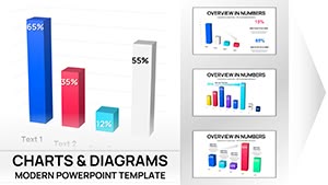 (16)
(16) 3D Clustered Column Charts Keynote - Editable | ImagineLayoutID: #KC01106$14.00
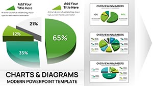 (15)
Keynote 3D Pie Chart Template - Fully Editable | ImagineLayoutID: #KC01105$15.00
(15)
Keynote 3D Pie Chart Template - Fully Editable | ImagineLayoutID: #KC01105$15.00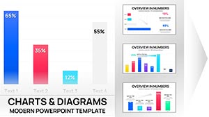 (9)
(9) Clustered Column Keynote Charts Template - Fully Editable | Instant DownloadID: #KC01102$10.00
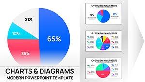 (16)
Pie Charts Keynote Template - Fully Editable | Instant DownloadID: #KC01100$15.00
(16)
Pie Charts Keynote Template - Fully Editable | Instant DownloadID: #KC01100$15.00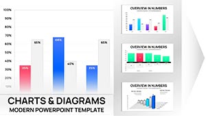 (13)
Sales Infographic Keynote Charts Template - 56 Fully Editable Slides | ImagineLayoutID: #KC01085$14.00
(13)
Sales Infographic Keynote Charts Template - 56 Fully Editable Slides | ImagineLayoutID: #KC01085$14.00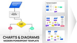 (13)
Business Process Flowchart Keynote Chart - Editable | ImagineLayoutID: #KC01075$14.00
(13)
Business Process Flowchart Keynote Chart - Editable | ImagineLayoutID: #KC01075$14.00 (10)
Psychology of Leadership Charts Keynote Template: Insightful Tools for Dynamic LeadersID: #KC01051$24.00
(10)
Psychology of Leadership Charts Keynote Template: Insightful Tools for Dynamic LeadersID: #KC01051$24.00 (17)
Download Online Education Charts Template for Keynote PresentationsID: #KC01046$15.00
(17)
Download Online Education Charts Template for Keynote PresentationsID: #KC01046$15.00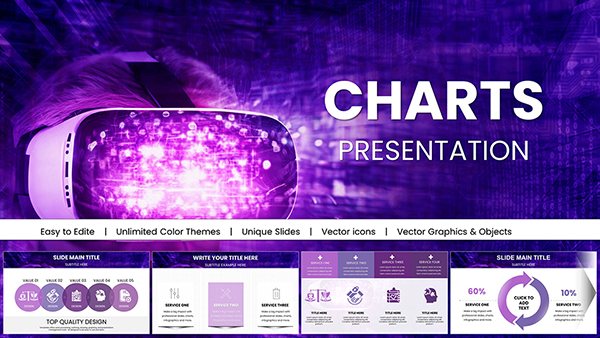 (11)
Futuristic Mask Charts Keynote TemplateID: #KC01042$18.00
(11)
Futuristic Mask Charts Keynote TemplateID: #KC01042$18.00 (16)
Editable Financial Charts Keynote Template: Transform Data into Impactful StoriesID: #KC01036$25.00
(16)
Editable Financial Charts Keynote Template: Transform Data into Impactful StoriesID: #KC01036$25.00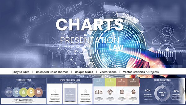 (12)
Professional Law Charts Keynote Presentation TemplateID: #KC01031$15.00
(12)
Professional Law Charts Keynote Presentation TemplateID: #KC01031$15.00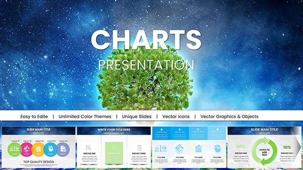 (1034)
Ecology Charts Keynote Template - Save the PlanetID: #KC01027$20.00
(1034)
Ecology Charts Keynote Template - Save the PlanetID: #KC01027$20.00 (579)
Creative Marketing Keynote Charts Template - Fully Editable | Instant DownloadID: #KC01022$15.00
(579)
Creative Marketing Keynote Charts Template - Fully Editable | Instant DownloadID: #KC01022$15.00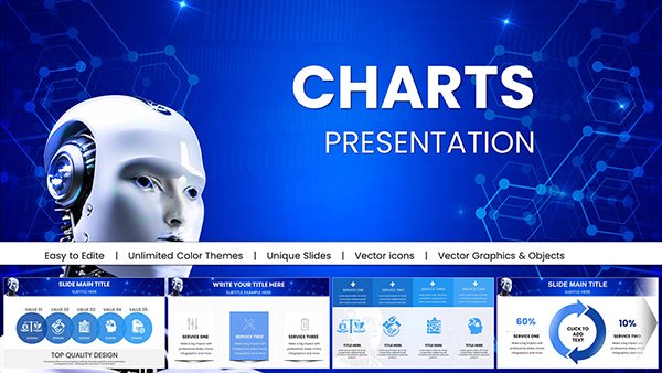 (909)
AI Keynote Presentation Templates with Robot AI ChartsID: #KC01020$20.00
(909)
AI Keynote Presentation Templates with Robot AI ChartsID: #KC01020$20.00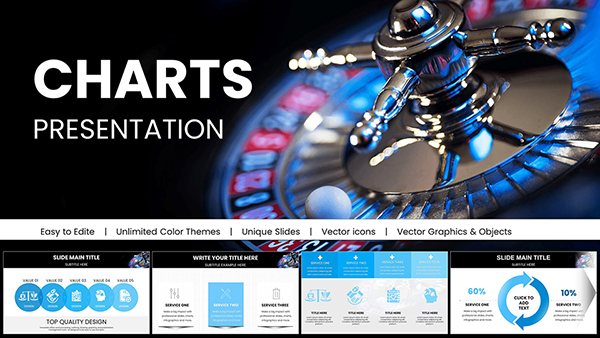 (386)
Casino Keynote Presentation Template: Bet on Professional Gaming SlidesID: #KC01018$20.00
(386)
Casino Keynote Presentation Template: Bet on Professional Gaming SlidesID: #KC01018$20.00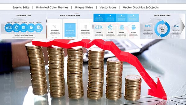 (105)
(105) Data Visualization Keynote Charts Template: Illuminate Your InsightsID: #KC01017$18.00
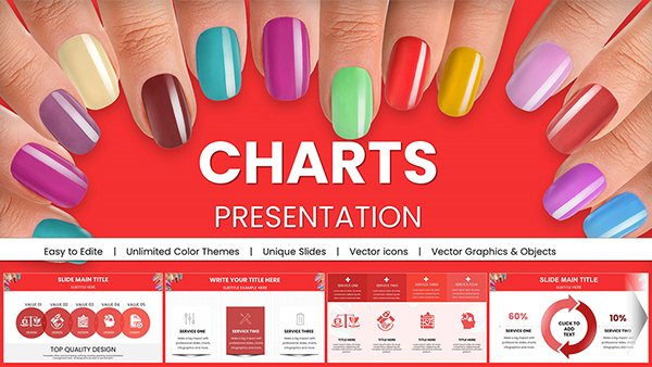 (786)
(786) Manicure Charts for Stunning Keynote PresentationsID: #KC01009$20.00
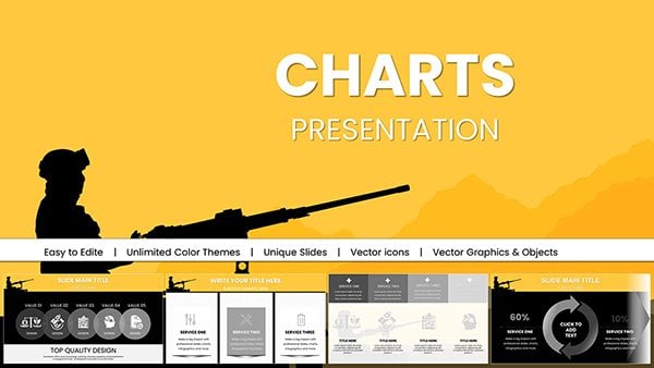 (1047)
Air Force Pay Keynote Charts, Download Military PresentationID: #KC00991$18.00
(1047)
Air Force Pay Keynote Charts, Download Military PresentationID: #KC00991$18.00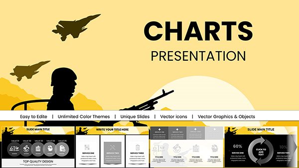 (190)
Military Keynote Charts PresentationID: #KC00990$20.00
(190)
Military Keynote Charts PresentationID: #KC00990$20.00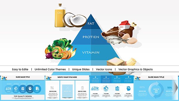 (767)
Food Pyramid Keynote Charts PresentationID: #KC00989$18.00
(767)
Food Pyramid Keynote Charts PresentationID: #KC00989$18.00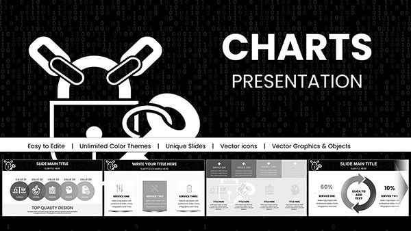 (135)
Background Information Security Code Keynote Charts: Safeguard Data with Visual PrecisionID: #KC00985$18.00
(135)
Background Information Security Code Keynote Charts: Safeguard Data with Visual PrecisionID: #KC00985$18.00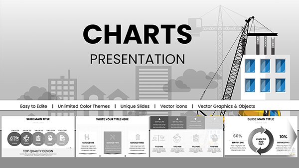 (1066)
Construction Companies Keynote Charts Template: Build Visions with Data-Driven ClarityID: #KC00984$20.00
(1066)
Construction Companies Keynote Charts Template: Build Visions with Data-Driven ClarityID: #KC00984$20.00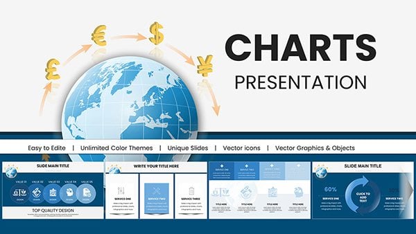 (1062)
International Currency Exchange Keynote ChartsID: #KC00982$18.00
(1062)
International Currency Exchange Keynote ChartsID: #KC00982$18.00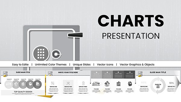 (926)
Bank Security Safeguarding: Keynote Charts for Financial FortificationID: #KC00981$18.00
(926)
Bank Security Safeguarding: Keynote Charts for Financial FortificationID: #KC00981$18.00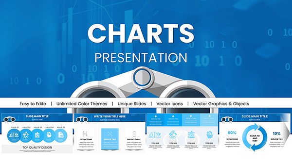 (71)
Binoculars Search Marketing Keynote Charts Template: Zoom In on InsightsID: #KC00979$18.00
(71)
Binoculars Search Marketing Keynote Charts Template: Zoom In on InsightsID: #KC00979$18.00 (490)
Data Financial Keynote Charts Template: Empower Fiscal StorytellingID: #KC00973$20.00
(490)
Data Financial Keynote Charts Template: Empower Fiscal StorytellingID: #KC00973$20.00 (85)
Editable Analytical Charts for Keynote: Transform Data into Dynamic NarrativesID: #KC00971$20.00
(85)
Editable Analytical Charts for Keynote: Transform Data into Dynamic NarrativesID: #KC00971$20.00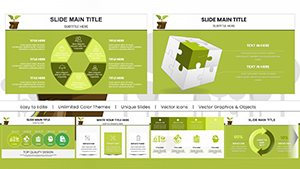 (1002)
Eco Sustainable Keynote Charts Template: Green Visuals for a Better TomorrowID: #KC00967$20.00
(1002)
Eco Sustainable Keynote Charts Template: Green Visuals for a Better TomorrowID: #KC00967$20.00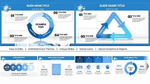 (385)
Air Delivery Logistics Keynote Charts TemplateID: #KC00959$18.00
(385)
Air Delivery Logistics Keynote Charts TemplateID: #KC00959$18.00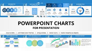 (200)
WiFi Internet Connection Keynote Charts TemplateID: #KC00958$18.00
(200)
WiFi Internet Connection Keynote Charts TemplateID: #KC00958$18.00 (1181)
Project Timeline Keynote Charts Template - Plan & PresentID: #KC00942$25.00
(1181)
Project Timeline Keynote Charts Template - Plan & PresentID: #KC00942$25.00 (445)
Business Analysis Solution Keynote ChartsID: #KC00941$25.00
(445)
Business Analysis Solution Keynote ChartsID: #KC00941$25.00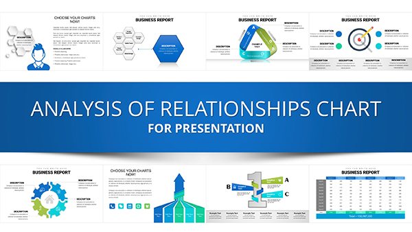 (347)
Analysis of Relationship Keynote Charts TemplateID: #KC00940$25.00
(347)
Analysis of Relationship Keynote Charts TemplateID: #KC00940$25.00
Why Specialized Analysis Templates Matter
Default Keynote charts offer basic functionality, but specialized analysis templates provide the visual sophistication and layout flexibility that executive presentations demand. These templates incorporate proven design principles for data visualization, ensuring your audience focuses on insights rather than struggling to interpret poorly formatted charts.
Pre-built layouts save hours of design work while guaranteeing consistency across multi-slide presentations. Instead of manually adjusting colors, spacing, and labels for each chart, you can focus on analyzing data and crafting your narrative.
Comprehensive Chart Types for Every Analysis
Trend Analysis & Time Series
Line charts and area graphs excel at showing patterns over time. Use these templates to display sales trends, website traffic growth, stock performance, or any metrics tracked across months, quarters, or years. Multiple line comparisons help audiences understand relationships between different variables.
Comparative Analysis
Bar and column charts make category comparisons effortless. Present product performance across regions, compare competitor metrics, or show year-over-year growth. Horizontal bar charts work beautifully for ranking items or displaying survey results with long category names.
Correlation & Distribution
Scatter plots reveal relationships between variables, making them invaluable for risk-reward analysis, customer segmentation, or identifying outliers in large datasets. Bubble charts add a third dimension to scatter plots, showing magnitude alongside correlation.
Part-to-Whole Analysis
While pie charts show simple proportions, stacked area and stacked bar charts demonstrate how composition changes over time. These are perfect for market share evolution, budget allocation across periods, or resource distribution analysis.
Industry Applications That Drive Results
Corporate Strategy & Consulting
Strategy consultants rely on analytical charts to present market analysis, competitive positioning, and growth opportunities. Templates help create compelling board presentations, investor decks, and strategic planning documents that communicate complex recommendations clearly.
Financial Services & Investment
Financial analysts use these templates for portfolio performance reviews, risk assessment presentations, and investment committee reports. Clean chart designs help wealth managers and advisors explain performance metrics to clients without overwhelming them.
Marketing Analytics & Performance
Marketing teams present campaign ROI, customer acquisition costs, conversion funnel analysis, and engagement metrics. Visual dashboards created from these templates turn raw data into actionable insights for stakeholders.
Operations & Supply Chain
Operations managers track KPIs like production efficiency, quality metrics, inventory turnover, and delivery performance. Chart templates help communicate operational improvements and identify bottlenecks in process reviews.
Academic Research & Education
Researchers present study findings, experimental results, and statistical analysis with professional-grade visualizations. Graduate students use these templates for thesis defenses and conference presentations.
Advantages Over Basic Keynote Charts
- Mac-Optimized Design: Built specifically for Keynote, ensuring smooth performance and native feature compatibility
- Professional Aesthetics: Carefully designed color schemes, typography, and spacing create executive-ready presentations
- Rapid Deployment: Pre-formatted layouts reduce presentation creation time by 50-70%
- Visual Consistency: Matching slide designs maintain cohesive storytelling throughout your deck
- Advanced Layouts: Access dashboard-style arrangements and multi-chart comparisons not easily created from scratch
- Complete Customization: Modify every element while preserving professional design integrity
Best Practices for Analytical Presentations
Choose the Right Chart Type: Match visualization to your message. Trends need line charts, comparisons need bars, relationships need scatter plots. Using the wrong chart type confuses audiences and dilutes your message.
Simplify Ruthlessly: Remove chart junk - unnecessary gridlines, 3D effects, excessive colors. Each element should serve a purpose. A cluttered chart is worse than no chart at all.
Guide the Eye: Use color strategically to highlight key data points. Keep secondary information in neutral tones. Add annotations or callout boxes to emphasize critical insights your audience must notice.
Scale Appropriately: Start y-axes at zero for bar charts to avoid misleading proportions. For line charts showing trends, adjusted scales can emphasize meaningful changes. Always label axes clearly with units of measurement.
Provide Context: Never present data without interpretation. Add descriptive titles that state the insight, not just the topic. Include comparison benchmarks, targets, or prior period data to give numbers meaning.
Customization for Your Brand
Templates are fully editable in Keynote. Update chart data by clicking and entering your values - charts automatically redraw to reflect new information. Apply your corporate color palette with Keynote's color picker. Adjust fonts to match brand guidelines. Add company logos, modify layouts, and rearrange elements to fit your presentation structure.
For organizations with multiple presenters, distributing standard templates ensures everyone creates slides that maintain brand consistency. This is especially valuable for consulting firms, financial institutions, and corporate teams where multiple departments present to shared stakeholders.
Technical Considerations for Mac Users
These templates leverage Keynote's native charting engine, ensuring optimal performance on Mac systems. Charts remain editable and won't pixelate when projected on large screens. Templates work seamlessly across MacBook, iMac, and iPad versions of Keynote, making them perfect for presenters who switch between devices.
Unlike imported PowerPoint files that sometimes lose formatting on Mac, these Keynote-native templates maintain perfect fidelity. Animations and transitions behave consistently, and you won't encounter font substitution issues that plague cross-platform presentations.
Transform your data into compelling visual stories. Download professionally designed analysis chart templates that help you communicate insights with clarity and confidence. Perfect for business analysts, consultants, researchers, and executives who present data regularly.
Frequently Asked Questions
How do I update the data in these Keynote chart templates?
Click on any chart to select it, then click Edit Chart Data in the Format panel. A data editor window appears where you can enter your values. Charts automatically update to reflect your data. You can also copy-paste data from Excel or Numbers.
Will these templates work on iPad or iPhone?
Yes, these Keynote templates are fully compatible with Keynote for iOS on iPad and iPhone. You can edit charts, customize colors, and present directly from your mobile device. All features work across Mac and iOS versions.
Can I convert these to PowerPoint if needed?
Keynote allows exporting to PowerPoint format through File > Export To > PowerPoint. Most formatting transfers well, though some advanced Keynote features may need adjustment. For best results, use Keynote-native presentations on Mac systems.
What chart types are included in analysis templates?
Collections typically include bar charts, column charts, line graphs, area charts, scatter plots, bubble charts, combination charts, and multi-axis visualizations. Each template offers multiple layout variations and color schemes for different analytical purposes.
Are these suitable for investor presentations and board meetings?
Absolutely. These templates are designed for high-stakes business presentations including investor pitches, board reports, executive briefings, and client proposals. The professional design quality meets the standards expected in corporate and financial environments.
What version of Keynote do I need?
Templates work with Keynote 10.0 and newer versions on Mac, and recent versions of Keynote for iOS. They're optimized for the latest Keynote features but maintain compatibility with recent releases to support most users.