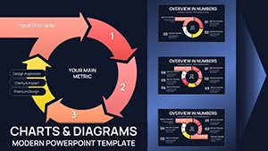
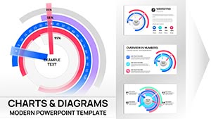
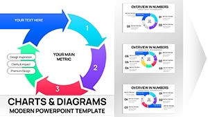
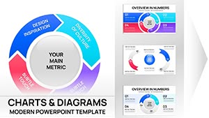
Arrows Keynote Charts
Our Arrows Keynote Charts Templates provide everything you need to design clear, engaging, and visually professional presentations. Whether you're preparing a business strategy, a marketing plan, an educational lesson, or a technical report, these arrow-based slides help you illustrate processes, sequences, and hierarchies with clarity. Designed for Apple Keynote, these templates turn complex ideas into simple, inspiring visuals that capture attention.
What Are Arrows Keynote Chart Templates?
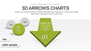
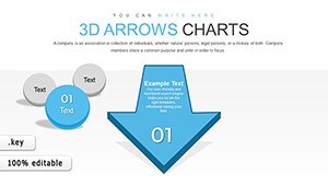
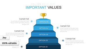
Arrows Keynote Chart Templates are ready-made slides with various arrow designs used in Apple's Keynote. They are perfect for showing workflows, project stages, timelines, and data flows. Using the universal symbol of arrows, they help represent direction, progression, and relationships, making your message easier to understand and remember.
Benefits of Using Arrows Keynote Chart Templates
- Visually represent movement and direction to simplify complex data.
- Suitable for multiple purposes: project management, marketing strategies, educational content, and more.
- Save time with pre-designed, customizable slides.
- Enhance professionalism with clean, modern designs.
- Keep your audience engaged and focused on your key points.
Types of Arrows Keynote Chart Templates
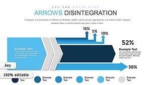
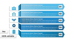
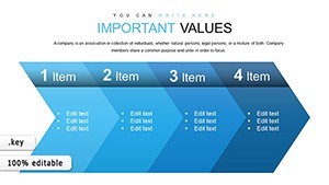
- Linear Arrow Charts: Perfect for timelines, project phases, and step-by-step guides.
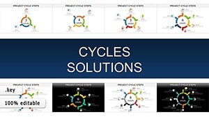
- Circular Arrow Charts: Ideal for cycles, feedback loops, and continuous processes.
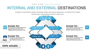
- Diverging & Converging Arrows: Show branching decisions or merging paths.
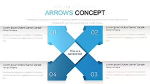
- Multi-directional Arrows: Great for complex systems, maps, or network diagrams.
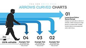
- Curved Arrow Charts: Add movement and flow to abstract concepts.
How to Use Arrows Keynote Charts Effectively
- Business Strategies: Map out goals, milestones, and growth directions.
- Project Management: Display schedules, dependencies, and progress tracking.
- Education: Explain historical timelines, processes, or scientific concepts.
- Marketing: Visualize customer journeys, funnels, and campaign stages.
- Healthcare: Outline patient care steps or medical procedures.
Who Should Use Arrows Keynote Chart Templates?
- Business Professionals: For strategy and decision-making.
- Educators: To explain concepts visually.
- Project Managers: To present timelines and workflows.
- Marketers: To show campaign flows and tactics.
- Healthcare Providers: For clear process explanations.
User Feedback
Users praise these templates for their clarity, time-saving features, and professional design. Educators report increased student engagement, while business teams find them valuable for meetings and pitches. Overall, they’re loved for versatility, quality, and ease of use.
FAQ
- What are Arrows Keynote Charts Templates?
They are slide designs featuring arrow graphics for Apple Keynote to illustrate processes and data flows. - Can I customize them?
Yes, you can change colors, shapes, and sizes to fit your brand. - Where can I use them?
In business, education, marketing, healthcare, and more. - What types of arrows are available?
Straight, curved, circular, segmented, and multi-directional. - Why use arrow charts?
They make complex information easy to follow and remember.

