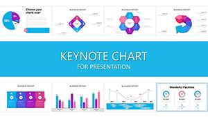
Selection Sort Keynote Charts Template - Fully Editable | Instant Download


Type: Keynote Charts template
Category: Matrix
Sources Available: .key
Product ID: KC00418
Template incl.: 11 editable slides
Present sorted data with 11 editable matrix Keynote charts inspired by the selection sort algorithm. Bar, line and scatter matrices for analysts and educators. Instant download.
What's Included
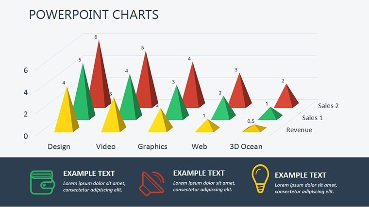
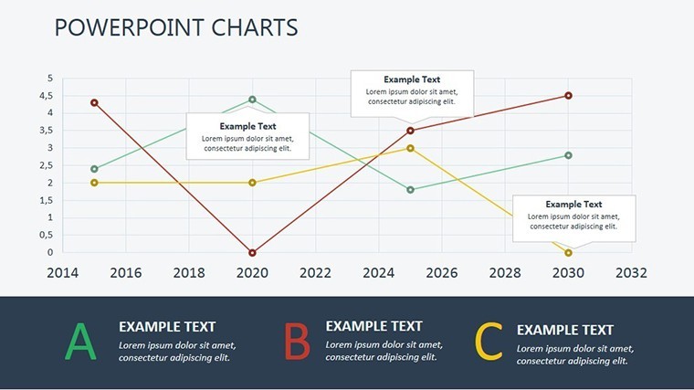
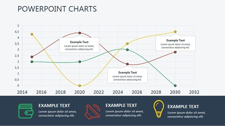
The Selection Sort Keynote Charts template provides 11 editable slides in matrix format within a single .key file. Slides are built around bar, line and scatter matrices that mirror the logical progression of the selection sort algorithm. The file opens directly in Keynote on Mac.
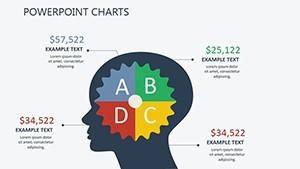
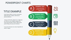
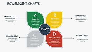
Matrix Focus
All 11 slides emphasize structured data organization for quarterly trends and statistical concepts.
Key Features
Matrix layouts with algorithmic precision set this template apart. Every chart element is fully editable with intuitive interfaces for quick data swaps.
| Feature | Details |
|---|---|
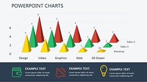
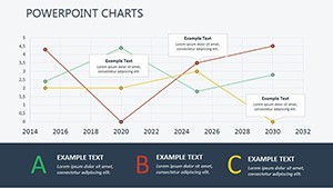
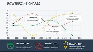
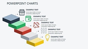
| 11 Editable Matrix Slides | Bar, line, scatter |
| Algorithmic Structure | Logical data flow |
| Intuitive Editing | Data replacement in seconds |
| Color & Layout Controls | Brand matching |
| Professional Balance | No visual overload |
| .key Format | Mac Keynote ready |
Unique Layout Style
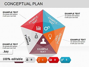
Different from the Executive Decision puzzle or Mortgage Transfer Venn templates, this set uses matrix formats specifically for sorted data visualization and algorithmic clarity.
Professional Use Cases
Business Analyst Quarterly Reports
A business analyst at a financial services firm transformed chaotic quarterly trend data into neatly sorted matrix visuals. Executives followed the logical progression instantly, approving new investment strategies without follow-up questions.
University Statistics Lectures
An economics lecturer used the scatter matrix slides to explain sorting concepts. Students grasped statistical relationships faster because the matrix layouts mirrored the algorithm they were studying.
How to Customize
Download the .key file, open in Keynote, select any matrix cell or chart, replace placeholder values, adjust colors and layouts to your needs. The algorithmic structure keeps everything aligned automatically. Export or present in minutes.
Why Choose This Template
Manually building 11 matrix charts that follow selection sort logic usually requires 4 hours of precise alignment. This template delivers pre-structured matrices that already embody algorithmic precision, saving time while guaranteeing visual clarity. The design decision to use matrix formats instead of scattered graphs helps analysts and educators present sorted data with confidence and without overwhelming audiences.
Soft CTA: Streamline your data visualization now.
FAQ
Are the matrix slides fully editable?
Yes, all 11 matrix charts with bar, line and scatter elements are fully editable in Keynote. The product page confirms intuitive interfaces and matrix formats, so you can update data and layout instantly.
What software is required?
Apple Keynote on Mac. The native .key file opens with all matrix elements perfectly positioned. Not compatible with other presentation software.
Can I use this for commercial reports?
Yes, the license allows commercial use in business and academic settings. Analysts and educators use these 11 matrix slides daily in paid or institutional work.
Do the slides support quarterly trend data?
Yes, the 11 slides are specifically designed for presenting sorted quarterly trends and statistical concepts as stated on the product page.
What is the refund policy?
14-day money-back guarantee. If the algorithmic matrix charts do not streamline your data presentation after testing in Keynote, receive a full refund.
Can colors and layouts be customized?
Yes, every color and layout element is fully adjustable in Keynote while preserving the selection sort matrix structure and logical flow.