Free Templates Keynote Charts
An operations manager preparing the Q2 review deck has exactly 45 minutes between the last data pull and the executive meeting. Instead of rebuilding a Gantt chart from scratch, these free Keynote chart templates already contain the correct slide master, color palette, and data labels.
The free collection here isn't a trimmed-down version of the paid catalog - it's a curated starting point for the kind of work that moves quickly: internal reviews, first-draft pitches, training materials that need to look presentable without a three-hour formatting session.
Download the Keynote chart that matches your next data storytelling moment.
 (790)
(790) Decision Making Keynote Charts - Editable Keynote | ImagineLayoutID: #KC00660free
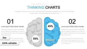 (803)
24 Free Thinking Charts - Editable Keynote | ImagineLayoutID: #KC00651free
(803)
24 Free Thinking Charts - Editable Keynote | ImagineLayoutID: #KC00651free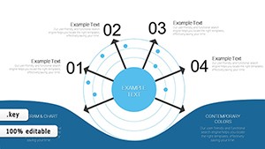 (49)
(49) Free Radar Charts Keynote Template - Instant Download | ImagineLayoutID: #KC00646free
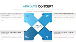 (97)
Arrows Concept Keynote Chart - Free Editable Keynote | ImagineLayoutID: #KC00643free
(97)
Arrows Concept Keynote Chart - Free Editable Keynote | ImagineLayoutID: #KC00643free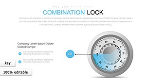 (40)
Combination Lock Keynote Chart - Free Editable Keynote | ImagineLayoutID: #KC00641free
(40)
Combination Lock Keynote Chart - Free Editable Keynote | ImagineLayoutID: #KC00641free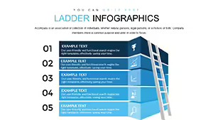 (372)
Ladder Infographic Keynote Chart - Free Editable Keynote | ImagineLayoutID: #KC00640free
(372)
Ladder Infographic Keynote Chart - Free Editable Keynote | ImagineLayoutID: #KC00640free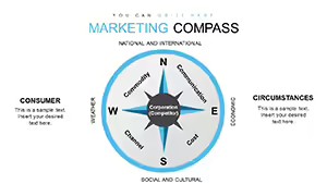 (885)
(885) Marketing Compass Keynote Charts - Fully Editable | ImagineLayoutID: #KC00638free
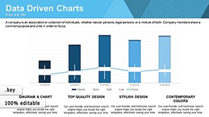 (872)
Data Driven Charts Keynote Template - Instant Download | ImagineLayoutID: #KC00637free
(872)
Data Driven Charts Keynote Template - Instant Download | ImagineLayoutID: #KC00637free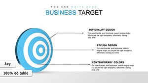 (358)
Business Target Keynote Charts - Fully Editable | ImagineLayoutID: #KC00636free
(358)
Business Target Keynote Charts - Fully Editable | ImagineLayoutID: #KC00636free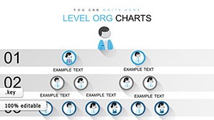 (705)
Organizational Keynote Chart Template - Instant Download | ImagineLayoutID: #KC00635free
(705)
Organizational Keynote Chart Template - Instant Download | ImagineLayoutID: #KC00635free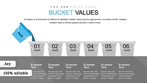 (255)
Bucket Creative Keynote Charts - Editable Keynote | ImagineLayoutID: #KC00634free
(255)
Bucket Creative Keynote Charts - Editable Keynote | ImagineLayoutID: #KC00634free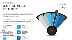 (230)
(230) KPI Gauges Keynote Charts - Fully Editable | ImagineLayoutID: #KC00632free
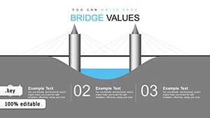 (1120)
Bridge Value Keynote Charts - Instant Download | ImagineLayoutID: #KC00631free
(1120)
Bridge Value Keynote Charts - Instant Download | ImagineLayoutID: #KC00631free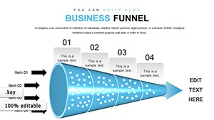 (148)
Business Funnel Keynote Charts - Fully Editable | ImagineLayoutID: #KC00627free
(148)
Business Funnel Keynote Charts - Fully Editable | ImagineLayoutID: #KC00627free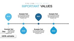 (300)
Timeline Concept Keynote Charts - Instant Download | ImagineLayoutID: #KC00626free
(300)
Timeline Concept Keynote Charts - Instant Download | ImagineLayoutID: #KC00626free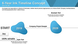 (783)
Ink Timelines Keynote Charts - Fully Editable | ImagineLayoutID: #KC00624free
(783)
Ink Timelines Keynote Charts - Fully Editable | ImagineLayoutID: #KC00624free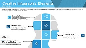 (18)
Creative Matrix Keynote Charts - Editable KEY | ImagineLayoutID: #KC00622free
(18)
Creative Matrix Keynote Charts - Editable KEY | ImagineLayoutID: #KC00622free (133)
Infographic Concepts Keynote Charts - Editable KEY | ImagineLayoutID: #KC00621free
(133)
Infographic Concepts Keynote Charts - Editable KEY | ImagineLayoutID: #KC00621free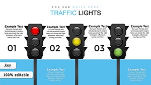 (714)
Traffic Lights Keynote Charts - Editable KEY | ImagineLayoutID: #KC00619free
(714)
Traffic Lights Keynote Charts - Editable KEY | ImagineLayoutID: #KC00619free (244)
Free Process Description Keynote Charts TemplateID: #KC00616free
(244)
Free Process Description Keynote Charts TemplateID: #KC00616free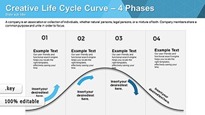 (977)
Life Cycle Curve Keynote Charts TemplateID: #KC00615free
(977)
Life Cycle Curve Keynote Charts TemplateID: #KC00615free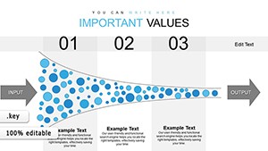 (746)
Keynote Charts Template - Instant Download | ImagineLayoutID: #KC00614free
(746)
Keynote Charts Template - Instant Download | ImagineLayoutID: #KC00614free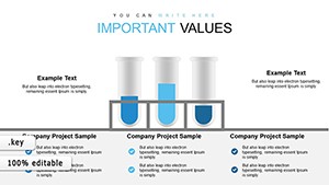 (116)
Chemical Test Keynote Charts - Instant Download | ImagineLayoutID: #KC00613free
(116)
Chemical Test Keynote Charts - Instant Download | ImagineLayoutID: #KC00613free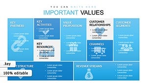 (1145)
Business Model Canvas Keynote - Fully Editable | ImagineLayoutID: #KC00612free
(1145)
Business Model Canvas Keynote - Fully Editable | ImagineLayoutID: #KC00612free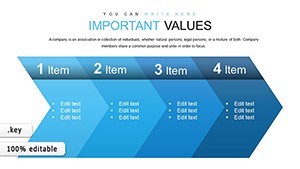 (668)
Chevron Steps Keynote Charts - Editable Keynote | ImagineLayoutID: #KC00611free
(668)
Chevron Steps Keynote Charts - Editable Keynote | ImagineLayoutID: #KC00611free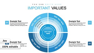 (732)
Sector Circle Keynote Charts - Fully Editable | ImagineLayoutID: #KC00610free
(732)
Sector Circle Keynote Charts - Fully Editable | ImagineLayoutID: #KC00610free (239)
Free Christmas Keynote Charts Template: Sparkle Up Your Holiday PresentationsID: #KC00430free
(239)
Free Christmas Keynote Charts Template: Sparkle Up Your Holiday PresentationsID: #KC00430free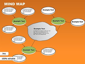 (678)
Free Mind Map Keynote Template: Ignite Ideas with Visual BrillianceID: #KC00070free
(678)
Free Mind Map Keynote Template: Ignite Ideas with Visual BrillianceID: #KC00070free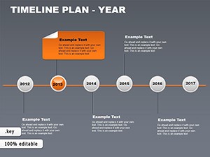 (695)
Yearly Timeline Plan Keynote Template - FreeID: #KC00069free
(695)
Yearly Timeline Plan Keynote Template - FreeID: #KC00069free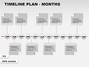 (132)
Free Monthly Timeline Keynote Charts - Download NowID: #KC00068free
(132)
Free Monthly Timeline Keynote Charts - Download NowID: #KC00068free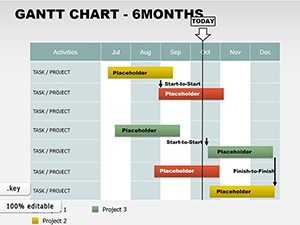 (387)
6-Month Gantt Keynote Template - Free & EditableID: #KC00067free
(387)
6-Month Gantt Keynote Template - Free & EditableID: #KC00067free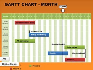 (1000)
Monthly Gantt Keynote Charts - Instant Download | ImagineLayoutID: #KC00066free
(1000)
Monthly Gantt Keynote Charts - Instant Download | ImagineLayoutID: #KC00066free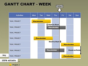 (1138)
Free Weekly Gantt Keynote Template: Master Short-Term Projects with EaseID: #KC00065free
(1138)
Free Weekly Gantt Keynote Template: Master Short-Term Projects with EaseID: #KC00065free
How Gantt Charts Structure Project Updates for Cross-Functional Teams
When a product manager needs to show timeline slippage to engineering and leadership in the same room, a well-structured Gantt slide does more than list dates - it visually separates critical path items from supporting tasks. The template keeps the bar heights proportional and the milestone diamonds aligned so no one has to ask which items are at risk.
Real-World Moments These Charts Actually Solve
A sales director walks into the monthly pipeline review carrying last week's funnel numbers. The funnel chart template already stacks stages with the correct percentage labels so the conversation stays on win probability instead of slide alignment.
A strategy lead presents a priority matrix to the executive team. The quadrant layout forces every initiative into one of four clear boxes, eliminating the vague "important but not urgent" discussion that usually eats half the meeting.
An HR business partner runs a training session on organizational structure. The org chart template scales automatically when new departments are added, keeping names readable even on the 60-inch conference screen.
A data analyst prepares the monthly KPI dashboard for the CFO. The gauge and radar slides update with one data paste and maintain the same visual language the leadership team has seen for the past eight quarters.
What a Blank Slide Actually Costs You in a Recurring Deck
Every time you start a new chart in Keynote you must set the axis scale, choose the color palette that matches the deck master, align the legend, and ensure the font size works at 16:9. Those five minutes per chart multiply across a 30-slide deck and suddenly your thinking time is gone. The templates already solved those decisions.
How the Slide Master Keeps Charts Consistent Across 60 Slides
Keynote's slide master stores the chart style, font stack, and color overrides. Once you apply the template master, every new slide you insert inherits the same formatting. No more fixing one bar chart only to discover the next funnel uses the wrong accent color.
Navigation Advice for Related Chart and Presentation Needs
If your deck also needs full presentation layouts, the Keynote templates give you complete decks that already contain these charts. For PowerPoint users the free PowerPoint chart templates deliver the same structures in PPTX format. When you need diagrams instead of charts, the Keynote diagram templates round out the set.
Mid-content CTAGrab the free Keynote chart that fits your next review.
Do these free Keynote chart templates work in the latest version of Apple Keynote?
Yes. All files were created and tested in Keynote version 14 and open without compatibility warnings in version 13 or newer. The charts use native Keynote chart objects so data updates instantly when you paste new values. Embedded fonts are included so the file looks identical when opened on any Mac.
Can I export these charts to PowerPoint or PDF without losing formatting?
Exporting to PDF preserves every line weight, label position, and color exactly as seen in Keynote. When exporting to PowerPoint the native charts convert to editable objects in most cases; if any conversion issue appears you can simply copy the chart object and paste it as an image or re-link the data in PowerPoint - the original Keynote file remains untouched.
Are the charts fully editable or do I have to replace them with new ones?
Every chart is built with native Keynote chart objects. You can change titles, data series, colors, and axis labels directly inside the chart editor. The placeholder data is already grouped so swapping in your numbers takes seconds.
How do I change the aspect ratio if my deck is 4:3 instead of 16:9?
Open the slide master, select the chart placeholder, and resize it to the 4:3 proportions. Because the chart elements are vector-based the labels and bars scale cleanly. Save the master and the change applies to every slide that uses that layout.