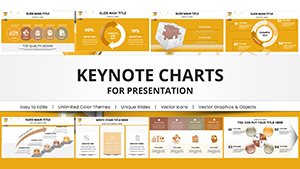
Timelines Keynote Charts
Formerly known as timelines keynote charts templates - this collection now covers Keynote timeline templates that combine clean markers with flexible date scaling.
A project manager updating the product roadmap for the steering committee can adjust milestones directly without redrawing arrows each quarter.
These files prioritize sequence clarity. A consultant illustrating historical events or an HR lead showing policy rollout phases inserts dates and text instantly. Download the template that matches your timeline length.
 (1181)
 Project Timeline Keynote Charts Template - Plan & PresentID: #KC00942$25.00
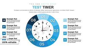 (215)
(215) Test Timer Keynote Charts for Precise Time ManagementID: #KC00874$15.00
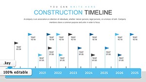 (1071)
 Construction Timeline Keynote Charts - 42 Editable SlidesID: #KC00864$18.00
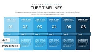 (589)
Tube Timeline Keynote Charts: Bring Sequences to LifeID: #KC00855$15.00
(589)
Tube Timeline Keynote Charts: Bring Sequences to LifeID: #KC00855$15.00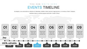 (613)
Events Timeline Keynote Charts: Transform Your Presentations with Dynamic InfographicsID: #KC00838$13.00
(613)
Events Timeline Keynote Charts: Transform Your Presentations with Dynamic InfographicsID: #KC00838$13.00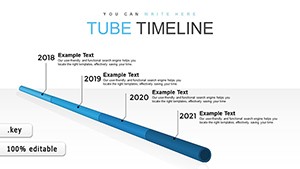 (94)
Pipe Timeline Keynote Chart TemplateID: #KC00815$12.00
(94)
Pipe Timeline Keynote Chart TemplateID: #KC00815$12.00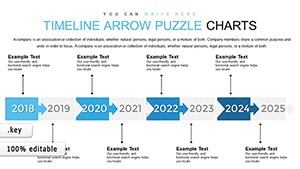 (219)
Dynamic Timeline Arrow Keynote Charts Template for PresentationID: #KC00797$18.00
(219)
Dynamic Timeline Arrow Keynote Charts Template for PresentationID: #KC00797$18.00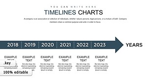 (471)
Timelines Work Keynote Charts TemplateID: #KC00756$15.00
(471)
Timelines Work Keynote Charts TemplateID: #KC00756$15.00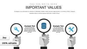 (48)
(48) Steps to Action Campaign Keynote Charts - Editable KeynoteID: #KC00723$15.00
 (904)
Banking Keynote Charts Template - Editable | ImagineLayoutID: #KC00703$24.00
(904)
Banking Keynote Charts Template - Editable | ImagineLayoutID: #KC00703$24.00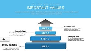 (406)
Keynote Problem Solving Charts - Editable Keynote | ImagineLayoutID: #KC00702$23.00
(406)
Keynote Problem Solving Charts - Editable Keynote | ImagineLayoutID: #KC00702$23.00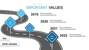 (189)
Roadmap Keynote Charts - Fully Editable | ImagineLayoutID: #KC00630$14.00
(189)
Roadmap Keynote Charts - Fully Editable | ImagineLayoutID: #KC00630$14.00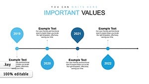 (300)
Timeline Concept Keynote Charts - Instant Download | ImagineLayoutID: #KC00626free
(300)
Timeline Concept Keynote Charts - Instant Download | ImagineLayoutID: #KC00626free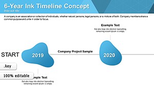 (783)
Ink Timelines Keynote Charts - Fully Editable | ImagineLayoutID: #KC00624free
(783)
Ink Timelines Keynote Charts - Fully Editable | ImagineLayoutID: #KC00624free (639)
Economic Analysis Keynote Charts Template: Transform Data into Actionable InsightsID: #KC00607$17.00
(639)
Economic Analysis Keynote Charts Template: Transform Data into Actionable InsightsID: #KC00607$17.00 (862)
Business Process Modeling Keynote ChartsID: #KC00589$17.00
(862)
Business Process Modeling Keynote ChartsID: #KC00589$17.00 (1126)
Evolve with Ease: Business Process Management Keynote Charts in MotionID: #KC00550$17.00
(1126)
Evolve with Ease: Business Process Management Keynote Charts in MotionID: #KC00550$17.00 (163)
Process Timeline Keynote Charts: Chart Your Journey to EfficiencyID: #KC00545$13.00
(163)
Process Timeline Keynote Charts: Chart Your Journey to EfficiencyID: #KC00545$13.00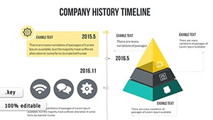 (994)
History Maker Keynote Timeline Charts TemplateID: #KC00518$18.00
(994)
History Maker Keynote Timeline Charts TemplateID: #KC00518$18.00 (141)
Company Timeline Keynote Charts Template: Visualize Your Business JourneyID: #KC00514$18.00
(141)
Company Timeline Keynote Charts Template: Visualize Your Business JourneyID: #KC00514$18.00 (1188)
Create Timeline Keynote ChartsID: #KC00501$18.00
(1188)
Create Timeline Keynote ChartsID: #KC00501$18.00 (499)
Project Timeline Keynote Charts TemplateID: #KC00500$20.00
(499)
Project Timeline Keynote Charts TemplateID: #KC00500$20.00 (559)
Company Timeline Keynote Charts - Instant Download | ImagineLayoutID: #KC00498$20.00
(559)
Company Timeline Keynote Charts - Instant Download | ImagineLayoutID: #KC00498$20.00 (385)
Timeline Maker Keynote Charts: Sequence Your Architectural MasterpiecesID: #KC00497$21.00
(385)
Timeline Maker Keynote Charts: Sequence Your Architectural MasterpiecesID: #KC00497$21.00 (763)
Strategic Planning Keynote Template - Fully Editable Charts & Instant DownloadID: #KC00495$22.00
(763)
Strategic Planning Keynote Template - Fully Editable Charts & Instant DownloadID: #KC00495$22.00 (62)
Optimizing Performance Keynote Charts: Elevate Architectural MetricsID: #KC00491$18.00
(62)
Optimizing Performance Keynote Charts: Elevate Architectural MetricsID: #KC00491$18.00 (874)
Dynamic Model Animation Charts in KeynoteID: #KC00460$18.00
(874)
Dynamic Model Animation Charts in KeynoteID: #KC00460$18.00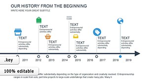 (1129)
Bring History to Life: History Timeline Keynote Charts TemplateID: #KC00453$12.00
(1129)
Bring History to Life: History Timeline Keynote Charts TemplateID: #KC00453$12.00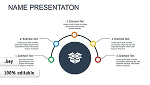 (118)
Functional Keynote Charts - Ready to Present | ImagineLayoutID: #KC00442$16.00
(118)
Functional Keynote Charts - Ready to Present | ImagineLayoutID: #KC00442$16.00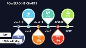 (1166)
Decisive Definition Keynote Charts: Unlock Impactful InfographicsID: #KC00417$20.00
(1166)
Decisive Definition Keynote Charts: Unlock Impactful InfographicsID: #KC00417$20.00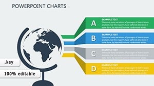 (1079)
Tactical Precision: Elevate Your Planning with Keynote ChartsID: #KC00374$17.00
(1079)
Tactical Precision: Elevate Your Planning with Keynote ChartsID: #KC00374$17.00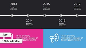 (713)
Dark Infographic Mastery: Business Keynote ChartsID: #KC00364$14.00
(713)
Dark Infographic Mastery: Business Keynote ChartsID: #KC00364$14.00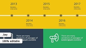 (983)
Dynamic Timeline Keynote Charts - Free DownloadID: #KC00363$14.00
(983)
Dynamic Timeline Keynote Charts - Free DownloadID: #KC00363$14.00
How Keynote Timeline Charts Support Iterative Planning
Keynote`s native chart tools lack built-in milestone connectors. These templates provide pre-linked markers that move together when you drag a date, keeping every arrow and label in sync across Mac and iPad.
Four Business Contexts Where Timeline Templates Accelerated Delivery
A construction project lead presented the 18-month build schedule to investors. The editable markers let the team shift phases live during the meeting without breaking connections.
An events coordinator mapped a conference agenda with parallel tracks. The dual-line timelines showed speaker slots and break times on one slide for the venue team.
A software product manager visualized feature releases for the board. Color-coded markers distinguished beta, launch, and support phases without manual line drawing.
A marketing director tracked campaign phases over six months. The timeline chart exported cleanly to PDF for the printed executive summary.
Time Saved Versus Building Timelines Manually in Keynote
You skip the 30 minutes spent aligning arrowheads, the hour testing date label spacing at different zoom levels, and the rework when stakeholders move one milestone and every connector needs adjustment.
Practical Workflow Tip for Recurring Quarterly Updates
Duplicate the master timeline slide each quarter, update the date text, and Keynote`s auto-alignment keeps the markers proportional. Share the .key file via iCloud and every team member sees the same layout regardless of device.
Technical Detail About Animation Behavior in Keynote
Apply the "Build In" effect to individual markers rather than the entire group. This lets milestones appear sequentially during the presentation while the connecting line remains static, preventing the jitter that occurs when animating large grouped objects.
What Makes These Timeline Templates Corporate-Ready
Maximum editing freedom, no decorative flourishes, and full compatibility with all current Keynote versions on Mac and iPad. The markers and lines remain vector-sharp on export to PDF or when presented on external displays.
For shape-based data containers see our PowerPoint shape templates. When you need icon flows try the PowerPoint diagram templates. For branding collateral the business card templates use matching geometric styling.
Open the timeline file that matches your project length and adjust the dates.
FAQ
Can I open these Keynote timeline templates on Windows?
Keynote files require the Keynote application. Export to PowerPoint format from within Keynote for Windows users; the markers and lines convert to native shapes with full editability. Test the export on your target machine before the presentation.
Do the timelines support custom date formats?
Yes, all text fields are standard Keynote text boxes. Change the date format in the inspector and the markers reposition automatically to maintain spacing.
Are animations preserved when exporting to PDF?
PDF export from Keynote captures the static layout only. For animated presentations share the .key file or record the slideshow as a video.
Can multiple team members edit the same file simultaneously?
Store the .key file in iCloud Drive or a shared folder. Keynote`s collaboration features allow real-time edits from different devices while preserving marker connections.