Dynamic Timeline Arrow Keynote Charts Template for Presentation


Type: Keynote Charts template
Category: Timelines
Sources Available: .key
Product ID: KC00797
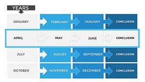
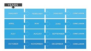
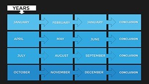
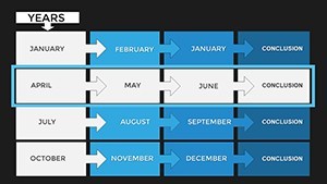
Template incl.: 26 editable slides
Time is the backbone of every great story, and in professional presentations, conveying it effectively can mean the difference between confusion and clarity. Enter our Dynamic Timeline Arrow Keynote Charts Template - a game-changer for anyone needing to illustrate project progress, historical events, or future roadmaps with precision and style. With 26 editable slides dedicated to arrow-themed timelines, this template is crafted for executives charting corporate strategies, educators outlining historical narratives, and creatives mapping out campaign phases. Forget bland bullet points; these dynamic arrows guide your audience through sequences effortlessly, highlighting key milestones with visual flair. The modern design blends functionality with aesthetics, ensuring your slides not only inform but inspire. Whether you're pitching to stakeholders or teaching a class, this template transforms complex timelines into engaging visuals, boosting comprehension and retention. Dive in and discover how a simple arrow can propel your ideas forward.
Unpacking the Features That Drive Dynamic Storytelling
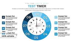
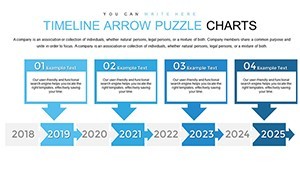
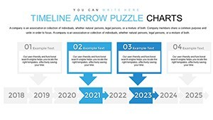
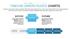
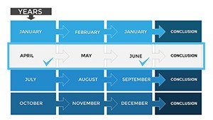
This template's strength lies in its versatile features, all centered around arrow timelines that adapt to any narrative. Each of the 26 slides offers unique variations, from straight-line progressions to curved paths symbolizing flexible journeys. Editable elements include adjustable arrow lengths, color gradients for phase differentiation, and text boxes for annotations. Categorize your content under timelines, with options for horizontal, vertical, or even spiral layouts to suit different screen orientations. Built-in icons enhance visual appeal - think clocks for deadlines or flags for achievements - all scalable without loss of quality. The template supports Keynote's animation capabilities, allowing arrows to "grow" as you reveal steps, creating a sense of motion. Compatibility extends to iOS devices, making it perfect for on-the-go edits. Unlike basic Keynote defaults, these charts incorporate data-linking features, pulling in dates from calendars or spreadsheets for automatic updates. This level of detail ensures your timelines are not just static displays but living documents that evolve with your project.
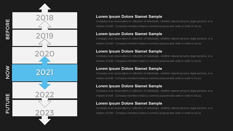
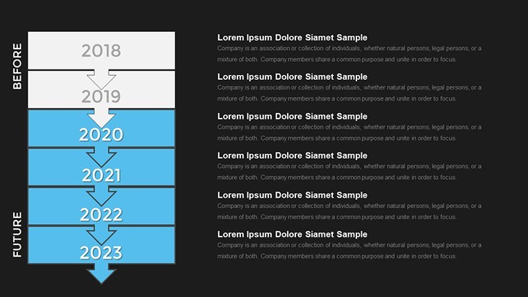
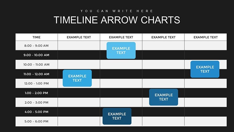
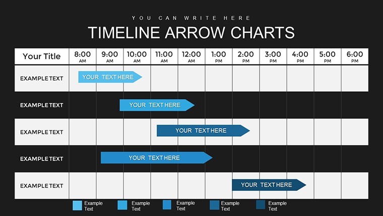
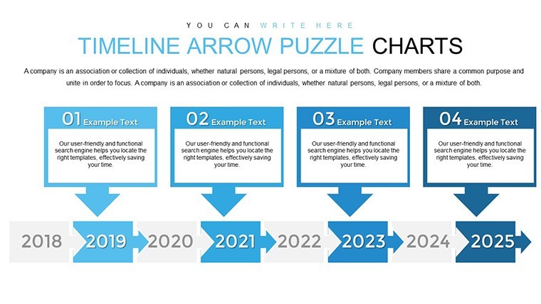
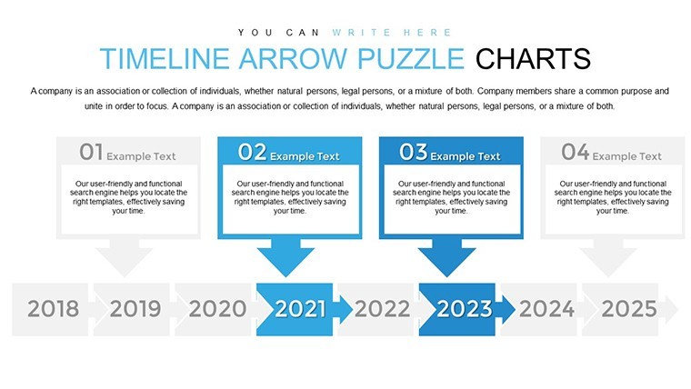
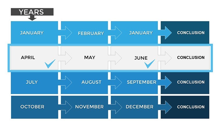
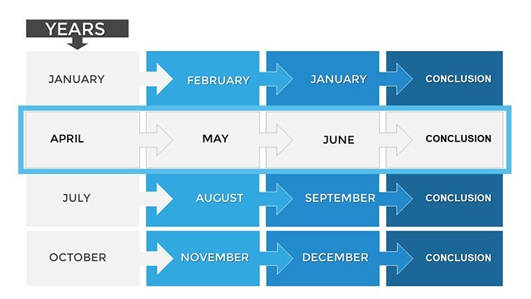
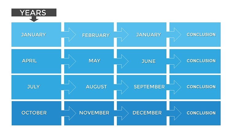
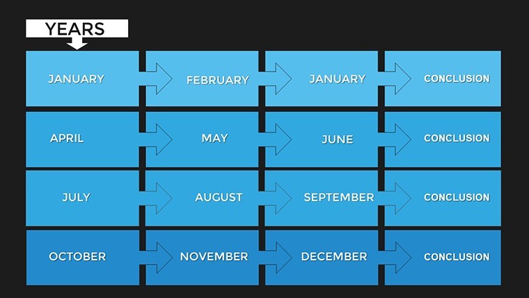
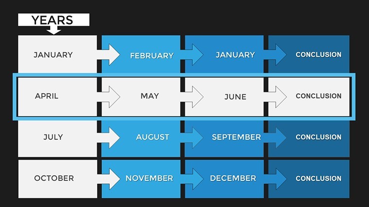
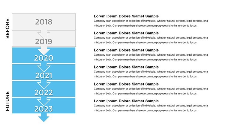
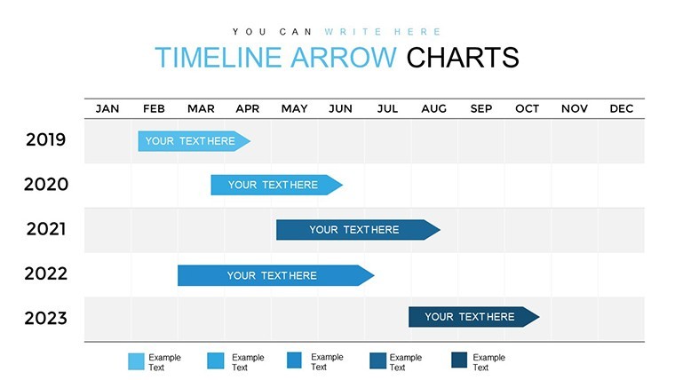
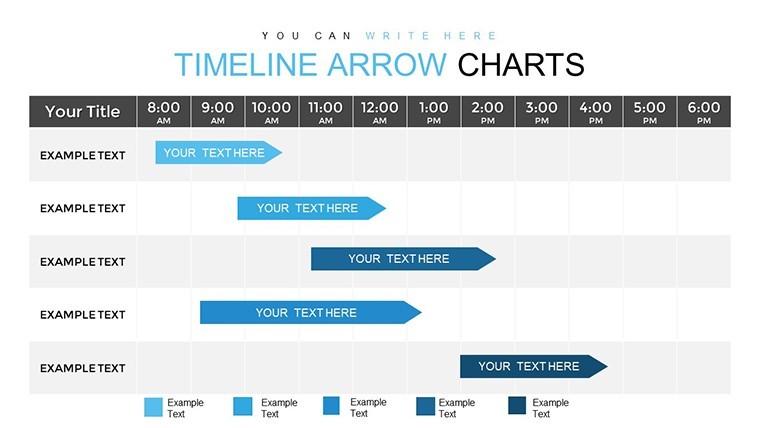
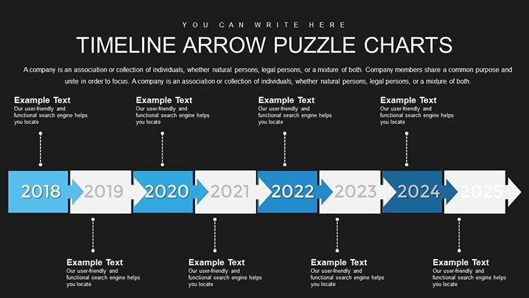
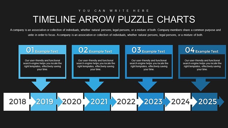
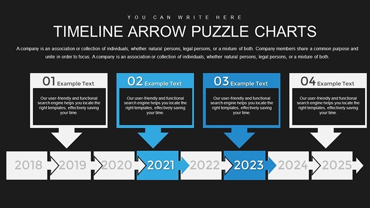
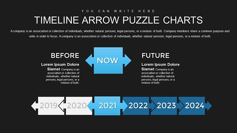
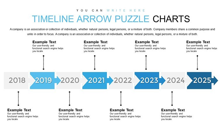
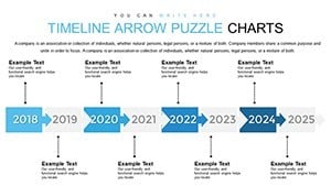
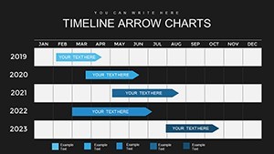
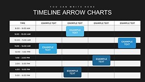
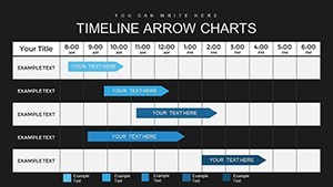
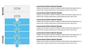
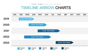
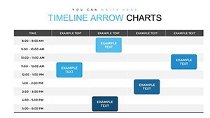
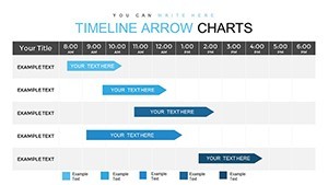
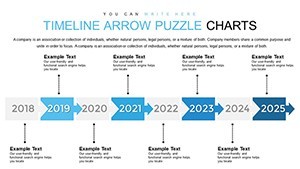
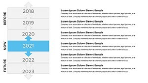
A Slide-by-Slide Journey Through Time
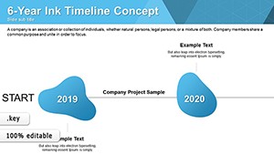
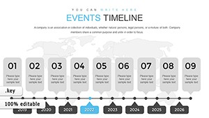
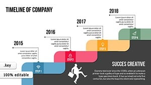
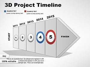
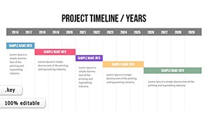
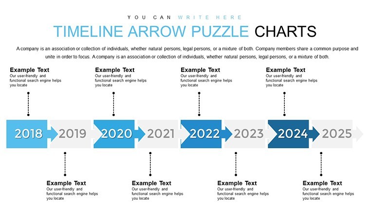
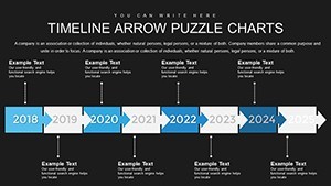
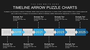
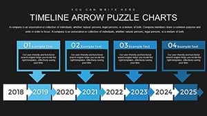
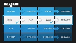
Breaking it down, Slide 1 introduces a master timeline overview, with branching arrows for sub-projects - ideal for complex initiatives like product launches. Slides 2-7 focus on linear progressions, featuring Gantt-style elements with draggable bars for duration adjustments. For historical contexts, slides 8-12 offer annotated arrows with photo placeholders, allowing integration of images from events like company milestones. Creative twists appear in slides 13-18, with zigzag arrows representing challenges and triumphs, inspired by storytelling arcs from narrative experts like Joseph Campbell. Project management shines in slides 19-23, incorporating resource allocation markers and dependency links. The final slides, 24-26, provide summary views with zoomable details for in-depth reviews. Each includes tooltips for hover explanations in presentation mode, enhancing interactivity. This comprehensive breakdown means you have a tool for every timeline need, from quick overviews to detailed breakdowns.
Practical Applications Across Industries
Envision a marketing director using this template to map a year-long campaign: Arrows delineate phases from ideation to evaluation, with metrics overlaid for ROI tracking - mirroring successful strategies from brands like Nike's product rollouts. In education, history teachers animate timelines of world events, making lessons interactive and memorable, as supported by studies from the Journal of Educational Psychology on visual aids. For software developers, agile sprints are visualized with iterative arrows, aligning with Scrum principles and reducing miscommunication in teams. Event planners benefit too, charting wedding timelines or conference schedules with customizable icons for vendors and deadlines. Drawing from real-world examples, like how NASA uses similar visualizations for mission planning, this template adapts to high-stakes environments. Its flexibility encourages cross-industry use, from non-profits tracking grant cycles to freelancers outlining client deliverables, always emphasizing clarity to drive better outcomes.
Tailoring Timelines to Fit Your Vision
Personalization is effortless here. Begin by selecting a base arrow style and resizing to fit your slide ratio - 16:9 for widescreen or 4:3 for traditional. Change arrow colors to reflect urgency: red for critical paths, green for completed phases. Embed hyperlinks to external documents, like project charters, for deeper dives. For collaborative work, utilize Keynote's comment features on arrows to gather team input. Add multimedia: Insert videos of key events along the timeline for immersive experiences. If exporting, convert to PowerPoint format while preserving most animations. A handy tip: Use the template's grid alignment for perfect symmetry, avoiding common design pitfalls noted by experts like Garr Reynolds in "Presentation Zen." This customization empowers you to create timelines that resonate personally, turning data into compelling stories.
Proven Strategies for Timeline Presentation Success
From my experience optimizing presentations for impact, the key is balance: Avoid overcrowding arrows with too much text - stick to keywords and let visuals speak. Incorporate contrast principles from color theory to make milestones pop. Practice pacing: Reveal timeline segments one by one to build anticipation. For virtual audiences, ensure arrows are legible on smaller screens by testing zoom levels. Gather feedback post-presentation using tools like Poll Everywhere integrated via links. Align with cognitive load theory by chunking information, as recommended in multimedia learning research by Richard Mayer. These strategies, honed through years of copywriting for digital tools, ensure your timelines not only convey information but also engage emotionally, fostering lasting impressions.
Elevate Your Narratives Today
Why settle for ordinary when you can deliver extraordinary? This Dynamic Timeline Arrow Keynote Charts Template equips you with professional-grade tools to master time visualization. With its intuitive design and robust features, it's an investment in clearer communication and stronger results. Ready to arrow your way to success? Download and start crafting timelines that captivate.
Frequently Asked Questions
- What makes the arrow timelines dynamic?
- They support animations and data linking, allowing real-time updates and motion effects in presentations.
- Can I use this for non-project timelines?
- Yes, it's versatile for historical, personal, or educational timelines beyond business projects.
- How do I edit the arrow designs?
- Simply select elements in Keynote to adjust shapes, colors, and add custom icons or text.
- Is it compatible with older Keynote versions?
- It works with recent versions, but check for full animation support on updates.
- What industries benefit most from this template?
- Marketing, education, project management, and creative fields see the greatest impact.
- Can I export to other formats?
- Export to PDF, PowerPoint, or images while retaining core designs.