Relationship Keynote Charts
These Keynote files deliver ready-made layouts for showing how people, processes or data sets relate to one another. The charts arrive with consistent spacing, grouped shapes and color-coded relationship strength so the message lands immediately.
A strategy consultant facing a tight deadline for a client stakeholder mapping workshop can drop their list of contacts into the preset network diagram and finish the deck in the time it normally takes to align one arrow.
Open the file, swap the placeholder text and export - the structure stays intact.
 (15)
(15) Keynote Relationship Diagram Charts - Editable Keynote | ImagineLayoutID: #KC01115$14.00
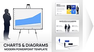 (16)
Business Silhouettes Keynote Charts - Editable | ImagineLayoutID: #KC01110$15.00
(16)
Business Silhouettes Keynote Charts - Editable | ImagineLayoutID: #KC01110$15.00 (15)
Project Tracking Keynote Charts - Editable | ImagineLayoutID: #KC01109$18.00
(15)
Project Tracking Keynote Charts - Editable | ImagineLayoutID: #KC01109$18.00 (15)
(15) Network Charts Keynote Template - Fully Editable 26 Slides | Instant Download | ImagineLayoutID: #KC01084$12.00
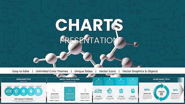 (8)
Chemical Charts Keynote Template - Fully Editable 47 Slides | Instant DownloadID: #KC01062$15.00
(8)
Chemical Charts Keynote Template - Fully Editable 47 Slides | Instant DownloadID: #KC01062$15.00 (8)
Architectural Keynote Charts Template - Fully Editable | Instant DownloadID: #KC01056$20.00
(8)
Architectural Keynote Charts Template - Fully Editable | Instant DownloadID: #KC01056$20.00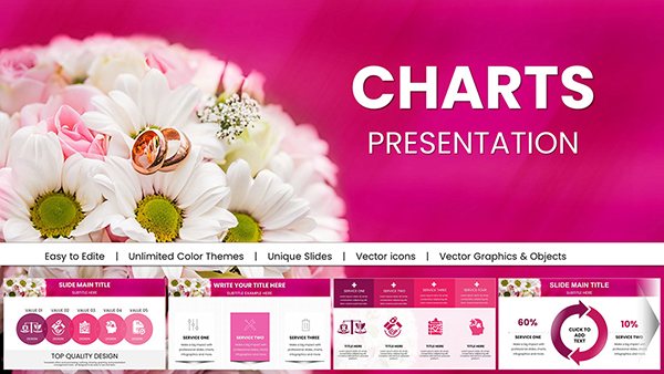 (11)
Wedding Keynote Charts Template: Weave Romance into Every DetailID: #KC01055$25.00
(11)
Wedding Keynote Charts Template: Weave Romance into Every DetailID: #KC01055$25.00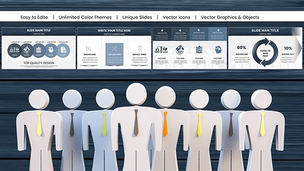 (10)
Psychology of Leadership Charts Keynote Template: Insightful Tools for Dynamic LeadersID: #KC01051$24.00
(10)
Psychology of Leadership Charts Keynote Template: Insightful Tools for Dynamic LeadersID: #KC01051$24.00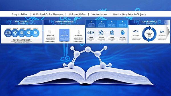 (11)
Chemistry Keynote Charts Template for ProsID: #KC01048$22.00
(11)
Chemistry Keynote Charts Template for ProsID: #KC01048$22.00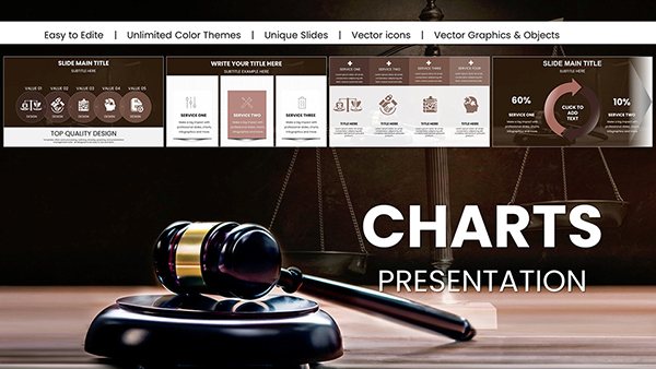 (16)
Professional Legal Keynote Charts Template: Build Winning Arguments VisuallyID: #KC01032$25.00
(16)
Professional Legal Keynote Charts Template: Build Winning Arguments VisuallyID: #KC01032$25.00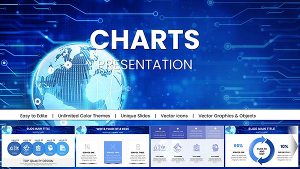 (818)
(818) Global Network Charts Keynote TemplateID: #KC01030$18.00
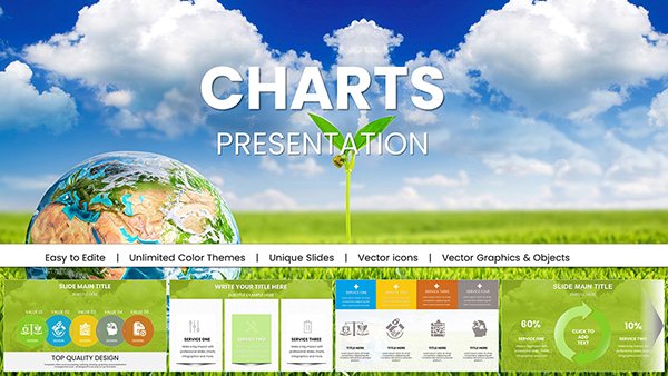 (392)
Stunning Eco Planet Charts Keynote TemplateID: #KC01029$18.00
(392)
Stunning Eco Planet Charts Keynote TemplateID: #KC01029$18.00 (71)
Binoculars Search Marketing Keynote Charts Template: Zoom In on InsightsID: #KC00979$18.00
(71)
Binoculars Search Marketing Keynote Charts Template: Zoom In on InsightsID: #KC00979$18.00 (331)
Travel-Themed Keynote Charts Template: Visualize Adventures with StyleID: #KC00970$20.00
(331)
Travel-Themed Keynote Charts Template: Visualize Adventures with StyleID: #KC00970$20.00 (1026)
Education-Focused Keynote Charts Pack: Spark Learning with VisualsID: #KC00968$20.00
(1026)
Education-Focused Keynote Charts Pack: Spark Learning with VisualsID: #KC00968$20.00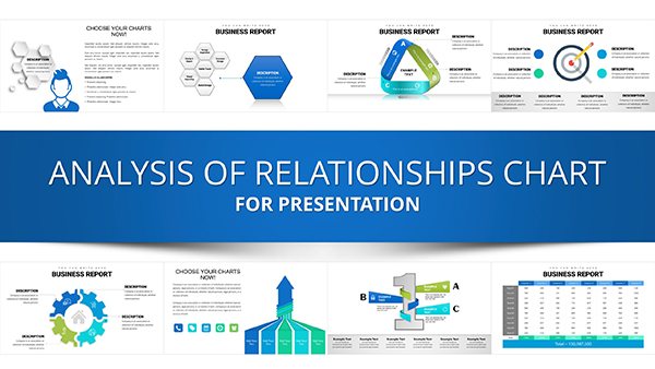 (347)
Analysis of Relationship Keynote Charts TemplateID: #KC00940$25.00
(347)
Analysis of Relationship Keynote Charts TemplateID: #KC00940$25.00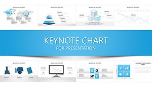 (591)
Communication Process Chart Keynote Template - Editable Messaging Flow DiagramsID: #KC00935$20.00
(591)
Communication Process Chart Keynote Template - Editable Messaging Flow DiagramsID: #KC00935$20.00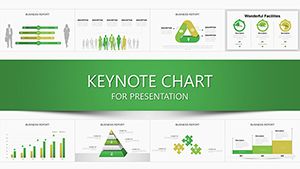 (1051)
Transform Data into Decisions with the Manager Chart Keynote TemplateID: #KC00926$24.00
(1051)
Transform Data into Decisions with the Manager Chart Keynote TemplateID: #KC00926$24.00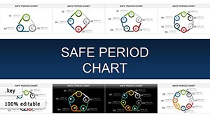 (1065)
Safe Period Charts for Keynote: Illuminating the Rhythms of ChangeID: #KC00903$20.00
(1065)
Safe Period Charts for Keynote: Illuminating the Rhythms of ChangeID: #KC00903$20.00 (1103)
Process Infographic Ideas Keynote Charts TemplateID: #KC00893$20.00
(1103)
Process Infographic Ideas Keynote Charts TemplateID: #KC00893$20.00 (498)
Drive Awareness with Preventing Sexual Violence Keynote TemplateID: #KC00879$15.00
(498)
Drive Awareness with Preventing Sexual Violence Keynote TemplateID: #KC00879$15.00 (676)
Business Needs - Challenges Keynote Charts for AnalysisID: #KC00869$15.00
(676)
Business Needs - Challenges Keynote Charts for AnalysisID: #KC00869$15.00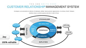 (1096)
Customer Relationship Management Keynote Charts: Revolutionize Your StrategyID: #KC00860$18.00
(1096)
Customer Relationship Management Keynote Charts: Revolutionize Your StrategyID: #KC00860$18.00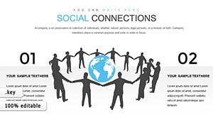 (1066)
Social Connections and Happiness: Keynote Template for Deeper InsightsID: #KC00844$14.00
(1066)
Social Connections and Happiness: Keynote Template for Deeper InsightsID: #KC00844$14.00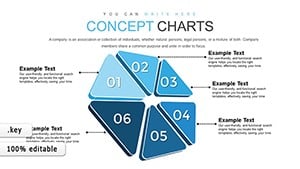 (674)
Momentum Concept Keynote Charts: 30 Editable SlidesID: #KC00834$12.00
(674)
Momentum Concept Keynote Charts: 30 Editable SlidesID: #KC00834$12.00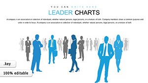 (331)
(331) Professional Leader Charts Template for KeynoteID: #KC00827$15.00
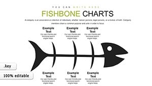 (1131)
Fishbone Keynote Charts - Fully Editable | ImagineLayoutID: #KC00799$15.00
(1131)
Fishbone Keynote Charts - Fully Editable | ImagineLayoutID: #KC00799$15.00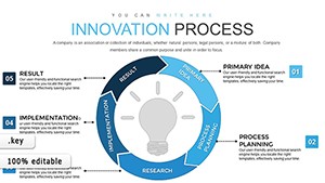 (838)
Innovation Process Steps Keynote Template: Fuel Your Business GrowthID: #KC00798$18.00
(838)
Innovation Process Steps Keynote Template: Fuel Your Business GrowthID: #KC00798$18.00 (818)
Houses for Sale and Rent Keynote Charts: Transform Your Real Estate PresentationsID: #KC00753$24.00
(818)
Houses for Sale and Rent Keynote Charts: Transform Your Real Estate PresentationsID: #KC00753$24.00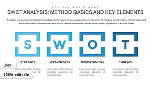 (1187)
SWOT Analysis Keynote Charts - Fully Editable | ImagineLayoutID: #KC00752$22.00
(1187)
SWOT Analysis Keynote Charts - Fully Editable | ImagineLayoutID: #KC00752$22.00 (668)
Vision Mission Strategy Charts - Editable | ImagineLayoutID: #KC00740$18.00
(668)
Vision Mission Strategy Charts - Editable | ImagineLayoutID: #KC00740$18.00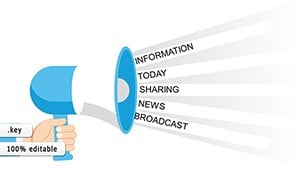 (535)
IT Processes Charts - Editable Keynote | ImagineLayoutID: #KC00738$19.00
(535)
IT Processes Charts - Editable Keynote | ImagineLayoutID: #KC00738$19.00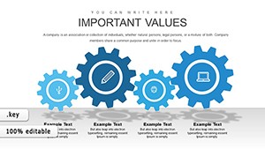 (699)
Employee Training Keynote Charts - Editable | ImagineLayoutID: #KC00715$15.00
(699)
Employee Training Keynote Charts - Editable | ImagineLayoutID: #KC00715$15.00
Why Relationship Visualization Changes How Audiences Follow Your Argument
When stakeholders see a clean network diagram instead of a bullet list, they instantly grasp who influences whom and where the leverage points sit. The layout carries part of the logic so your spoken explanation can focus on implications rather than description.
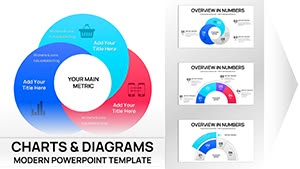
Matching Chart Type to the Relationship You Need to Show
Not every connection is the same. Use a matrix when you need to compare two sets of factors, a network diagram when you want to show multiple overlapping influences, and a flowchart when sequence matters more than strength. The collection gives you each style with matching slide masters so switching types keeps the visual language consistent.
Four Moments These Charts Have Saved Real Projects
A management consultant arrived at a two-day offsite with only the raw list of 35 stakeholders. By lunch the first day the team had built a full influence map using one of the network templates; the discussion shifted from confusion to concrete action plans.
An HR director rolling out a new reporting structure across 12 departments used the hierarchy chart to show every employee exactly where they sat; questions dropped by 70 percent once the visual was shared in the town hall.
A marketing lead negotiating partnership terms dropped the proposed alliance into a Venn diagram slide; the client immediately spotted the overlapping value and signed the memo of understanding the same week.
A finance analyst presenting portfolio risk connections replaced a 20-slide table with one matrix chart; the board asked follow-up questions about mitigation instead of asking for clarification on the data layout.
What You Lose When You Build These Charts Manually in Keynote
You lose the time spent deciding font sizes for labels that must stay readable at 16pt across 40 slides, the repeated grouping and ungrouping of arrows when one node moves, and the version-control headache when the color palette changes mid-project. The templates lock those decisions in place so the only variable left is your content.
Non-Obvious Editing Tricks Specific to These Relationship Files
Double-click any shape group to enter isolation mode and edit labels without disturbing connections. Use Keynote`s "Replace Image" command on the placeholder icons to keep the exact size and alignment. For multi-slide decks, copy the entire chart group to the slide master once and it will update everywhere when you change the master color scheme.
Keynote Technical Detail That Matters for Relationship Charts
When you embed these diagrams, Keynote`s vector shapes remain fully scalable even after export to PDF at 300 dpi. Keep the file under 15 MB by avoiding high-resolution background images; the built-in gradients are already optimized and will not bloat the deck when you add your own data.
What Sets This Collection Apart
Every layout was built by people who present to boards weekly. There is no decorative padding, no floating elements that break when resized, and no forced animations. The focus is on editing freedom and corporate readability from the first slide.
If you also work with health and wellness Keynote decks or need supporting consulting proposals in Word, these relationship charts slot directly into the same visual system without redesign. For farm-related visuals check the agriculture animals Word templates collection.
Ready to Map Your Next Set of Connections
Pick the chart style that matches your data, open the file and start editing. Your audience will thank you for the clarity.
Are these Keynote relationship chart templates compatible with the latest version of Keynote?
Yes, every file opens cleanly in Keynote 13 and newer on both Mac and iCloud. The vector shapes, grouped objects and master layouts remain fully editable. If you open an older file in the newest version you may see a one-time "update" prompt; after that all connections and smart guides behave exactly as designed. Export to PDF or PowerPoint keeps the relationship lines intact.
Can I share the downloaded files with my team?
Each license covers unlimited internal use within your organization. You can place the files on a shared drive or send them to colleagues for editing. The license does not allow resale or distribution outside your company. If you need a multi-seat corporate license, contact support for volume pricing.
Do the charts work in presentation mode with animations?
All connection lines and nodes are grouped objects, so you can apply Keynote`s "Build In" or "Build Out" animations to individual elements or the entire chart. The recommended approach is to reveal one relationship level at a time using the "Dissolve" transition on grouped layers; this keeps file size low and rendering smooth even on older MacBooks.
What happens if I need a custom relationship type not shown in the collection?
Every chart uses standard Keynote shapes and connectors. You can duplicate any slide, ungroup the objects and rebuild a new configuration in minutes. The included slide master also gives you blank relationship frames with the same styling so you stay consistent when extending the deck.
Is there a refund policy if the file does not open correctly?
If the download is corrupted or fails to open in your version of Keynote within the first 14 days, we replace the file immediately at no cost. The policy covers technical compatibility issues only; once you successfully open and edit the content the sale is final.