Spheres Keynote Charts
The collection features 3D sphere graphics, cycle charts, cyclical pie representations and abstract spherical elements designed for Keynote. These help present data relationships and segmented information.
They target business executives, analysts, educators and marketing professionals who prepare materials for client meetings, conferences or investor updates.
Use these when your data involves volumes, overlaps or layered categories that benefit from spatial depth. Standard Keynote chart tools produce flat visuals that can hide relationships. Sphere-based options add dimension while remaining simple to edit.
In a marketing strategy session a sphere diagram can display overlapping customer segments or channel impacts so the team sees priorities at a glance. The visual supports faster decisions on resource allocation.
Explore the designs below to find the one that matches your data needs.
 (9)
(9) Cycle Charts Template for Keynote - 40 Fully Editable Slides | Instant DownloadID: #KC01083$14.00
 (11)
Cyclical Pie Charts Keynote Template - Fully Editable | Instant DownloadID: #KC01079$18.00
(11)
Cyclical Pie Charts Keynote Template - Fully Editable | Instant DownloadID: #KC01079$18.00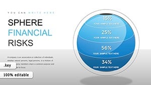 (495)
(495) Sphere Financial Risks Keynote Charts: Safeguard Your FutureID: #KC00859$17.00
 (1065)
 Positive and Negative Effects of Technology Keynote Charts TemplateID: #KC00561$20.00
 (405)
Transform Your Digital Strategies with Internet Marketing Keynote ChartsID: #KC00539$23.00
(405)
Transform Your Digital Strategies with Internet Marketing Keynote ChartsID: #KC00539$23.00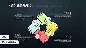 (58)
(58) TOP Creative Keynote Charts: Inspire InnovationID: #KC00488$24.00
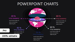 (1152)
World Development Indicators Keynote Charts: Mapping Global ProgressID: #KC00403$15.00
(1152)
World Development Indicators Keynote Charts: Mapping Global ProgressID: #KC00403$15.00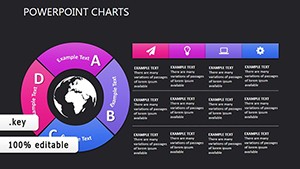 (912)
Social Relationships Keynote Charts: Mapping Human DynamicsID: #KC00377$15.00
(912)
Social Relationships Keynote Charts: Mapping Human DynamicsID: #KC00377$15.00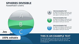 (385)
Spheres Divisible Keynote Charts: Visualize Investment Cash Flows with PrecisionID: #KC00289$22.00
(385)
Spheres Divisible Keynote Charts: Visualize Investment Cash Flows with PrecisionID: #KC00289$22.00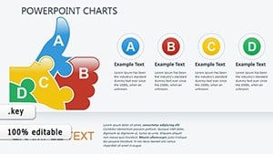 (734)
Quality Excellence: Sculpt Superior Narratives with 3D Keynote ChartsID: #KC00317$20.00
(734)
Quality Excellence: Sculpt Superior Narratives with 3D Keynote ChartsID: #KC00317$20.00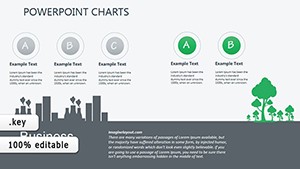 (926)
Eco-Impact Keynote Charts: Visualize Sustainability Like Never BeforeID: #KC00319$20.00
(926)
Eco-Impact Keynote Charts: Visualize Sustainability Like Never BeforeID: #KC00319$20.00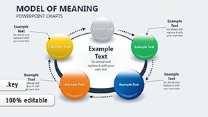 (1009)
Economic Models Keynote Charts for ArchitectsID: #KC00275$16.00
(1009)
Economic Models Keynote Charts for ArchitectsID: #KC00275$16.00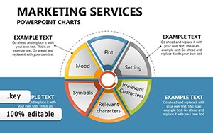 (812)
Marketing Plan Keynote Chart TemplateID: #KC00268$22.00
(812)
Marketing Plan Keynote Chart TemplateID: #KC00268$22.00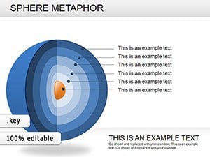 (84)
Sphere Metaphor Keynote Charts: Orbit Ideas in Stunning 3DID: #KC00238$23.00
(84)
Sphere Metaphor Keynote Charts: Orbit Ideas in Stunning 3DID: #KC00238$23.00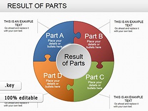 (284)
Pie Data Keynote Charts: Master Data Visualization with PrecisionID: #KC00236$20.00
(284)
Pie Data Keynote Charts: Master Data Visualization with PrecisionID: #KC00236$20.00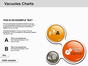 (344)
Strategic Vacuoles Keynote Charts TemplateID: #KC00207$15.00
(344)
Strategic Vacuoles Keynote Charts TemplateID: #KC00207$15.00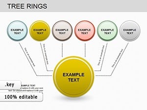 (114)
Tree Rings Keynote Charts: Reveal Nature's Timeless SecretsID: #KC00202$20.00
(114)
Tree Rings Keynote Charts: Reveal Nature's Timeless SecretsID: #KC00202$20.00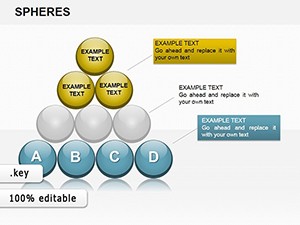 (70)
Analysis Spheres Keynote Charts: Master Complex Data VisualizationID: #KC00194$20.00
(70)
Analysis Spheres Keynote Charts: Master Complex Data VisualizationID: #KC00194$20.00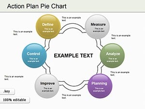 (483)
Action Plan Pie Charts Keynote TemplateID: #KC00187$23.00
(483)
Action Plan Pie Charts Keynote TemplateID: #KC00187$23.00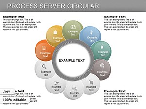 (97)
Circular Process Keynote Charts: Map Workflows in Elegant CyclesID: #KC00180$27.00
(97)
Circular Process Keynote Charts: Map Workflows in Elegant CyclesID: #KC00180$27.00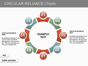 (115)
Circular Reliance Keynote Charts: Master Data Interdependence VisuallyID: #KC00157$15.00
(115)
Circular Reliance Keynote Charts: Master Data Interdependence VisuallyID: #KC00157$15.00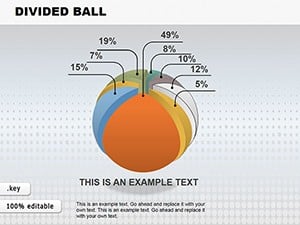 (960)
Spherical Divided Ball Keynote Charts - Fully Editable | ImagineLayoutID: #KC00149$22.00
(960)
Spherical Divided Ball Keynote Charts - Fully Editable | ImagineLayoutID: #KC00149$22.00 (799)
3D Sphere Charts: Revolutionize Data Segmentation in KeynoteID: #KC00132$22.00
(799)
3D Sphere Charts: Revolutionize Data Segmentation in KeynoteID: #KC00132$22.00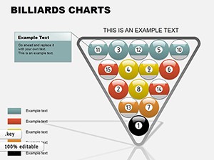 (1047)
Billiards Keynote Charts Template: Rack Up Your Data GameID: #KC00087$18.00
(1047)
Billiards Keynote Charts Template: Rack Up Your Data GameID: #KC00087$18.00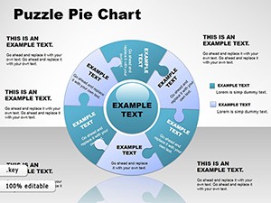 (227)
Puzzle Pie Charts Template for Keynote BusinessID: #KC00054$26.00
(227)
Puzzle Pie Charts Template for Keynote BusinessID: #KC00054$26.00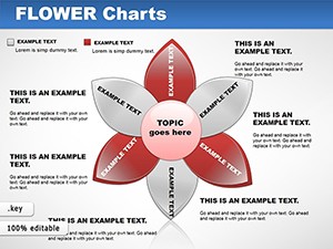 (1162)
Flower Keynote Charts: Bloom Your DataID: #KC00048$22.00
(1162)
Flower Keynote Charts: Bloom Your DataID: #KC00048$22.00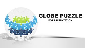 (121)
Infographic Globe Puzzle Charts for Keynote: Visualize Global Insights with EaseID: #KC00026$28.00
(121)
Infographic Globe Puzzle Charts for Keynote: Visualize Global Insights with EaseID: #KC00026$28.00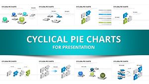 (889)
3D Puzzle Spheres Keynote Template: Puzzle Together Persuasive PresentationsID: #KC00011$20.00
(889)
3D Puzzle Spheres Keynote Template: Puzzle Together Persuasive PresentationsID: #KC00011$20.00 (647)
Stunning 3D Sphere Charts for Keynote: Elevate Data to Eye-Catching HeightsID: #KC00016$22.00
(647)
Stunning 3D Sphere Charts for Keynote: Elevate Data to Eye-Catching HeightsID: #KC00016$22.00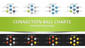 (911)
Network Charts Keynote Template - Fully Editable with Dynamic Animations | Instant Download | ImagineLayoutID: #KC00014$14.00
(911)
Network Charts Keynote Template - Fully Editable with Dynamic Animations | Instant Download | ImagineLayoutID: #KC00014$14.00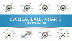 (251)
3D Cycle Charts Template for Keynote - 31 Dynamic Slides | Instant DownloadID: #KC00012$10.00
(251)
3D Cycle Charts Template for Keynote - 31 Dynamic Slides | Instant DownloadID: #KC00012$10.00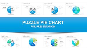 (1152)
Fully Editable Puzzle Pie Charts Keynote Template - 33 Dynamic SlidesID: #KC00007$18.00
(1152)
Fully Editable Puzzle Pie Charts Keynote Template - 33 Dynamic SlidesID: #KC00007$18.00
Use Cases
Business executives use sphere financial risks charts in investor pitches to map potential outcomes across market conditions. The 3D layout shows risk levels in concentric spheres so stakeholders grasp exposure at different layers. This format replaces dense tables and keeps attention on key metrics. The team can rotate the view during discussion for different angles.
Educators and researchers apply world development indicators charts in academic lectures to show global progress metrics. The spherical segments highlight regional comparisons and trends over time. Students follow the relationships more easily than line graphs. The diagram serves as a reference slide for follow-up questions.
Marketing professionals rely on positive and negative effects of technology charts during campaign planning workshops. The sphere elements illustrate balanced impacts across channels. The team discusses adjustments based on the visual balance. This leads to more nuanced strategy documents.
Public speakers employ social relationships charts in conference talks to map human dynamics and networks. The interconnected spheres display influence levels and connections clearly. Audience members retain the concepts longer due to the memorable structure. The slide supports Q&A by pointing to specific segments.
Comparison vs. default Keynote shapes or blank slides
Default Keynote charts stay two-dimensional and limit depth when showing layered data. Sphere templates provide built-in 3D perspective that highlights volume and overlap without extra work. Blank slides require manual creation of every sphere which risks inconsistent lighting and rotation. Templates maintain professional spacing and color harmony across all elements. The result is faster slide creation and stronger visual impact in Keynote presentations.
Best-practice advice for using the templates in this category
Choose the sphere layout that matches the data structure such as cyclical for repeating processes or segmented for category breakdowns. Limit labels to essential terms so the audience focuses on the overall pattern rather than reading details. Apply brand colors consistently to spheres and connectors for recognition. Preview the slide in presenter mode to check visibility from the back of the room. Update data values only in the designated fields to keep the 3D effects intact.
Technical tip specific to this category type
In Keynote select a sphere object then open the Format panel and adjust the 3D rotation and depth sliders to change perspective without breaking the layout. Group multiple spheres before applying uniform lighting effects so changes apply evenly. This approach works well for financial or relationship charts and keeps editing quick.
How ImagineLayout sphere chart templates differ from competitors
These templates are built around Keynote native 3D tools and include pre-configured rotation settings drawn from real business and academic use cases. Competitor files often require additional plugins or lose quality when edited. The designs here focus on data update points that let you swap numbers quickly. This integration with Keynote environment reduces setup time compared to generic options.
Choosing the right sphere chart for your presentation
Review your data type first: cyclical charts suit repeating flows while divisible spheres work for investment breakdowns. Count the segments needed and select a template with enough divisions. Consider the presentation environment so the 3D depth remains visible on the screen size. Insert sample data early to confirm the visual hierarchy supports your main message.
How do I download these templates?
Select the template preview you like then click the download button on its page. The file downloads as a Keynote package compatible with current macOS and iOS versions. Complete the secure checkout and the file becomes available instantly. Open it in Keynote and start adjusting text or data right away. The process requires no extra accounts or software.
Are the templates compatible with all Keynote versions?
The designs work with Keynote 10 and newer on recent macOS and iOS releases. They rely on standard 3D objects and charts that remain editable in supported versions. Test the file on your system if using an older release. The elements avoid features that could break in legacy builds. Reach out if you notice any rendering differences.
Can I customize colors, fonts and data points freely?
Every sphere, segment and label uses editable Keynote objects. Change fill colors, fonts and data values using the built-in inspectors. The 3D settings stay intact during edits. You can add or remove segments as your dataset changes. This gives full control to match your brand or content needs.
What licensing applies when using them in commercial presentations?
The license allows inclusion in client decks, internal reports and conference materials for your organization. Modify the slides and share the final output freely. Original template files cannot be resold or redistributed. The rights cover unlimited projects within one entity. Check the license file for any extra conditions on public distribution.
How do these templates compare to free Keynote options?
These include purpose-built 3D sphere configurations and industry examples that free files rarely provide. Free downloads often need manual fixes for depth and alignment in Keynote. The templates here are optimized for quick data swaps and come with direct support access. You spend less time troubleshooting and more time on content. The final slides deliver higher visual consistency.