Spherical Divided Ball Keynote Charts - Fully Editable | ImagineLayout


Package Contents
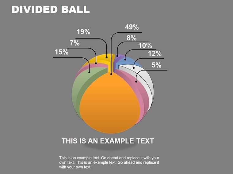
The download supplies 20 spherical divided ball chart slides.
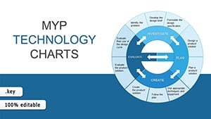
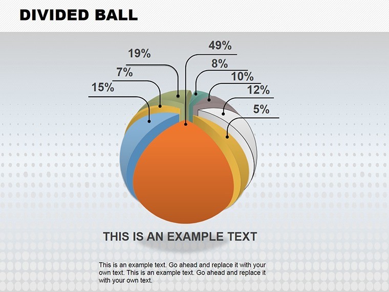
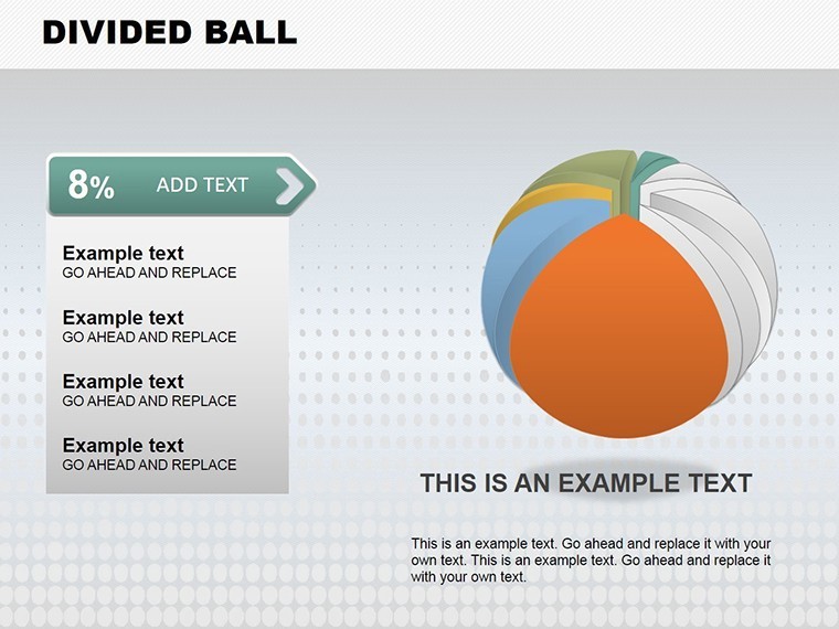
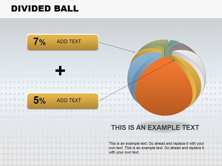
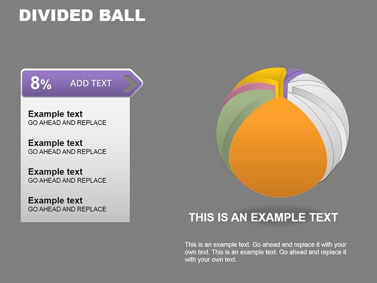
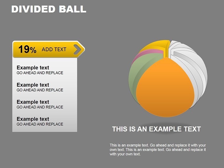
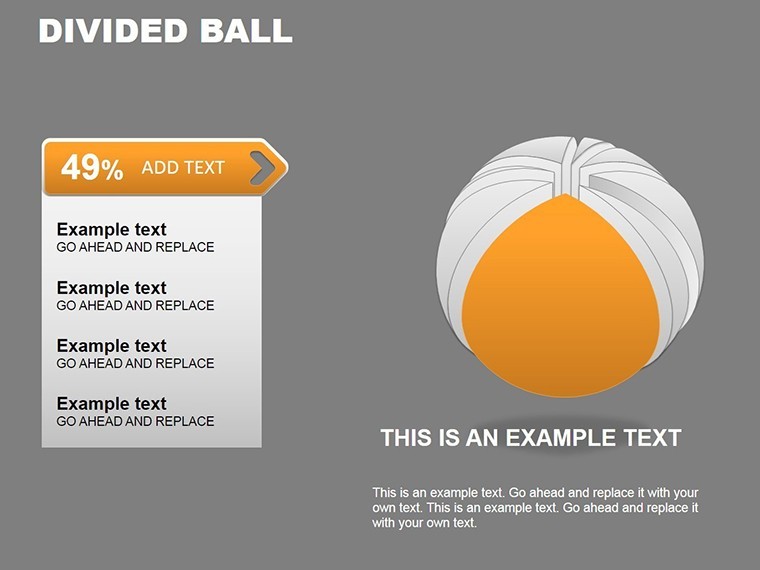
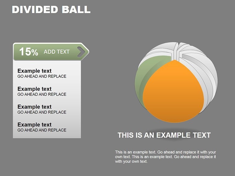
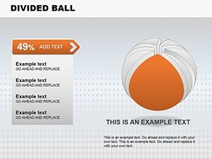
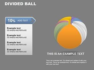
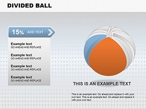
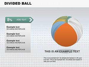
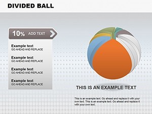
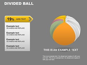
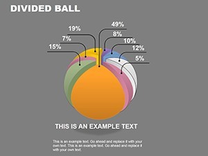
Quadrant to octant segmentation appears on each diagram.
One .key file covers the full set.
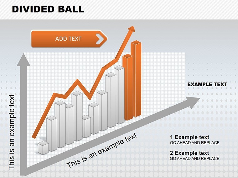
Spherical segmentation with quadrant division differentiates this from 3D Pyramid and Puzzle templates by supporting multifaceted trend analysis.
All charts load with editable zones.
At a Glance
| Feature | Details |
|---|---|
| Slides included | 20 spherical charts |
| Diagram categories | divided ball segmentation |
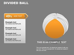
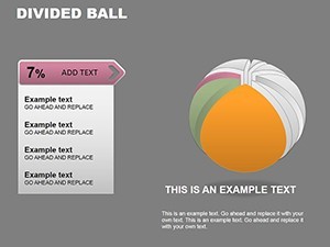
| Editable elements | segments resize independently |
| Aspect ratio | 16:9 widescreen |
| Keynote compatibility | version 12 and later |
| Color themes | master palette adjustments |
Color contrast zones remain easy to modify.
Layout composition holds during edits.
This enables strong visual hierarchy.
Information spacing stays optimal.
Who Reaches for This Template
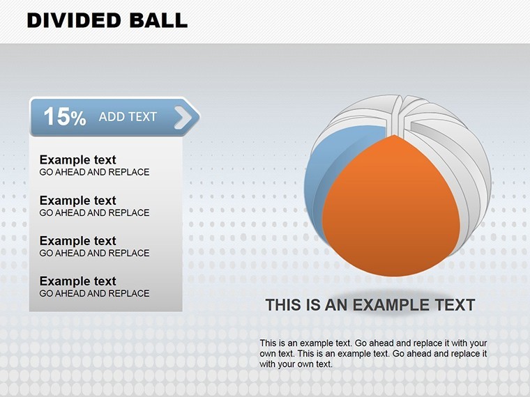
Data analysts in finance use the divided balls to break down portfolio performance in investor decks.
They reuse color schemes across three quarterly briefings.
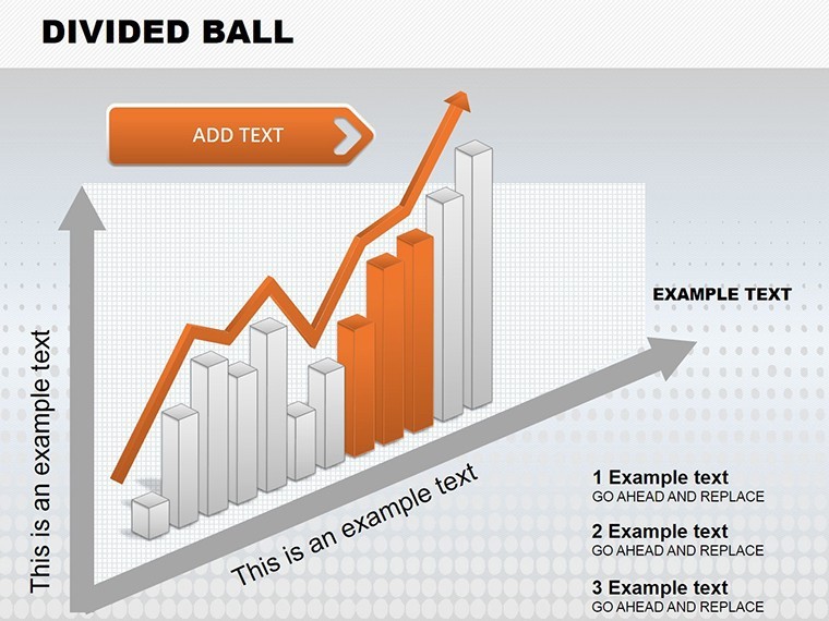
Marketing teams in retail apply segmentation for customer trend tracking in sales presentations.
They reduce deck build time from 3 hours to 45 minutes.
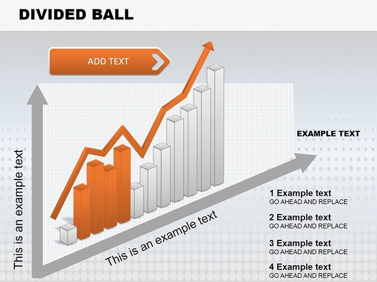
Engineers in manufacturing rely on spherical zones for process reviews.
Download the Spherical Divided Ball Charts Keynote Template now and present in minutes.
Adapting the Template to Your Brand
1. Open the .key file in Keynote (1 minute).
2. Edit segment labels in each divided ball (3 minutes).
3. Recolor quadrants via the inspector (2 minutes).
4. Export ready for distribution (1 minute).
Difficulty stays moderate with basic Keynote knowledge.
Diagram connectors adjust freely.
Icon layers swap without disruption.
The Cost of Not Using a Template
Manual spherical division requires 4 hours and exact alignment tools.
Common problems include uneven segments and lost contrast on projection.
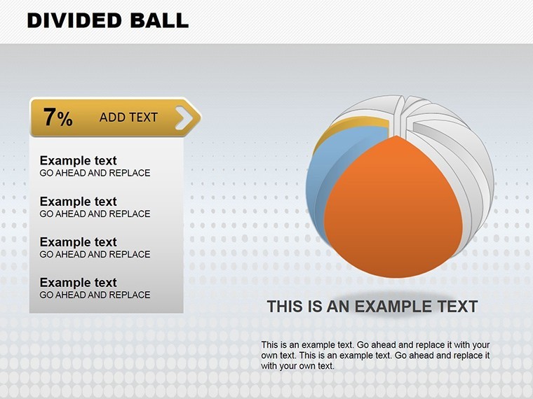
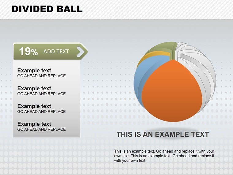
This keeps labels outside the balls with connecting lines.
Many charts embed text inside spheres which reduces readability in academic lectures.
The paid version supplies all 20 editable slides unlike free previews.
Get the Spherical Divided Ball Charts Keynote Template for $22 and start segmenting data visually right away.
Which Keynote versions does this template support?
Keynote 12 and newer versions open it correctly. Older builds may alter segmentation. Test immediately after download. Support helps with version mismatches.
How do I change the color scheme?
Select any ball segment. Change fills in the Format panel. Apply to the slide master for consistency across all 20 slides. Your brand colors update the entire set.
What does the license allow for client work?
Use in client proposals and reports is permitted. Template resale is forbidden. Internal modifications remain allowed. Retain the license statement.
What does the paid version include compared to free?
The paid version provides the full 20-slide .key file with editable segments. Free previews offer static images only. All quadrant divisions unlock instantly. The file arrives without watermarks.
What software is required and what is the refund policy?
Keynote 12+ is essential. Refunds cover 7 days for opening failures. Supply version and screenshot details. Each case receives individual review.