Graphs PowerPoint Charts
This collection includes graph-based PowerPoint templates designed for analysts, managers, and teams who need to present numbers clearly. It focuses on trend visualization rather than decoration, which matters when your audience needs to see movement, not just values.
In a monthly performance review, a marketing analyst often needs to show how campaigns evolve over time. A graph works because it reveals direction. Not just comparison, but change. I`ve used similar layouts in quarterly decks where one messy chart nearly derailed the discussion - switching to a clean line graph fixed it fast.
Browse the layouts and pick the graph structure that fits your next report. Done.
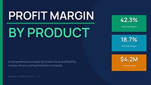 (16)
(16) Profit Margin by Product PowerPoint Template with Editable Charts (2026)ID: #PC01135$13.00
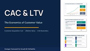 (14)
CAC and LTV PowerPoint Charts Template - 41 Editable SlidesID: #PC01134$15.00
(14)
CAC and LTV PowerPoint Charts Template - 41 Editable SlidesID: #PC01134$15.00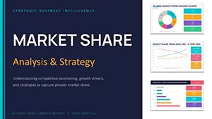 (17)
(17) Market Share Analysis PowerPoint Charts Template 2026ID: #PC01132$14.00
 (16)
Startup Financial Model PowerPoint Template 2026ID: #PC01131$14.00
(16)
Startup Financial Model PowerPoint Template 2026ID: #PC01131$14.00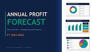 (8)
Profit Forecast PowerPoint Template - Editable PPTX | ImagineLayoutID: #PC01129$13.00
(8)
Profit Forecast PowerPoint Template - Editable PPTX | ImagineLayoutID: #PC01129$13.00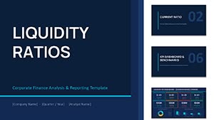 (16)
Liquidity Ratios PowerPoint Template - Editable PPTX | ImagineLayoutID: #PC01128$14.00
(16)
Liquidity Ratios PowerPoint Template - Editable PPTX | ImagineLayoutID: #PC01128$14.00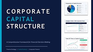 (11)
Corporate Capital Structure PPT - Editable PPTXID: #PC01127$15.00
(11)
Corporate Capital Structure PPT - Editable PPTXID: #PC01127$15.00 (15)
Financial Charts Presentation - Editable PPTXID: #PC01126$18.00
(15)
Financial Charts Presentation - Editable PPTXID: #PC01126$18.00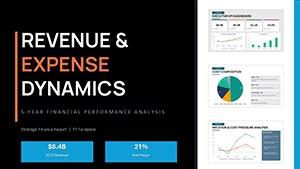 (13)
PowerPoint Revenue and Expense Dynamics - Editable PPTX | ImagineLayoutID: #PC01124$18.00
(13)
PowerPoint Revenue and Expense Dynamics - Editable PPTX | ImagineLayoutID: #PC01124$18.00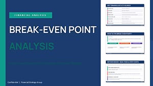 (16)
Break-even Analysis PowerPoint - Editable PPTXID: #PC01121$14.00
(16)
Break-even Analysis PowerPoint - Editable PPTXID: #PC01121$14.00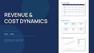 (17)
Financial Analysis Presentation Template - Editable PPTXID: #PC01119$10.00
(17)
Financial Analysis Presentation Template - Editable PPTXID: #PC01119$10.00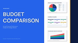 (11)
Department Budget Analysis - Editable PPTX | ImagineLayoutID: #PC01117$14.00
(11)
Department Budget Analysis - Editable PPTX | ImagineLayoutID: #PC01117$14.00 (9)
3-D Clustered Column Chart PowerPoint Template - Editable Charts for Financial ReportsID: #PC01106$14.00
(9)
3-D Clustered Column Chart PowerPoint Template - Editable Charts for Financial ReportsID: #PC01106$14.00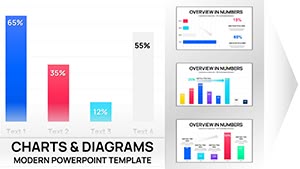 (13)
Clustered Column PowerPoint Charts - Editable PPTXID: #PC01102$10.00
(13)
Clustered Column PowerPoint Charts - Editable PPTXID: #PC01102$10.00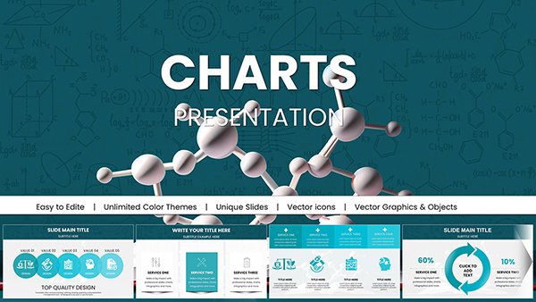 (821)
Pro Chemical & Biochemical Education PowerPoint ChartsID: #PC01062$22.00
(821)
Pro Chemical & Biochemical Education PowerPoint ChartsID: #PC01062$22.00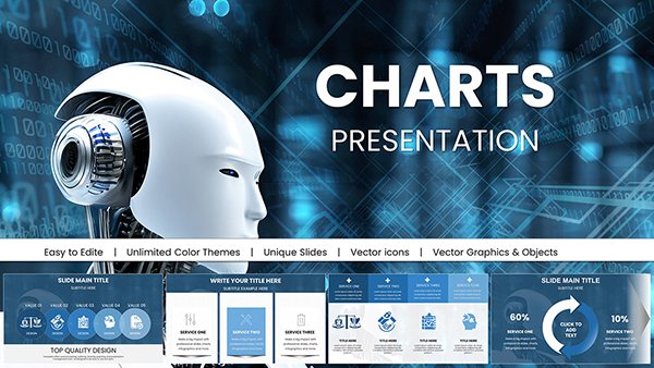 (657)
Presentations with AI-Powered Robot PowerPoint ChartsID: #PC01054$20.00
(657)
Presentations with AI-Powered Robot PowerPoint ChartsID: #PC01054$20.00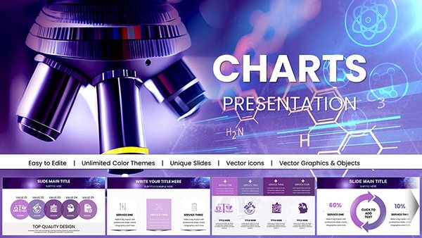 (1124)
 Nanoscience and Nanotechnology PowerPoint Charts: Magnifying the MinusculeID: #PC01039$20.00
 (1072)
 Ecology PowerPoint Template - Fully Editable Conservation Charts | Instant DownloadID: #PC01028$18.00
 (3)
Comprehensive Marketing Strategies PowerPoint Charts: Data-Driven MasteryID: #PC01026$22.00
(3)
Comprehensive Marketing Strategies PowerPoint Charts: Data-Driven MasteryID: #PC01026$22.00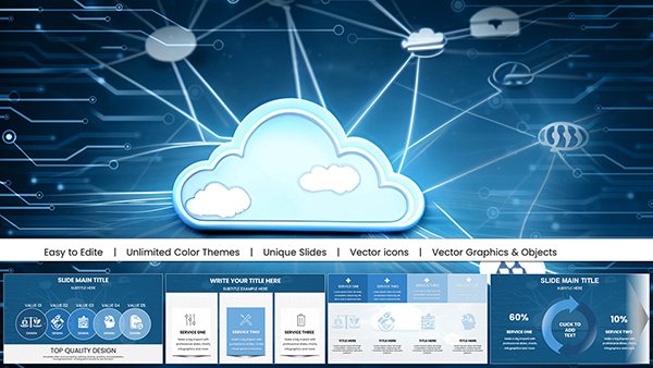 (19)
Secure Cloud for Business PowerPoint Charts: Streamlined Data SecurityID: #PC01024$18.00
(19)
Secure Cloud for Business PowerPoint Charts: Streamlined Data SecurityID: #PC01024$18.00 (456)
Analytical Reports PowerPoint Presentation Template: Elevate Your Data StorytellingID: #PC01017$18.00
(456)
Analytical Reports PowerPoint Presentation Template: Elevate Your Data StorytellingID: #PC01017$18.00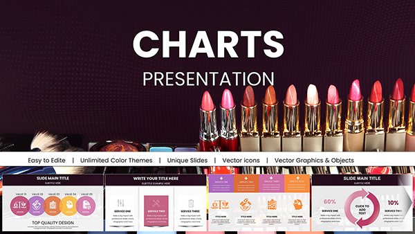 (727)
Vibrant Beauty Makeup Cosmetics PowerPoint Charts: Sparkle in Every SlideID: #PC01004$22.00
(727)
Vibrant Beauty Makeup Cosmetics PowerPoint Charts: Sparkle in Every SlideID: #PC01004$22.00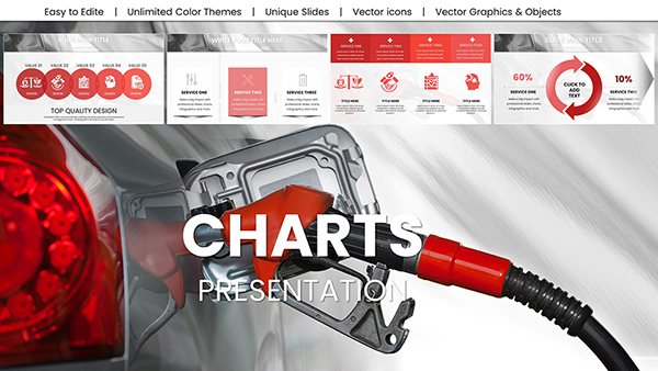 (123)
Refuel a Car PowerPoint Charts - Download Editable Presentation TemplateID: #PC00999$18.00
(123)
Refuel a Car PowerPoint Charts - Download Editable Presentation TemplateID: #PC00999$18.00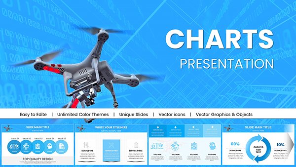 (491)
Drone Commercial PowerPoint Charts - 59 Editable Slides for Industry ProsID: #PC00998$20.00
(491)
Drone Commercial PowerPoint Charts - 59 Editable Slides for Industry ProsID: #PC00998$20.00 (1136)
Sharpshooter PowerPoint Charts Template for Precision PresentationsID: #PC00995$18.00
(1136)
Sharpshooter PowerPoint Charts Template for Precision PresentationsID: #PC00995$18.00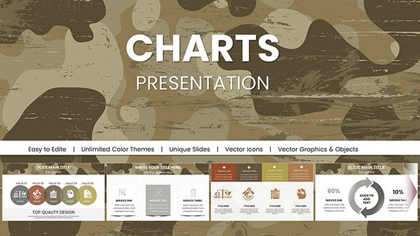 (627)
Military Camouflage PowerPoint Charts TemplatesID: #PC00994$18.00
(627)
Military Camouflage PowerPoint Charts TemplatesID: #PC00994$18.00 (666)
War Armed Forces PowerPoint Charts - Download PresentationID: #PC00993$16.00
(666)
War Armed Forces PowerPoint Charts - Download PresentationID: #PC00993$16.00 (901)
Battle Military PowerPoint Charts Template - Instant Download | Tactical Briefing Slides for Defense & OperationsID: #PC00992$15.00
(901)
Battle Military PowerPoint Charts Template - Instant Download | Tactical Briefing Slides for Defense & OperationsID: #PC00992$15.00 (516)
Real Estate Market PowerPoint Charts - 53 Editable Slides for AgentsID: #PC00988$18.00
(516)
Real Estate Market PowerPoint Charts - 53 Editable Slides for AgentsID: #PC00988$18.00 (741)
Architectural PowerPoint Charts Template - 57 Editable Slides for DesignersID: #PC00987$18.00
(741)
Architectural PowerPoint Charts Template - 57 Editable Slides for DesignersID: #PC00987$18.00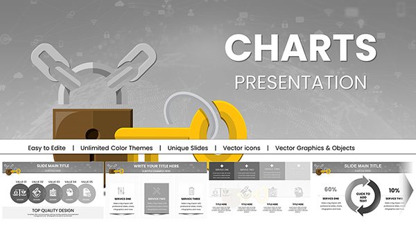 (1191)
Security PowerPoint Charts: Key Access TemplatesID: #PC00983$18.00
(1191)
Security PowerPoint Charts: Key Access TemplatesID: #PC00983$18.00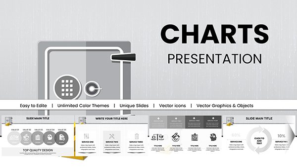 (551)
Bank Security PowerPoint Charts: Fortify Your Financial PresentationsID: #PC00981$18.00
(551)
Bank Security PowerPoint Charts: Fortify Your Financial PresentationsID: #PC00981$18.00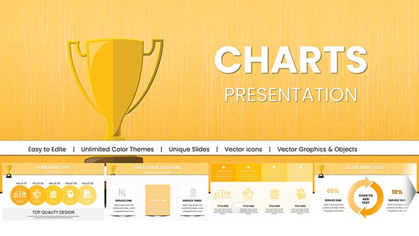 (968)
Victory Cup PowerPoint Charts: Sales & Success TemplateID: #PC00980$20.00
(968)
Victory Cup PowerPoint Charts: Sales & Success TemplateID: #PC00980$20.00
What a graph slide shows that tables and diagrams usually miss
Graphs are built for movement. That`s the point. When your data has a timeline, progression, or pattern, a graph makes it visible in seconds. Tables don`t. They show numbers, but you have to read them. Diagrams explain relationships, but not direction.
The column alignment here actually saves you a lot of pain. Honestly. When I worked on a set of 40+ slides for a finance team, the biggest issue was consistency across graphs. Same scale, same spacing. These templates handle that upfront, which sounds small, but it`s not.
But graphs fail when overfilled. Too many lines. Too many colors. In practice, anything beyond 4-5 data series becomes noise. You lose the story. Keep it tight.
If your slide needs to show change over time, start here. If not, pick something else.
Browse all chart templates if you need a broader mix of visual types.
Real situations where graph slides actually carry the conversation
A product manager walks into a weekly sync. Retention is slipping. The team expects numbers, but what they really need is a trend. A simple line graph makes the drop obvious. No explanation needed. The conversation shifts from "what happened" to "what do we do."
Another case. Sales pipeline review. You track deal flow across months. A bar graph shows volume changes, but more importantly, pacing. I`ve seen this turn a vague update into a clear forecast discussion.
You know that moment when the deck is due at 9am and the trend slide still looks wrong. This is that fix. Swap in a clean graph, adjust labels, done.
And for internal ops reviews, graphs work surprisingly well. Not flashy. Just clear.
Why these layouts hold up in real decks (and where they don`t)
Most graph templates break when resized or reused. Axes shift. Labels overlap. It gets messy fast. Here, the spacing is more predictable. The hierarchy is actually usable. Titles, values, legend - all where you expect them.
At first it feels a bit much, but once you get the logic it becomes second nature. Especially the way color variants are handled across slides. You swap once in the master, everything follows. That saved me a rebuild on a client deck last month.
But. If you need live data updates or complex analytics, this isn`t the tool. These are static slides. Built for presentation, not analysis.
Technical detail most people ignore (until it breaks)
Graphs in PowerPoint can be native charts or grouped shapes. These templates lean toward structured layouts that behave well when edited, but you still need to check one thing: scaling.
If you stretch the slide, axis labels can shift slightly. Not always, but it happens. From experience, it`s safer to adjust data inside the chart tool rather than resizing the whole object. Keeps alignment intact.
Small detail. Big difference.
When to choose graph templates over other chart categories
Use graph templates when your message is about change or direction. That`s the core difference.
If you need to compare categories without time involved, a table layout works better. Try chart templates collection for mixed formats.
If your content is process-driven or directional, arrows make more sense. See arrow diagram slides.
And if your story is about structure or levels, hierarchy layouts fit better. Explore hierarchy chart templates.
Different tools. Different jobs.
Why not just build a graph from scratch
You can. It`s not hard. But consistency is the problem.
Font sizes, axis spacing, color mapping across slides. It adds up. I`ve rebuilt the same graph three times in one deck just to keep it aligned with others. That`s where templates help. They remove that repetition.
Basically, the structure is already solved. You just fill in data.
How this collection fits into your workflow
Think of these as building blocks for reporting decks. You don`t design from zero. You pick a structure, adapt it, move on.
I usually start by testing one slide. If it holds with real data, I reuse it across the deck. Works as-is. That`s it.
Download a layout and try it with your next report. If it fits, you`ll know quickly.
FAQ
Can I edit the graph data directly in PowerPoint?
Yes, you can edit the data using PowerPoint`s built-in chart tools. In most cases, you just right-click the graph and update values in the data sheet. It behaves like Excel inside PowerPoint. Usually yes, but if the graph is built from shapes instead of a native chart, you`ll need to adjust values manually. That`s less common here, but worth checking.
Will these graph templates work in older PowerPoint versions?
The short answer is yes, but with limits. Most templates work fine in PowerPoint 2016 and newer. Older versions might display minor layout shifts, especially in fonts or spacing. From experience, it`s always safer to open the file and check one slide before committing it to your full deck. Works fine after small tweaks.
Can I add more data series to an existing graph?
Yes, you can add additional data series through the chart editor. But here`s the catch. More data isn`t always better. I`ve seen this trip up even experienced users. Once you go beyond 4-5 lines, readability drops fast. So technically yes, but practically you should simplify instead of expanding.
Are these templates suitable for team sharing and reuse?
Yes, they can be shared within a team, but licensing depends on how you purchased them. It`s the same license most marketplaces use - one buyer, one project, commercial use included. For internal teams, people usually duplicate slides into shared decks instead of redistributing files. That keeps things simple.
What happens if I resize the graph or change slide ratio?
Honestly, this depends on how much you change. Small adjustments usually hold fine. But large scaling can shift labels or distort spacing. From experience, it`s better to keep the original layout and adjust content inside it. Oh, and you can also export to PDF from there.