Clustered Column PowerPoint Charts - Editable PPTX


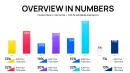
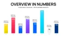

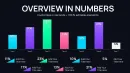


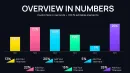
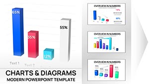
What is a clustered column chart template? A clustered column chart template is a PowerPoint diagram template that displays multiple data series as grouped vertical bars for direct side-by-side comparison.
Files and Formats Included
46 editable slides arrive inside one PPTX file.
Clustered column layouts work together with stacked variants and percentage bars to cover every comparison need in one package.
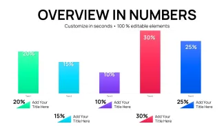
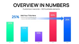
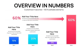
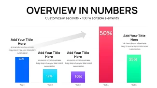
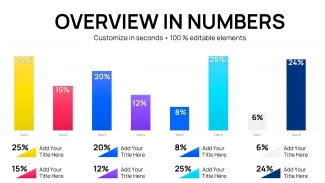
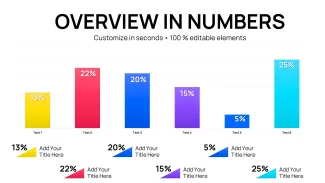
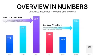
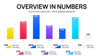
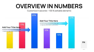
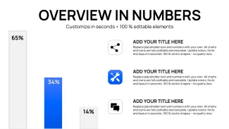
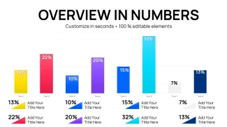
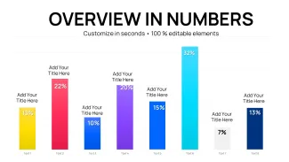
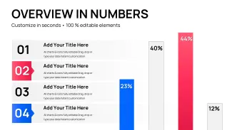
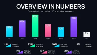
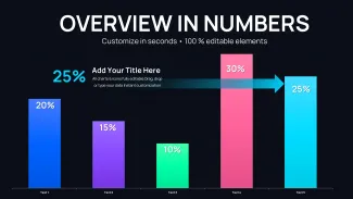
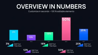
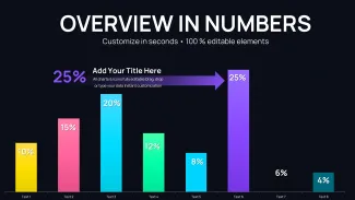
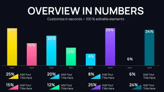
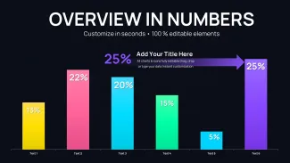
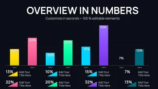
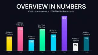
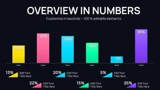
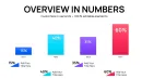
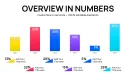
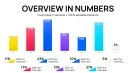
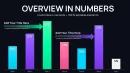
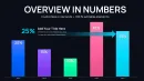
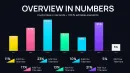
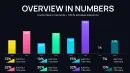
Side-by-side clustering sets this template apart from single-series graphs by allowing immediate visual ranking of categories across groups.
Key Specifications At a Glance
| Feature | Details |
|---|---|
| Editable shapes | diagram segments resize and recolor independently |
| Text placeholders | labels update without unlocking grouped elements |
| Color theme adjustments | compatible with PowerPoint slide master palette |
| Diagram connectors | arrows and lines adjustable in direction and weight |
| Icon layers | icons replaceable without affecting layout |
| Export options | .pptx for editing PDF for distribution |
Adapting the Template to Your Brand
Open the file and spend the first two minutes orienting to the master slide structure - this is where all color changes happen globally. The most common mistake is editing individual slide colors directly going through the master saves 15 minutes of repeated work. Once content is in place the export step depends on the destination platform and whether animation is required.
How Teams Apply These Charts Daily
Three hours before a board meeting the slide deck still had no comparison visuals.
The analyst inserted the clustered column slides replaced the numbers and aligned colors to brand guidelines.
Before 4 hours building from scratch inconsistent alignment. After 35 minutes all diagrams consistent across 6 client decks.
Download and start editing immediately
Why This Template, Not a Blank Slide
Building clustered column charts manually takes hours to align bars match colors and position labels consistently.
This template reduces that effort to minutes.
Manual versions frequently end up with misaligned grids or overlapping text that confuse audiences.
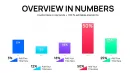
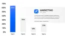
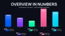
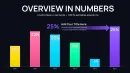
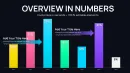
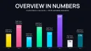
Side-by-side clustering allows pre-attentive comparison of categories across series before reading values.
Download and start editing immediately
See more graph options at the graphs PowerPoint chart templates.
Professionals often combine these with alternative chart configurations.
For full business decks check related chart collections.
Which PowerPoint versions does the template support?
The template works in PowerPoint 2016 2019 2021 and Microsoft 365 on both Windows and Mac computers. All clustered effects render correctly without add-ins. Older versions keep basic bar shapes editable. Open in a supported version to retain full layout integrity.
How do I change the color scheme?
Open the slide master view select the color palette and update the theme colors globally. Every chart updates instantly across all 46 slides. Individual bar overrides remain possible. The master approach saves time when aligning to brand guidelines.
What does the license allow?
The license permits use in internal company presentations and paid client work. You may not resell or redistribute the original template files. One license covers one user or one team account depending on purchase tier. Contact support for enterprise multi-user options.
What is the difference between free and paid versions?
The paid version provides the complete 46 editable slides with all clustered layouts. Free previews typically show only sample slides with watermarks. Paid buyers receive full customization rights and future updates. The difference ensures professionals get production-ready files.
What is the refund policy?
Refunds are available within 14 days if the file does not open or edit as described. You must provide proof of purchase and a description of the issue. Digital downloads are non-refundable after successful use. The policy protects both buyers and the creator.
How do I update chart data?
Select any clustered column chart right-click and choose Edit Data. The embedded Excel sheet opens replace the numbers and close the sheet. All bars labels and legends update automatically. Repeat for every slide that needs new figures. The process takes seconds per chart.
How do I export the final deck?
Go to File Export and choose PDF or keep the native PPTX format. PDF preserves all bar effects for sharing while PPTX keeps full editability. Both formats maintain color accuracy and layout integrity across devices.