Financial Charts Presentation - Editable PPTX


Financial charts template you actually use, not just browse
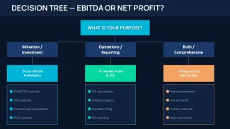
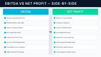
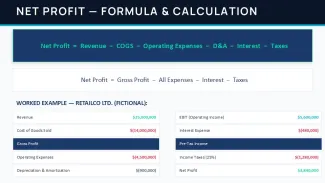
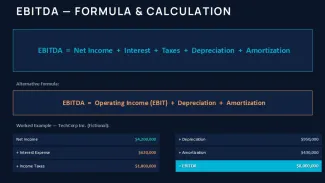
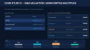
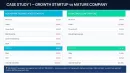
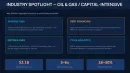
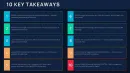
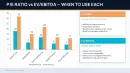
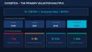
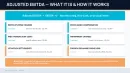
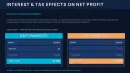
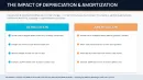
This is a 45-slide financial presentation file built around one topic - EBITDA vs Net Profit - but the structure is broader than that. When I opened the file, it`s basically a full financial storytelling deck: definitions, comparison tables, KPI dashboards, valuation multiples, even case-study style slides. It`s not just diagrams thrown together - it`s a sequence. You can follow it or just grab pieces.
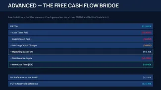
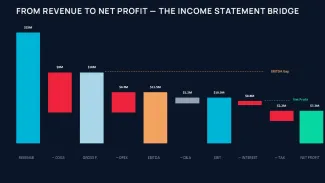
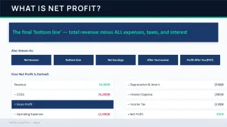
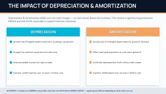
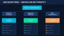
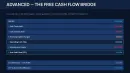
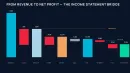
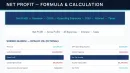
The layouts lean heavily on horizontal flows and step-by-step bridges. One slide literally walks from revenue to net profit in a left-to-right chain with labeled gaps - that kind of visual is surprisingly rare in cheaper templates. Most free sets just stack boxes. Here, the spacing is controlled so even when you extend labels, things don`t collapse. I tested that by stretching a few numbers and adding longer labels - still held together.
The horizontal flow layouts are genuinely well-structured - each step connects without crowding the slide. That`s where this template actually works better than a lot of generic finance packs. You don`t end up fighting alignment.
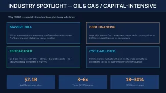
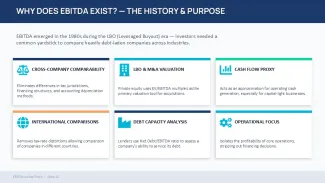
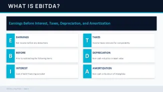
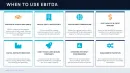
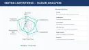
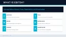
Icons are minimal and mostly symbolic (letters, labels, arrows), not decorative. No heavy illustration style. Diagrams rely more on blocks and numeric emphasis than icons. That means it scales better when you overload slides with data - which, let`s be honest, happens all the time in finance decks.
Honestly, I just opened it, changed the colors, and it looked fine. Took maybe five minutes. You know the kind of deck where you need it done today and don`t want to think about layout? This is that. Works as-is.
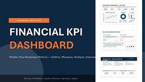
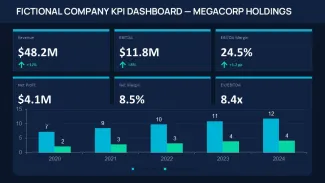
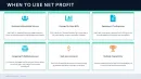
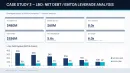
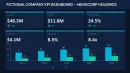
One thing I noticed - the KPI dashboard slide uses stacked metrics with small percentage deltas underneath. And the spacing between those blocks is wider than usual, so even if you duplicate metrics, it doesn`t feel cramped. That`s a small detail, but in practice it matters a lot. Also works for internal team updates, not just client decks.
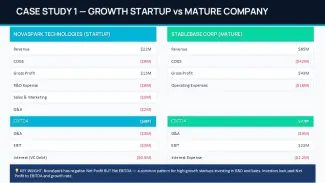
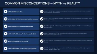
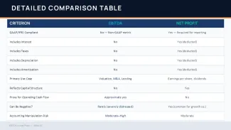
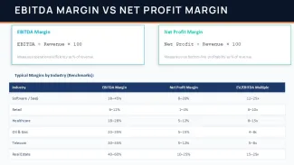
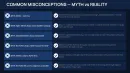
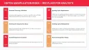
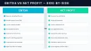
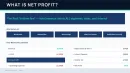
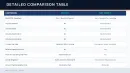
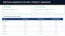
There`s a clear pattern: comparison tables, then visual explanation, then example. It repeats. That repetition is actually useful when you`re building a narrative. You don`t need to rethink structure every time. That`s it.
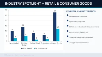
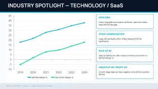
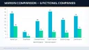
But it`s not ideal if you need raw data charts pulled from Excel. These are stylized visuals, not data-bound charts. You`ll be typing values manually or pasting screenshots. Slightly annoying at first, but once you accept that, editing is straightforward.
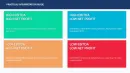
The color system is one of the better-built parts - navy, teal, gold - and it`s controlled through the master. Change it once, everything updates. I always change the colors in the master first before filling in any data. It saves time, especially here because many slides reuse the same color logic.
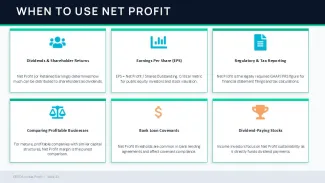
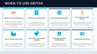
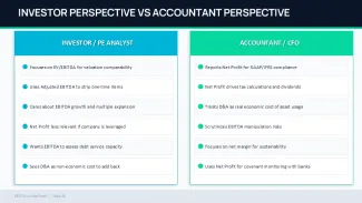
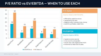
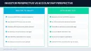
This works best for analysts, consultants, finance students, or anyone building an explanation-heavy deck. Think: internal training, investor prep, or explaining metrics to non-finance stakeholders. You`re not just showing numbers - you`re explaining what they mean and when to use them.
Compared to free templates, this one is more structured and consistent. Free ones usually give you isolated slides. Here, the sequence actually makes sense. And yeah, if you`re using it more than once, the paid version makes more sense. No extras, just more usable slides.
Download and start editing immediately
Template specifications
| Feature | Details |
|---|---|
| Slides/diagrams | 45 slides including comparison tables, KPI dashboards, process flows, valuation diagrams |
| File format | .pptx (PowerPoint), also opens in Google Slides with minor adjustments |
| Software version | PowerPoint 2016 and newer, tested on modern Office versions |
| Color schemes | 3-color system (navy, teal, gold) controlled via slide master for global updates |
| Editable elements | Text blocks, shapes, charts and labels resize independently without breaking alignment |
| Aspect ratio | 16:9 widescreen layout |
| Free vs Paid | Free version limited slides, paid includes full 45-slide structure and all sections |
| Masters/Backgrounds | Centralized master controls colors and repeated layout spacing across slides |
| Best used for | Financial explanation decks, investor prep, KPI storytelling and metric comparison |
FAQ
How do I change colors in this template?
Go to View - Slide Master, then find the main theme colors. Replace the accent colors (usually teal and gold here) with your own. After that, close the master view and everything updates automatically across slides. In practice, it takes under a minute once you know where to click.
Can I use this template for client work?
Yes, that`s what it`s for. It`s the same license most marketplaces use - one buyer, one project, commercial use is fine. If you plan to reuse it across multiple clients, you usually need additional licenses. Pretty standard.
What`s the difference between free and paid versions?
The short answer is: slide count and completeness. Free versions typically include a small subset of layouts, while the paid one gives you the full 45-slide structure with all sections. That matters because this template relies on sequence, not just single slides. You feel the difference when building a full deck.
Are refunds available after purchase?
Usually yes, but it depends a bit on the marketplace policy. If the file is defective or not as described, refunds are typically approved. If you just changed your mind after downloading, that`s less likely. Pretty typical digital product rules.
Can I apply this design to an existing presentation?
So basically, yes - but you`ll need to copy slides or layouts into your current file. The easiest way is just to paste your content into this template instead of the other way around. Keeps formatting intact. Oh, and you can also export to PDF from there.