Financial KPI Dashboard Template - Editable PPTX | ImagineLayout


A functional look at the Financial KPI Dashboard deck
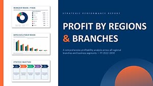
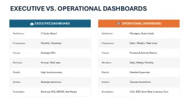
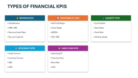
I spent some time going through this 14-slide deck and, to be honest, it is more than just a collection of charts. It actually structures a narrative for a financial review. The file is a standard .pptx format, so you do not need any weird plugins to get it working. It basically covers the five main pillars of finance: revenue, profitability, liquidity, efficiency, and cash flow. And it does this using a mix of high-level executive views and more granular operational layouts.
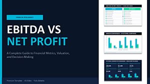
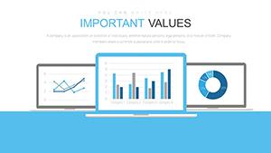
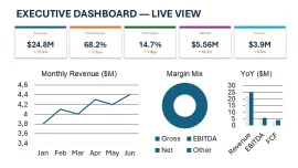
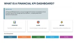
The horizontal flow layouts are genuinely well-structured - each metric connects without crowding the slide. For example, the Executive Dashboard uses five distinct cards across the top for immediate status checks on things like Gross Margin and Free Cash Flow. Below that, you get a line chart for monthly trends and a donut chart for margin mix. It feels balanced. But, one thing I noticed is that if you try to add a sixth card to that top row, you are going to have to do a lot of manual resizing. It works best when you stick to their five-metric limit.
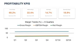
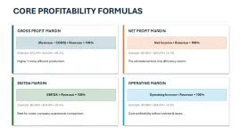
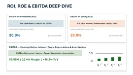
You know the kind of deck where you need it done today and do not want to think about layout? This is that. It is especially useful for CFOs or Finance Managers who need to explain things like ROI or EBITDA to a board that might not be as numbers-heavy. The deep-dive slides actually include the formulas (like Net Income ÷ Revenue for Net Margin), which is a nice touch for transparency. I actually liked how they placed the benchmarks right next to the results. It saves you from having to explain if 20% is "good" or "bad" every five minutes. Basically, it provides context.
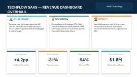
The color system is one of the better-built parts - one change in the master and the whole deck updates. That alone saves real time. I always change the colors in the master first before filling in any data just to see how the charts react. It is priced at around $24, which I think is fair given you get the formula breakdowns and the SaaS-specific case study layout. That case study slide is actually great for showing a "Challenge/Solution/Result" story, which is exactly what I would do for a quarterly business review.
Honestly, I just opened it, changed the colors, and it looked fine. Took maybe five minutes. It is not ideal if you are looking for an automated dashboard that pulls live data from Xero or QuickBooks - this is for static presentations where you type the numbers in yourself. But for process flows and quarterly reporting? Yeah, it works. The layout direction is mostly top-to-bottom for the data cards and left-to-right for the timelines, which is a standard reading pattern that most people find easy to follow.
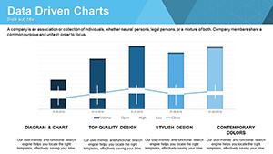
The icon style is flat and minimal, using simple shapes like droplets for liquidity and gears for efficiency. They are all vector-based, so you can recolor them individually if you need to. Oh, and the aspect ratio is 16:9 by default. If your team regularly presents project updates or annual budget reviews, this set covers most of what you will need without any redesign. It is a solid starting point that does not look generic.
| Feature | Details |
|---|---|
| Slides/diagrams | 14 slides including KPI cards, Donut charts, and Bar graphs |
| File format | .pptx (PowerPoint) |
| Software version | PowerPoint 2016 or newer (including Microsoft 365) |
| Color schemes | Dynamic; controlled via the Slide Master |
| Editable elements | All text, chart data, and vector icons resize and recolor |
| Aspect ratio | 16:9 (Widescreen) |
| Free vs Paid | Paid version includes the full 10-section agenda and formulas |
| Masters/Backgrounds | Includes 2 primary layout masters |
Download and start editing immediately
Frequently Asked Questions
How do I change the colors for the whole deck at once?
So basically, you want to head over to the View tab and select Slide Master. Once you are there, look for the "Colors" dropdown in the ribbon; changing it there will update every slide in the file instantly. It is the fastest way to match your company branding without clicking every single box. - Actually, the easiest way is just to pick a pre-set color theme if you are in a rush.
Can I use this for client presentations?
The short answer is yes, the license usually allows for commercial use in client work. It is the same license most marketplaces use - one buyer, one project, and you can show it to as many clients as you want. Just do not try to resell the template itself as your own work because that is where the legal issues start. That is basically the rule.
What is the difference between the free and paid versions?
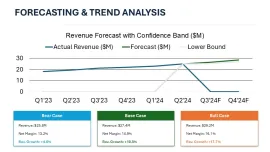
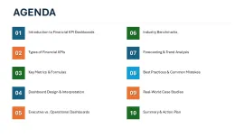
Honestly, the paid version is the way to go if you need the full framework. The free samples usually only give you a slide or two, whereas the full deck has all 10 sections from the agenda, including the deep-dive formulas and the forecasting scenarios. If you are doing a real business review, you will likely need the extra detail in the paid version anyway. No extras in the free one, just a teaser.
Will this work on a Mac?
It works fine on both Windows and macOS as long as you have PowerPoint 2016 or newer. I have opened it in the Mac version of Microsoft 365 and everything stayed in place, which is usually where things break. Just keep in mind it is a .pptx file, so Keynote might shift the text a little if you try to import it there. Works as-is in PPT though.
Can I get a refund if I do not like the layout?
Refunds are usually only granted if the file is actually broken or does not match the description. Since these are digital downloads, most sites are pretty strict about "change of heart" returns once you have the file on your computer. In most cases, it is best to check the preview images carefully before hitting buy. Oh, and you can also reach out to support if there is a technical glitch.