Liquidity Ratios PowerPoint Template - Editable PPTX | ImagineLayout


Current Ratio Quick Ratio Cash Ratio PowerPoint Template - What the 31 Slides Actually Cover
This liquidity ratios PowerPoint template is built around four core metrics: current ratio, quick ratio, cash ratio, and operating cash flow. The 31 slides follow a logical reporting sequence - definitions, formula breakdowns, benchmark comparisons, case studies, and a final recommendations section. It's not a random collection. Someone clearly built it to mirror how a CFO or analyst would actually walk through a liquidity review.
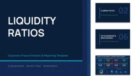
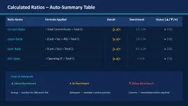
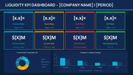
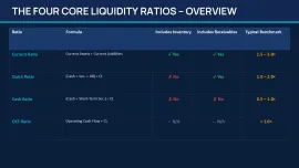
When I opened the file, the first thing I checked was the KPI dashboard slide. The four ratio blocks - Current, Quick, Cash, OCF - are grouped as independent objects. You can resize one tile without shifting the others. Honestly, the vertical alignment here is what makes it actually usable in a real project. That kind of behavior isn't guaranteed in cheaper template sets.
Slide Layout Behavior: Horizontal Flows, Stacked Blocks, and the Liquidity Spectrum
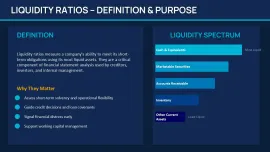
Most slides use horizontal flow structures with flat filled icons - not outline style, which means they stay readable when scaled down on a projected screen. The liquidity spectrum slide runs left-to-right from cash to inventory with evenly distributed segments. I added a longer label to one segment to test overflow behavior, and it compressed spacing without breaking the layout entirely. Slightly rare, to be honest, in a template at this price point.
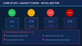
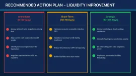
The case study section uses a Year 1 - Year 4 vertical timeline - ratio values stacked per period - which is exactly the layout you'd want when explaining deterioration or recovery trends to a credit committee or a lender. I used something structurally similar in a retail sector analysis, and this financial ratios PowerPoint chart layout saved me from rebuilding slides from scratch. It just works.
The color system is one of the better-built parts - one change in the slide master and the whole deck updates. That alone saves real time when you're adapting this liquidity ratios PowerPoint template for different clients or branding requirements. Anyway, it's the kind of thing you only notice when you've wasted 40 minutes manually recoloring slides in a different template.
Liquidity Ratios Analysis Presentation Editable PPTX - What You're Actually Getting vs. Free Alternatives
The .pptx file opens in PowerPoint 2016 and later without layout shifts - I checked on both a Windows 365 install and a slightly older 2019 version. No font substitution warnings, no shifted text boxes. Free alternatives in this space (Google Slides templates on sites like SlidesCarnival) give you maybe two or three ratio slides with no formula context. This deck includes working capital ratio context, benchmark ranges, and a structured case study section that free sets simply don't offer.
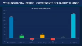
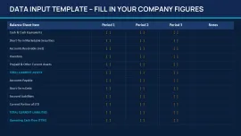
That said, one honest limitation: if you need Excel-linked charts with live data, you won't find them here. The visuals are diagram-based - boxes, arrows, ratio tiles - not chart-driven. For a financial KPI dashboard PowerPoint built around formulas and concept explanation rather than raw data visualization, this works well. But if your CFO wants to click into a cell and see the source data, you'll need to add your own charts.
You know that situation when the deck is due tomorrow and you need something that covers both the definition and the formula and the benchmark - this is exactly when you grab something like this. Basically, you drop in your numbers, swap the colors in the master, and you're done. Works as-is for most internal reporting situations.
This template is clearly aimed at financial analysts, CFO office teams, credit risk presenters, and consultants building liquidity reviews. Also works for internal team updates, not just investor-facing decks.
Specs
| Feature | Details |
|---|---|
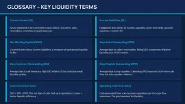
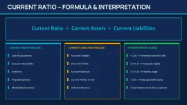
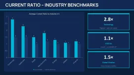
| Slides / diagrams | 31 slides: KPI dashboard, ratio formula cards, liquidity spectrum, Year 1-4 case study timeline, benchmark comparison, checklist, recommendations section |
| File format | .pptx (PowerPoint native - no conversion needed) |
| Software version | PowerPoint 2016+ - tested without layout shifts on 2019 and 365 |
| Color schemes | Master-controlled theme; one color change in Slide Master updates all KPI tiles, icons, and accent blocks simultaneously |
| Editable elements | KPI metric tiles, ratio formula blocks, timeline bars, and text placeholders resize independently; grouping holds on resize |
| Aspect ratio | 16:9 widescreen |
| Free vs Paid | No free version listed; paid version ($14.00) includes all 31 slides - KPI dashboards, case studies, formula cards, benchmark slides, and recommendations |
| Masters / Backgrounds | Prebuilt slide master controls global typography, spacing, and color accents across all 31 slides |
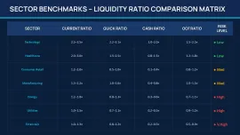
| Best used for | Liquidity ratios PowerPoint template use cases: CFO quarterly updates, credit risk presentations, investor reporting decks, working capital reviews - current ratio, quick ratio, cash ratio, and OCF breakdowns |
Frequently Asked Questions
How do I change the colors across all slides at once?
Go to View - Slide Master in PowerPoint. Once you're in the master view, click on the top-most layout (the parent master), then open the Theme Colors panel - usually under the Design tab while in master view. Change the accent colors there and every KPI tile, icon color, and section highlight updates automatically. The color switching is slightly confusing the first time, but once you find the slide master it takes under a minute. Oh, and it's worth doing this before you fill in any actual data, so you're not recoloring twice.
Can I use this template in client-facing work or commercial presentations?
It's the same license most marketplaces use - one buyer, one project, commercial use is fine. You can include it in client deliverables, CFO decks, or investor reports. The one thing you can't do is resell the template file itself as your own product. That part is standard across the industry. Works fine for agency or consulting use.
What's actually different between this and a free liquidity ratios template I can find elsewhere?
Honestly, most free options give you two or three slides - a ratio definition and maybe a formula card. This liquidity ratios analysis presentation editable pptx includes 31 structured slides: formula breakdowns, a KPI dashboard with four metrics, benchmark comparisons, a multi-year case study timeline, and a recommendations section. Free sets don't include the case study flow or the reporting sequence logic. If you're building something for an actual stakeholder meeting rather than a practice exercise, the difference shows.
Are refunds available after downloading?
Usually depends a bit on the specific situation. Most digital marketplaces don't offer refunds post-download unless there's a technical failure - the file won't open, it's missing slides, something is genuinely broken. In that case, contact support with details. For style preferences or "it's not what I expected," that's generally not covered. Preview the slides carefully before purchasing. The thumbnails are accurate.
Can I export this to PDF or video for sharing?
So basically, yes - PowerPoint's built-in export handles both. File - Export - Create PDF/XPS gives you a clean fixed-layout version for emailing or printing. For video, use File - Export - Create a Video and choose your resolution. No issues there with this file format. Oh, and if you're presenting remotely, PDF export from this current ratio PowerPoint template holds formatting better than sharing the live .pptx across different machines.
Download and start editing immediately
David has built financial reporting decks for mid-market CFO teams across Central Europe for over nine years, working primarily in PowerPoint 365 and Google Slides. He stress-tests every template by importing live ratio data from Excel before recommending it to clients.