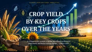
Crop Yield by Key Crops Over the Years PowerPoint Template and Charts


Type: PowerPoint Charts template
Category: Graphs, Tables, Illustrations
Sources Available: .pptx
Product ID: PC01150
Template incl.: 35 editable slides
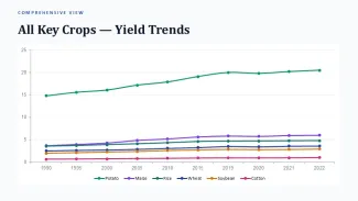
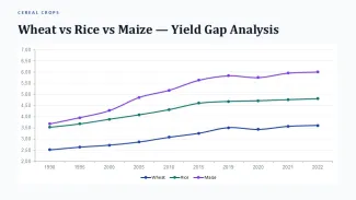
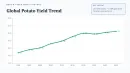
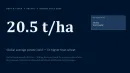
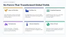
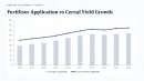
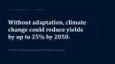
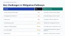
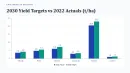
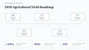
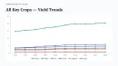
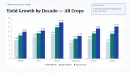
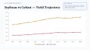
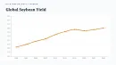
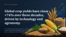
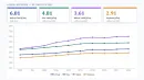
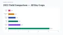
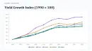
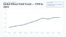
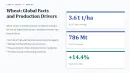
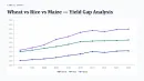
This PowerPoint chart template provides structured layouts for displaying crop yield trends across multiple key crops and time periods. Agriculture analysts, agribusiness consultants, and sustainability teams use it to present historical performance data and year-over-year comparisons.
The layouts maintain alignment when replacing sample data with your own figures. Grouped chart elements scale proportionally, and data labels adjust automatically to prevent overlap on longer crop names or values.
- Slide master updates apply consistent colors and fonts across all 35 slides without manual adjustment on each layout.
- Duplicated timeline or multi-year comparison slides retain grid alignment and spacing.
- Vector icons and shapes remain fully editable and resize without distortion.
- Chart data ranges expand or contract while preserving axis scaling behavior.
| Specification | Details |
|---|---|
| Slides | 35 editable slides |
| Format | .pptx |
| Aspect Ratio | 16:9 |
| Editable Elements | Charts, tables, icons, text placeholders, shapes |
| Color Customization | Via Slide Master theme colors |
| Software | PowerPoint 2016 and later |
FAQ
Does this template work in older PowerPoint versions?
Layouts are built for PowerPoint 2016 and newer. Some advanced chart formatting may require version 2019 or Microsoft 365 for full fidelity.
Can I change the chart colors globally?
Yes. Update the theme colors in Slide Master view to propagate changes across all slides and chart elements automatically.
Are the charts and icons fully editable?
All charts use native PowerPoint elements. Icons and shapes are vectors that can be ungrouped, recolored, and modified individually.