What is a Hierarchy Keynote Chart Template?
Hierarchy Keynote Chart Templates are specialized tools for visualizing hierarchical structures in presentations, such as organizational charts, family trees, or process workflows. These templates are intended for use with Apple's Keynote program, and they provide users with a flexible and straightforward approach to presenting complicated material in a clear and structured manner. Presenters may successfully express links and hierarchies within a system using these templates, allowing audiences better to comprehend the flow and structure of the provided material.
Advantages of Using Hierarchy Keynote Chart Templates
- Clarity and Organization: Hierarchy charts assist in conveying complicated systems in an easily consumable style, aiding comprehension and retention of knowledge.
- Professionalism: Pre-designed templates provide a polished and uniform appearance, enhancing the presentation's professionalism.
- Time-saving: Templates give a ready-made structure, allowing users to focus on content rather than design, thereby saving time and effort.
- Customization: These templates are easily adjustable, allowing users to modify the charts to their needs and tastes, such as changing the colors, fonts, and layout.
- Consistency: These templates make it easier to maintain a similar appearance over several slides or presentations, which is very important in corporate environments.
Types of Hierarchical Keynote Chart Templates
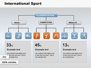
- Organizational charts: Ideal for showcasing organizational hierarchies and demonstrating the links between divisions and employees.
- Flowcharts: Represent processes, workflows, or decision trees to facilitate complex operations.
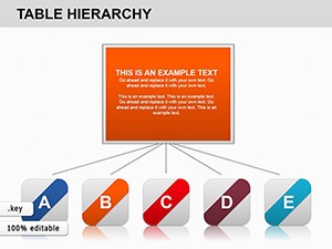
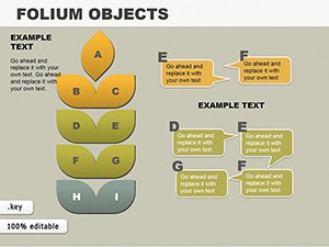
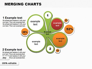
- Tree Diagrams: Frequently used to visualize hierarchical connections, including family trees or categorization systems.
- Network diagrams: Commonly used in IT and telecommunications presentations to illustrate linked systems or networks.
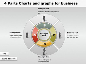
- Pyramid charts: Useful for displaying hierarchical data in a pyramid form, often used in marketing and sales presentations to illustrate concepts like Maslow's hierarchy of needs.
Examples of Applying Hierarchy Keynote Chart Templates in Various Situations
- Corporate Presentations: Organizational charts can represent the firm structure, helping new workers grasp reporting connections.
- Education: Teachers and educators can use tree diagrams to illustrate complicated topics like biological categorization or historical lineages.
- Project Management: Flowcharts are useful for detailing project workflows, ensuring all team members understand the stages and responsibilities.
- Sales and Marketing: Pyramid charts are useful for presenting market segmentation or product hierarchy, aiding in strategy formulation.
Who Needs Hierarchy Keynote Chart Templates?
Hierarchy Keynote Chart Templates are important for a variety of professionals, including:
- Business executives and managers: Present the firm structure, workflow procedures, and decision-making hierarchies.
- Educators and Trainers: Simplify complicated concepts and enhance learner engagement.
- Project managers: Create project plans and timetables and assign team roles.
- Marketing and sales teams: Visualize market statistics, product lines, and client segments.
- HR professionals: Outline organizational hierarchies and departmental structures.
User Reviews for Hierarchy Keynote Chart Templates
Many people find Hierarchy Keynote Chart Templates useful tools for developing effective professional presentations. Common compliments include the simplicity of use, the flexibility to alter templates to meet specific requirements easily, and the professional gloss they add to presentations. Users particularly appreciate the templates' time-saving element, allowing them to focus on content rather than design.
To conclude, Hierarchy Keynote Chart Templates are a valuable resource for anyone who wants to convey hierarchical information in a clear, structured, and visually appealing fashion. Whether you're a business professional, educator, or project manager, these templates can help you clearly convey complicated structures and connections. To use these templates effectively, consider the following steps: select the appropriate template for your data, customize it to your needs, and then populate it with your information.
FAQ
- What are the Hierarchy Keynote Chart Templates?
Hierarchy Keynote Chart Templates are pre-designed slides for Keynote presentations that graphically show hierarchical structures such as organizational charts, family trees, and decision-making processes.
- Why use Hierarchy Keynote Charts in your presentations?
They help simplify complex systems, highlight links and responsibilities, and create a clear visual representation that can improve audience comprehension and communication.
- What are the main components of a Hierarchy Keynote Chart?
A clear title, well-defined levels, linking lines or arrows, and various categories or units to indicate different places or items within the hierarchy are all common key characteristics.
- How can Hierarchy Keynote Charts be customized?
They can be customized by altering colors, fonts, shapes, and sizes, adding photos or icons, and tweaking the layout to match the presentation's specific content and style.
- Can Hierarchy Keynote Charts be used to create interactive presentations?
Yes, some designs include interactive components like clickable sections and animated transitions, which can help make the presentation more engaging and dynamic.