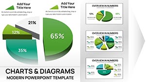
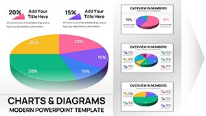
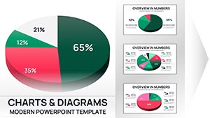
Bring data to light through our Lucid PowerPoint chart templates, champions of clarity amid complexity. Suited for analysts, executives, and reporters, these refined charts employ subtle axes, clean legends, and intuitive scales to transform raw figures into strategic stories.
Rooted in Lucid aesthetics - think muted tones and precise spacing - they integrate flawlessly with PowerPoint`s charting engine, supporting dynamic updates and 3D illusions without gimmicks.
Highlights: formula-embedded cells for auto-calcs, theme-sync for branding, and variant packs for every scenario. Tackle sales funnels or survey breakdowns with confidence, ensuring every slide informs decisively.
Chart your course to insight - investigate our lineup and acquire templates that decode data elegantly.
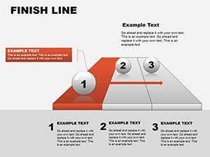
Finish Line PowerPoint Charts Template | 24 Editable Milestone Tracking Slides for Board Meetings
ID: #PC00075
$14.00
(489)
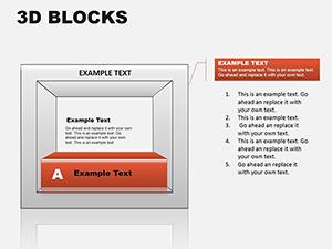
3D Blocks PowerPoint Chart Template Download
ID: #PC00072
$19.00
(785)
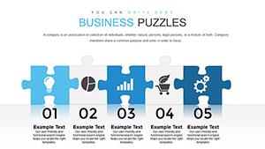
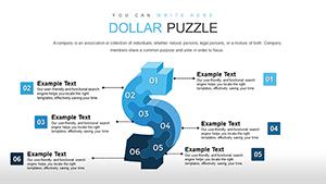
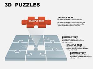
Professional 3D Puzzle Charts PowerPoint Template
ID: #PC00059
$17.00
Superiority of Lucid Charts in PowerPoint Environments
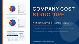
Lucid charts distill essence, favoring line simplicity over bar overloads - perfect for trend spotting where generics muddle. In finance, they forecast via smooth curves; in HR, pie slices for demographic slices.
Strategic Deployments Across Functions
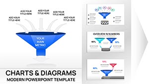
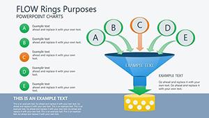
Sales Analytics: Funnel drops with hover details.
Market Research: Scatter plots for correlation hunts.
Project Tracking: Gantt bars for milestone syncs.
They accelerate beyond built-ins with preset formulas, trimming analysis by 30% for timely decisions.
Insider Tactics for Lucid Chart Creation
Anchor with context labels, scaling axes uniformly for trust. Animate series entry for emphasis, revealing insights progressively. Cap colors at brand primaries for cohesion.
Layer tooltips for depth, accessible on click.
Refinement Protocol for Peak Performance
Input validated data sources.
Tune legends for brevity.
Audit for accessibility contrasts.
Anecdote: A consultancy decoded client ROI with our Lucid lines, clinching renewals. Nonprofits charted impact metrics, rallying donors with transparent visuals.
Proficient Lucid Variations for PowerPoint
Master combos like combo charts blending bars and lines for multifaceted views. Edgier than defaults, they auto-adjust for outliers, preserving scale integrity.
Link to external datasets for real-time pulses, vital for dashboards.
Fine-tune by role: Execs get executive summaries; analysts, granular grids.
Core Traits of Lucid Chart Mastery
Axes: Labeled with purpose.
Legends: Minimalist placements.
Trends: Dashed for projections.
Unveil data`s story - examine charts and download to visualize victory.
Frequently Asked Questions
What sets Lucid charts apart?
Their emphasis on whitespace and precision, turning data into digestible narratives.