Bring your data to life with our handpicked collection of Keynote chart examples. Designed to spark ideas and save hours of work, these templates showcase the best ways to visualize information in Keynote.
Over 100 professionally crafted examples cover every major chart type - from classic bars and lines to advanced radar and waterfall charts - all built with-ready aesthetics, subtle animations, and clean layouts that look stunning on any screen.
Whether you`re new to data visualization or a seasoned presenter, these ready-to-use examples help you communicate complex ideas clearly and confidently. Skip the trial-and-error phase and start with designs that already follow proven presentation principles.
Browse the collection now and find the perfect starting point for your next slide deck.
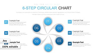
Simple and Useful Tricks for Analysis Keynote Charts
ID: #KC00574
$21.00
(951)
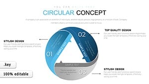
Strategic Analysis Value Chain Keynote Charts: Unlock Business Insights
ID: #KC00571
$24.00
Why Professional Chart Examples Make a Difference
Default Keynote charts get the job done, but they rarely impress. Our examples are created by presentation designers who understand how audiences process visual information. The result? Cleaner layouts, better color harmony, thoughtful animations, and data arrangements that guide the viewer`s eye exactly where you want it.
You`ll notice higher engagement, clearer message retention, and a more polished overall impression - small details that add up to big impact.
Real-World Applications for Keynote Chart Examples
Business & Sales Presentations
Compare quarterly results with stacked bars, show growth trajectories with elegant line charts, or highlight market share using modern donut variations.
Educational & Training Sessions
Explain concepts through timeline charts, illustrate survey results with pie segments, or demonstrate correlations with scatter plots that reveal patterns instantly.
Marketing & Strategy Reviews
Present campaign performance, customer journey stages, or competitive analysis with charts that combine clarity and visual appeal.
Creative Tips to Maximize Your Charts
Use progressive animation to reveal data points one by one - keeps attention focused
Limit colors to 3-5 that match your brand palette
Add minimal icons or illustrations for context without clutter
Place key numbers in larger font sizes to create natural emphasis
Ready to upgrade your slides? Explore our full collection of Keynote chart examples and download the ones that inspire you most.
Frequently Asked Questions
Are these chart examples fully compatible with current Keynote versions?
Yes - all templates work seamlessly with the latest Keynote on macOS, iPadOS, and iCloud.
Can I change colors, fonts, and data completely?
Absolutely. Every element is 100% editable, with organized layers and smart data tables for quick updates.
Do the examples include built-in animations?
Most templates feature tasteful, professional animations that you can keep, modify, or remove.
Are free examples available?
Yes, we offer several high-quality free chart examples to try before exploring premium options.