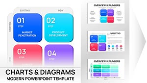
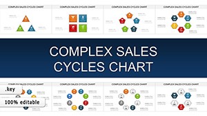
Embrace the elegance of circular storytelling with our circle Keynote charts templates, perfect for depicting cycles, proportions, and interconnected data. Geared toward data enthusiasts in marketing, sustainability, and project management, these templates turn numbers into harmonious visuals that resonate.
From pie slices representing market shares to radial timelines tracking project phases, our designs leverage Keynote`s strengths in smooth rotations and layered opacities. Effortlessly adjust segments, add labels, or animate sweeps to reveal insights progressively, making complex info digestible and delightful.
Built for professionals who value aesthetics without sacrificing function, these charts ensure your Keynote decks stand out. Whether illustrating feedback loops or budget allocations, find inspiration in our curated gallery. Begin enhancing your slides with circular brilliance today.
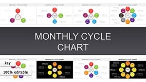
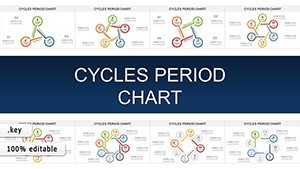

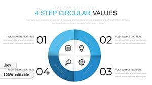
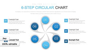


Circle charts excel at conveying wholeness and relationships, and our templates amplify this with pre-configured segments that snap into place. Unlike linear graphs, they intuitively show parts-to-whole dynamics, ideal for environmental cycles or customer journey maps.
Keynote users benefit from native vector scaling - no pixelation on zoom - and color gradients that evoke motion, drawing eyes to key data points.
Adaptable for any rotational narrative, they clarify without overwhelming.
Basic pie charts in Keynote can look dated and cramped; ours incorporate breathing room with exploded views and custom arcs, plus integrated tooltips for hover details. This modernizes your visuals, boosting perceived professionalism.
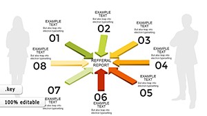
Furthermore, our templates include variant shapes - ovals for asymmetry, spirals for progression - expanding creative options beyond defaults.
Fluid Animations: Spin segments on entry for dramatic reveals. Theme Harmony: Auto-match to your deck`s palette. Accessibility: Screen-reader friendly with descriptive tags.
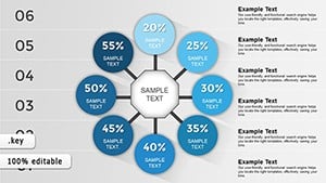
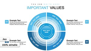
Limit segments to 5-7 for readability, using varying thicknesses for hierarchy. Animate clockwise for natural flow, and pair with explanatory callouts. For depth, nest smaller circles within larger ones to show sub-categories.
Pro idea: Sync with Keynote`s build effects to stagger appearances, mimicking a pie`s assembly. Validate data accuracy pre-presentation to build trust.
Ready for rounded excellence? View circle Keynote charts templates and secure yours for seamless integration.
Circle charts aren`t mere graphics - they`re narratives in motion. Integrate them to make your Keynote presentations unforgettable.
Copyright © 2009-2026 ImagineLayout All rights reserved.