Pie PowerPoint Charts
Enhance your presentations with professional pie chart PowerPoint templates that make data visually compelling and easy to understand. These ready-to-use slides are perfect for business reports marketing plans educational lessons and financial summaries.
Each template is fully editable allowing you to customize colors fonts and styles to match your brand. Save time and impress your audience with clear concise charts that tell your story effectively.
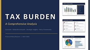 (17)
(17) PowerPoint Tax Burden Analysis - Editable PPTXID: #PC01125$15.00
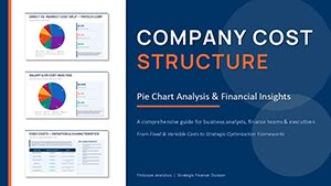 (8)
PowerPoint Pie Chart Cost Structure - Editable PPTXID: #PC01122$15.00
(8)
PowerPoint Pie Chart Cost Structure - Editable PPTXID: #PC01122$15.00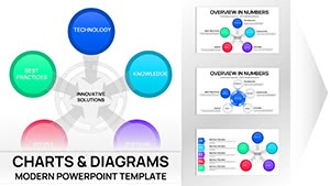 (12)
(12) Innovative Solutions PowerPoint Charts Template | 41 Editable Slides - Business Models ReadyID: #PC01114$18.00
 (12)
Editable PowerPoint Charts Template for Board Meetings - Fully EditableID: #PC01105$15.00
(12)
Editable PowerPoint Charts Template for Board Meetings - Fully EditableID: #PC01105$15.00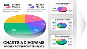 (10)
3-D Pie PowerPoint Charts - Fully Editable Ready for Board MeetingsID: #PC01104$15.00
(10)
3-D Pie PowerPoint Charts - Fully Editable Ready for Board MeetingsID: #PC01104$15.00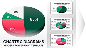 (8)
3D Pie PowerPoint Charts - Fully EditableID: #PC01103$16.00
(8)
3D Pie PowerPoint Charts - Fully EditableID: #PC01103$16.00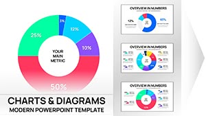 (10)
PowerPoint Chart Doughnut Template - Editable PPTX | ImagineLayoutID: #PC01101$15.00
(10)
PowerPoint Chart Doughnut Template - Editable PPTX | ImagineLayoutID: #PC01101$15.00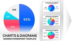 (11)
Comprehensive Pie Charts PPT Template CollectionID: #PC01100$15.00
(11)
Comprehensive Pie Charts PPT Template CollectionID: #PC01100$15.00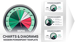 (17)
Professional Gauge Charts PowerPoint TemplateID: #PC01099$18.00
(17)
Professional Gauge Charts PowerPoint TemplateID: #PC01099$18.00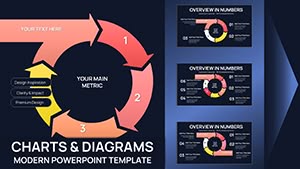 (10)
Cycle Periods PowerPoint Template for Time-Based ChartsID: #PC01096$20.00
(10)
Cycle Periods PowerPoint Template for Time-Based ChartsID: #PC01096$20.00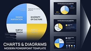 (8)
Pie Charts PowerPoint Template - 26 Editable SlidesID: #PC01094$16.00
(8)
Pie Charts PowerPoint Template - 26 Editable SlidesID: #PC01094$16.00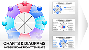 (17)
Bowman's Strategy Clock Charts Template for PowerPoint - 40 editable slidesID: #PC01088$16.00
(17)
Bowman's Strategy Clock Charts Template for PowerPoint - 40 editable slidesID: #PC01088$16.00 (16)
Cycle Periods Incoming PowerPoint Charts Template - 44 SlidesID: #PC01087$20.00
(16)
Cycle Periods Incoming PowerPoint Charts Template - 44 SlidesID: #PC01087$20.00 (11)
Ripple Effects PowerPoint Charts TemplateID: #PC01086$15.00
(11)
Ripple Effects PowerPoint Charts TemplateID: #PC01086$15.00 (13)
Connected Balls Chart Template for PowerPoint - 26 SlidesID: #PC01084$12.00
(13)
Connected Balls Chart Template for PowerPoint - 26 SlidesID: #PC01084$12.00 (11)
Cyclical Pie Chart PowerPoint TemplateID: #PC01079$18.00
(11)
Cyclical Pie Chart PowerPoint TemplateID: #PC01079$18.00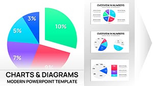 (9)
Pie Charts PowerPoint Template 46 SlidesID: #PC01076$15.00
(9)
Pie Charts PowerPoint Template 46 SlidesID: #PC01076$15.00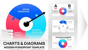 (8)
Process Puzzle Pie PowerPoint Charts TemplateID: #PC01074$15.00
(8)
Process Puzzle Pie PowerPoint Charts TemplateID: #PC01074$15.00 (10)
Dynamic Puzzle Pie Charts PowerPoint TemplateID: #PC01073$20.00
(10)
Dynamic Puzzle Pie Charts PowerPoint TemplateID: #PC01073$20.00 (16)
3D Puzzle Pie Charts Template for PowerPoint PresentationsID: #PC01072$20.00
(16)
3D Puzzle Pie Charts Template for PowerPoint PresentationsID: #PC01072$20.00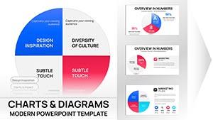 (8)
PowerPoint Pie Charts TemplateID: #PC01070$18.00
(8)
PowerPoint Pie Charts TemplateID: #PC01070$18.00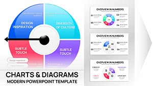 (17)
Professional Pie Charts PowerPoint TemplateID: #PC01067$16.00
(17)
Professional Pie Charts PowerPoint TemplateID: #PC01067$16.00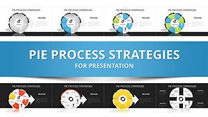 (574)
(574) Pie Process Strategies PowerPoint Charts Template - Presentation PPTID: #PC00293$24.00
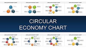 (986)
Circular Economy Charts: PowerPoint Tools for Sustainable ArchitectureID: #PC00904$15.00
(986)
Circular Economy Charts: PowerPoint Tools for Sustainable ArchitectureID: #PC00904$15.00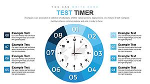 (283)
Time Clock Dial PowerPoint Charts TemplateID: #PC00874$15.00
(283)
Time Clock Dial PowerPoint Charts TemplateID: #PC00874$15.00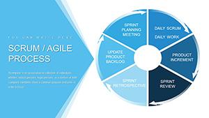 (949)
Scrum Agile Development Process PowerPoint Charts TemplateID: #PC00856$18.00
(949)
Scrum Agile Development Process PowerPoint Charts TemplateID: #PC00856$18.00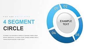 (1054)
Pie Segment Circle PowerPoint Charts TemplateID: #PC00821$15.00
(1054)
Pie Segment Circle PowerPoint Charts TemplateID: #PC00821$15.00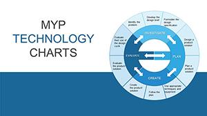 (1169)
MYP Technology Pie Chart PowerPoint TemplateID: #PC00813$20.00
(1169)
MYP Technology Pie Chart PowerPoint TemplateID: #PC00813$20.00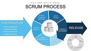 (266)
Scrum Process Flow PowerPoint Charts TemplateID: #PC00795$20.00
(266)
Scrum Process Flow PowerPoint Charts TemplateID: #PC00795$20.00 (426)
(426) SEO Infographic PowerPoint Charts TemplateID: #PC00735$15.00
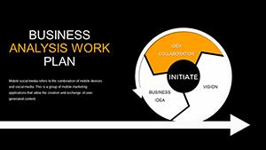 (334)
Business Analysis Work Experience PowerPoint Charts - Presentation TemplateID: #PC00711$22.00
(334)
Business Analysis Work Experience PowerPoint Charts - Presentation TemplateID: #PC00711$22.00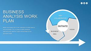 (524)
Business Analysis PowerPoint Charts Template: Download PPTXID: #PC00710$22.00
(524)
Business Analysis PowerPoint Charts Template: Download PPTXID: #PC00710$22.00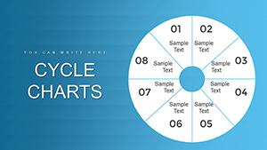 (814)
8 Segment Cycle PowerPoint Charts TemplateID: #PC00706$20.00
(814)
8 Segment Cycle PowerPoint Charts TemplateID: #PC00706$20.00
Why Choose Pie Chart Templates
Pie charts are essential for presenting proportions distributions and market shares. Our templates offer a modern design that goes beyond default PowerPoint charts ensuring clarity and impact.
Real-World Use Cases
- Business reports and financial summaries
- Marketing campaign data visualization
- Educational statistics and lessons
- Project performance tracking
Benefits Over Default Templates
- Fully editable and customizable
- Modern professional designs
- Time-saving pre-built layouts
- Enhanced visual clarity and readability
Creative Tips and Best Practices
- Limit categories to highlight key data points
- Use contrasting colors for emphasis
- Combine charts with icons or images for context
- Keep text minimal and readable
FAQs
Can I edit the pie chart colors and fonts?
Yes all elements including colors fonts and labels are fully customizable.
Are these templates compatible with the latest PowerPoint?
Yes they work seamlessly with modern PowerPoint versions.
Can I use these templates for client presentations?
Yes they are suitable for professional commercial presentations under the license terms.
Do I need design experience to use these templates?
No the templates are designed for easy use even if you have minimal design skills.