Pie PowerPoint Diagrams
Formerly known as pie powerpoint diagram templates - this collection now includes pie chart templates for data visualization.
This category offers a selection of pie chart layouts ready for PowerPoint and Keynote. Financial analysts, strategy consultants, and operations managers use them to present percentage breakdowns clearly.
Choose these when default shapes require too much time to customize for brand alignment or when you need ready variants for multiple data sets. For example, a marketing manager in retail reviews channel contribution in a quarterly review using one template to highlight key insights fast.
Downloading saves time compared to building from scratch and ensures the focus stays on business decisions rather than slide design.
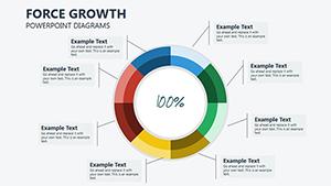 (621)
(621) Force Growth PowerPoint Diagrams and Infographics PPTXID: #PD00209$18.00
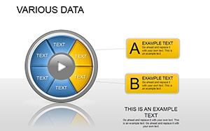 (1110)
 Various Data PowerPoint Template: Infuse Your Presentations with Visual IntelligenceID: #PD00182$20.00
 (126)
(126) Strategic PowerPoint Diagram TemplateID: #PD00179$20.00
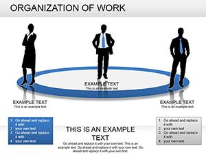 (743)
Organization of Work PowerPoint Diagrams: Download PPTXID: #PD00172$25.00
(743)
Organization of Work PowerPoint Diagrams: Download PPTXID: #PD00172$25.00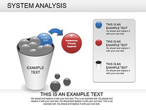 (814)
System Analysis PowerPoint Diagram: Decode Processes EffortlesslyID: #PD00169$25.00
(814)
System Analysis PowerPoint Diagram: Decode Processes EffortlesslyID: #PD00169$25.00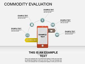 (40)
Decode Products: Commodity Evaluation PowerPoint DiagramsID: #PD00158$19.99
(40)
Decode Products: Commodity Evaluation PowerPoint DiagramsID: #PD00158$19.99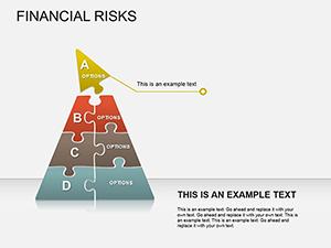 (880)
Financial Risks PowerPoint Diagrams Template: Download PPTXID: #PD00155$24.00
(880)
Financial Risks PowerPoint Diagrams Template: Download PPTXID: #PD00155$24.00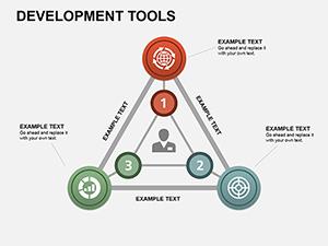 (1196)
 Development Tools PowerPoint Diagrams: Streamline Your Project VisionsID: #PD00153$18.00
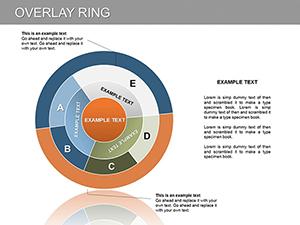 (426)
Overlay Ring PowerPoint DiagramID: #PD00125$20.00
(426)
Overlay Ring PowerPoint DiagramID: #PD00125$20.00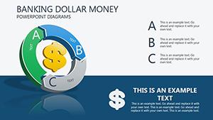 (973)
Banking Dollar Money PowerPoint diagramID: #PD00088$16.00
(973)
Banking Dollar Money PowerPoint diagramID: #PD00088$16.00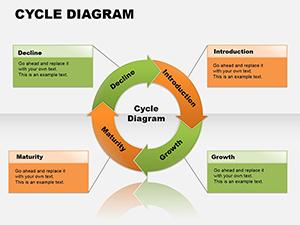 (172)
Cycle Analytical PowerPoint Diagrams TemplateID: #PD00084$16.00
(172)
Cycle Analytical PowerPoint Diagrams TemplateID: #PD00084$16.00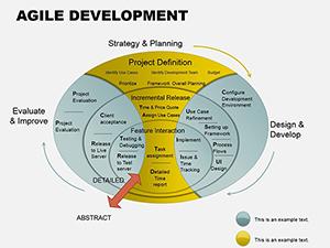 (162)
Agile Development PPT Template: Ignite Iterative ExcellenceID: #PD00081$25.00
(162)
Agile Development PPT Template: Ignite Iterative ExcellenceID: #PD00081$25.00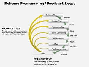 (137)
XP Feedback Loop Diagrams for PowerPointID: #PD00079$6.00
(137)
XP Feedback Loop Diagrams for PowerPointID: #PD00079$6.00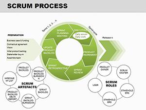 (109)
Agile Scrum Process PowerPoint Diagrams: Visualize Iterative SuccessID: #PD00078$17.00
(109)
Agile Scrum Process PowerPoint Diagrams: Visualize Iterative SuccessID: #PD00078$17.00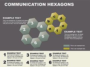 (295)
Hexagon PowerPoint Diagrams - Editable PPTX | ImagineLayoutID: #PD00070$18.00
(295)
Hexagon PowerPoint Diagrams - Editable PPTX | ImagineLayoutID: #PD00070$18.00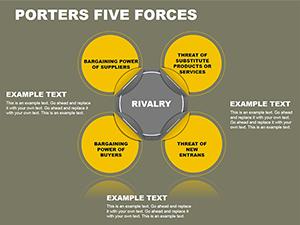 (196)
Porter's Five Forces PPT Template: Strategy InsightsID: #PD00069$18.00
(196)
Porter's Five Forces PPT Template: Strategy InsightsID: #PD00069$18.00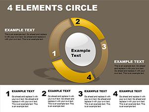 (757)
4 Elements Circle PowerPoint Template: Piecing Together Perfect PresentationsID: #PD00065$18.00
(757)
4 Elements Circle PowerPoint Template: Piecing Together Perfect PresentationsID: #PD00065$18.00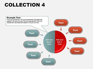 (534)
PowerPoint Diagrams Collection: Weaving Data into NarrativesID: #PD00063$18.00
(534)
PowerPoint Diagrams Collection: Weaving Data into NarrativesID: #PD00063$18.00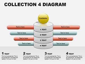 (156)
PowerPoint Diagram Collection 4: Sculpting Ideas in 3DID: #PD00062$18.00
(156)
PowerPoint Diagram Collection 4: Sculpting Ideas in 3DID: #PD00062$18.00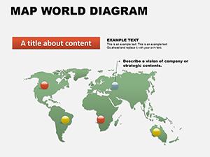 (672)
World Maps PowerPoint Template for ProsID: #PD00061$16.00
(672)
World Maps PowerPoint Template for ProsID: #PD00061$16.00 (1068)
Circular Tree PowerPoint Template: Branch into Radial BrillianceID: #PD00060$16.00
(1068)
Circular Tree PowerPoint Template: Branch into Radial BrillianceID: #PD00060$16.00 (6)
Fully Editable Cycle, Pyramid, Arrow, Pie & Puzzle PowerPoint Diagram Templates - 11 Slides | Instant DownloadID: #PD00059$12.00
(6)
Fully Editable Cycle, Pyramid, Arrow, Pie & Puzzle PowerPoint Diagram Templates - 11 Slides | Instant DownloadID: #PD00059$12.00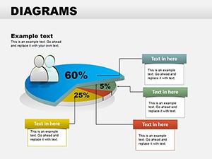 (44)
PowerPoint Diagrams Collection 2: Craft Data Stories That StickID: #PD00058$28.00
(44)
PowerPoint Diagrams Collection 2: Craft Data Stories That StickID: #PD00058$28.00 (236)
Versatile Collection: PowerPoint Diagrams PackID: #PD00056$22.00
(236)
Versatile Collection: PowerPoint Diagrams PackID: #PD00056$22.00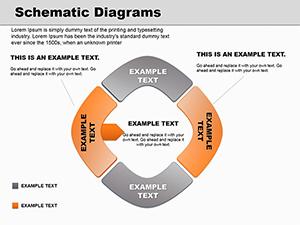 (360)
Schematic PowerPoint Diagrams: 18 Editable PPTX SlidesID: #PD00050$20.00
(360)
Schematic PowerPoint Diagrams: 18 Editable PPTX SlidesID: #PD00050$20.00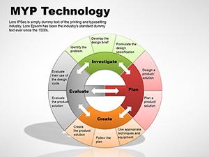 (882)
MYP Technology PowerPoint Diagrams TemplateID: #PD00048$15.00
(882)
MYP Technology PowerPoint Diagrams TemplateID: #PD00048$15.00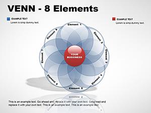 (54)
8-Element Venn PowerPoint DiagramsID: #PD00045$24.00
(54)
8-Element Venn PowerPoint DiagramsID: #PD00045$24.00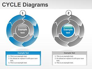 (92)
Cycle Diagrams for PowerPointID: #PD00026$28.00
(92)
Cycle Diagrams for PowerPointID: #PD00026$28.00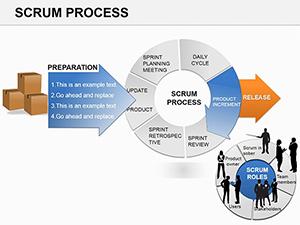 (462)
Scrum Process PowerPoint DiagramsID: #PD00025$18.00
(462)
Scrum Process PowerPoint DiagramsID: #PD00025$18.00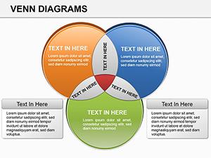 (361)
Venn PowerPoint Diagrams: Compare Ideas EffortlesslyID: #PD00019$24.00
(361)
Venn PowerPoint Diagrams: Compare Ideas EffortlesslyID: #PD00019$24.00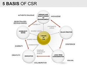 (212)
Basis of CSR PowerPoint Diagrams TemplateID: #PD00012$28.00
(212)
Basis of CSR PowerPoint Diagrams TemplateID: #PD00012$28.00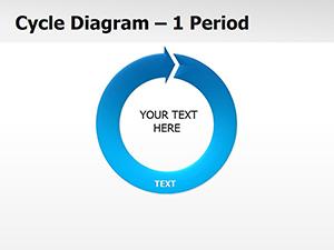 (980)
Cycle Periods PowerPoint Diagrams TemplateID: #PD00011$24.00
(980)
Cycle Periods PowerPoint Diagrams TemplateID: #PD00011$24.00 (1162)
Collection Cycle Period PowerPoint Diagrams TemplateID: #PD00007$24.00
(1162)
Collection Cycle Period PowerPoint Diagrams TemplateID: #PD00007$24.00
Use Cases
In banking, financial analysts prepare investor pitches where pie chart templates show asset allocation across different classes. The situation involves presenting to senior stakeholders who need to grasp risk levels quickly during the meeting. The templates allow direct data input and color matching to corporate guidelines so the slide supports the spoken narrative without distraction. This approach keeps the discussion on strategy instead of technical chart issues.
Technology marketing managers use them in campaign performance reports to the leadership team. Here the focus is on channel mix and conversion rates in a monthly review. Pre-set layouts with exploded segments make it easy to point out the dominant sources and justify budget shifts in real time.
Healthcare strategy consultants deploy the templates in client workshops to map service line contributions to overall revenue. Participants discuss growth opportunities based on the visual breakdown that the template provides in a format aligned with the rest of the deck. The result drives clearer decisions on resource allocation.
Education sector analysts apply the designs in academic reporting to display student performance distribution by subject. The clear segments help faculty and administrators identify areas for intervention during planning sessions. The ready-to-use structure fits directly into longer reports without reformatting.
Comparison vs. default PowerPoint or Keynote shapes or blank slides
Default pie chart tools in PowerPoint or Keynote produce basic versions that often require extensive formatting to fit the slide theme and brand colors. These templates come with pre-aligned colors and layouts that match common business palettes right out of the box. Building from blank slides means spending time on segment angles and labels that can easily misalign when data updates occur before a presentation. The category options include ready multi-pie comparisons and donut variations that would take hours to recreate manually from scratch. You avoid the common issue of data labels overlapping in small segments or inconsistent spacing across slides. Overall the templates reduce errors in proportion representation and maintain consistency across a full deck prepared for board meetings or reviews.
Best-practice advice for using the templates in this category
Limit each pie chart to no more than seven segments so the audience can absorb the information in seconds during a presentation. Apply contrasting colors only for the most important segments and keep the rest in neutral tones to guide attention exactly where you want it. Always include the total value next to the chart title so viewers understand the full context without guessing. Test the slide on the actual projector or screen size used in the meeting room because small text labels can become unreadable. Integrate each chart into the surrounding narrative by adding one callout sentence on the same slide that links the data back to the business decision at hand.
Technical Tip for Working with These Templates
To update the data in any pie chart template, select the chart object then edit the linked datasheet that appears in the spreadsheet view. Enter new percentage values directly and the segments automatically recalculate while preserving your custom colors and labels. If you prefer vector control, ungroup the chart elements once and adjust individual arcs manually for fine-tuning beyond standard percentages. This method works in both PowerPoint and Keynote after import and prevents loss of quality when you resize the entire slide for different aspect ratios. Always group the elements again after changes to keep the chart intact during copy-paste operations into other decks.
Why Choose ImagineLayout Versions of These Templates
ImagineLayout versions draw directly from consulting frameworks used in real client engagements at firms like McKinsey and BCG. The layouts prioritize decision-making clarity over decorative extras so every segment serves a specific business question. Other marketplaces often supply generic versions with limited segment options or styles that require additional rework to fit high-stakes decks. Here the focus stays on clean data flow and brand consistency without extra steps. The result is a set of templates that consultants and executives actually reuse across multiple quarters and projects because they fit the workflow of board meetings and strategy sessions exactly.
FAQ
How do I download the PowerPoint templates from this category?
After adding any template to your cart and completing the checkout process you receive an email with direct download links. The files arrive in standard .pptx format ready to open in PowerPoint 2010 or newer. You can also access all purchased files anytime from your account dashboard on the site. The process takes under two minutes once payment is confirmed and works on both Windows and Mac systems.
Are these templates compatible with Keynote?
Yes the templates import into Keynote with only minor formatting adjustments needed in most cases. Open the .pptx file directly in Keynote and the pie chart elements retain their editable properties including colors and data links. You may need to regroup objects after import but the overall layout and proportions stay intact. This compatibility lets teams using mixed software environments share the same files without rebuilding slides from scratch.
Can I fully customize the pie charts in the templates?
Every element including segments, colors, labels, and fonts can be changed using standard PowerPoint or Keynote tools. You can add or remove slices, adjust percentages via the datasheet, and apply your company color palette in seconds. Vector graphics ensure no quality loss during edits or resizing. This full flexibility supports last-minute data updates right before a board meeting while keeping the design consistent across your entire presentation.
What licensing applies to the downloaded templates?
The license permits use in any number of your own business or academic presentations including client work and internal reports. You may not resell or redistribute the template files themselves as standalone products. Commercial use in paid workshops or conferences is allowed as long as the focus remains on your content rather than the template design. This arrangement gives teams freedom to apply the files across multiple projects without additional fees.
Do the templates include options for different chart variations?
Yes the collection contains single pies, multi-pie comparisons, donut styles, and exploded segment designs. Each variation comes with several layout options so you can pick the one that best matches your data story. All variations remain fully editable and follow the same consistent style guidelines. This range covers most proportion-based scenarios encountered in quarterly reviews, market analysis, and survey reporting without needing to combine multiple files.