Graphs PowerPoint Diagrams
A collection of graph diagrams created for Microsoft PowerPoint. These layouts give analysts the axes and series already placed when the story lives in the numbers.
When a business analyst prepares the monthly performance review for leadership, rebuilding chart formatting across fifteen slides leaves no time for insight. The templates open with consistent scales and color palettes.
The data-driven structure stays locked while you update values. Swap the source data, adjust labels, and the deck is ready. Choose the graph type that fits the meeting and begin.
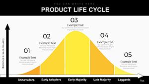 (264)
(264) Navigate Market Waters: PowerPoint Diagrams for Life Cycle MasteryID: #PD00220$16.00
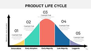 (1168)
Evolve with Ease: Comprehensive Product Life Cycle PowerPoint DiagramsID: #PD00219$18.00
(1168)
Evolve with Ease: Comprehensive Product Life Cycle PowerPoint DiagramsID: #PD00219$18.00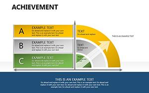 (857)
Achievement PowerPoint DiagramsID: #PD00188$15.00
(857)
Achievement PowerPoint DiagramsID: #PD00188$15.00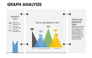 (699)
(699) Graph Analysis PowerPoint Diagrams: Decode Data with Designer FlairID: #PD00185$15.00
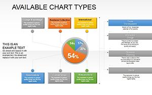 (205)
(205) Available Types PowerPoint Diagrams: Weave Data Dependencies into Compelling VisualsID: #PD00180$20.00
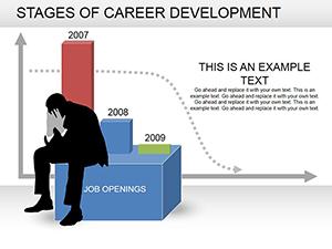 (126)
(126) Career Development Stages PowerPoint Template | 16 Fully Editable Slides | Instant DownloadID: #PD00178$18.00
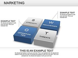 (381)
Dynamic Marketing PowerPoint Diagrams TemplateID: #PD00166$28.00
(381)
Dynamic Marketing PowerPoint Diagrams TemplateID: #PD00166$28.00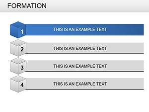 (44)
Versatile Formation PowerPoint Diagram TemplatesID: #PD00165$22.00
(44)
Versatile Formation PowerPoint Diagram TemplatesID: #PD00165$22.00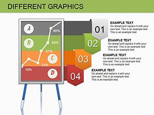 (581)
Different Graphics PowerPoint Diagrams: Embed and ImpressID: #PD00150$16.00
(581)
Different Graphics PowerPoint Diagrams: Embed and ImpressID: #PD00150$16.00 (818)
3D Curve Graphics PowerPoint Template: Dynamic DiagramsID: #PD00105$12.00
(818)
3D Curve Graphics PowerPoint Template: Dynamic DiagramsID: #PD00105$12.00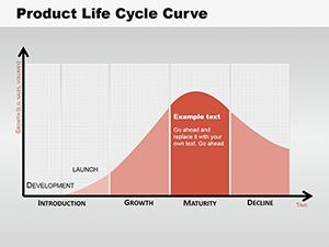 (450)
Product Life Cycle Curve PowerPoint Diagrams: Chart Your SuccessID: #PD00101$12.00
(450)
Product Life Cycle Curve PowerPoint Diagrams: Chart Your SuccessID: #PD00101$12.00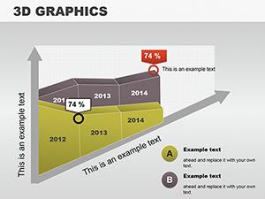 (686)
3D Vector Graphic PowerPoint Diagrams: Elevate Your Visual StorytellingID: #PD00099$14.00
(686)
3D Vector Graphic PowerPoint Diagrams: Elevate Your Visual StorytellingID: #PD00099$14.00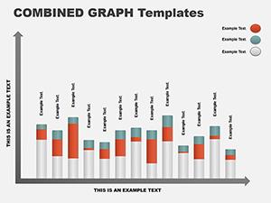 (948)
Column Graph PowerPoint Template for Financial InsightsID: #PD00089$10.00
(948)
Column Graph PowerPoint Template for Financial InsightsID: #PD00089$10.00 (44)
PowerPoint Diagrams Collection 2: Craft Data Stories That StickID: #PD00058$28.00
(44)
PowerPoint Diagrams Collection 2: Craft Data Stories That StickID: #PD00058$28.00
How Graph Diagrams Clarify Data Stories That Numbers Alone Cannot Tell
Column graphs stacked by region instantly show contribution gaps. A sales operations manager used one to highlight underperforming territories; the discussion moved straight to action plans.
Will the Charts Link to External Data Sources?
Each template contains placeholder data. You can link Excel tables via Paste Special or edit values directly inside PowerPoint. The layout holds regardless of source.
Four Moments Where Graph Templates Changed the Conversation
A finance controller presented quarterly variances to the board. Combo column-line graphs showed budget vs actual at a glance; questions focused on root causes rather than chart legibility.
A product analyst mapped feature adoption curves for the leadership offsite. Line graphs with confidence bands replaced tables; the team approved the roadmap extension immediately.
A marketing manager illustrated campaign ROI across channels. Pie and donut graphs clarified spend allocation; budget reallocation was decided in one pass.
An HR metrics lead showed employee engagement trends over four years. Area graphs layered by department revealed retention hot spots; the CHRO requested the file for the next town hall.
Need the visuals now? The file is ready when your data is.
One Technical Detail About Morph Transitions with Graphs
Name each series consistently across slides before applying Morph. PowerPoint recognizes the named elements and animates value changes smoothly without redrawing axes.
Configuring Chart Styles Before Team Use
Set the slide master chart style once so every new graph inherits brand colors and fonts. Future team members open any file and stay on-palette without extra steps.
The Advantage of These Templates for Corporate Teams
Charts remain fully data-editable with no flattened images. The collection focuses on storytelling layouts that survive repeated updates and cross-department sharing.
Choosing the Right Diagram Category for Your Next File
If spherical relationships fit the message better, review the spheres Keynote diagram templates. For physical structure the PowerPoint cube diagram templates add tangible depth. Keynote users can switch to the Keynote graph diagrams for native chart handling.
Select the graph collection that matches your format and open the file.
What PowerPoint version do these graph templates require?
PPTX format works in PowerPoint 2016 and newer for full chart animations and Morph support. Earlier versions keep charts editable but lose some transition smoothness. The file uses native chart objects so data updates work in any supported release.
Are the templates licensed for commercial use and team sharing?
The license covers use in any internal or client presentation. Team sharing inside one organization is permitted. Separate purchases are required for consultants serving multiple clients. Resale of the chart files is not allowed.
How do I update the data in the graphs?
Select the chart, click Edit Data, and paste from Excel or type new values. Axis scales and colors update automatically because styles are set at the template level.
What file format will I receive and how is it opened?
You receive a PPTX file. Open directly in PowerPoint on Windows or Mac. All charts are native objects so no additional fonts or links are required.
Can I export these graphs to PDF with correct scaling?
Yes. Use the standard PDF export at 16:9; data labels and axes remain crisp. For printed reports increase DPI in the print settings to avoid pixelation on legends.