Tree PowerPoint Diagrams
This collection includes PowerPoint templates built around tree diagram layouts - structures designed to show hierarchy, branching logic, and parent-child relationships. It`s for analysts, project leads, and anyone who needs to explain how something breaks down into parts without losing the structure in the process.
Think of a product manager walking into a roadmap review with multiple feature layers and dependencies. A list doesn`t show structure. A chart overcomplicates it. A tree diagram shows what depends on what - and where decisions split. That`s the point here. In practice, this layout carries the logic of the explanation, not just the visuals.
If your next slide needs to show how pieces connect and branch, start with a structure that already does that. You drop in your data. Done.
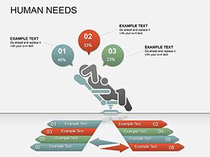 (785)
(785) Innovative Startup Ideas PPT Diagrams - Fully EditableID: #PD00154$20.00
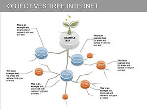 (511)
(511) Dynamic Objectives Tree PowerPoint Diagrams: Elevate Your PresentationsID: #PD00113$20.00
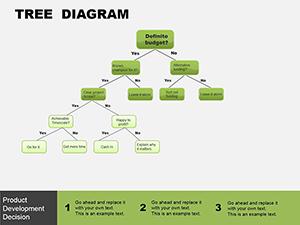 (626)
(626) Tree Block PowerPoint Template: Branch Out Your Data StoriesID: #PD00083$8.00
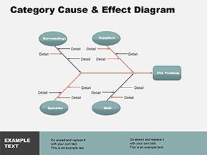 (943)
(943) Cause Effect PowerPoint Diagrams: Decode Impacts with PrecisionID: #PD00082$14.00
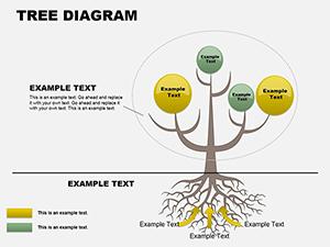 (475)
Tree Analysis PowerPoint Template: Branching Out Your Business InsightsID: #PD00074$22.00
(475)
Tree Analysis PowerPoint Template: Branching Out Your Business InsightsID: #PD00074$22.00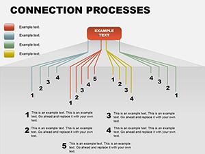 (668)
Connection Processes PowerPoint DiagramsID: #PD00064$15.00
(668)
Connection Processes PowerPoint DiagramsID: #PD00064$15.00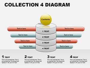 (156)
PowerPoint Diagram Collection 4: Sculpting Ideas in 3DID: #PD00062$18.00
(156)
PowerPoint Diagram Collection 4: Sculpting Ideas in 3DID: #PD00062$18.00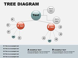 (1068)
Circular Tree PowerPoint Template: Branch into Radial BrillianceID: #PD00060$16.00
(1068)
Circular Tree PowerPoint Template: Branch into Radial BrillianceID: #PD00060$16.00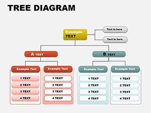 (870)
Tree Organizational PowerPoint DiagramsID: #PD00057$16.00
(870)
Tree Organizational PowerPoint DiagramsID: #PD00057$16.00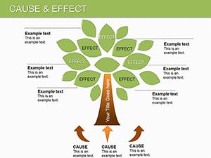 (587)
Cause and Effect PowerPoint Diagrams TemplateID: #PD00030$27.00
(587)
Cause and Effect PowerPoint Diagrams TemplateID: #PD00030$27.00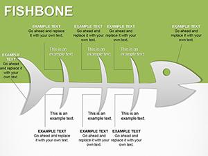 (1009)
Fishbone Diagram PowerPoint TemplateID: #PD00029$20.00
(1009)
Fishbone Diagram PowerPoint TemplateID: #PD00029$20.00
Where a tree layout actually makes the message clearer
Tree diagrams are not just "nice structure." They solve a very specific communication problem: showing how something expands from a single point into multiple layers. That could be an org structure, a product breakdown, or even a decision tree. And the key here is that the branching is visible at a glance - not explained in bullets.
From working on internal strategy decks, I`ve seen this matter most when the audience needs to understand both scope and dependency. A CFO doesn`t want a list of cost drivers - they want to see how they group. A tech lead doesn`t want paragraphs - they want structure. That`s where this layout holds up.
These templates keep spacing consistent across branches, which sounds small until you try aligning ten nodes manually at 11pm. Honestly, the alignment here is what makes them usable in real work.
If that`s your use case, download a layout that already carries the structure and move on.
Real scenarios where these slides get used
A consulting team preparing a market entry presentation needs to explain how a company`s product lines break into segments and subsegments. They start with a tree diagram because each branch represents a category expansion. By the time the slide is filled, the structure tells the story - not the speaker. That`s the difference.
A product manager mapping features for a quarterly planning meeting builds a tree where each level reflects priority tiers. The layout forces clarity. If a branch looks too dense, it usually means the thinking isn`t clean yet. The diagram exposes that early, which is slightly annoying at first, but useful.
In HR presentations, org charts are basically tree diagrams with labels. The difference here is flexibility - these templates let you adjust depth without rebuilding the whole structure. I`ve had to fix broken org slides before. Not fun.
Another case: decision trees in risk analysis. A finance analyst lays out scenarios branching from a single assumption. Each path leads somewhere different. You see outcomes side by side. No explanation needed. Works as-is.
What tree diagrams do better than other slide types
Compared to tables, tree diagrams don`t force everything into rows. Tables compare - trees expand. Compared to flowcharts, trees don`t imply process sequence. They show structure, not movement. That distinction matters more than people think.
But they`re not perfect. If your data isn`t hierarchical - if it doesn`t branch - forcing it into a tree makes the slide harder to read. I`ve seen teams do that just because the layout looked clean. It backfires.
A Gantt chart, for example, is technically structured like a table with time across one axis. That belongs elsewhere. A tree is about relationships, not timelines.
Editing behavior you should know before using these
Most of these templates are built using grouped shapes rather than native SmartArt. That`s intentional. It gives you more control - but also means you need to move elements carefully. If you drag one node, connectors may not auto-adjust like SmartArt would.
So basically, when you need flexibility, this works. When you want automation, less so.
In practice, I usually duplicate an existing branch rather than build from scratch. Keeps spacing intact. Also, check the slide master before editing - the color system is consistent, but it takes a second to understand.
Oh, and the aspect ratio is 16:9 by default.
Why these templates beat building a tree diagram yourself
Building a tree diagram from scratch sounds simple until you start aligning nodes across multiple levels. Then it becomes a spacing problem. Then a connector problem. Then a font consistency problem across slides.
These templates solve that upfront. The hierarchy spacing is already calculated. The connectors are placed. The visual weight between levels is balanced. That`s what saves time - not the shapes themselves.
And yes, you could recreate it. But you probably won`t get the alignment right on the first pass. That`s where most time goes.
When to use this instead of other diagram categories
If your content branches from one concept into multiple levels, this is the right category. If you`re comparing items side by side, a table from PowerPoint chart templates will be clearer. If you`re showing a process step-by-step, a flow layout from diagram templates makes more sense.
And if your focus is geographic relationships, not structure, then map templates are the better fit.
This category is specific. It`s for hierarchy. When that`s the problem - use it. When it`s not - don`t force it.
Why this collection feels different from generic marketplaces
There`s less decoration here. That`s noticeable immediately. The layouts focus on spacing and readability rather than visual effects. In real decks, that`s what holds up - especially when slides get reused across teams.
Some templates are simpler than you`d expect. But that`s intentional. They`re built to adapt, not impress on first glance. And honestly, that`s what you want when the content matters more than the slide design.
If you need a structured slide that holds up in actual presentations, not just previews, this set works well.
Pick a layout, adjust the hierarchy, and move on. That`s it.
FAQ
Can I add more levels to a tree diagram without breaking the layout?
Yes, but it depends on how the template is built. Most use grouped shapes, so you can duplicate a branch and extend it. The key is to maintain spacing manually. From experience, copying an existing level works better than inserting new shapes from scratch because alignment is already set up.
Do these templates work in Google Slides or only PowerPoint?
Usually yes, but with limitations. You can import PPTX files into Google Slides, but some connectors or grouped elements may shift slightly. It`s not a dealbreaker, just something to check after upload. Most users adjust spacing once and move on.
Are these based on SmartArt or custom shapes?
The short answer is: mostly custom shapes. That gives you more control over layout and styling, but less automatic behavior compared to SmartArt. If you`re used to SmartArt auto-adjusting connectors, you`ll need to handle that manually here. Works fine once you get used to it.
Can I change colors and fonts easily across all slides?
Yes, through the slide master. That`s where the color system is defined. I always update that first before editing content - saves time later. Fonts and theme colors apply across all layouts once changed there. No issues.
What license do these templates come with?
It`s the same license most marketplaces use - one buyer, one project, commercial use included. You can use the slides in client presentations, internal reports, or sales decks. Just don`t resell or redistribute the template files themselves.