Energy - Power Keynote Themes
This collection brings together energy-focused Keynote templates built for consultants, utility teams, sustainability managers, startup founders, and operations executives who need presentation structure before they start designing. The layouts cover renewable energy, oil and gas, power generation, environmental reporting, and industrial production in Apple Keynote format.
A strategy lead preparing an investor update on wind infrastructure usually does not need decorative slides. They need a deck where the executive summary, timeline, energy mix charts, and funding roadmap already make sense visually. Honestly, the slide hierarchy here is what makes the collection actually useful in a real review meeting. You drop in your numbers, adjust the brand colors in the slide master, done.
The templates work well for board presentations, internal operations reviews, conference sessions, and ESG reporting. And the layouts are already balanced for widescreen presentations and PDF export. Browse the collection and pick the structure that matches your next energy presentation.
 (14)
(14) Keynote Renewable Energy Template - Editable Keynote | ImagineLayoutID: #KT04031$10.00
 (15)
(15) Keynote Innovation Template Free Download - Editable Keynote | ImagineLayoutID: #KT04030free
 (12)
Eco-Friendly Energy: Solar and Wind Power Template for Keynote PresentationsID: #KT04029$10.00
(12)
Eco-Friendly Energy: Solar and Wind Power Template for Keynote PresentationsID: #KT04029$10.00 (8)
Renewable Energy Keynote Template for Green TechnologyID: #KT04028$10.00
(8)
Renewable Energy Keynote Template for Green TechnologyID: #KT04028$10.00 (15)
Keynote Renewable Energy Theme - Editable Keynote | ImagineLayoutID: #KT04027$10.00
(15)
Keynote Renewable Energy Theme - Editable Keynote | ImagineLayoutID: #KT04027$10.00 (12)
Keynote Power Generation Template - Editable Keynote | ImagineLayoutID: #KT04026$10.00
(12)
Keynote Power Generation Template - Editable Keynote | ImagineLayoutID: #KT04026$10.00 (12)
Keynote Sustainable Energy Theme - Editable Keynote | ImagineLayoutID: #KT04025$10.00
(12)
Keynote Sustainable Energy Theme - Editable Keynote | ImagineLayoutID: #KT04025$10.00 (11)
Keynote Green Energy Tech Template - Editable Keynote | ImagineLayoutID: #KT04024$10.00
(11)
Keynote Green Energy Tech Template - Editable Keynote | ImagineLayoutID: #KT04024$10.00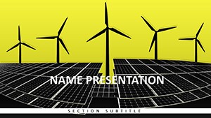 (8)
Keynote Renewable Energy Template for Pros - Editable | ImagineLayoutID: #KT04023$12.00
(8)
Keynote Renewable Energy Template for Pros - Editable | ImagineLayoutID: #KT04023$12.00 (9)
Solar & Wind Power Diagrams - Editable Keynote | ImagineLayoutID: #KT04022$10.00
(9)
Solar & Wind Power Diagrams - Editable Keynote | ImagineLayoutID: #KT04022$10.00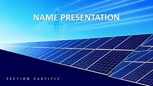 (11)
Renewable Energy Tech Diagrams - Editable Keynote | ImagineLayoutID: #KT04021$10.00
(11)
Renewable Energy Tech Diagrams - Editable Keynote | ImagineLayoutID: #KT04021$10.00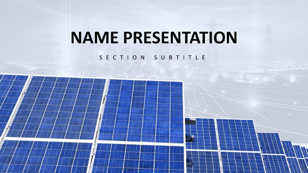 (14)
Download Sustainable Energy Keynote Template for Impactful Eco PresentationsID: #KT03972$10.00
(14)
Download Sustainable Energy Keynote Template for Impactful Eco PresentationsID: #KT03972$10.00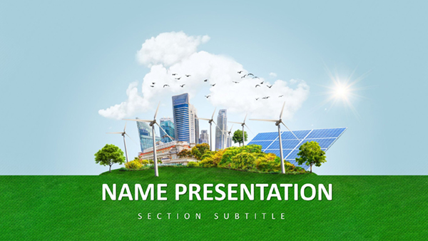 (9)
Renewable Resources Keynote Template: Empower Your Green VisionID: #KT03971$10.00
(9)
Renewable Resources Keynote Template: Empower Your Green VisionID: #KT03971$10.00 (393)
(393) Oil Rig Power Keynote Template: Drill Down to Dynamic ImpactID: #KT03873$12.00
 (96)
Industrial Power: Versatile Keynote TemplateID: #KT03872$10.00
(96)
Industrial Power: Versatile Keynote TemplateID: #KT03872$10.00 (1)
Rainbow of Success Design Keynote TemplateID: #KT03829$10.00
(1)
Rainbow of Success Design Keynote TemplateID: #KT03829$10.00 (634)
Eco Planet Keynote Template: Sustainable DesignsID: #KT03759$12.00
(634)
Eco Planet Keynote Template: Sustainable DesignsID: #KT03759$12.00 (89)
Conservation Ecology Keynote: Stunning Eco DecksID: #KT03758$12.00
(89)
Conservation Ecology Keynote: Stunning Eco DecksID: #KT03758$12.00 (1137)
 Tree of Life Keynote Template: Ecology EssentialsID: #KT03757$12.00
 (329)
Oil & Gas Extraction Keynote Template: Visualize Industry InsightsID: #KT03737$12.00
(329)
Oil & Gas Extraction Keynote Template: Visualize Industry InsightsID: #KT03737$12.00 (196)
Gasoline Pump Refueling Car Keynote Template for PresentationID: #KT03736$12.00
(196)
Gasoline Pump Refueling Car Keynote Template for PresentationID: #KT03736$12.00 (243)
Professional Gas Station Keynote TemplateID: #KT03731$12.00
(243)
Professional Gas Station Keynote TemplateID: #KT03731$12.00 (564)
Dynamic Fuel Pump Keynote Template SlidesID: #KT03730$12.00
(564)
Dynamic Fuel Pump Keynote Template SlidesID: #KT03730$12.00 (859)
Revitalize Your Presentations with Refuel a Car Keynote Template for PresentationID: #KT03729$12.00
(859)
Revitalize Your Presentations with Refuel a Car Keynote Template for PresentationID: #KT03729$12.00 (214)
Geothermal Energy Keynote Template for RenewablesID: #KT03699$10.00
(214)
Geothermal Energy Keynote Template for RenewablesID: #KT03699$10.00 (931)
Eco-Friendly Growth Keynote Template for SustainabilityID: #KT03697$12.00
(931)
Eco-Friendly Growth Keynote Template for SustainabilityID: #KT03697$12.00 (1190)
Solar Energy Keynote Template for Renewable VisionsID: #KT03696$12.00
(1190)
Solar Energy Keynote Template for Renewable VisionsID: #KT03696$12.00 (873)
Hydropower Energy Keynote Template for Flowing IdeasID: #KT03695$12.00
(873)
Hydropower Energy Keynote Template for Flowing IdeasID: #KT03695$12.00 (1057)
Wind Power Keynote Template for Turbine TalesID: #KT03694$12.00
(1057)
Wind Power Keynote Template for Turbine TalesID: #KT03694$12.00 (872)
Alarm: Security and Warning Keynote Template: Sound the Call to VigilanceID: #KT03442$12.00
(872)
Alarm: Security and Warning Keynote Template: Sound the Call to VigilanceID: #KT03442$12.00 (1005)
Ecology Types of Ecosystem Keynote Template: Nature's Visual GuideID: #KT03439$10.00
(1005)
Ecology Types of Ecosystem Keynote Template: Nature's Visual GuideID: #KT03439$10.00 (775)
Bushfire Risk Keynote Template: Ignite Safer StrategiesID: #KT03360$12.00
(775)
Bushfire Risk Keynote Template: Ignite Safer StrategiesID: #KT03360$12.00 (507)
Electric Abstract Keynote Template for PresentationsID: #KT02820$10.00
(507)
Electric Abstract Keynote Template for PresentationsID: #KT02820$10.00
Why energy presentations break down when the slide structure is unclear
Energy presentations usually combine technical data with financial argumentation. That's the difficult part. A renewable energy startup pitching investors needs generation forecasts, funding phases, regulatory timelines, and operating assumptions on the same screen without the slide turning into a spreadsheet. Most blank Keynote decks fail there because the visual hierarchy is missing from the start.
These templates solve that by building the narrative flow directly into the layouts. Executive summary slides lead into production forecasts. Comparison charts already reserve space for labels and supporting notes. Timeline slides anticipate milestone-heavy projects like solar farm deployment or grid modernization reviews. Basically, the deck already understands the kind of conversation happening in the room.
The hierarchy is genuinely well-built across the collection: headline, supporting evidence, action. That matters more than most people expect once a presentation reaches a board review or funding committee.
If your next presentation involves energy infrastructure, climate reporting, or industrial transition planning, this is a practical starting point instead of a design exercise.
Where these Keynote layouts fit in real business work
A sustainability consultant preparing a quarterly ESG review for a manufacturing client often has less than a day to combine emissions metrics, renewable sourcing targets, and supplier updates into one deck. In practice, the problem is not the data itself. It's aligning all the visual elements so the presentation reads clearly. The renewable energy templates here already separate headline claims from technical detail, which keeps executive audiences focused on decisions instead of formatting noise.
An operations manager at a utility company might use the hydropower and wind power layouts during internal infrastructure planning sessions. The timeline diagrams help show phased maintenance schedules and grid expansion plans without rebuilding arrows and milestone markers every time a date changes. Slightly annoying at first: the slide master looks dense when you open it. But once you understand the color system, editing becomes straightforward.
A startup founder pitching clean-energy technology to venture investors has a different problem. Investors expect concise storytelling. The pre-built comparison layouts and KPI slides help keep market size, adoption forecasts, and return assumptions visually consistent across the deck. Also works for accelerator demo days, not just formal investor pitches.
University researchers and conference speakers use these layouts differently again. Technical diagrams, generation flow visuals, and environmental impact charts need to stay readable when projected in large rooms. Keynote handles high-resolution export well, and these templates are already optimized for widescreen 16:9 presentation delivery.
Renewable energy, oil and gas, and industrial power in the same collection
The category is broader than solar and wind slides. The first visible templates include renewable investment decks, hydropower layouts, geothermal presentations, fuel and gasoline station themes, industrial energy reporting, and oil extraction presentations. That mix matters because many organizations are presenting transition strategies rather than single-topic initiatives.
An energy holding company, for example, may need one presentation covering legacy oil operations alongside renewable expansion forecasts. A generic marketplace template usually handles one subject well and the other badly. Here the visual language stays consistent across both traditional and renewable sectors, so mixed portfolios still feel coherent inside the same presentation.
The collection also includes diagrams for sustainability reporting, energy infrastructure updates, operational risk summaries, and policy communication. Not ideal if you need live dashboard analytics. But for structured narrative presentations? Yeah, it works.
What makes Keynote useful for energy reporting specifically
Apple Keynote is especially good at motion sequencing and visual pacing. Energy presentations often rely on staged reveals: showing current production first, then projected capacity, then investment impact. These templates already separate diagram layers logically, so animations stay manageable instead of chaotic.
One practical detail regular Keynote users notice quickly: grouped energy diagrams here generally preserve alignment properly when resized between aspect ratios. Native charts and vector shapes also export cleanly to PDF for board packets and email distribution. I always check that first because broken exports ruin otherwise decent decks.
Another small thing. The templates rely heavily on editable vector objects instead of flattened images, which means you can recolor wind turbines, process diagrams, and energy icons directly inside Keynote without opening Illustrator or another editor.
The difference between these layouts and generic marketplace slides
A lot of presentation marketplaces optimize for visual novelty instead of corporate usability. You see oversized graphics, crowded infographics, gradients everywhere, and slide transitions that look impressive for ten seconds and then become exhausting across a 40-slide deck.
This collection is more restrained. The layouts are designed for recurring reporting environments where teams update the same presentation structure every quarter. Font scaling is consistent, diagram spacing stays predictable, and most slides leave enough whitespace for real operational data. No extras.
That sounds minor until you've rebuilt the same executive summary slide four times during late-night revisions. The layout does the structural thinking for you, which honestly saves more effort than fancy visual effects ever do.
How this category compares with adjacent template sections
If your presentation depends more heavily on process visuals or organizational flows than industry-specific imagery, the broader Keynote diagram templates category gives more flexibility for generic consulting and operations work. Teams presenting numeric forecasting or KPI-heavy reporting may also prefer the structured layouts inside Keynote chart templates because those collections focus more aggressively on data comparison and chart density.
For geographic reporting - grid coverage, drilling regions, utility territories, renewable deployment by country - the dedicated Keynote maps templates section makes more sense. But when the goal is a full energy-sector narrative deck combining charts, timelines, operational context, and executive messaging, this category is the better fit.
Works as-is for internal reviews, investor meetings, procurement presentations, and sustainability reporting cycles.
FAQ
Are these energy Keynote templates compatible with current Apple Keynote versions?
Yes. The templates are provided in .key and .kth formats and generally work with modern versions of Apple Keynote on macOS. Usually yes, but older Keynote releases may simplify some animation layers or flatten chart behavior during import. In most cases the layouts still remain editable. If you export to PDF for stakeholder review, charts and vector diagrams keep their alignment correctly. Oh, and the widescreen aspect ratio is already configured by default.
Can I edit the renewable energy diagrams and power charts without breaking the layout?
So basically, yes - the diagrams are built from editable Keynote objects rather than locked screenshots. You can resize wind turbines, change energy mix values, replace icons, add labels, or move timeline milestones while keeping the overall structure intact. The important part is editing inside grouped layers instead of ungrouping everything immediately. Once the original alignment guides disappear, rebuilding spacing manually becomes slightly tedious. But if you keep the master structure in place, the layouts stay stable even after fairly heavy customization.
Do these templates work for investor presentations and ESG reporting?
They do, and honestly that is probably the strongest use case for this category. Many of the visible templates already include layouts for investment timelines, sustainability metrics, infrastructure phases, renewable adoption forecasts, and operational reporting. The structure reads well in boardrooms because the slides separate narrative claims from supporting numbers cleanly. That's usually the difference between a presentation that feels rushed and one that feels credible to executive audiences.
Can teams share and reuse the downloaded Keynote templates internally?
It's the same license most marketplaces use - commercial presentation work is allowed, but redistribution of the original template files is not. Teams usually duplicate the presentation internally after customization, which is fine for normal reporting workflows. If several designers or consultants need direct access to the editable source package itself, additional licenses may be required depending on how the files are distributed inside the organization. No issues for exported PDFs or finalized presentations.
How difficult is it to adapt these slides to an existing company brand system?
The short answer is: easier than rebuilding a corporate deck manually from blank slides. Most templates rely on centralized slide master settings for typography, accent colors, and diagram styling. That means changing a few master settings updates large sections of the deck automatically. I liked how the color systems stay restrained instead of using ten competing accent tones. For companies with strict brand requirements, you can also replace fonts, update logo placement, and export branded PDF presentations directly from Keynote afterward. That's basically it.