General Keynote Themes
This collection contains Keynote presentation templates built for a wide range of business contexts - strategy reviews, training rollouts, operational briefings, and startup pitches. The templates are not locked to a single industry, which is what makes them useful when the topic changes week to week but the need for a structured, clean deck does not.
A training manager coordinating a leadership offsite across three locations needs slides that work on a MacBook, an iPad connected to the room display, and an Apple TV running Keynote Live. These themes are built on the slide master, so font weights, line spacing, and color assignments stay consistent when the file moves between devices. The layout does not drift between the machine that built it and the one presenting it.
Start with the theme closest to your topic. Edit the master once, fill in your content, and the formatting follows.
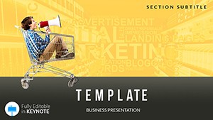 (732)
(732) Marketing Presentation: What Buyer Wanted Keynote templatesID: #KT02500$12.00
 (675)
(675) Manual for Managers Keynote templatesID: #KT02496$12.00
 (324)
(324) Studies Lesson Plans Keynote templatesID: #KT02491$12.00
 (369)
Coffee Shops Keynote template PresentationID: #KT02245$12.00
(369)
Coffee Shops Keynote template PresentationID: #KT02245$12.00 (66)
(66) Flower Petal Keynote Template PresentationID: #KT02217$12.00
 (278)
Fantastic Keynote TemplatesID: #KT02180$12.00
(278)
Fantastic Keynote TemplatesID: #KT02180$12.00 (999)
Building Bricks Keynote templates PresentationID: #KT02174$12.00
(999)
Building Bricks Keynote templates PresentationID: #KT02174$12.00 (153)
Business Intelligence Keynote Template - Fully Editable | Instant Download | ImagineLayoutID: #KT02172$10.00
(153)
Business Intelligence Keynote Template - Fully Editable | Instant Download | ImagineLayoutID: #KT02172$10.00 (490)
Background Symbols United States Template for Keynote PresentationID: #KT02157$12.00
(490)
Background Symbols United States Template for Keynote PresentationID: #KT02157$12.00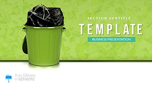 (1062)
Rubbish - Garbage Disposal Keynote TemplateID: #KT02131$12.00
(1062)
Rubbish - Garbage Disposal Keynote TemplateID: #KT02131$12.00 (487)
How to Start a Business Keynote presentationID: #KT02108$12.00
(487)
How to Start a Business Keynote presentationID: #KT02108$12.00 (1018)
Examples Business Plans Keynote template, Presentation themesID: #KT02097$12.00
(1018)
Examples Business Plans Keynote template, Presentation themesID: #KT02097$12.00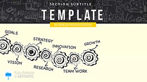 (557)
Corporate Strategy Keynote templatesID: #KT02091$12.00
(557)
Corporate Strategy Keynote templatesID: #KT02091$12.00 (1183)
Manufacturing Robots Keynote templatesID: #KT02086$12.00
(1183)
Manufacturing Robots Keynote templatesID: #KT02086$12.00 (124)
Artificial Intelligence Keynote templatesID: #KT02077$12.00
(124)
Artificial Intelligence Keynote templatesID: #KT02077$12.00 (297)
Energy Saving Lamp Keynote templateID: #KT02043$12.00
(297)
Energy Saving Lamp Keynote templateID: #KT02043$12.00 (520)
Wind Turbines Keynote Template: PresentationID: #KT02016$12.00
(520)
Wind Turbines Keynote Template: PresentationID: #KT02016$12.00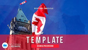 (1080)
Canada: immigration, life, work, learning Keynote Presentation TemplateID: #KT01929$12.00
(1080)
Canada: immigration, life, work, learning Keynote Presentation TemplateID: #KT01929$12.00 (995)
Current Times Business Keynote TemplateID: #KT00697$10.00
(995)
Current Times Business Keynote TemplateID: #KT00697$10.00
What "general" means in practice - and why it covers more than it sounds
The word general here is a category label, not a quality description. These are Keynote themes that are not locked to a specific industry - no medical diagrams, no legal scales, no geographic map overlays. What you get instead is a set of layouts flexible enough to carry a marketing pitch in the morning and a manager onboarding session in the afternoon. The slide structures are topic-neutral. The visual logic - hierarchy, emphasis, data placeholder positions - is built for business communication.
In practice, most people download from this category when they need a clean, editable theme quickly and do not want to filter through sector-specific options. That is a reasonable use case. It also covers cross-functional teams where the deck will be reused by multiple departments who each need to adapt it.
Four situations where this collection is the right call
A startup founder is preparing a first investor meeting. The How to Start a Business theme has a financial summary slide built around a two-column layout - projections on the left, assumptions on the right. The linked Numbers data updates both columns when the model changes. The founder spent the hour before the meeting refining the numbers, not reformatting the slide.
An L&D manager is rolling out a new policy framework across regional teams. The Manual for Managers template uses icon placeholder rows that keep the slide visually organized even when the policy list runs long. Each section uses the same visual weight - which, in a 40-slide handbook deck, keeps the audience oriented across the whole file.
A marketing consultant is running a buyer persona workshop for a mid-market client. The Marketing Presentation theme includes a comparison layout that holds four personas side by side at the same visual scale. The client team updated their own column live during the session using Keynote collaboration. It worked without anyone having to share a file afterward.
A university lecturer is preparing a guest talk for an MBA cohort - 18 slides, heavy on frameworks, light on decoration. The Corporate Strategy theme has a master with a clean content area and a persistent footer that holds the session title and slide number. The lecturer dropped in the content, adjusted the color to match the university's palette, and had a presentation that looked considered rather than last-minute. Honestly, adjusting a master palette in Keynote takes about four minutes once you have done it once.
How Keynote's slide master works - and what to check before you start editing
Keynote stores typography, colors, background rules, and placeholder positions in the master slide set, which lives under View - Edit Master Slides. Everything on a content slide that looks designed - the font, the text box position, the background layer - is inherited from the master. When you edit a master, every slide using that layout updates automatically. This is the mechanism that keeps a 20-slide deck consistent without manually fixing each slide.
When you download one of these templates, the first step before adding any content is to open the master editor and check two things: the color palette matches your brand (or close enough), and the default font is something you have installed. If the file uses a font you do not have, Keynote will substitute silently and the layout may shift slightly. Swap the font in the master - not slide by slide - and the substitution propagates across every layout at once.
For iPad users presenting live: Keynote on iPad reads the same .key file without conversion. The master slide definitions travel with the file. Transitions, builds, and presenter notes are all intact. The only exception is linked charts pointing to Numbers files - those require the Numbers file to be on the same iCloud account to update correctly.
Why a theme built for business communication reads differently than a generic design
Generic Keynote themes - the ones bundled with the app or pulled from stock design sites - are built to look impressive in a thumbnail. They use heavy decorative gradients, centered layouts, and large hero images that work for consumer keynotes. Business presentations have different constraints: dense text, data tables, multi-column comparisons, and slides that need to hold up at both 16:9 on a projector and on a laptop screen shared over Zoom.
The themes here were built around those constraints. Content areas are sized for text-heavy slides. Data placeholder positions allow two or three columns without crowding. Background treatments are light enough that chart objects remain readable when dropped in. And the font hierarchies - headline, subhead, body, caption - are genuinely well-built across every layout, which sounds minor until you are on slide 14 and realize the hierarchy has been consistent the whole way through.
Find the theme that matches your format and start with the master. Everything else follows from there.
Related Keynote template categories for more specific topics
If your presentation has a specific industry context, the subcategories in the Keynote section go deeper. For data-heavy presentations with embedded chart objects, Keynote chart templates provides layouts where the chart structure is the starting point rather than an afterthought. For teams working across Mac and Windows who need the same deck in both .key and .pptx formats, the business Keynote templates section covers corporate communication formats specifically. And for analytical presentations - competitive benchmarking, market reviews, strategic assessments - Keynote analysis templates has layouts built around framework logic rather than general storytelling.
Frequently asked questions
Will these Keynote templates open correctly on the latest macOS versions?
Yes. All files use the current .key format and have been confirmed to open on macOS Sonoma and Sequoia with Keynote 13 and later. Master slide definitions, embedded fonts, linked chart data, and slide transitions are preserved on open. iPad and iPhone versions of Keynote also open the files without conversion. One thing to watch: if you are on an older macOS running Keynote 11 or earlier, some newer master layout properties may render slightly differently - the content will be there, but text box sizing might shift by a few pixels. Exporting to PDF from the current version before sharing ensures recipients see exactly what you designed, regardless of what Keynote version they are running.
Can I update the color scheme to match my organization's brand guidelines?
So basically - yes, and it is faster than most people expect. Go to View - Edit Master Slides, then open the Colors panel and select the theme color palette. Replace each swatch with your brand hex or RGB values and save the modified theme under a new name. Every slide, shape, and chart in the file that references theme colors updates immediately. The only elements that do not update automatically are objects with direct color overrides applied - usually accent elements like icon fills or callout borders. There are typically only two or three of those per file, and they are quick to fix manually. I always do the master update first, before touching any slide content. Saves the frustration of updating colors after the deck is half-built.
Do the templates support Keynote collaboration - can multiple team members edit at the same time?
Yes, in most cases. Once the file is uploaded to iCloud Drive and shared via Keynote's Collaborate menu, team members with edit access can work on different slides simultaneously. Changes sync in near real-time. The master slide setup is protected during collaboration - a collaborator editing a content slide cannot accidentally modify the master unless they specifically navigate to Edit Master Slides and have permission to do so. The one limitation worth knowing: if two people edit the same text box at exactly the same moment, Keynote resolves the conflict by keeping one version and discarding the other. For critical slides, it helps to assign ownership before a live editing session rather than relying on the sync to sort it out.
What happens to animations and builds when I export the presentation to PDF?
Animations and slide transitions do not carry over to PDF - PDF is a static format. What you get on export is one page per slide build state, which Keynote handles in two ways depending on your export settings. If you choose one slide per page, you get the final state of each slide. If you choose one page per stage, each animation step becomes its own page - useful for handouts where you want the audience to follow along. For live presenting with animations intact, use Keynote Live or share the .key file directly. For distributing to people who will not be presenting, PDF with one slide per page is the clean option. Oh, and presenter notes export separately as a different PDF option - worth using if you are handing the deck to someone else to present.
Can I convert these Keynote themes to PowerPoint format for colleagues who use Windows?
Depends a bit on the complexity of the file. Keynote's File - Export - PowerPoint converts the file to .pptx and preserves most layout elements: text boxes, images, basic shapes, and slide structure. What sometimes changes in conversion: custom font substitutions if the font is not installed on Windows, Keynote-specific chart styles which convert to basic PowerPoint chart objects, and some transition types that have no PowerPoint equivalent and are dropped. For templates in this collection - which use standard business layouts without heavy Keynote-specific effects - the conversion holds up well in practice. Run through the converted file in PowerPoint before sending it, check for any font substitution warnings, and fix label positions on any converted charts. That is basically it. Works fine for most cross-platform sharing scenarios.