Food & Beverage Keynote Themes
This collection includes Keynote templates designed for food and beverage presentations - menus, product showcases, brand decks, and hospitality pitches. The layouts balance imagery and structured content, which is harder than it sounds when every slide competes visually. A restaurant owner preparing a seasonal menu update, or a beverage startup pitching to distributors, needs slides that handle photos, pricing, and short descriptions without looking chaotic. These templates solve that by setting clear zones for visuals and text. You drop in your images, adjust copy, and the slide still holds together.
Image-heavy content - that`s what food presentations rely on, but those images need context. These slides balance that by using consistent image ratios across slides, separating pricing or descriptions into fixed text areas, and maintaining spacing so visuals don`t overlap awkwardly. In practice, this means you can swap images freely without rebuilding the slide each time. Honestly, that`s what makes them usable under time pressure.
Choose a layout that fits your format and build from it.
 (10)
(10) Keynote Diagrams for Trendy Foods - Editable | ImagineLayoutID: #KT04002$10.00
 (14)
Dinner Recipes Keynote Template: 28 Editable DiagramsID: #KT03963$10.00
(14)
Dinner Recipes Keynote Template: 28 Editable DiagramsID: #KT03963$10.00 (8)
(8) Free Fruit Cocktail Keynote Template: Juicy Visuals for Vibrant TalksID: #KT03953free
 (14)
Berry Keynote Template: Fresh Takes on Healthy Eating NarrativesID: #KT03952$10.00
(14)
Berry Keynote Template: Fresh Takes on Healthy Eating NarrativesID: #KT03952$10.00 (18)
Citrus Fresh Keynote TemplateID: #KT03912$8.00
(18)
Citrus Fresh Keynote TemplateID: #KT03912$8.00 (324)
Tropical Breeze Keynote TemplateID: #KT03911$10.00
(324)
Tropical Breeze Keynote TemplateID: #KT03911$10.00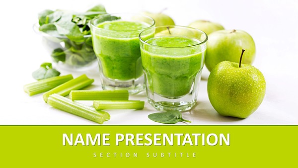 (112)
Healthy Living Keynote Template: Fueling Vitality Through VisualsID: #KT03892free
(112)
Healthy Living Keynote Template: Fueling Vitality Through VisualsID: #KT03892free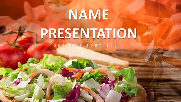 (389)
Food Industry Keynote Template: Plate Your Ideas with FlavorID: #KT03884$10.00
(389)
Food Industry Keynote Template: Plate Your Ideas with FlavorID: #KT03884$10.00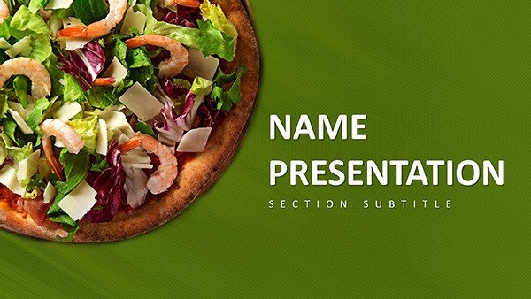 (96)
(96) Pizza-Perfect Keynote Template: Dough Up Engaging Food TalksID: #KT03883free
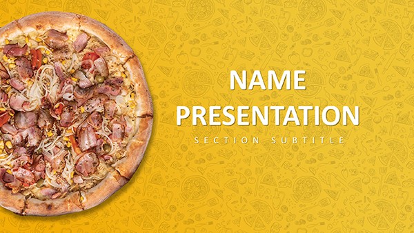 (950)
Menu Pizza Keynote Template: Ignite Appetites with Visual FeastID: #KT03806$12.00
(950)
Menu Pizza Keynote Template: Ignite Appetites with Visual FeastID: #KT03806$12.00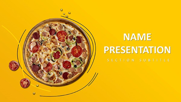 (506)
(506) Pizza Menu Keynote Template - Download PresentationID: #KT03805$12.00
 (926)
Delectable Keynote Template for Pizza PresentationsID: #KT03804$12.00
(926)
Delectable Keynote Template for Pizza PresentationsID: #KT03804$12.00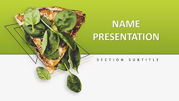 (974)
Vegetarian Pizza Keynote Template: Greens on the SceneID: #KT03803$10.00
(974)
Vegetarian Pizza Keynote Template: Greens on the SceneID: #KT03803$10.00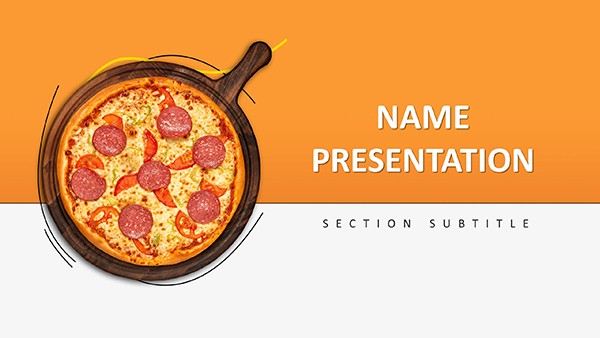 (914)
Delicious Pizza Keynote Template: Bake Brilliance into Every SlideID: #KT03802$10.00
(914)
Delicious Pizza Keynote Template: Bake Brilliance into Every SlideID: #KT03802$10.00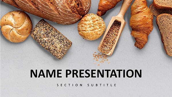 (748)
Delicious and Easy Baking Recipes Keynote Template: PresentationID: #KT03810$12.00
(748)
Delicious and Easy Baking Recipes Keynote Template: PresentationID: #KT03810$12.00 (554)
Mouthwatering Baking Keynote: Oven-Ready SlidesID: #KT03811$12.00
(554)
Mouthwatering Baking Keynote: Oven-Ready SlidesID: #KT03811$12.00 (1074)
Bread & Rolls Keynote Template: Bakery SlidesID: #KT03812$12.00
(1074)
Bread & Rolls Keynote Template: Bakery SlidesID: #KT03812$12.00 (448)
Baking Bread Keynote Template: Culinary DecksID: #KT03808$12.00
(448)
Baking Bread Keynote Template: Culinary DecksID: #KT03808$12.00 (745)
Croissant Keynote Template: Gourmet VisualsID: #KT03809$12.00
(745)
Croissant Keynote Template: Gourmet VisualsID: #KT03809$12.00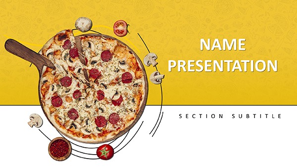 (970)
Delicious Pizza Recipe Keynote Template: PresentationID: #KT03807$12.00
(970)
Delicious Pizza Recipe Keynote Template: PresentationID: #KT03807$12.00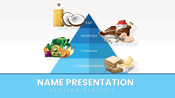 (920)
Healthy Food Pyramid Keynote Template: Stack Your Nutrition Story Layer by LayerID: #KT03719$12.00
(920)
Healthy Food Pyramid Keynote Template: Stack Your Nutrition Story Layer by LayerID: #KT03719$12.00 (288)
Vitamin E Foods Keynote Template: Nourish Your PresentationsID: #KT03685$12.00
(288)
Vitamin E Foods Keynote Template: Nourish Your PresentationsID: #KT03685$12.00 (924)
Vitamin D Nutrition Keynote Template: Wellness DeckID: #KT03684$12.00
(924)
Vitamin D Nutrition Keynote Template: Wellness DeckID: #KT03684$12.00 (242)
Vitamin C Supplements Keynote: Immune Boost SlidesID: #KT03683$8.00
(242)
Vitamin C Supplements Keynote: Immune Boost SlidesID: #KT03683$8.00 (95)
Vitamin B Essentials Keynote: Diet & Health DeckID: #KT03682$12.00
(95)
Vitamin B Essentials Keynote: Diet & Health DeckID: #KT03682$12.00 (570)
Fats and Oils Educational Keynote TemplateID: #KT03677$12.00
(570)
Fats and Oils Educational Keynote TemplateID: #KT03677$12.00 (249)
Healthy Food Keynote TemplateID: #KT03676$12.00
(249)
Healthy Food Keynote TemplateID: #KT03676$12.00 (624)
Vibrant Fruits Keynote Template: Juice Up Your PresentationsID: #KT03675$10.00
(624)
Vibrant Fruits Keynote Template: Juice Up Your PresentationsID: #KT03675$10.00 (157)
Vegetables and Greengrocery Keynote Template: Harvest Engaging ContentID: #KT03674$12.00
(157)
Vegetables and Greengrocery Keynote Template: Harvest Engaging ContentID: #KT03674$12.00 (52)
Food Products Keynote TemplateID: #KT03673$12.00
(52)
Food Products Keynote TemplateID: #KT03673$12.00 (526)
Breakfast Muesli Keynote Template for Nourishing NarrativesID: #KT03634$12.00
(526)
Breakfast Muesli Keynote Template for Nourishing NarrativesID: #KT03634$12.00 (195)
Classic Smashed Cheeseburger Keynote Template: Ignite Your Food PresentationsID: #KT03567$12.00
(195)
Classic Smashed Cheeseburger Keynote Template: Ignite Your Food PresentationsID: #KT03567$12.00 (462)
Sophisticated Wine Classification Keynote TemplateID: #KT03466$12.00
(462)
Sophisticated Wine Classification Keynote TemplateID: #KT03466$12.00
When a table layout does what a photo gallery cannot
Food presentations fail in a predictable way: too many images, not enough structure. Everything looks good individually, but the slide as a whole becomes cluttered. A table layout - or more precisely, a structured layout with fixed zones for imagery and text - solves this by enforcing layout boundaries. Image areas, text blocks, and spacing are predetermined. It sounds basic, but it`s what keeps the deck readable. When I`ve worked on hospitality decks, the biggest issue wasn`t content - it was consistency. One slide looked like a menu, the next like a brochure. Here, the visual system stays stable across slides. That matters more than any single design element. And yes, some layouts feel a bit constrained at first. But that`s what keeps them usable in real decks.
Real-world scenarios where these templates actually help
A café owner preparing a seasonal menu presentation for investors needs to show products, pricing, and positioning. A simple list won`t work. These layouts allow them to present each item visually while keeping pricing clear. The slide becomes both a menu and a pitch. That combination - visual appeal plus structured data - is exactly what this category delivers.
A beverage brand building a distributor pitch deck often struggles with consistency. Each product looks different. Using a structured template ensures every product slide follows the same format, which makes comparison easier. In internal reviews, marketing teams use these slides to present campaign visuals tied to products. The structure helps keep messaging aligned with imagery. Slight detail, but it keeps meetings focused.
A corporate communications manager preparing an internal brand guidelines deck that includes food and beverage photography across multiple departments. The challenge is maintaining hierarchy when images vary in quality and aspect ratio. A structured layout with fixed image containers prevents the photos from dominating the slide. When I opened a template from this collection for a client quarterly review, the pre-set image ratios meant I could drop in five different product shots in under ten minutes without adjusting any of the text boxes.
A startup founder pitching a new beverage line to retailers needs to show packaging, nutritional information, and pricing in a single view. A standard chart can`t carry the visual context. The multi-zone layout places the product image prominently while keeping spec data aligned on the side. That structure makes the comparison work.
A hotel food and beverage director preparing a quarterly performance review with both revenue data and menu photography. The challenge is blending financial metrics with visual examples of the offerings. The templates here provide a consistent grid that handles both data tables and images without forcing the presenter to choose which element gets emphasized.
What editing with image-heavy Keynote templates actually feels like
Editing pain point 1: Aspect ratio mismatch. Most slides use standard image placeholders, which makes swapping visuals straightforward. You drag in your image, it snaps into place. Done. But watch for aspect ratios - not all images scale perfectly, so you may need minor cropping. That`s slightly annoying, but expected in this type of layout.
Editing pain point 2: Text overflow. Text areas are usually fixed, which helps maintain layout consistency. If your descriptions run long, you`ll need to adjust font size or spacing. The alternative - having the template guess your text length - would break the layout entirely. So this trade-off is intentional.
Editing pain point 3: Slide master simplicity cuts both ways. The slide master is relatively simple. Changing colors or fonts applies across the deck without surprises. That`s a plus. But it also means you can`t easily add complex global elements without editing each slide individually. For most food and beverage decks, that`s fine. For highly branded presentations, plan to spend an extra ten minutes on the master.
Technical observation: What breaks when you misuse the image placeholder system
These templates use standard Keynote image placeholders, which are actually shape masks applied to images. When you drag a new image into a placeholder, Keynote scales the image to fit the mask dimensions. If your image has a different aspect ratio than the mask, Keynote either crops the image or adds letterboxing, depending on your settings. The default behavior is to fill the mask, which means cropping. If you need the full image visible, you have to manually adjust the image inside the mask - a multi-click process that becomes tedious across twenty slides. The workaround: before dragging images, check the placeholder`s dimensions in the Format panel. Match your source images to that ratio before import. Saves about fifteen minutes of cropping per deck.
When to choose this category over adjacent Keynote templates
If your presentation is visual-first - menus, products, branding - this category fits. If instead your content is more analytical, you`ll get better results from Keynote chart templates where data clarity matters more than imagery. For structured processes or diagrams, switch to diagram-based Keynote slides. Food templates aren`t built for flow or systems. And if you need geographic context - store locations, distribution - use map templates. Different job entirely. So yeah, choose this when visuals carry the message.
Why building a food presentation from scratch slows you down
Creating a food presentation manually means balancing images, text, and spacing on every slide. It`s repetitive and easy to get wrong. When you start from a blank slide, you make the same layout decisions repeatedly: where does the image go, how much text fits next to it, what`s the spacing between elements. Each slide takes three to five minutes just to establish the basic structure. Over a fifteen-slide deck, that`s an hour of purely mechanical work before you`ve added any content. These templates remove that hour. The balance is already set. You focus on content - products, pricing, positioning - not on layout mechanics. And there`s a second-order benefit: when the layout is consistent, stakeholders stop making subjective comments about slide structure and start discussing the actual content. That shift saves entire meetings.
What makes this collection different from generic marketplace templates
The layouts here are built for corporate usability, not portfolio showcase. That means no decorative elements that serve no purpose, no 3D effects that clash with brand guidelines, and no overlapping text boxes that break when you add real copy. The editing freedom is real - you can change colors, fonts, and image positions without fighting the template structure. But there`s a trade-off. Some layouts feel slightly constrained when you try to repurpose them for non-food content. That`s expected. They`re optimized for food and beverage presentations, not for general use. Accept that limitation upfront, and editing becomes straightforward.
Navigation: related Keynote resources
If you`re building a full presentation deck that combines visual layouts with data analysis, you might need both image-focused slides and chart layouts. Start with this category for your product and menu slides, then pull chart templates from the Keynote charts collection for your market data. For process explanations - supply chain, production workflow - the diagram templates provide the right structural elements. And if you`re presenting store locations or distribution networks, map templates handle geography better than any image-based layout.
Browse the layouts and download the one that fits your next campaign or pitch. Start with structure, then add your content.
Can I replace all images easily in these Keynote templates?
Yes, in most cases you can. The templates use standard Keynote image placeholders, so you just drag and drop your own visuals. The main thing to watch is image ratio - if your photo doesn`t match the placeholder shape, you`ll need to crop it slightly. Works fine once you get used to it. For product shots where the entire image matters, you can adjust the image inside the placeholder mask by double-clicking and repositioning. That takes an extra ten seconds per image but preserves the full frame.
Are these templates suitable for restaurant menus?
So basically, yes - but they`re more for presentations than printed menus. You can present menu items, pricing, and visuals effectively, especially in investor or internal contexts. For printed menus, you`d want dedicated print design files with bleed and CMYK color space. These Keynote templates are built for on-screen presentation, not commercial print. That said, for quick internal menu reviews or pitch decks, they work perfectly.
Can I share these templates with my team?
It`s the same license most standard template collections use - you can use them across your team internally. The straightforward answer is yes, within your organization. Each team member can download and edit the files for company presentations. If you`re distributing to external clients or contractors, check the specific license terms, but internal team sharing is standard practice.
What happens to the layout when I add longer text descriptions?
Text areas are fixed-size text boxes, not auto-expanding containers. That`s intentional - it maintains the layout balance. If your text overflows, you have three options: reduce the font size, shorten the copy, or manually expand the text box and adjust surrounding elements. The most practical approach is to edit your copy to fit. Menu descriptions and product specs usually can be trimmed without losing meaning. In practice, I`ve found that forcing concise copy improves slide readability anyway.
Do these templates work in Keynote for iPad?
The templates are built in Keynote for Mac. They`ll open in Keynote for iPad, but some layout features - specifically image masking and advanced alignment - behave differently on the mobile version. For simple edits like text changes and image swaps, you`ll be fine. For anything involving slide master modifications or complex alignment adjustments, use the Mac version. Export to PDF from the iPad works without issues.