Why Airbnb's IPO Roadshow Presentation Broke the Usual Rules
Airbnb had a 360-page prospectus full of numbers — so why did its roadshow deck spend most of its runtime on people, not spreadsheets?
Design tips, tutorials, product updates, and industry insights.

Tired of blank stares during your presentations? These 10 practical slide design rules help you keep attention without gimmicks or clutter.

Learn what separates pitch decks investors fund from ones that get ignored — structure, pacing, and the slides founders usually get wrong.
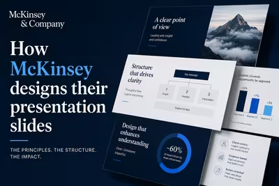
McKinsey's slide design isn't about polish — it's a structured argument system. Here's how the Pyramid Principle actually works in practice.

Airbnb had a 360-page prospectus full of numbers — so why did its roadshow deck spend most of its runtime on people, not spreadsheets?

The advice every presentation designer repeats sounds airtight — until you watch it fail in a real client deck, and nobody says why.

Most companies don't have a template problem — they have thirty of them, and nobody remembers which one is actually current.

The decks look about the same as three years ago — what happens around them doesn't, and that's the part nobody's writing about.

A gradient-filled chart can look sophisticated and still quietly tell your audience the wrong story — here's the mechanism behind it.

Turns out the honest answer depends less on slide count than most guides admit — here's what actually eats the hours.

The "people fear it more than death" line about public speaking isn't quite true — but the real reasons people freeze are, and they're fixable.

The slides went perfectly — so why does one raised hand undo all that confidence?
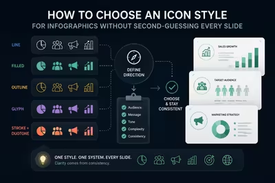
The icon style you pick before lunch on a Tuesday ends up defining how trustworthy your entire deck looks — here's how to choose one you won't regret by slide twelve.