How to Present on Video Calls Without Losing Your Audience
Video presenting isn't public speaking with a webcam bolted on — here's what actually changes, and what to do about it.
Design tips, tutorials, product updates, and industry insights.

Tired of blank stares during your presentations? These 10 practical slide design rules help you keep attention without gimmicks or clutter.

Learn what separates pitch decks investors fund from ones that get ignored — structure, pacing, and the slides founders usually get wrong.
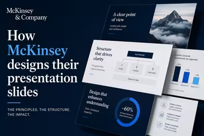
McKinsey's slide design isn't about polish — it's a structured argument system. Here's how the Pyramid Principle actually works in practice.

Video presenting isn't public speaking with a webcam bolted on — here's what actually changes, and what to do about it.

Most presentations don't lose the room in the middle — they lose it in the last ninety seconds, right when it matters most.

Attention doesn't disappear all at once — here's where it actually breaks down in a presentation, and what to do about each point.

Most rehearsal advice tells you to practice out loud — here's how to rehearse against your actual slides, not just your script.

Most decks aren't too long because the topic needed more room — they're too long because nobody wanted to make the hard cuts, and here's how to make them anyway.
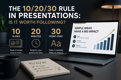
Guy Kawasaki's famous slide rule gets quoted in nearly every design article — here's where it actually holds up in real client work, and where it quietly falls apart.

The real answer isn't a number — it's a method, and once you see it you'll stop counting slides altogether.

Most "storytelling" advice for slides is really just plot structure borrowed from film — here's what actually changes when your story has to survive being skimmed.
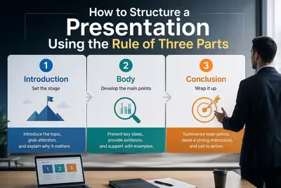
The three-part structure sounds simple until your middle section balloons to twenty slides — here's how to actually keep it in proportion.