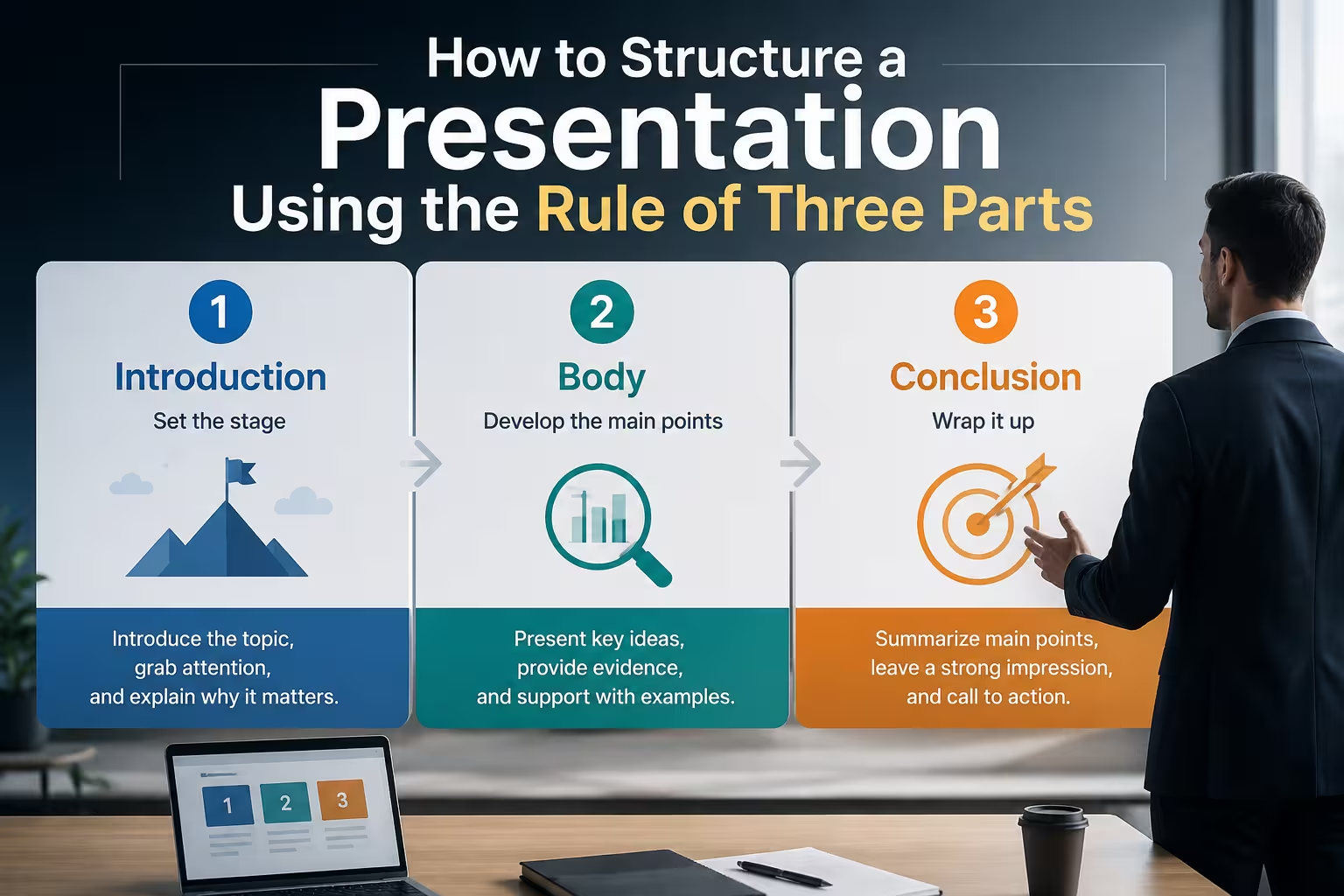
Ask ten people how to structure a presentation and eight of them will say some version of "beginning, middle, end." True, but useless on its own — I've watched that advice produce openings that ramble for four slides and middles that swallow the entire deck. The three-part structure isn't the problem. The problem is that most people treat the three parts as equal in size and importance, when in a working presentation they almost never are.
The rule of three — opening, body, closing — comes from classical rhetoric, and it survives in presentations for a good reason: an audience can only hold so much unstructured information before it starts losing the thread. Three chunks is roughly the ceiling for what people track without notes. But the rule tells you nothing about proportion, sequencing, or what happens when your content doesn't naturally split into three neat movements. That's the part worth actually working through.
What the three parts are actually for
Opening, body, close map to three different jobs, not three equal time blocks:
- Opening — establishes why anyone should keep watching. This is where you frame the problem or question, not where you list your agenda for three minutes.
- Body — does the actual persuading or explaining. This is where most of your evidence, data, and reasoning lives.
- Close — converts attention into a decision or action. Not a recap — a decision point.
In my experience, the opening should run short — often under 10% of total time — and the close shorter still. The body carries the weight. When I see a 20-minute deck where the opening eats five minutes, it's almost always because the presenter is stalling before getting to the part they're least confident about.
Where the three-part rule breaks down in practice
Here's the part most articles skip: the three-part structure works cleanly for a single-threaded narrative — one problem, one proposed solution, one ask. It gets messy the moment you have multiple audiences in the room with different stakes in the outcome, or multiple decisions bundled into one presentation (say, a budget approval plus a hiring plan plus a timeline shift).
When that happens, forcing everything into one opening-body-close arc usually means the close either tries to resolve three separate asks at once — which audiences find confusing — or you quietly nest three-part structures inside each other without realizing it. I wouldn't recommend fighting this. If you genuinely have three separate decisions to land, it's often cleaner to build three short three-part arcs back to back, each with its own mini-close, rather than one long arc with a single mega-close at the end trying to do too much work.
Sizing the body without letting it sprawl
The body is where structure discipline actually gets tested, because it's tempting to keep adding "just one more slide" of supporting evidence. A trick that's worked for me: before building the body, decide how many sub-points it needs to make its case, and cap that number before you start pulling content together — not after. Three sub-points is common for a reason similar to the outer structure — audiences track three claims reasonably well — but there's nothing sacred about the number. Two strong points beat three where the third is filler, and four is fine if the material genuinely demands it and you're not defending a slide count for its own sake.
One thing people overlook: the body doesn't have to be linear. For sequential material — a rollout plan, a project history, a phased rollout of features — a timeline structure inside the body section can carry the audience through time without you narrating every step verbally. If you're building that kind of sequential body section, a timeline layout does a lot of the pacing work that a wall of bullet slides won't.
The close is not a summary
This is the section that gets flattened into "recap your key points" advice everywhere, and it's the weakest advice in the whole framework. A recap is passive. A close should ask for something — a decision, a next meeting, a sign-off, a changed opinion. If your close is just restating what you already said in the body, you've used your last moment of audience attention to bore them with material they just heard.
What I do instead: write the close first, before building the rest of the deck. Decide exactly what you want the room to do when the lights come up, then build the opening and body backward from that target. It sounds obvious, but I'd guess a majority of presentations I've reviewed were built front-to-back with no fixed close in mind, which is exactly why so many of them trail off instead of landing.
Matching the three parts to visual weight, not just narrative weight
Structure isn't only about spoken content — it should show up visually too. A common mismatch: the opening gets the most polished, custom-designed slide (title slide, hero image, brand treatment), while the body — where the actual argument lives — gets whatever chart formatting was fastest to produce. That's backward. If your case rests on data comparisons or process flow, the body deserves your best visual thinking, not your title slide.
If you're building the body around charts or comparison visuals, it's worth looking at what diagram layouts are available before you start dropping default bar charts into slides — a structured diagram often communicates a body-section argument faster than a paragraph of bullet points ever will. And if you're not sure which layout style fits your content type, a general run-through of template features across formats can save you from picking a design that fights your structure instead of supporting it.
A short, hypothetical example
Say you're pitching a mid-year budget reallocation to a leadership team (this is a hypothetical scenario, not a real case). A weak version opens with five minutes of company background, spends the body walking through every line item in the current budget, and closes with "so that's where we are." A tighter version opens with one slide framing the specific gap ("we're 15% under target in region X"), spends the body on two or three reallocation options with trade-offs stated plainly, and closes by naming the option you're recommending and the exact approval needed to move forward this week. Same information, radically different structure — and the second version gives the room something to actually decide on.
The rule of three isn't a formula that writes the presentation for you. It's a constraint that forces you to decide, before you open a slide editor, what job each part of the deck is doing — and to stop pretending that a well-organized middle section is optional just because the opening and close are easier to plan.
Comments (0)