PowerPoint objects can be only a few pixels apart and still make a slide look unfinished. The problem is that dragging shapes, images, or text boxes until they “look right” gives you no reliable way to keep the same geometry across the rest of the presentation.
If you want to align objects perfectly in PowerPoint, the better approach is to treat the objects as a system. PowerPoint already has the tools for this: Align commands, Distribute commands, guides, gridlines, and Smart Guides. The important part is knowing which tool to use and when.
Start by deciding what should actually align
Before selecting anything, decide what relationship you are trying to create. Not every object needs to line up with the edge of the slide. Sometimes the correct alignment is between two related elements.
For example, an icon may need to align vertically with the text beside it rather than with the slide's top or bottom edge. A title may share a left edge with the body copy below it, while a supporting image intentionally sits outside that visual column.
This distinction matters because PowerPoint can make an object mathematically aligned without making the composition feel balanced. ImagineLayout's guidance on slide alignment makes the same practical distinction: related elements often need to be aligned to each other, not simply to the canvas. See the slide alignment rules guide.
Use Align instead of dragging objects by eye
Manual dragging is acceptable when you are roughly positioning an object. It becomes unreliable when you are trying to create a finished layout.
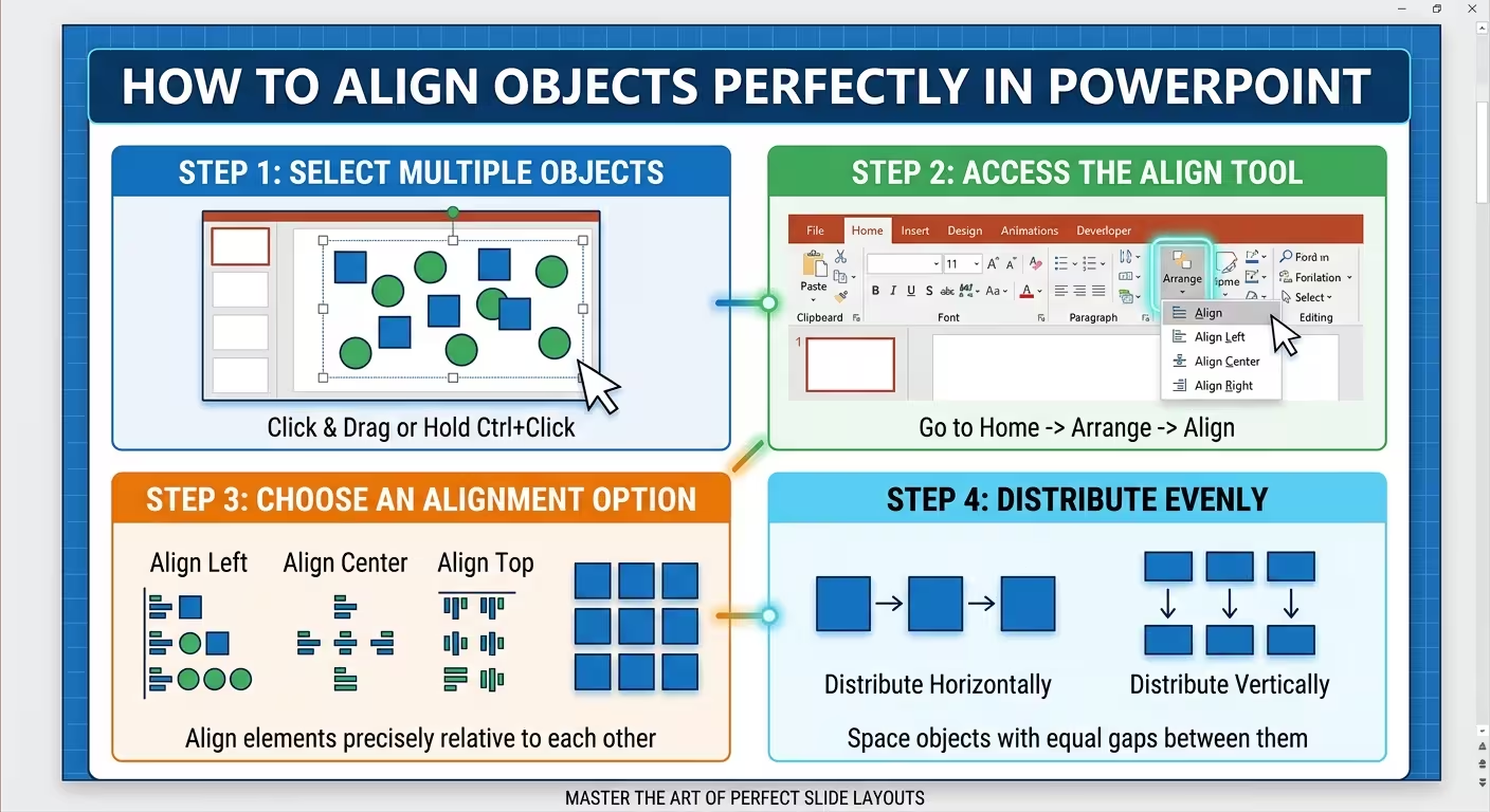
Select the objects you want to align, then use PowerPoint's alignment commands. Depending on the layout, you can align objects to the left, center, right, top, middle, or bottom.
The key is understanding what you are aligning against. PowerPoint can align selected objects relative to each other or relative to the slide. Those are two different jobs.
- Align Left: creates a common left edge.
- Align Center: places objects on the same vertical center line.
- Align Right: creates a common right edge.
- Align Top: creates a common top edge.
- Align Middle: places objects on the same horizontal center line.
- Align Bottom: creates a common bottom edge.
For a row of cards, for instance, you might first align their tops and then distribute them horizontally. For a column of images, you might align their left edges and distribute them vertically.
Use Distribute when the real problem is spacing
Three objects can be perfectly aligned and still look wrong because the gaps between them are inconsistent.
This is where Distribute Horizontally and Distribute Vertically become more useful than manually adjusting each gap.
Imagine three equal boxes positioned approximately in a row. Instead of trying to calculate the distance between each box, select all three and distribute them horizontally. PowerPoint creates consistent spacing between the objects.
The same principle works vertically. A column of steps, labels, screenshots, or cards becomes much easier to maintain when the vertical gaps are controlled by the distribution command rather than by repeated dragging.
This is especially useful when building diagrams. The basic workflow is simple: create the objects approximately, align them into a common position, then distribute them to establish consistent intervals. This PowerPoint diagram workflow explains why treating shapes as a system is faster than perfecting each shape individually.
Turn on guides before you build the slide
Alignment becomes much easier when you establish the slide's visual boundaries before placing content.
PowerPoint guides can act as invisible columns and rows. For a simple business slide, you might use guides for the left margin, central axis, and right margin, plus horizontal guides for the title and main content areas.
The important detail is timing: establish the basic structure before the slide becomes crowded. Trying to reconstruct a grid after dozens of objects have already been positioned creates unnecessary work.
Gridlines can also help when you need a more regular construction system. They are particularly useful for diagrams, card layouts, tables, and repeated objects.
Once the guides are in place, you no longer have to ask whether two objects “look about right.” You can ask whether they share the same reference line.
Group objects before aligning complex blocks
One of the easiest ways to damage an otherwise clean layout is to align the individual pieces of a compound element separately.
Suppose you have a heading, a short description, and an icon that together form one content block. If you align each piece independently against other objects, the internal relationship can shift.
Group the elements first when they are meant to behave as one unit. Then align the group with the other groups on the slide.
This is particularly useful for repeated cards or diagram nodes. The outer alignment stays consistent while the internal spacing remains controlled.
Afterward, you can ungroup only if you need to make a specific internal adjustment.
Perfect mathematical alignment is not always perfect visual alignment
There is a subtle problem with relying on PowerPoint's alignment commands for everything: the eye does not always perceive mathematical symmetry as visual symmetry.
A bold headline placed at the exact vertical center of a slide can sometimes appear slightly low. A large icon can also appear visually heavier than a text block with the same bounding-box dimensions.
That means the best workflow has two stages:
- First, align mathematically. Use PowerPoint's tools to establish a precise structure.
- Then, check optically. Make a small intentional adjustment if the composition genuinely looks unbalanced.
The important distinction is that an optical adjustment should be deliberate. Do not use “it looks right” as the starting method for the entire slide. Use it as the final inspection after the geometry is already controlled.
Check alignment across duplicated slides
A slide can be perfectly aligned on its own and still create problems across a presentation.
This often happens when a slide is duplicated and the content is replaced. An image may be resized slightly, a title may be moved a few pixels, or a text box may become a different height. Individually, these differences are easy to miss. Viewed as a sequence, they become obvious.
For repeated layouts, compare similar slides side by side or in sequence. Look specifically at:
- left and right content margins
- title positions
- image edges
- card widths and heights
- spacing between repeated elements
- icon-to-label relationships
ImagineLayout's alignment guidance highlights this “drift” problem with duplicated slides: small changes introduced during editing can gradually make otherwise identical layouts inconsistent. The full alignment checklist is useful when reviewing a finished deck.
A practical PowerPoint alignment workflow
When I need to clean up a slide quickly, I would not start by adjusting individual objects. I would work in this order:
- Identify the main visual relationships on the slide.
- Turn on guides or establish the main reference lines.
- Select related objects and align them.
- Use horizontal or vertical distribution where spacing needs to be equal.
- Group elements that should move as one unit.
- Check the relationships between icons, labels, images, and captions.
- Make only necessary optical adjustments.
- Compare repeated layouts across the presentation for alignment drift.
This approach also explains why editable diagram templates can save time. If the spatial structure is already established, you can spend your time adapting the content rather than repeatedly constructing and aligning the same geometry. ImagineLayout's editable PowerPoint templates are one example of starting from an existing structured layout rather than a completely blank slide.
The goal is not to make every object obey an invisible mathematical rule. The goal is to make the relationships between objects intentional. Use PowerPoint's alignment tools to establish the geometry, then use your eye only for the small decisions that software cannot make for you.
Comments (0)