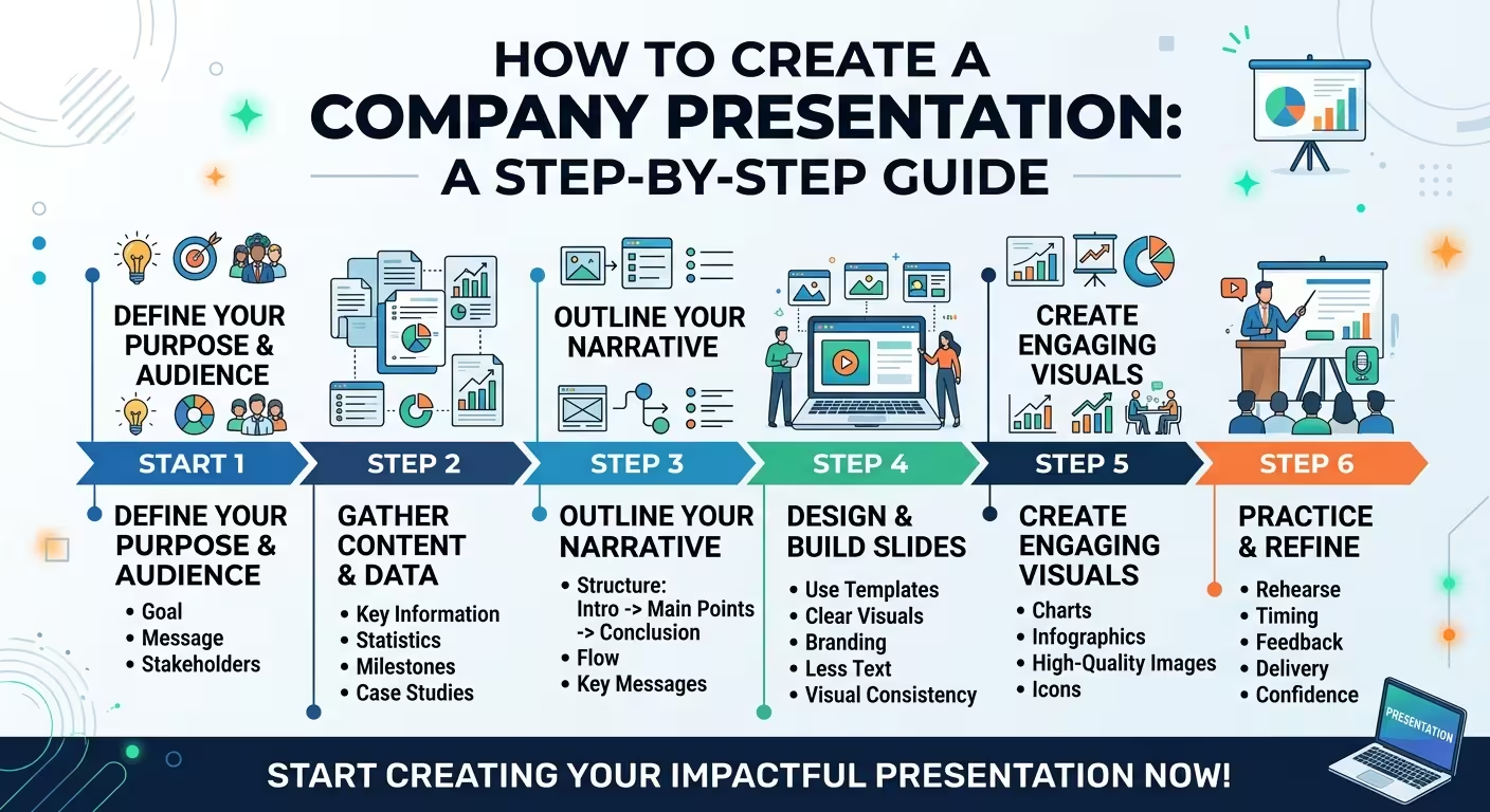
Start with the reason the company presentation exists
A company presentation often starts with a familiar instruction: “We need a few slides about the company.” That sounds simple until the first draft reaches 30 slides and contains everything from the founding story to office photos, service descriptions, awards, team biographies, and a page of logos.
The problem is not that any of this information is necessarily wrong. The problem is that a company presentation can easily become a collection of facts instead of a reason for the audience to care.
Before opening PowerPoint, define what the presentation needs to accomplish. Is it introducing the company to a potential client? Supporting a sales meeting? Explaining the business to a partner? Giving investors a high-level overview? Preparing a reusable corporate deck?
Those situations may involve the same company, but they do not require the same presentation.
A useful starting sentence is:
“After seeing this presentation, the audience should understand ______ and be ready to ______.”
The first blank defines the information. The second defines the purpose. Together, they give you a much better filter for deciding what belongs in the deck.
Build the story around the audience, not the company history
Most companies naturally want to begin with themselves: when they were founded, how they grew, what they believe in, and who works there.
That is understandable. It is also rarely the strongest opening.
The audience is usually trying to answer a different question: Why should I pay attention to this company?
For a potential client, that may mean understanding what problem you solve. For a partner, it may mean understanding your capabilities and market position. For an investor, the questions will be different again.
So instead of creating one universal sequence and sending it to everyone, identify the audience first.
- Potential client: problem, solution, capabilities, proof, differentiation, next step.
- Partner: business model, capabilities, reach, complementary strengths, partnership opportunity.
- Investor: company, market, business model, traction, competitive position, financial story.
- General company overview: who you are, what you do, where you operate, what makes you credible, and how to learn more.
This is one reason a company presentation should not automatically be treated as a pitch deck. A company overview may need to explain the business without making an investment or sales argument. A sales presentation, by contrast, should spend much more of its limited space helping the buyer understand the value of working with you.
ImagineLayout's guide to building a presentation step by step makes the same structural distinction: the presentation should be planned around what the audience needs to understand, decide, or do before individual slides are designed. Start with the presentation's objective before building the slides.
Choose a company presentation structure that can be edited without losing the story
There is no mandatory number of slides for a company presentation. A small service business may need only a handful. A multinational organization may need a much larger core deck plus optional sections.
What matters is the order in which the audience receives the information.
A practical core structure can look like this:
- Opening: company name and a clear description of what the company does.
- Positioning: the problem, market, or situation in which the company operates.
- Offer: products, services, or capabilities.
- Difference: what makes the company meaningfully different or useful.
- Proof: results, customers, projects, milestones, certifications, or other evidence that is relevant to the audience.
- Company: team, locations, history, scale, or operating model where these details add credibility.
- Next step: contact information or a clear action for the audience.
The important word here is core. Do not interpret this as a checklist that requires every section.
If your company has a 25-year history but the audience is evaluating a particular service, the entire history may deserve only one compact timeline. If the team is the reason clients choose you, the team may deserve substantially more space.
The structure should follow the argument, not the amount of information available.
Separate facts from proof
“We are innovative.” “We provide high-quality solutions.” “We have extensive experience.” These statements may be true, but they are weak presentation material on their own because the audience has no way to evaluate them.
A stronger company presentation turns claims into evidence.
Instead of:
“We have extensive international experience.”
Consider showing the relevant footprint: countries served, representative projects, locations, or another verifiable indicator that demonstrates what “international” actually means for your company.
Instead of:
“Our team consists of experienced professionals.”
Show the information that makes the experience meaningful: relevant expertise, leadership roles, certifications, years in the field, or specific responsibilities.
The distinction is simple:
- Claim: what the company says about itself.
- Proof: information that allows the audience to believe the claim.
Not every slide needs a number. A project example, recognizable client category, certification, product demonstration, or concise process can sometimes provide stronger evidence than another large statistic.
When creating a company presentation, ask of every credibility statement: “What would make someone believe this?”
Do not turn the company presentation into an About Us page
A website can afford to contain detailed company information because visitors choose what to read. A presentation is different. The audience usually receives a controlled sequence of information.
That makes slide order much more important.
For example, putting “Our History” immediately after the cover may feel logical internally. But if the audience has not yet understood what the company actually does, the history has little context.
The same issue appears with team slides. A page containing twelve portraits and job titles can take considerable space while telling the audience very little about why those people matter to the current conversation.
History, team, offices, awards, certifications, and company statistics should therefore earn their place by supporting the main story.
One useful test is to temporarily remove a slide and ask:
Does the audience lose an important piece of understanding, or do they simply lose another piece of company information?
If the second answer is true, the slide may belong in an appendix or supporting document rather than the core presentation.
Design the company presentation as a visual system
Once the structure works, start designing. Not before.
A company presentation becomes much easier to control when the visual system is defined early. Decide how the brand colors will be used, which type hierarchy will carry the deck, how section dividers will work, how images will be cropped, and how charts, diagrams, tables, and metrics will look.
The goal is not to put the logo on every possible surface. Branding should help the presentation feel like it belongs to the company without competing with the information.
This distinction becomes especially important when a presentation will be reused by different people.
A company template that looks excellent when its original designer controls every object may fall apart when someone in sales duplicates a slide, replaces the headline, inserts a chart, and adds two lines of text.
That is why a reusable company presentation needs a system rather than a collection of attractive slides.
ImagineLayout's recent analysis of company presentation templates highlights this exact problem: a company-ready template has to survive reuse by people with different skill levels, not merely look polished in its initial version. When choosing a company presentation template, test how well the structure survives real editing.
Give different information different visual weight
One of the easiest ways to make a corporate deck feel amateur is to give every piece of information the same visual treatment.
If the slide contains a key number, three supporting facts, a paragraph, a logo strip, and a decorative graphic, they cannot all be equally prominent.
Visual hierarchy should reflect the importance of the information.
For example, a company overview slide might contain one large statement about the business, three supporting capabilities, and a small note about geographic coverage. The viewer should not need to discover that hierarchy by reading everything.
The same principle applies to metrics. If one figure is the reason the slide exists, do not surround it with five equally large numbers simply because the company has them.
One thing people overlook is that hierarchy also creates credibility. When the slide makes it obvious which fact matters most, the company appears more confident about what it wants the audience to remember.
Use visuals to explain the company, not decorate it
Company presentations often contain two opposite visual problems: too little visual information or too much decorative material.
A better question is what kind of visual can communicate something faster than text.
- Timeline: useful when company development is genuinely relevant.
- Map: useful when geography or market coverage matters.
- Process diagram: useful when the audience needs to understand how the company delivers its service.
- Comparison: useful when the audience needs to distinguish capabilities, products, or options.
- Chart: useful when a quantitative relationship is central to the argument.
- Photography: useful when the people, physical environment, product, or real-world operation needs to be seen.
The visual should have a job. A photograph of an attractive office may establish atmosphere, but it does not automatically establish credibility. A diagram showing how a complicated service works may communicate far more about the company in the same amount of space.
For companies that repeatedly need diagrams, charts, comparison layouts, and other editable structures, a prepared presentation system can also reduce the amount of time spent rebuilding common slide mechanics. ImagineLayout's business presentation resources are designed around this reusable approach rather than treating every presentation as a completely blank file. A business presentation set can be structured as reusable components rather than one oversized master deck.
Build one core presentation, then adapt it
Many companies make the opposite mistake: they create one enormous presentation intended to serve every possible situation.
The result is usually a 30- or 40-slide file containing optional slides for investors, clients, partners, recruitment, internal meetings, and trade shows.
It technically contains everything. It is also difficult to use.
A more practical approach is to create a core company presentation and then build audience-specific modules around it.
For example:
- Core: company overview, positioning, capabilities, proof, and contact.
- Sales module: customer problems, solution details, relevant cases, commercial next steps.
- Partner module: capabilities, geographic reach, operating model, partnership opportunities.
- Investor module: market, business model, traction, financial information, growth opportunity.
- Recruitment module: culture, team, roles, employee experience, career information.
This structure has another advantage: when the company changes, you can update the core information once instead of hunting through several unrelated decks.
ImagineLayout's analysis of business presentation sets reaches a similar practical conclusion: a company-wide presentation system is usually more useful when different deck types have their own purpose and ownership rather than being forced into one giant master file.
Finish with a next step, not just a contact slide
A company presentation should not simply end because the last piece of information has been displayed.
Think about what the audience should do next.
If the presentation was used to introduce a company to a prospective client, the next step might be a discovery call. If it was sent to a partner, it might be a follow-up meeting. If it is a general company overview, the next step may simply be contacting a specific person or visiting a relevant page.
The closing slide can remain simple, but it should not be ambiguous.
“Thank you” is polite. “Contact us” is functional. A clear next step is more useful.
That final decision also gives you a useful test for the whole deck. If you cannot explain what the audience should understand and what they should do afterward, the presentation may still be describing the company rather than communicating with the audience.
The strongest company presentations are not the ones that contain the most information about the company. They are the ones that make the right information easy to understand, credible, and relevant to the person looking at the slides.
Comments (0)