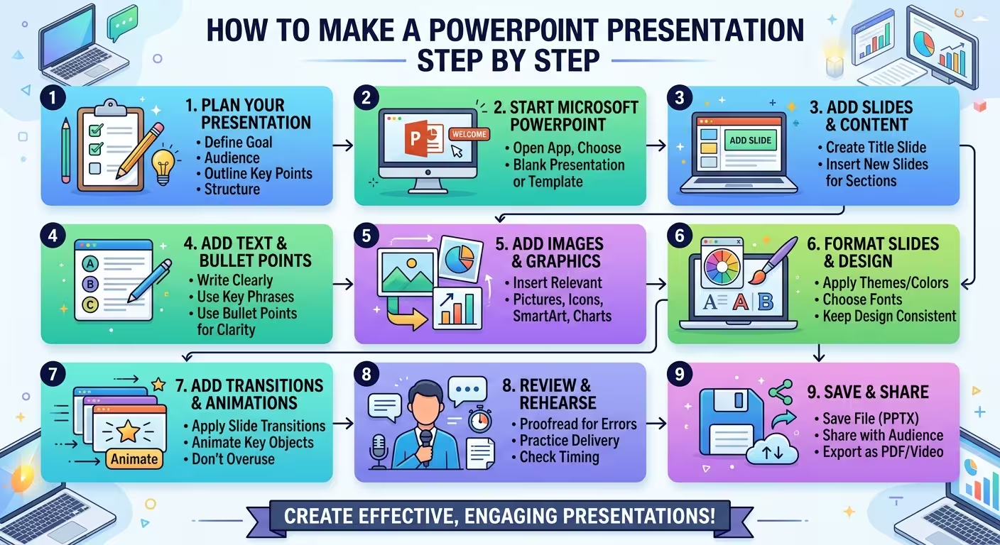
Most PowerPoint problems start before the first slide is designed. You open a blank file, add a title, drop in some text, and only several slides later discover that the story is out of order. At that point, changing the structure also means changing the design.
If you want to know how to make a PowerPoint presentation step by step, the useful answer is not simply which buttons to click. The better workflow is to decide what the presentation needs to say first, turn that message into a sequence of slides, and only then build the visual system inside PowerPoint.
1. Decide what the presentation needs to accomplish
Before opening PowerPoint, finish this sentence: “After this presentation, the audience should understand, decide, or do…”
That single sentence gives you a filter for everything that follows. A presentation explaining a process has a different structure from a presentation asking management to approve a project. A classroom presentation may need more explanation, while an executive update may need to get to the decision much faster.
Don't start by deciding how many slides you need. Start with the outcome.
A useful first pass is to define three things:
- Audience: who will be looking at the slides?
- Purpose: what should they understand or decide?
- Evidence: what information actually supports that purpose?
One thing people overlook is the difference between information you possess and information the audience needs. A presentation can contain accurate research and still be poorly constructed if most of that research does not help the audience reach the intended conclusion.
2. Write the slide outline before you design anything
A blank PowerPoint canvas encourages you to solve visual problems before you have solved the communication problem. Resist that.
Write your slide titles as a simple list first. Don't worry about fonts, images, icons, animations, or colors yet.
For example, a hypothetical project-update deck might begin like this:
- Project status has improved, but two risks remain
- The delivery timeline is currently on track
- Customer testing exposed two recurring issues
- Those issues affect the final release sequence
- Three actions are required before launch
Notice that these are not generic labels such as “Status,” “Testing,” or “Next Steps.” Each title tells the reader what the slide is actually saying.
This is also the fastest point at which to discover structural problems. If two consecutive slides make almost the same point, combine them. If a later slide introduces evidence needed to understand an earlier claim, move it forward. If the conclusion requires information that never appears in the deck, you have found a content gap before spending time designing around it.
This content-first approach is also used in professional presentation workflows. ImagineLayout's discussion of presentation design describes how the logic of a deck can be established before visual design, while a recent article on presentation creation similarly argues that source material and structure increasingly come before the finished slide. Read more about building the argument before designing the slides.
3. Choose the right slide size and presentation format
Once the outline works, create the PowerPoint file.
For a normal business, classroom, or meeting presentation, a widescreen layout is usually the practical starting point. In PowerPoint, check Design → Slide Size before building the deck.
The important point is not that one aspect ratio is universally correct. It is that changing the canvas after you have designed dozens of slides can create unnecessary layout work.
Also save the file immediately. Give it a useful filename rather than something like Presentation1.pptx. If several versions will exist, use a naming system that makes the working version obvious.
At this stage, you can start from a blank presentation or use a template. A template is particularly useful when the deck needs recurring layouts, diagrams, charts, or a defined visual identity. ImagineLayout's PowerPoint template library is organized around different presentation subjects and formats, so the useful question is not simply “Which template looks good?” but “Which existing structure resembles the kind of information I need to present?”
4. Build the presentation around a small set of slide types
Now create the actual slides, but don't treat every slide as a completely new design problem.
A practical presentation usually needs a limited vocabulary of structures. Depending on the subject, that might include:
- Title or opening slide
- Section or transition slide
- Key-message slide
- Comparison slide
- Process or timeline slide
- Data or chart slide
- Image-led explanation
- Summary or decision slide
The advantage is subtle: once you know which type of slide you are building, you spend less time inventing layouts and more time deciding how the information should be represented.
This is where a template can save more time than simply providing attractive backgrounds. The useful asset is the underlying set of layouts. ImagineLayout, for example, separates full PowerPoint templates from specialized PowerPoint diagram layouts and chart resources.
Don't force every piece of information into the same title-and-bullets layout. If the content describes a sequence, use a sequence. If it compares two alternatives, build a comparison. If one number is the central message, give that number a composition that reflects its importance.
5. Put the message on each slide before adding decoration
At this point, you should be able to look at any slide and answer one question: What does this slide want the audience to understand?
If the answer is “there are several things,” the slide may need to be split or reorganized.
This doesn't mean every slide must contain only one object or one sentence. A complex slide can contain a chart, annotation, supporting text, and a comparison. The constraint is conceptual rather than visual: the pieces should work together toward one main takeaway.
For example, suppose a slide contains a sales chart. The title “Sales Results” tells the audience what the chart is about but not why it matters. A more useful headline might state the actual observation: “Growth came from two regions, while the third declined.” The chart then becomes evidence for the headline rather than something the audience has to interpret without guidance.
This distinction is one of the most important changes between assembling slides and designing a presentation.
6. Create a visual system before polishing individual slides
Once the content is in place, establish the rules that should repeat throughout the deck: typography, colors, margins, headline treatment, chart style, image treatment, and recurring elements.
The mistake is to perfect slide one and then copy its visual decisions inconsistently across the rest of the presentation.
If the deck contains many repeated layouts, use PowerPoint's Slide Master rather than manually fixing the same element on every slide. A Slide Master can control recurring layouts, placeholders, and structural elements so that changes don't require a slide-by-slide repair job.
ImagineLayout's practical guide to using Slide Master in PowerPoint explains the distinction between the master and its underlying layouts and why this matters when a presentation becomes larger.
There is an important trade-off here: don't build a complicated design system for a five-slide presentation. A small deck may only need a few deliberate rules. A long report or recurring corporate deck benefits much more from reusable layouts and controlled formatting.
7. Add visuals because they explain something, not because the slide feels empty
A visual should earn its space.
Use a chart when the audience needs to compare quantities or see a trend. Use a diagram when relationships or sequence are difficult to explain in prose. Use an image when the visual subject itself carries information that words cannot communicate efficiently.
A common failure is choosing the visual first and then searching for a message that fits it. The workflow should run in the opposite direction:
- Identify the point.
- Determine what evidence supports it.
- Choose the visual form that makes that evidence easiest to read.
- Remove visual elements that don't contribute to the interpretation.
This is especially important with charts. A chart can be technically correct and still be ineffective if the important comparison is visually buried among secondary categories, labels, or decorative elements.
For presentation-specific design decisions, ImagineLayout's guide on designing slides that don't bore your audience focuses on the practical problem of making the slide support the speaker instead of competing with the spoken message.
8. Review the deck as a sequence, not as individual slides
Here is where many presentations receive their final polish but never receive their final edit.
Run through the deck in Slide Show mode and ignore the design for a moment. Listen to the argument.
Ask:
- Does each slide naturally lead to the next one?
- Does the headline of each slide tell me why it is there?
- Are there slides that repeat information already established?
- Does the presentation reach the important point early enough?
- Is there any slide that requires an explanation the audience cannot reasonably get from the screen?
Then do a separate visual review. Look for alignment errors, inconsistent spacing, font substitutions, broken charts, awkward line breaks, image quality problems, and elements that move unexpectedly between layouts.
Don't combine these two reviews into one pass. When you are simultaneously judging the story and the pixels, it is easy to miss both.
9. Rehearse the actual presentation, not just the slideshow
A deck can look finished and still be difficult to present.
Run it from beginning to end while speaking aloud. Pay attention to places where you repeatedly stop, read the slide word for word, or need to explain something that the slide doesn't make clear.
Those moments are useful design feedback.
If you keep saying, “What this slide is really showing is…,” the slide may be missing the explanation your audience needs. If you spend thirty seconds reading text that the audience can also read, the slide may be carrying too much of the spoken script.
Use Presenter View if you need speaker notes or a presenter-facing view, and rehearse in the environment in which you expect to present when possible. A deck viewed on your own monitor is not necessarily a deck that will work equally well on a projector, conference-room display, or video call.
10. Finish with a pre-presentation check
The final step is not “make it prettier.” It is making sure the file survives contact with the real presentation.
Before sending or presenting, check:
- File name and final version
- Slide order
- Fonts and font substitutions
- Charts and numbers
- Images and image quality
- Links and embedded media
- Speaker notes
- Animations and transitions, if used
- Presentation timing
- PDF or other backup export when appropriate
Save the editable .pptx file separately from any exported PDF. The PowerPoint file is the working source; the PDF is useful when the recipient needs a stable, easy-to-view version rather than an editable presentation.
The workflow matters more than the first slide
The fastest way to make a PowerPoint presentation is rarely to make the first slide faster. It is to prevent the same decision from being made repeatedly.
Plan the message before the software. Outline the slides before designing them. Choose layouts according to the information they need to contain. Establish the visual system before polishing individual pages. Then rehearse the finished sequence and make the final changes based on how the presentation actually works.
That order may feel slower for the first fifteen minutes. It usually becomes faster once the deck gets complicated, because you are no longer solving the same structural problem every time you move something three slides later.
Comments (0)