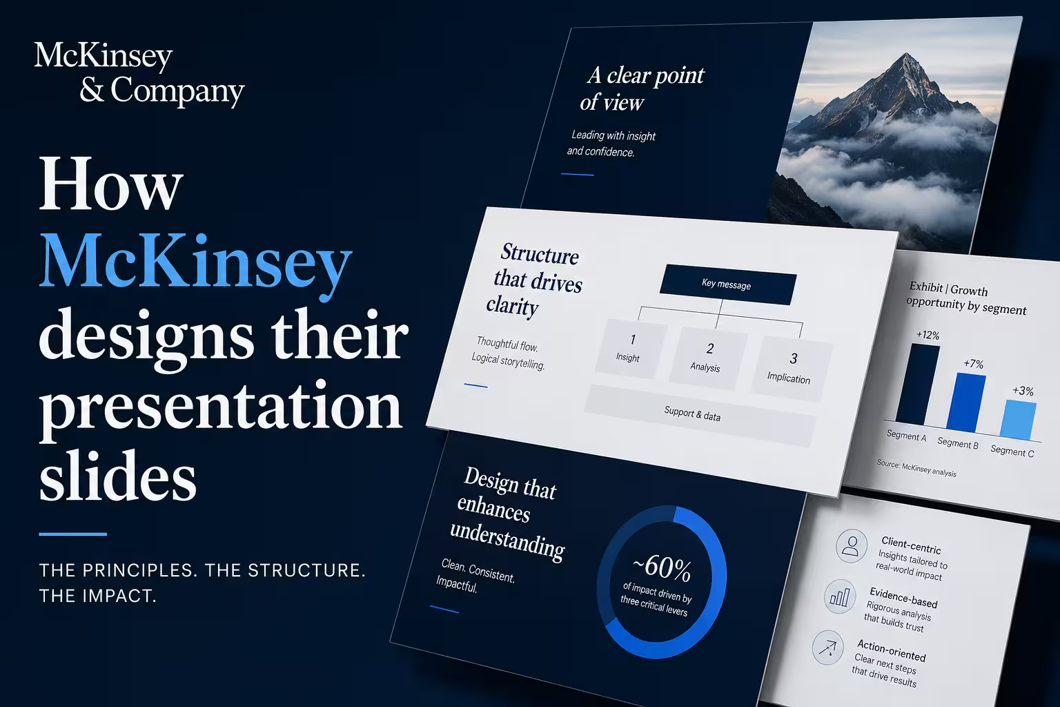
I've sat through enough client reviews of "make it look like a consulting deck" requests to notice a pattern: most people who ask for this are pointing at the wrong thing. They mean the fonts, the whitespace, the clean charts. That's the surface. What actually makes a McKinsey deck work is decided before anyone opens PowerPoint.
Here's the system behind it, and where it tends to break down when people try to copy just the look.
The deck gets written before it gets designed
McKinsey teams build what's commonly called a "ghost deck" — a sequence of slide titles and rough content, often in a Word doc or a stack of blank slide shells, before any layout work starts. The logic gets tested first: does the argument hold together? Are the sections in the right order? Only once that's solid does design begin.
This traces back to the Pyramid Principle, developed by Barbara Minto during her time at McKinsey in the 1960s. The idea inverts how people naturally think. When you're doing the analysis, you build up from data to conclusion. When you present, you reverse it — the conclusion comes first, and everything below it exists to support that one claim.
In my experience, this is the step most teams skip. They open a blank presentation, start dropping in charts as they finish the analysis, and try to find the story afterward. It usually shows.
Every title makes a claim, not a label
This is the most quoted McKinsey habit, and for good reason: it's the easiest one to check. A McKinsey slide title isn't "Regional Sales Performance" — it's a full sentence that states the takeaway, something closer to "Regional sales grew despite a weaker product mix." The idea is that a reader should be able to skim just the titles, top to bottom, and follow the entire argument without opening a single chart.
Try this on your own deck: strip out everything but the titles and read them in sequence. If they don't form a logical narrative — situation leading to complication leading to resolution — the deck has a structure problem no amount of formatting will fix.
One thing people overlook here: action titles keep you honest about what your data actually proves. If you can't write an honest one-sentence claim for a slide, that's usually a sign the underlying analysis isn't finished yet.
One slide, one idea
McKinsey slides are built around a rule that sounds simple and is genuinely hard to follow: one message per slide. If you have two points, that's two slides, not one dense one. This connects to the MECE framework — Mutually Exclusive, Collectively Exhaustive — which is really just a discipline for organizing evidence so nothing overlaps and nothing important is missing.
I wouldn't recommend trying to retrofit this onto a finished deck. It's much easier to apply while you're still in the ghost-deck stage, because splitting a crowded slide after the design work is done usually means redoing the layout anyway.
The narrative shell: SCQA or SCR
Most McKinsey decks open using a structure called SCQA — Situation, Complication, Question, Answer — to frame why the audience should care before diving into evidence. Some teams use a simplified version, SCR (Situation-Complication-Resolution), which skips the explicit question and moves straight to the answer. Bain and BCG use close variants of the same opening logic, which is part of why it's often described as a shared "MBB" default rather than something proprietary to one firm.
As a hypothetical example — not an actual McKinsey deck — imagine a growth strategy presentation that opens with: the market is expanding (situation), but the client's share is shrinking despite that growth (complication), which raises the question of what's driving the gap (question), answered directly on slide three. That's the shape, regardless of the industry or client.
Design restraint is a rule, not an aesthetic
Visually, McKinsey slides are deliberately unremarkable: a limited color palette, one clean sans-serif typeface, consistent formatting across the deck, and source lines on anything with data. Full-bleed charts often get an entire slide to themselves, with minimal surrounding text, so nothing competes with the one number or trend the slide exists to prove.
None of that is decoration. It's signal-to-noise discipline applied to layout — the same instinct that drives one-message-per-slide, just executed visually instead of verbally. Anything that doesn't help someone understand or remember the point gets cut.
Where this actually matters if you're not a consultant
You don't need a strategy practice to use any of this. The sequence that transfers best is: write your argument as a list of plain-sentence titles before you touch layout, cut anything that doesn't support the conclusion you're leading with, and give each slide exactly one job.
Where a lot of people get stuck isn't the thinking — it's translating a clean argument into a deck that actually looks disciplined, especially under a deadline. That's less about design talent and more about having layouts that already enforce the constraints: one chart, one takeaway, consistent type and spacing, so you're not reinventing the grid on every slide.
Next time you're building a deck, try the title test before you build a single slide: write out just the headlines, in order, and read them as a paragraph. If they don't tell a complete story on their own, that's the thing worth fixing first — not the fonts.
Comments (0)