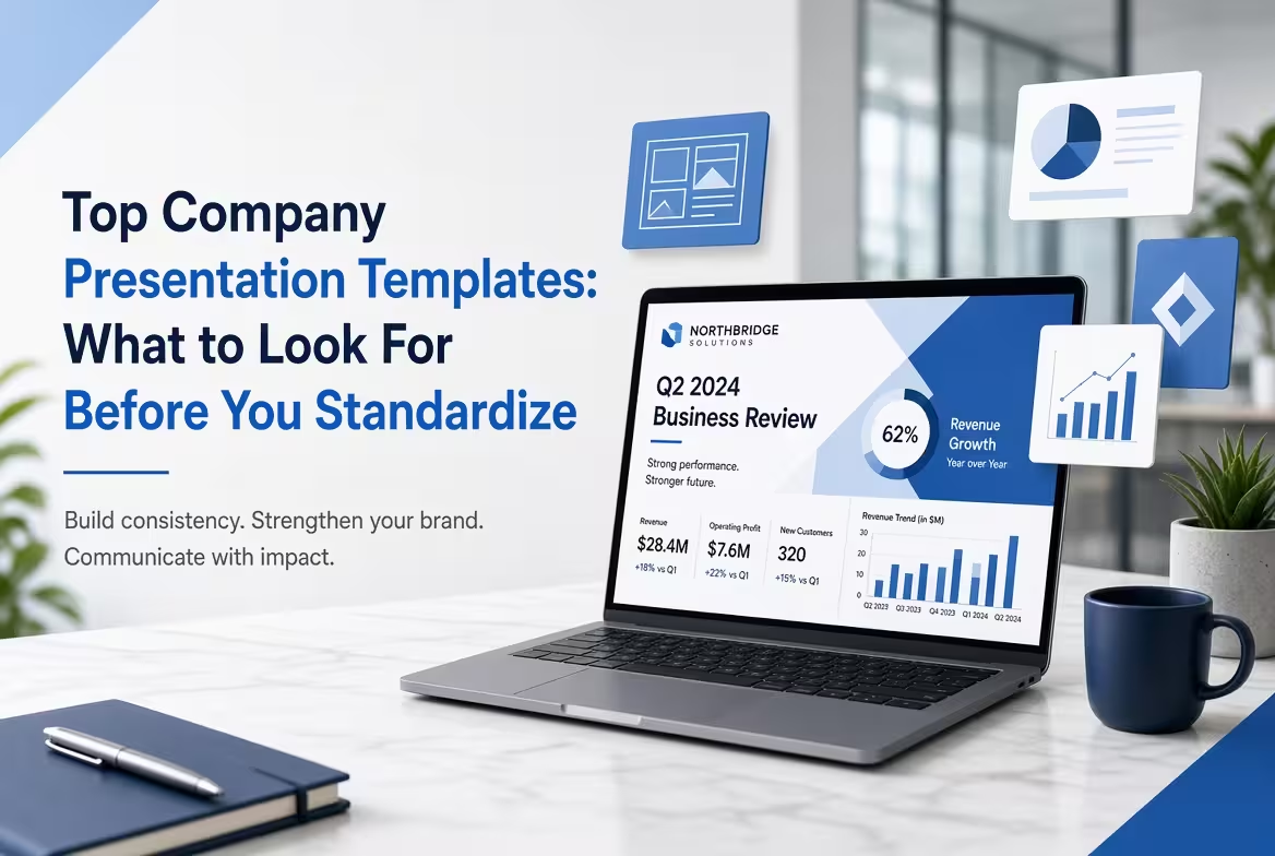
Every company eventually ends up with a shared deck that three departments have quietly forked into three different decks — same logo, three different blues, two different bullet styles nobody remembers approving. Nobody chose that outcome on purpose. It's what happens when "grab a template" is the entire template strategy, and it's the reason picking a company presentation template is a different job from picking a nice-looking one.
This is about that decision — what to actually check before your team standardizes on a template it will be copying for the next two years, not which ones look best as a marketplace thumbnail.
What makes a template "company-ready" instead of just business-themed
A one-off pitch deck template only has to survive one person editing it once. A company template has to survive ten different people, with ten different skill levels, most of whom will never open the slide master and will instead duplicate whichever slide looks closest to what they need and type over it. That's the real test: not whether the first version looks polished, but whether slide forty, built by someone in sales who has never touched a master layout, still lines up with slide two.
In practice this comes down to placeholder discipline. A template built for reuse locks font sizing, spacing, and color to named styles in the master, so a new text box someone drops in inherits the right look automatically. A template built to look good in a screenshot usually doesn't bother — the text boxes are manually sized and colored on each slide, which looks identical in the preview and falls apart the moment two different people start extending it.
The slides that get copied every time, and the ones nobody rebuilds
Open any company's shared deck folder and a handful of slide types get duplicated constantly — the section divider, the single-metric summary, the comparison table. A handful of others get built once, dragged into every new deck out of habit, and never actually rebuilt for the audience in front of the room. A template that's genuinely useful for a company should make the first kind easy to duplicate and resist encouraging the second kind by default — the recap slides and decorative closers that quietly bloat corporate presentations without anyone deciding to add them. If a template's default slide count leans heavily on filler like that, it's optimizing for looking complete in a preview, not for what a team will actually reuse.
A palette that survives contact with your actual brand colors
Most company templates ship with four or five "brand" accent colors already applied everywhere — headers, icons, chart series, footers — because that reads as more finished in a marketplace preview. The problem shows up later: once you swap in your own two-color palette, half the slide's visual hierarchy was riding on accents that no longer exist, and elements that were supposed to draw the eye now just sit there in whatever color survived the swap. A template worth standardizing on treats color as something to point at one thing per slide, not something to decorate every slide with — the same restraint that determines whether a polished-looking deck actually holds up under scrutiny or just looks like it does. Before adopting a template company-wide, it's worth testing it with your palette stripped down to two colors and seeing what, if anything, breaks.
Where the time actually goes if this step gets skipped
A GfK survey conducted for Made in Office, covering more than 1,000 office workers, found that people who regularly use PowerPoint spend around 20 hours a month on it — and roughly eight of those hours go into formatting alone, not content. That number tracks with what usually happens after a company skips the template-selection step: every new deck starts from whichever old file someone can find, and a chunk of everyone's week goes into re-fixing fonts and spacing that a locked master would have handled automatically. Choosing a template with disciplined placeholders up front is what that eight hours is actually buying back.
This is also where browsing by category earns its keep over browsing by "looks nice" — filtering to a set built specifically around business and corporate use narrows out the templates that were designed for one flashy pitch rather than repeated internal use. Ready-made business PowerPoint templates built with a locked master and a smaller color set are a faster starting point than adapting a generic deck slide by slide.
Before you tell the team "this is the one"
Run a real deck through the template before you announce it as the standard — not the sample content, an actual internal deck someone will present next week. Duplicate a slide and retype it as someone unfamiliar with the file would. Strip the accent colors down to your actual two or three brand colors and see what goes flat. Count how many slide types in the default set you'd genuinely reuse versus delete on sight. A template that holds up under that isn't the one with the best first slide — it's the one where slide forty still looks like it belongs to the same file as slide two.
That's the fork-in-the-folder problem solved before it starts: not by writing a brand guideline nobody reads, but by picking a template where doing the wrong thing takes more effort than doing the right one.
Comments (0)