How to Create a Professional Title Slide
It's the one slide every single person in the room actually looks at — so why does it get built last, in five minutes, with whatever's left over?
Design tips, tutorials, product updates, and industry insights.

Tired of blank stares during your presentations? These 10 practical slide design rules help you keep attention without gimmicks or clutter.

Learn what separates pitch decks investors fund from ones that get ignored — structure, pacing, and the slides founders usually get wrong.
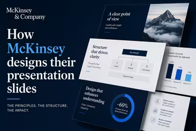
McKinsey's slide design isn't about polish — it's a structured argument system. Here's how the Pyramid Principle actually works in practice.
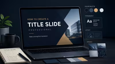
It's the one slide every single person in the room actually looks at — so why does it get built last, in five minutes, with whatever's left over?
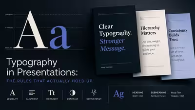
Most typography advice for slides falls apart the moment you're in a real room with a bad projector — here's what actually holds up.
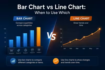
The rule everyone repeats — bars for categories, lines for trends — is right until the exact moment it isn't, and that moment shows up in almost every quarterly deck.

The template that makes your deck look "professional" for one industry can make it look naive in another — here's how to tell the difference before you download anything.

The audience decided what they thought of your talk before you finished your first sentence — here's what they were actually reading.
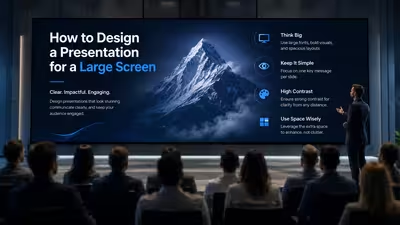
The slide that looks perfect on your laptop is the same slide that gets cropped, washed out, or unreadable the moment it hits a 75-inch boardroom display — here's why.

Most slide animation gets switched off by the second audience question — here's how to build the kind that survives contact with a live room.
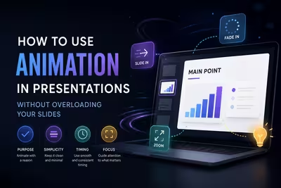
Animation is supposed to hold attention — so why does it so often do the opposite, and what actually decides which side of that line you land on?

The tone advice is fine — it's just not where most audience-mismatch presentations actually go wrong.