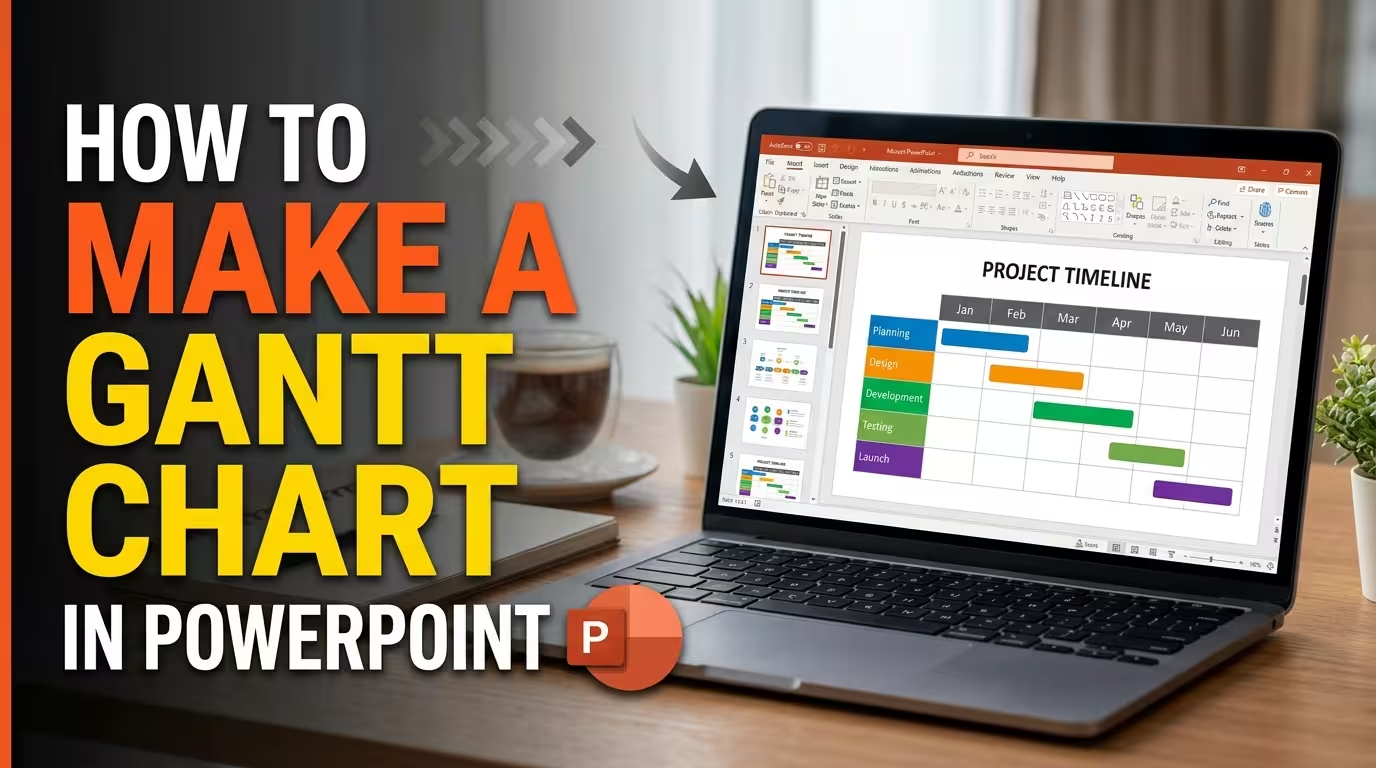
A project schedule can contain dozens of tasks, but a presentation slide rarely has room for all of them. A Gantt chart solves that problem by putting two things together: what needs to happen and when it happens.
If you are wondering how to make a Gantt chart in PowerPoint, the technical part is only half the job. The more important decision is how much scheduling detail your audience actually needs. This guide walks through the process of building a practical Gantt chart, from defining the time scale to adding task bars, milestones, dependencies, and progress indicators.
Decide What the Gantt Chart Needs to Show
Before drawing anything in PowerPoint, decide what the chart is supposed to communicate. A project team may need a detailed schedule, while an executive audience may only need the major phases and deadlines.
A useful presentation Gantt chart usually contains four basic elements:
- Tasks: the activities that make up the project.
- Time scale: days, weeks, months, or another appropriate unit.
- Duration: how long each task is expected to take.
- Milestones: important points that mark an approval, delivery, launch, or other event.
Dependencies can be added when the sequence between tasks matters. For example, testing may not begin until development has reached a particular stage.
The first useful constraint is therefore not a design rule. It is a content rule: only include scheduling information that helps the audience understand the project.
Set Up the Time Scale First
The horizontal axis determines how useful the rest of the chart will be. If the project lasts three months, showing every individual day can make the slide unnecessarily dense. If the project lasts only two weeks, a monthly scale may hide the differences between tasks.
Choose a time unit that matches the decision your audience needs to make:
- Days: short projects, events, launches, or intensive work periods.
- Weeks: development cycles, campaigns, implementation plans, and short-term projects.
- Months: strategic initiatives, annual plans, product development, and longer programs.
Once the scale is chosen, create the time headers across the top of the slide. The task area should then align directly beneath those periods.
This alignment is more important than decorative elements because the position of a task bar is what communicates its duration.
Create the Task Bars in PowerPoint
There are several ways to build a Gantt chart in PowerPoint. For a presentation slide, manually editable shapes are often easier to control than a chart generated from complex data.
Start by creating a horizontal rectangle for each task. Place the rectangle under the appropriate start date and extend it to the task's expected end date.
For example:
- Planning — Week 1
- Design — Weeks 2–3
- Development — Weeks 3–6
- Testing — Weeks 6–7
- Launch — Week 8
The bars should share a common vertical starting point for their task rows. This creates a direct relationship between the task name on the left and its position in time on the right.
PowerPoint's Align and Distribute Vertically commands are particularly useful here. They help keep task rows evenly spaced instead of requiring you to position every shape by eye.
Add Milestones Without Turning Them Into Tasks
A milestone represents a point in time rather than a period of work. Treating it like an ordinary task bar can make the chart harder to interpret.
Use a small diamond, circle, flag, or another distinctive marker for milestones. Place it directly on the date when the event occurs.
Typical milestones might include:
- Project approval
- Prototype completed
- Testing approved
- Client review
- Product launch
Keeping milestones visually different from duration bars gives the audience an immediate distinction between work that takes time and events that happen at a specific point.
ImagineLayout's Gantt Timeline PowerPoint layouts use dedicated milestone markers together with task bars and timeline structures, which is a useful reference when deciding how to separate these two types of information. View the Gantt Timeline PowerPoint Charts.
Show Dependencies When Sequence Matters
A list of task bars tells the audience when activities happen. It does not automatically explain why one task follows another.
That is where dependency connectors become useful.
For example, if testing can begin only after development is complete, a connector can visually link the end of the development bar to the beginning of testing.
Do not connect every task simply because PowerPoint allows it. Too many connectors create a second visual system that competes with the time scale.
Use dependency lines when they answer a meaningful question such as:
- What has to finish before this task can start?
- Which activity is waiting for another team?
- What sequence could cause a schedule delay?
ImagineLayout's fully editable Gantt layouts include separate dependency lines and milestone markers, demonstrating a structure where these relationships can remain distinct from the main task bars. See the editable Gantt layout.
Decide Whether Progress Belongs on the Chart
A project status presentation often needs more than planned dates. It may also need to show how much of each task has been completed.
One approach is to use a second visual layer inside the task bar. The full bar represents the planned duration, while a smaller filled portion represents completed work.
For example:
Development — 60% complete
The important distinction is between planned duration and progress. They should not be represented as though they are the same measurement.
ImagineLayout's free Monthly Gantt Chart PowerPoint template includes editable progress overlays and is designed for monthly project schedules, making it a useful reference for this type of presentation treatment. Explore the free Monthly Gantt Chart PowerPoint template.
Use PowerPoint's Slide Master for Consistent Formatting
If the Gantt chart will appear in several slides, formatting each bar individually becomes inefficient. Instead, establish the main visual settings through the PowerPoint theme and Slide Master where appropriate.
Keep the relationship between colors meaningful. For example, you could use one treatment for planned work, another for completed work, and a separate marker style for milestones.
The goal is not to create a colorful chart. It is to make the visual language predictable so the audience can interpret a new project phase without learning a new color system.
ImagineLayout's Gantt Timeline Charts template supports theme-level color adjustments through the slide master, allowing the visual treatment to be changed across the editable presentation rather than recoloring every individual element. See the editable PowerPoint Gantt template.
When a Gantt Template Makes More Sense Than Building From Scratch
Creating a Gantt chart manually is reasonable when you have only a few tasks and need a highly specific layout. It becomes less attractive when the slide contains multiple phases, dependencies, milestones, or different time scales.
A prepared PowerPoint template can give you the underlying structure immediately: task rows, timeline divisions, milestone markers, connectors, and editable labels are already positioned.
ImagineLayout currently offers Gantt-oriented PowerPoint files with editable task bars, dependency connectors, and milestone elements. Its Gantt Timeline Charts collection contains 18 editable layouts in a 16:9 PowerPoint format. Browse the Gantt Timeline Charts collection.
There is also a broader Gantt Timeline PowerPoint collection with 14 editable layouts covering basic overviews and more detailed multi-phase schedules. View the Gantt Timeline PowerPoint Chart Template.
Know When Your Gantt Chart Has Too Much Information
The easiest way to overload a Gantt chart is to treat the presentation slide like the project's master schedule.
If the audience has to read dozens of task names, inspect tiny date labels, and follow a network of crossing dependency lines, the chart may be technically complete but difficult to present.
For a presentation, consider reducing the chart to:
- Major project phases
- Key deliverables
- Important milestones
- Tasks that affect the current decision
- Dependencies that explain significant schedule constraints
Keep the detailed project schedule in the project-management system or working document. Use the PowerPoint version to communicate the schedule that matters for the meeting.
A good final test is simple: look at the slide for a few seconds and identify the current phase, the next major milestone, and the tasks occupying the most time. If those answers are difficult to find, simplify the chart before adding more design.
Once the structure is correct, formatting becomes much easier. A Gantt chart does not need to show everything your project team knows. It needs to make the project's timing understandable at the speed of a presentation.
Comments (0)