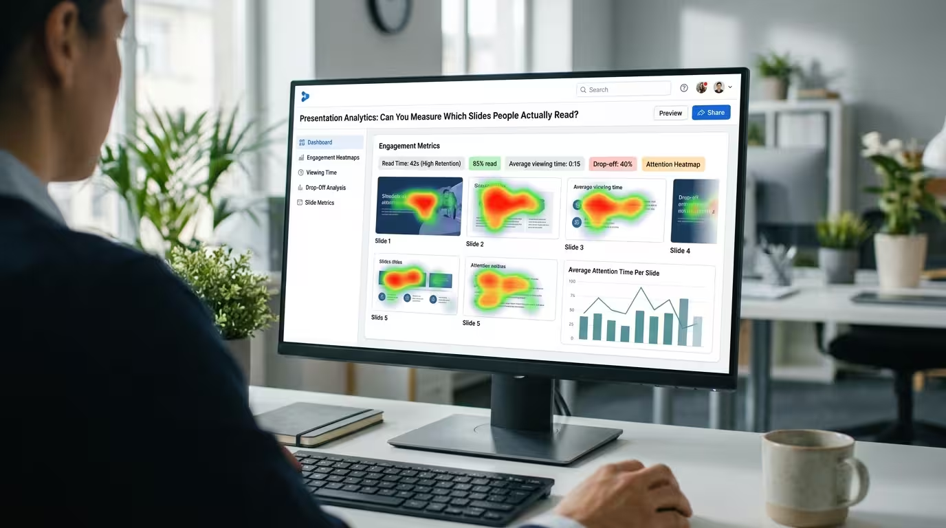
A presentation can record a slide view without proving that anyone actually read the slide. A viewer may leave a deck open for ten minutes, skip through it in seconds, or pause on one slide while discussing something completely unrelated.
That makes presentation analytics useful, but also easy to misinterpret. Analytics can show patterns in audience behavior—such as viewing time, slide progression, drop-offs, and interaction—but they do not automatically tell you what a person understood.
This distinction matters when you are trying to decide which slides deserve redesigning, which messages are being ignored, and whether a presentation is communicating effectively.
What Presentation Analytics Can Actually Measure
The first step is to separate observable behavior from assumptions about attention.
Depending on the presentation platform and tracking system, analytics may provide information such as:
- How many people opened the presentation.
- How long a presentation remained open.
- Which slides were viewed.
- How long viewers stayed on particular slides.
- Where viewers stopped progressing through the deck.
- Whether viewers returned to the presentation later.
- Which links or interactive elements were used.
These measurements can be valuable because they turn an otherwise invisible presentation experience into something you can examine.
But there is an important boundary: time spent on a slide is not the same thing as reading comprehension.
Why Time on Slide Is an Imperfect Metric
Imagine that Slide 7 has an average viewing time of two minutes while Slide 8 averages only twelve seconds. It is tempting to conclude that Slide 7 was more engaging.
That conclusion may be wrong.
Slide 7 could contain a dense table that takes time to interpret. It could also be the slide where the presenter asks the audience to discuss a question. Alternatively, someone might simply have left the presentation open while answering an email.
The twelve-second Slide 8 may have been completely understood because it contained one clear visual and a short message.
This is why I would treat viewing time as a diagnostic signal rather than a score. It tells you where behavior changed. It does not tell you exactly why.
Look for Patterns Across Several Slides
A single slide metric rarely tells the whole story. The more useful question is whether several signals point in the same direction.
For example, suppose analytics show that:
- Most viewers reach Slide 12.
- Many viewers leave immediately afterward.
- Slide 12 takes considerably longer to view than surrounding slides.
- The next slide contains a detailed explanation of the same topic.
That pattern gives you something worth investigating. Perhaps Slide 12 introduces a complicated decision and the following slide asks for too much additional information.
The analytics do not prove that this is the cause. They identify a point where the audience's behavior deserves closer examination.
This is a more useful way to work with presentation data: use analytics to locate questions, then use presentation testing or audience feedback to answer them.
Can Analytics Tell You Which Slides People Actually Read?
Not reliably on their own.
There is a difference between these four statements:
- The slide was opened. This is an observable event.
- The slide remained visible for 60 seconds. This is a measurable duration.
- The viewer looked at the slide. This may require additional behavioral tracking.
- The viewer read and understood the slide. This requires evidence beyond ordinary slide-view analytics.
The last statement is the difficult one. Reading is an internal cognitive process, and ordinary presentation analytics cannot directly observe comprehension.
If understanding matters, consider combining analytics with another signal: a short question, a follow-up action, a survey, a discussion, or a test of whether the audience can correctly use the information presented.
Turn Slide Analytics Into a Design Audit
Analytics become much more useful when you connect them to specific design decisions.
Instead of asking, “Which slide performed best?”, ask questions such as:
- Where do viewers consistently stop?
- Which slides take unusually long to process?
- Which slides are repeatedly revisited?
- Where does the viewing pattern change suddenly?
- Does a high-interest slide lead to a useful next action?
These questions can expose different problems.
A high viewing time might indicate complexity. A very short viewing time might indicate clarity—or irrelevance. A high drop-off might indicate that the audience has already received the information they needed, or that the next section failed to maintain interest.
The metric becomes meaningful only when you connect it to the role of the slide in the overall presentation.
Build the Slide So the Important Signal Is Measurable
Analytics cannot rescue a slide whose purpose is unclear.
Before measuring engagement, define what the audience should notice or do on each important slide. A dashboard slide might be designed to direct attention toward one KPI. A comparison slide might support a decision between two alternatives. A process diagram might explain the order of several stages.
Once the intended action is clear, analytics have something useful to investigate.
ImagineLayout's analytics-oriented PowerPoint resources are built around dashboards, metrics, charts, trend lines, funnels, and other data-focused visual structures. These types of layouts can help turn raw presentation data into a visual analysis rather than leaving it as a collection of isolated numbers.
Use Dashboards to Compare Slide Behavior
If you are reviewing a large presentation or multiple presentations, a dashboard can make patterns easier to see.
A practical slide-performance dashboard might contain:
- Reach: percentage of viewers who reached the slide.
- Viewing time: average or median time spent there.
- Drop-off: percentage of viewers who stopped progressing afterward.
- Interaction: clicks or other measurable actions, where available.
- Outcome: the action the slide was intended to support.
Do not automatically combine these values into a single “slide score.” Different slides have different jobs. A title slide should not be expected to generate the same behavior as a detailed decision slide.
ImagineLayout's Analytics PowerPoint Template includes dashboard-style layouts and diagrams for presenting metrics, trends, funnels, and other analytical information. This type of visual structure can be adapted to a presentation-performance review when you need to compare several engagement measures in one place.
Presentation Analytics Works Best as a Feedback Loop
The most useful workflow is not “collect analytics and declare a winner.” It is a repeated design loop:
- Design: give each slide a specific communication purpose.
- Present: deliver the presentation to the intended audience.
- Measure: collect available viewing and interaction data.
- Investigate: identify unusual behavior rather than assuming its cause.
- Improve: change the slides where the evidence suggests a problem.
- Test again: check whether the revised presentation changes the observed behavior.
This approach also prevents a common mistake: redesigning slides simply because one metric looks unusual.
A slide that receives little viewing time may be exactly as effective as intended. A slide that receives a lot of viewing time may be confusing rather than compelling.
The real value of presentation analytics is therefore not proving that someone “read” a slide. It is giving you evidence about where audience behavior changes. Once you know where to look, you can combine that evidence with the slide's purpose, audience feedback, and actual outcomes.
That is the point where analytics stops being a collection of numbers and becomes part of the presentation design process.
Comments (0)