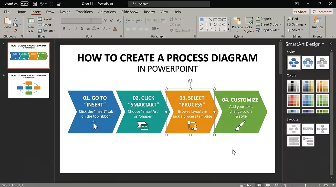
A process diagram can look simple right up until you try to build one. Five boxes, a few arrows, some labels — and suddenly the arrows collide, the text no longer fits, and the viewer cannot tell where the process actually goes.
This guide explains how to create a process diagram in PowerPoint that is not only editable, but also easy to follow. The important part is not finding the right SmartArt thumbnail or drawing perfect rectangles. It is choosing a structure that matches the logic of the process before you start formatting it.
Start with the process logic, not the PowerPoint shapes
The first mistake is opening PowerPoint and immediately looking for boxes.
Before creating anything, write the process as a short sequence of actions. For example, a hypothetical product approval process might be:
- Submit request
- Review requirements
- Approve or reject
- Prepare product
- Release
That small exercise reveals something important: this is not just a list. It contains a decision point. If you draw it as five identical boxes connected by straight arrows, the “Approve or reject” stage will be visually underrepresented even though it changes what happens next.
Microsoft recommends using PowerPoint's Process SmartArt layouts for sequential steps and using other SmartArt categories when the underlying relationship is different. A Cycle layout, for example, is intended for processes that repeat rather than simply move from start to finish.
So before choosing a layout, ask one question:
Does the information move in one direction, branch into alternatives, return to an earlier stage, or show parallel activities?
The answer determines the diagram more reliably than the visual style you happen to like.
Choose between SmartArt and manual shapes
PowerPoint gives you two practical ways to build most process diagrams: SmartArt or individual shapes and connectors.
SmartArt is useful when the process is straightforward. If you have a short sequence of stages and want something editable quickly, it can be the fastest starting point. In PowerPoint, you can insert SmartArt, choose the Process category, select a layout, and replace the placeholder text with your steps.
It also works well when the structure is still being developed. You can add or remove shapes from the SmartArt graphic rather than rebuilding the entire diagram.
Manual shapes become more useful when the process contains exceptions, branches, uneven amounts of text, or several different types of relationships.
For example, consider a workflow with these elements:
- four sequential stages;
- one approval decision;
- two possible outcomes;
- a feedback loop back to an earlier stage.
Trying to force all of that into a standard linear SmartArt layout can make the diagram fight its own structure. Building it with individual shapes gives you control over the position of every stage and connector.
There is also a useful middle ground: start with SmartArt to establish the basic sequence, then convert or rebuild the important parts as individual shapes when the diagram's logic becomes more complex.
Build the first version with only the essential shapes
Once the structure is clear, create a deliberately ugly first version.
Use simple rectangles, circles, diamonds, and arrows. Do not spend time choosing gradients, icons, shadows, or decorative colors yet. At this stage, the only question is whether the process can be understood by following the visual path.
A useful rule is to give each shape one job.
- Rectangle: an action, stage, or task.
- Diamond: a decision that changes the path.
- Circle or marker: a milestone or numbered stage.
- Arrow: movement from one state or activity to another.
You do not have to follow these shapes mechanically. The important thing is consistency. If one rectangle means “process stage” on slide one, it should not suddenly mean “decision” on slide two.
PowerPoint's flowchart tools support this approach directly: Microsoft describes flowcharts as sequential steps and provides Process SmartArt layouts as a starting point, while individual shapes can be used when more control is needed.
The most important design decision at this stage is actually what not to put into the diagram. A process diagram should show the logic of the process. Supporting explanations can sit outside the flow rather than turning every box into a paragraph.
Connect the stages so the eye never has to guess
Most process diagrams do not fail because the boxes are unattractive. They fail because the path between the boxes is ambiguous.
Imagine two adjacent stages with an arrow that approaches the second box from the side while another connector leaves that same area toward a decision. The information may technically be correct, but the viewer has to stop and decode which line belongs to which path.
That is why connector geometry matters more than decorative styling.
For a simple left-to-right process, keep the visual direction consistent:
- start on the left;
- move toward the right;
- keep connectors aligned with the main axis;
- use bends only when the process itself requires a change in direction.
For a branching process, make the decision visually obvious and label the branches where the answer is not self-evident. “Yes” and “No” are often more useful than forcing the reader to infer which branch represents approval.
PowerPoint's SmartArt tools can automatically handle much of the basic structure, but manual diagrams give you more control over where connectors enter and leave each shape. That control becomes increasingly valuable as the number of branches grows.
One practical test is to temporarily remove the text inside the boxes and look only at the shapes and arrows. If you cannot tell the intended direction from the geometry alone, the diagram probably needs structural work rather than better typography.
Keep the text short enough to preserve the process
A common problem appears when a process diagram becomes the place where every detail from a project document is stored.
A box that starts as “Review request” becomes “Review customer request and confirm that all technical, financial, legal, and operational requirements have been completed before approval.” At that point, the box is no longer functioning as a process marker. It has become a paragraph with an arrow attached to it.
Instead, separate the stage label from the explanation.
For example:
- Stage: Review request
- Supporting detail: Confirm technical and commercial requirements
The stage should remain short enough to be recognized immediately. If the explanation is essential, place it as a smaller supporting line or outside the main flow.
This is especially important when presenting rather than distributing the slide as documentation. A presentation audience usually needs to understand the sequence first. Detailed procedural instructions can be handled elsewhere.
Use visual emphasis to show where the process actually changes
Once the structure works, formatting becomes useful — but only when it communicates something.
If every process stage receives the same strong color, border, icon, and size, the diagram has nowhere to show importance. The viewer sees a collection of equally loud objects.
Instead, use emphasis for structural differences.
For example, a hypothetical procurement process could visually distinguish:
- normal process stages;
- the approval decision;
- an exception path;
- the final outcome.
The goal is not to make the diagram more colorful. It is to make the process easier to scan.
Microsoft's SmartArt controls allow you to change colors and apply styles after the structure has been created. For a presentation-quality result, however, it is often better to treat those controls as a starting point rather than the final design.
This is where editable process templates can save time. Instead of rebuilding common connector arrangements from scratch, you can start from an existing diagram structure and adapt the wording and visual system to your presentation. For example, Process Block Schemes PowerPoint Template provides editable process-oriented layouts for workflows and block diagrams.
Know when a process diagram should become a different diagram
There is a point where improving a process diagram is the wrong solution because the underlying information is no longer a simple process.
If the viewer needs to understand dates and milestones, a timeline may communicate the information better. If the process repeatedly returns to an earlier stage, a cycle may be more appropriate. If several teams perform activities simultaneously, a swimlane-style structure may be clearer than a single chain of boxes.
This distinction matters because adding more arrows does not fix the wrong diagram type.
For example, imagine a product-development workflow where research, engineering, design, and marketing all work during overlapping periods. A single left-to-right sequence could suggest that engineering waits until research is completely finished, even if that is not how the work actually happens.
In that situation, the problem is not spacing or color. The diagram is encoding the wrong relationship.
For processes that are really time-based, a dedicated timeline structure can make the sequence and milestones easier to control. ImagineLayout's Timeline Process Diagrams collection is one example of using multiple editable structures rather than forcing every workflow into the same linear pattern.
Likewise, if the main story is a sequence of clearly separated stages, a process-step layout can provide a faster starting point than constructing every connector manually. A resource such as Process Steps PowerPoint Charts is useful for that specific situation.
Finish with a five-second readability test
Before presenting the slide, stop editing and look at the diagram for about five seconds.
Then ask yourself:
- Where does the process start?
- Where does it finish?
- What is the most important decision?
- Can I follow the main path without reading every word?
- Is there any connector whose destination is ambiguous?
If those answers are not obvious, resist the temptation to add more styling. Go back to the structure.
A strong process diagram does something quite specific: it reduces the amount of reasoning the audience has to perform while reconstructing the workflow. The boxes carry the stages, the connectors carry the relationships, and the visual emphasis tells the viewer where the process changes direction.
That is also why the best process diagrams often look simpler after the design is finished. The complexity has not disappeared from the underlying process. It has been organized so the audience does not have to discover it for themselves.
Comments (0)