Why Professional PowerPoint Templates Often Make Presentations Look the Same
The reason your templated deck feels familiar isn't the template's fault — it's which parts of it you left untouched.
Design tips, tutorials, product updates, and industry insights.

The reason your templated deck feels familiar isn't the template's fault — it's which parts of it you left untouched.
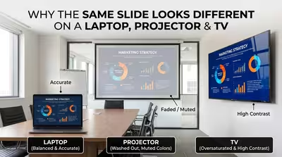
Your deck looked perfect on your laptop — then the room's projector made your brand blue look teal and your dark slide look grey, and here's the actual reason why.
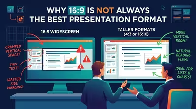
Widescreen became PowerPoint's default the moment nobody had to ask for it anymore — which is exactly why so few people stop to check if it still fits.
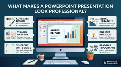
It's rarely the color palette — it's the half-millimeter of misalignment nobody consciously notices but everybody feels.
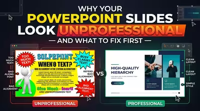
It's rarely the "wrong" font or color — it's the thing your audience never consciously names.
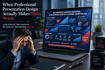
Professional presentation design can improve a deck—or make it harder to understand. Here are the situations where polish starts working against the message.
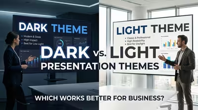
Dark or light? The right business presentation theme depends less on taste than on what the audience needs to see, do, and remember.
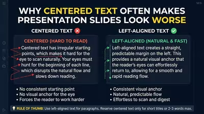
Centered text looks balanced at first, but on content-heavy slides it can quietly weaken hierarchy, alignment, and reading flow.
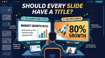
Not every slide needs a visible headline, but every slide needs a clear job. Here is how to decide when a title helps, hurts, or should stay hidden.